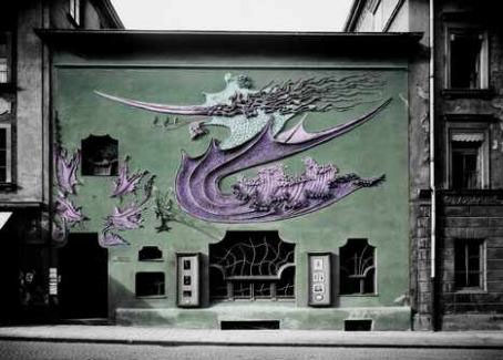
Atelier Elvira (1897-98).
Seeing as there’s been a run of Art Nouveau-related posts here it’s worth mentioning a location that’s familiar to students of the Jugendstil but less well-known to the world at large. August Endell’s Atelier Elvira was a Munich studio building whose exterior decoration of a very stylised dragon creature manages to be even more exaggerated than similar work by Antoni Gaudí. Munich was the centre of German arts and crafts and produced much home-grown Art Nouveau but this eruption of bizarre plasterwork in an otherwise mundane street was still surprising. The façade was painted green, as in the tinted photo above, and the dragon painted different colours each year, yellow, red and so on.
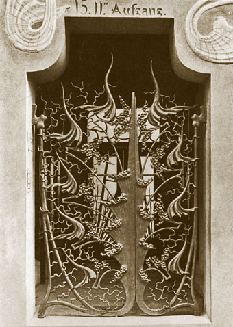
The ironwork street entrance.
Needless to say, not everyone looked upon this kind of challenging décor favourably. In 1937 the Nazi Oberbürgermeister complained about the “hideous façade disrupting the character of the rest of the street” and had the dragon design chipped off the wall. Allied bombs did for the rest a few years later so these pictures are all that we have left.