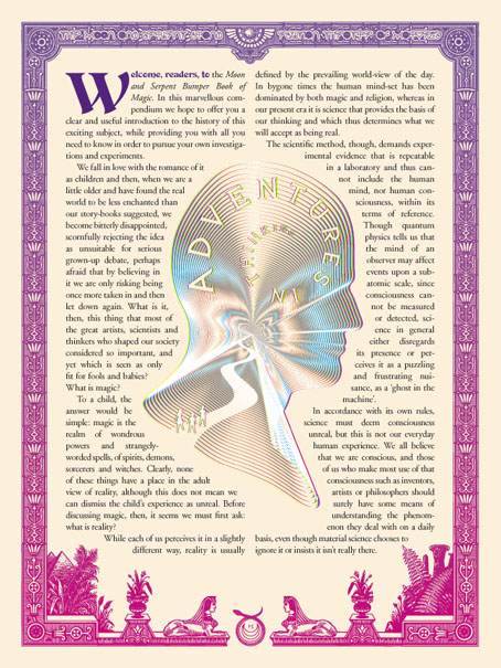
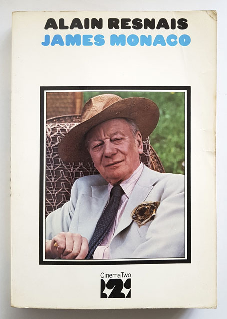
Worlds Beyond Time

worlds1.jpg

Or yesterday’s tomorrow today. Adam Rowe’s book arrived in the post this weekend, a little bumped at the corners (art books often suffer at the hands of the postal services) but very welcome all the same.

In the 1970s, mass-produced, cheaply printed science-fiction novels were thriving. The paper was rough, the titles outrageous, and the cover art astounding. Over the course of the decade, a stable of talented painters, comic-book artists, and designers produced thousands of the most eye-catching book covers to ever grace bookstore shelves (or spinner racks). Curiously, the pieces commissioned for these covers often had very little to do with the contents of the books they were selling, but by leaning heavily on psychedelic imagery, far-out landscapes, and trippy surrealism, the art was able to satisfy the same space race–fuelled appetite for the big ideas and brave new worlds that sci-fi writers were boldly pushing forward.

worlds2.jpg

In Worlds Beyond Time: Sci-Fi Art of the 1970s, Adam Rowe—who has been curating, championing, and resurrecting the best and most obscure art that 1970s sci-fi has to offer on his blog 70s Sci-Fi Art—introduces readers to the biggest names in the genre, including Chris Foss, Peter Elson, Tim White, Jack Gaughan, and Virgil Finlay, as well as their influences.

worlds3.jpg

One of my own formative influences was Visions of the Future (1976), a large-format book edited by Janet Sacks that recycled material from NEL’s Science Fiction Monthly magazine to present a guide to British SF art in the 1970s. In many ways the book was a rather poor collection—the reproductions aren’t good, not all the artists are first-rate, and a few have nothing to do with SF or “the future” at all—but it was important to me for the many artist interviews which confirmed that you could make some kind of living producing this type of art. Adam Rowe’s book is like a superior sequel to Visions of the Future, with miniature biographies for many of the artists, plus a look at the recurrent themes he’s explored on his 70s Sci-fi Art Tumblr. There’s a lot in here I hadn’t seen before. I’m grateful he’s found space for Paul Kirchner’s Dope Rider, a typically Surrealist Kirchner comic strip, and one I never got to see when it was running in the pages of High Times. Kirchner’s The Bus was a favourite, however, being a regular in the pages of Heavy Metal magazine. Kirchner has never been very science fictional either but Worlds Beyond Time is a more flexible title than Visions of the Future, one that can embrace imaginative possibilities that aren’t limited to spaceships, planets and futuristic cities.

Elsewhere on { feuilleton }
The book covers archive
The illustrators archive

Previously on { feuilleton }
Corgi SF Collector’s Library
Foss, Jodorowsky and low-flying spacecraft
Crank book covers
Do You Have The Force?
The artists of Future Life
Science Fiction Monthly
The fantastic and apocalyptic art of Bruce Pennington
Roger Dean: artist and designer

Toytown psychedelia

alala2.jpg

The Teletrips of Alala (1970).

The imaginative landscapes of childhood were always close at hand in the psychedelic culture of the 1960s, more so in Britain than the USA, and especially where music was concerned. Grace Slick may have given the world White Rabbit but there’s a whole sub-genre of British psychedelic song-writing devoted to children’s games, children’s dreams, sweetshops, fairy tales and the like. Rob Chapman in his essential study of the form, Psychedelia and Other Colours, refers to this tendency as “infantasia”. With psychedelic art being so vivid and playful it’s a small step from lysergic wonderlands to children’s books styled in a quasi-psychedelic manner, which is what we have here. There was a lot of this around in the early 1970s, not all of it very memorable. Some of the best examples were published by Harlin Quist, a US/French imprint who specialised in beautiful books illustrated by exceptional talents. A few of these may be seen at The Peculiar Manicule.


Gertrude and the Mermaid (1968)
by Richard Hughes, illustrated by Nicole Claveloux.

gertrude1.jpg

“This is the story a little girl, her doll named Gertrude, and a mysterious mermaid-child.” The first of several books by Nicole Claveloux for Harlin Quist.

gertrude2.jpg

gertrude3.jpg


Help, Help, the Globolinks! (1970)
by Gian Carlo Menotti, translated and adapted by Leigh Dean, illustrated by Milton Glaser.

globolinks1.jpg

“Recounts the events following the landing of the outer-space Globolinks on Earth.” A German comic opera from 1968 in which a group of children encounter an alien invasion.

globolinks2.jpg

globolinks3.jpg

globolinks4.jpg


The Teletrips of Alala (1970)
by Guy Monreal, illustrated by Nicole Claveloux.

alala1.jpg

“With her unique power to enter the television set and change the course of the programs, Alala creates havoc in the world.” Nicole Claveloux puts her own twist on the Yellow Submarine art style. A few years after this she was creating comic strips for Métal Hurlant. Her more recent work includes erotic retellings of fairy tales. (more pages)

alala3.jpg

alala4.jpg


Andromedar SR1 (1971)
by Martin Ripkens & Hans Stempel, illustrated by Heinz Edelmann.

andromedar1.jpg

“Two astronauts under the spell of an evil octopus are ordered to steal the cobalt-blue flowers from the Martian Mice.” Ripkens and Stempel were better known for their work as cinema critics and film-makers. (more pages)

andromedar2.jpg

andromedar3.jpg


Cartulino: El asombroso doctor Zas (1971)
by Miguel Agustí, illustrated by Alberto Solsona.

solsona02.jpg

A comic strip from a Spanish title, Strong. Alberto Solsona also drew Agar-Agar, the grooviest strip in the short-lived Dracula comic. Cartulino had a number of different adventures but online examples are scarce.

solsona03.jpg


Los Doce Trabajos de Hércules (1973)
by Miguel Calatayud.

hercules1.jpg

“Serie de episodios sobre la penitencia llevada a cabo por Hércules el mayor de los héroes griegos.” A comic adaptation rather than a story book but the art style is a good example of the general trend.

hercules2.jpg

hercules3.jpg


Update: Added Alberto Solsona.

Previously on { feuilleton }
Glaser goes POP
Return to Pepperland
The groovy look
The psychedelic art of Nicole Claveloux
Psychedelia and Other Colours by Rob Chapman
David Chestnutt’s psychedelic fairy tales

X-ray visions

x1.jpg

Cover art by George Wilson.

Cosmic weirdness isn’t something you expect to find in the tie-in comics published by Gold Key in the 1960s, but this adaptation of Roger Corman’s film contains a few such traces, as does the film itself. Having watched X: The Man with the X-ray Eyes again recently I was curious to know how artist Frank Thorne would manage with the scenes where Dr Xavier’s vision is showing him more of the world than he wants to see. Despite the general sketchiness of the drawing, in some of the panels these visions are more fully realised than they are in the film, it being easier to draw an unusual effect than capture it on celluloid. Roger Corman had a great idea, a talented co-writer in Ray Russell, and an authentically tormented performance from Ray Milland, but the film is hampered by the limitations of AIP’s budgets. When Xavier complains about the oppressive sight of people above him on the floors of his tenement building only the comic shows us what he sees.

x3.jpg

So too with the later scenes, by which time all of Corman’s point-of-view shots are the same combination of a diffracted lens (Spectarama!) and Les Baxter’s wailing theremin. Xavier’s description of a great watching eye “at the centre of the Universe” isn’t conjured so well by Corman’s visuals. The comic gives us an all-too-human eyeball floating in space, but before this there’s a panel of ragged shapes flapping through the interstellar void, as well as something never seen in the film when Xavier looks down into the Earth’s core.

x4.jpg

The comic was written by Paul Newman (not that one), and was evidently adapted from a script rather than a print of the film. None of the characters or scenes resemble their cinematic equivalents, while Xavier’s eyes in the comic hardly change appearance. But the additions to the finale make me wonder whether there was a little more in the script than ended up in the film.

x2.jpg

Corman made The Man with the X-ray Eyes in 1963, immediately after The Haunted Palace—the first film to adapt HP Lovecraft—and a few years before The Trip—the first feature film devoted solely to the psychedelic experience. Xavier’s journey into nightmare is a curious hybrid of Lovecraft and psychedelia: the titles are set against a swirling violet spiral, while the doctor’s Spectarama visions are precursors of the delirium experienced by Peter Fonda’s Paul in The Trip. (Corman’s initial idea for The Man with the X-ray Eyes had a jazz musician taking too many drugs.) At one stage in his LSD trip Paul looks in a mirror and announces that he can see inside his own brain, but in the earlier film we get to see inside Xavier’s brain for ourselves when he takes his eye drops for the first time, after which the camera passes through the back of the doctor’s head until we’re looking out of his eyes. This is so close to a moment in Gaspar Noé’s Enter the Void that I’ve been wondering whether Corman’s film is another of Noé’s cult titles like those you see named at the beginning of Climax.

x5.jpg

As for the Lovecraftian quality, The Man with the X-ray Eyes misses an opportunity to do more with the scope of its central concept. Stephen King famously reported a rumour that the film had a suppressed line of dialogue from the very end, when Xavier tears out his eyes then screams “I can still see!” Corman denied that this was the case but admitted it was a good idea. King mentions this in Danse Macabre, in a description of the film which also interprets the story as being far more Lovecraftian—he uses that word—than it actually is. His suggestion (or mis-remembering) is that all the Spectarama effects are Xavier’s growing perception of the Eye at the centre of the Universe, even though Xavier only mentions this presence in the last few minutes.

x6.jpg

The implications of this remain unexplored but Xavier’s final vision of cosmic horror is still truer to Lovecraft’s Mythos philosophy—a warning that the human race peers into the void at its peril—than almost anything else in cinema, and the revelation is made all the more disturbing by the appearance of Xavier’s eyes which by this point are solid black orbs. As King suggests, there’s another film altogether lurking under the surface of this one, a horror film with a cosmic reach. Hollywood still struggles to do anything substantial with Lovecraft’s fiction, but you know the way things are today we’ll be lucky to get anything weirder than more CGI monsters and lumbering kaiju. I wouldn’t want to suggest that Gaspar Noé remake The Man with the X-ray Eyes but if he ever wanted to create a psychedelic horror story then the cosmic route is the way to go.

Previously on { feuilleton }
Undead visions
Trip texts revisited
More trip texts
Enter the Void

Weekend links 673

ay-o.jpg

Butterfly (1988) by Ay-O.

• “[Mike] Jay says there are notional lessons to be learned about what happens next from the characters who populate Psychonauts but says they would have been of greatest benefit to ‘the legislators, the bureaucrats, the statisticians and social scientists of the early 20th century who created the idea of “good drugs” and “bad drugs”.’ It is the framework of ‘drugs’ itself which needs to be dismantled.” John Doran discussing Psychonauts: Drugs and the Making of the Modern Mind with the book’s author, Mike Jay. The piece ends with an extract from the book itself. There’s another extract at Nautilus.

• “From the eerie electronics of Earth Calling through to the warp speed crescendo of Master Of The Universe, Space Ritual is like no other live record released at the time or since.” Joe Banks explores the events that led to the recording of the definitive Hawkwind album, Space Ritual, which was released 50 years ago this week.

• “You know, it’s actually all about life, and love, and death, and it’s sexy, and it’s funny and it’s not depressing.” Simon Fisher Turner talking to Emily Bick about Blue Now, a new live staging of Derek Jarman’s final film.

mm.jpg

From The Castaway Captives (1934): Mickey Mouse in a deep fix.  Ignore the signature, this one was written and illustrated by Floyd Gottfredson.

• New music: Kinder Der Sonne (From Komplizen) by Alva Noto, and S.W.I.M. by Gunnar Jónsson Collider.

• Mixes of the week: Isolatedmix 120 by Lord Of The Isles, and XLR8R Podcast 799 by KMRU.

• Take a radiating, immersive trip into Ay-O’s Happy Rainbow Hell.

• At Dennis Cooper’s: New Queer Cinema 1985–1998 Day.

• Steven Heller’s font of the month is Hopeless Diamond.

Rainbow Chaser (1968) by Nirvana | Rainbows (1969) by Rainbows | Rainbow (2006) by Boris With Michio Kurihara

Saga de Xam revived

saga1.jpg

Saga est magnifique. Saga a la peau bleue. Saga est une extraterrestre. Envoyée par la reine de la planète Xam, la voici qui parcourt la Terre à plusieurs époques, traitées dans des styles différents. Son but: découvrir la quintessence artistique, politique et poétique de notre belle Terre. Marquée par l’Art nouveau, le psychédélisme américain, l’érotisme des années 1960 et la contreculture occidentale, Saga est une oeuvre hors norme et inclassable, dessinée sur des formats géants et publiée une première fois par Éric Losfeld en 1967. Hélas, le livre est très vite épuisé et devient un objet pour les collectionneurs. Cette édition reprend l’intégralité des planches de Saga, renumérisées et dotées d’une nouvelle mise en couleurs fidèle à l’originale. Saga peut enfin repartir dans une nouvelle… saga.

Here’s a book I never expected to see in a new edition. Saga de Xam is a 100-page bande dessinée depicting the time- and space-voyaging adventures of a blue-skinned alien woman, Saga, newly arrived on Earth from the planet Xam. The Xamians are a race of humanoid lesbians (their reproduction is parthenogenetic) whose planet is at war with the masculine Troggs; Saga has been sent to Earth to find a way to combat the Trogg invasion, an expedition that instructs her in the propensity of humans towards conflict and violence. The story was drawn by Nicolas Devil, with contributions from guest artists, and based on an outline by Jean Rollin which had been intended originally for a science-fiction film. There’s no need to go into detail about this cult item, I wrote about it at length several years ago after a couple of its pages stimulated my curiosity when they turned up in an exhibition catalogue. The book was published in 1967 by Éric Losfeld, an edition of 5000 which the publisher said he would never reprint, partly because of the expense, but also because he liked to think of the book becoming a rare object in the future. Rare it still is, although the embargo was broken in 1980, a year after Losfeld’s death, by the publication of a second edition. This was only a partial reprint, however, with a poor cover design and all the interior pages reproduced without their colour overlays.

saga2.jpg

The new edition from Revival is slightly larger than the original (27.5 x 36 cm to the original 24 x 31 cm), and bound between heavy boards. A lengthy preface by Christian Staebler describes the book’s history, offering a few biographical details about Nicolas Deville (as he was known pre-1967), together with further information about the story’s creation. The wildness of the final pages is explained as an attempt by all involved to capture some of the delirium of an LSD trip, while also bringing the story of Saga’s investigation of the human race and its violent nature into the present day. Jean Rollin was apparently unhappy with this dénouement but I find the ending to be a satisfying one for a story where each chapter explores a different period of time (and of space, when Saga returns to her home planet).

saga3.jpg

The icing on the cake is the appearance near the end of a few early drawings by Philippe Druillet, together with several beautiful pages by Devil, one of which found wider circulation when reprinted as a poster. The text in the new edition is still in French, of course, and even on slightly larger pages the legibility problem from the original remains. Devil was drawing on boards that were twice the size of their printed equivalents, without caring too much whether the story would be readable when scaled to a printable size. Losfeld’s solution was to provide a magnifying glass with each copy of the book. This isn’t too much of a problem; the story is easy enough to follow once you know the general outline, and for this story it’s the art that counts more than the words.

saga4.jpg

Continue reading “Saga de Xam revived”