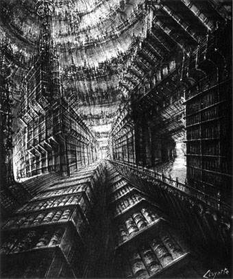
The Library of Babel (no date).
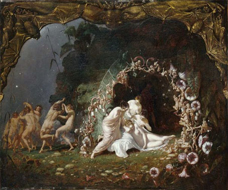
Another French artist who specialised in fantastic architecture, Pierre Clayette’s work came to my attention via the picture above which illustrates a Borges story. This leads me to wonder once again what it is about French and Belgian artists which attracts them more than others to this type of imagery.
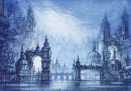
Whatever the reason, there isn’t a great deal of Clayette’s work online and biographical details are few. This page (the source of the untitled picture above) reveals that he worked as an illustrator for Planète magazine, the journal of “fantastic realism” founded by Jacques Bergier and Louis Pauwels in the early Sixties. Some readers may know that pair as the authors of a { feuilleton } cult volume, The Morning of the Magicians (1960), whose vertiginous blend of speculative and weird fiction, occultism and futurology Planète was intended to continue.
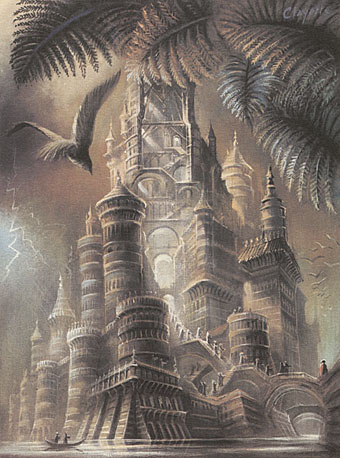
Clayette also worked as a theatre designer and book illustrator. Le Chateau (above) is an illustration from Songes de Pierres, a 1984 portfolio depicting scenes from Pierres by Roger Caillois. That writer has his own significant Borges connection, being responsible for introducing Borges’ work to France via his editorship of the UNESCO journal, Diogenes. (Pauwels and Bergier later published Borges in Planète.)
Finally, there’s a less extravagant Flickr collection of some Clayette covers for Penguin Shakespeare editions. All of which only scratches the surface of what was evidently a prolific career; I’ll look forward to more examples of his work coming to light.
Elsewhere on { feuilleton }
• The fantastic art archive
• The illustrators archive
Previously on { feuilleton }
• The art of Michiko Hoshino
• The art of Erik Desmazières
• The art of Gérard Trignac
• The Absolute Elsewhere