Storm Thorgerson, 1944–2013

hipgnosis1.jpg

Wish You Were Here (outer and inner sleeve, 1975) by Pink Floyd.

Whenever people ask questions about your work, at some point the subject of influences always turns up. Influences for me are usually few, they’re those things which skew your perception to such a degree—or which enlarge the range of possibilities—that they make you follow a path you might otherwise have never pursued. I’ve said on many occasions that the window of our local record shop in the 1970s was an art gallery whose contents changed every week, with gatefold sleeves offering an endless variety of fantastic visions and smart designs. I was often indifferent to the music the sleeves were intended to advertise, if a favourite band happened to have a great record sleeve then so much the better. It wasn’t that I wanted to be a record sleeve designer as such, more that the views (as Roger Dean called his first book) were incredibly stimulating, and they excited me enough that I wanted to have the creation of images like that in my future.

hipgnosis2.jpg

Wish You Were Here shrinkwrap and George Hardie’s sticker design.

I’ve written at some length about Roger Dean and Barney Bubbles but it was Hipgnosis that dominated those window displays during the golden age of record sleeve design. Obituaries of Storm Thorgerson have rightly been acknowledging the contributions of his Hipgnosis design partners Aubrey Powell and Peter Christopherson, but Thorgerson always came across as the driving force, a position reinforced by his text for the group’s first book collection, An ABC of the Work of Hipgnosis: Walk Away René (1978), and by his post-Hipgnosis career which continued to generate even more startling images. Walk Away René is like the designs of Hipgnosis themselves: witty, clever, and beautifully produced, while Thorgerson’s commentary is refreshingly honest both about the details of album production, and in its lack of the affectation which afflicts many design books. Working in the music business probably helped maintain a no-bullshit attitude; it’s difficult to imagine many other designers cheerfully announcing in their first public showcase that their studio is so primitive that everyone has to piss in the sink. Or, as I noted in December, drawing attention to your least favourite covers in an even more lavish showcase.

hipgnosis3.jpg

The Dark Side Of The Moon (1973) by Pink Floyd.

The cover examples here have been chosen via the essays in For the Love of Vinyl: The Album Art of Hipgnosis (2008) where several people were asked to choose their favourite sleeves. I’d find it impossible to choose a favourite, although at a push I’d probably go for Wish You Were Here. With its absence/four elements concept, in its original package—the postcard insert, the unlabelled sleeve shrink-wrapped in black cellophane then stickered with a George Hardie drawing which I once laboriously copied—it comes close to perfection when you’re discussing album designs as works of art.

hipgnosis4.jpg

Presence (1976) by Led Zeppelin.

The Hipgnosis Covers site is the place to see more work by Storm Thorgerson and company.

Storm Thorgerson, Pink Floyd and the final secret of the world’s greatest record sleeve designer
The Guardian: “The best album designer in the world”
Storm Thorgerson remembered by Aubrey Powell
Adrian Shaughnessy at Creative Review
Mark Blake at MOJO
Telegraph obituary

hipgnosis5.jpg

Go 2 (1978) by XTC.

Elsewhere on { feuilleton }
The record covers archive

Previously on { feuilleton }
Hipgnosis turkeys
Peter Christopherson, 1955–2010
Storm Thorgerson: Right But Wrong
Battersea Power Station

Weekend links 142

bowie.jpg

Gratifying this week to see album cover art under discussion even if the heat-to-light ratio was as unbalanced as it usually is when pop culture is the subject. Jonathan Barnbrook, who also designed the Heathen (2002) and Reality (2003) packaging for David Bowie, wrote about the thinking behind the new cover on his blog. (And for the time being let’s note that this is still only a cover design, we don’t know what else is on its way.)

For my part I’ll point out that the artist-as-cover-image is the great cliché of album design, and the bigger the name the more the rule applies; Neville Brody complains about this in the first book of his work, as does Storm Thorgerson in the Hipgnosis books. In Bowie’s case the rule has been applied almost universally since his debut album in 1967, the only variations being illustrational ones or slight dodges like having his feet appear on the front of Lodger and his back facing the viewer on Earthling. Consequently the new design is a radical gesture from an artist who could have got away with a photo of himself du jour. By way of contrast, consider that Rod Stewart is a year older than David Bowie and presented the world with this artefact in October 2012.

Related: Hard Format responds to the cover, Chris Roberts on “Picasso resurrected in a Rolf Harris era“, and Alexis Petridis on The inside story of how David Bowie made The Next Day.

The Quicksilver typeface, designed by Dean Morris when he was only 16, bought by Letraset and now an indelible feature of pop design from the 1970s. Morris describes his experience here (“they shunned rapidographs!”) and collects examples of the print history here.

When the days are short, we are closest to the medieval world. To the avoidance of mirrors where death improves our portraits every morning with a few more lines and shadows. What would once have been a sermon, a conjuring of hellfire, a phantom slide show, is now an entertainment. But before we can begin again, we have to kick free of the embrace of our inconvenient predecessors, that compost legion of the anonymous dead. They come uninvited, requiring us to sign up for what the late Derek Raymond called the general contract: a brief turn in the light, then extinction. Eternal darkness. How to live with such knowledge? William Burroughs admired the unswerving bleakness of Beckett’s gaze, the way he reduced compensatory illusions to zero. Nowhere left to crawl. And nothing to crawl on. Last breath is last breath. Stare into the abyss and the abyss will stare right back.

Iain Sinclair reviews The Undiscovered Country: Journeys Among the Dead by Carl Watkins

Broadcast’s James Cargill on Morricone, Minidiscs and Scoring Berberian Sound Studio. Related: Melmoth the Wanderer posts a new mix, The Curious Episode of the Wizard’s Skull, and more spooky sounds are on their way from The Haxan Cloak.

• A Firm Turn Toward the Objective: Joanne Meister on meeting the great Swiss designer Josef Müller-Brockmann.

duchess.jpg

Twitter user @thisnorthernboy reworked Paul Emsley’s portrait of Kate Middleton. @barnbrook approved.

• The Beatles of Comedy: David Free on the Monty Python team.

• The history of the London Underground poster.

Impossible Architecture by Filip Dujardin.

• At Pinterest: Art Dolls & Sculpture

• Grace Jones’ Nightclubbing album has been on repeat play this week: Warm Leatherette/Walking In The Rain | I’ve Seen That Face Before (Libertango) | Demolition Man

Hipgnosis turkeys

turkeys.jpg

Here in Britain there’s no Thanksgiving so turkey as a seasonal meal is a Christmas dish. Turkey also has another meaning which the OED can supply:

6.6 U.S. slang. a.6.a An inferior or unsuccessful cinematographic or theatrical production, a flop; hence, anything disappointing or of little value.

This post concerns the latter—turkeys for the turkey season—being a series of bad or merely lacklustre album covers produced by the Hipgnosis design partnership throughout the 1970s. If the label seems unfair it should be emphasised that “turkey” is the designation applied by Storm Thorgerson himself in the appendix to the third Hipgnosis book, For the Love of Vinyl: The Album Art of Hipgnosis (2008). The following are all covers that he says Hipgnosis disliked, although not necessarily because they were bad designs:

There are some designs we would rather like to forget altogether and have been awarded turkeys to denote — no disrespect is intended for the blame lies mostly with us, save for the twin spectres of release schedules and rock egoism — “That’s a jolly interesting idea chaps but… hmm… actually we’d rather have a picture of our good selves.”

A consistent feature of the Hipgnosis books is a refusal to adopt the Olympian attitude that radiates from many design monographs. Thorgerson has always been happy to describe the history of Hipgnosis, and the practice of album cover design, in warts-and-all anecdotal detail, so it’s no surprise if he also admits to failings. You’d be hard-pressed to find other designers who would draw attention to poor work in this manner, especially in a book dedicated to the highlights of a lauded career. Most designers are self-conscious types who can be relied upon to bury their mistakes as thoroughly as possible.

I wrote a brief post years ago about bad cover design but I usually try to avoid such things, there’s already enough junk in the world without compiling lists of it. But this post is instructive for showing that not everyone gets things right however good they might be, and also that everyone has to start somewhere. Most of my early album covers are various degrees of terrible so I try to spare others the accusatory finger. That said, you have to wonder what on earth Thorgerson and partner Aubrey Powell were thinking of with some of these designs.

01gods.jpg

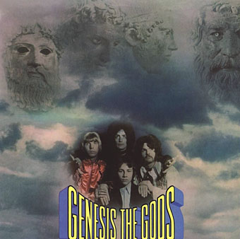
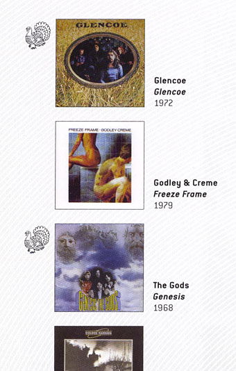
Genesis (1968) by The Gods.

Thorgerson’s introduction to For the Love of Vinyl explains the haphazard beginnings of Hipgnosis, pretty much two guys and a couple of cameras. They had no design training but a lot of luck (not least having Pink Floyd as friends), and were learning on the fly, something you can see happening with these early covers. It’s unfair to compare a design like the Gods sleeve to work they were producing a few years later when they had access to a range of professional illustrators, retouchers and models, and also budgets from record companies that paid for flights to exotic locations.

02gun.jpg

Gun Sight (1969) by Gun.

This was Gun’s second album. The cover for the first happened to feature the first album cover art by Roger Dean whose career in the music business would run parallel with that of Hipgnosis. Most of the early Hipgnosis covers are simple photos that are occasionally processed in some way. This one didn’t really work out, however, the Roger Dean cover is better.

03prettythings.jpg

Parachute (1970) by The Pretty Things.

But at least the Gun cover doesn’t look like this bizarre attempt at Surrealist collage. Hipgnosis often tried to illustrate the album title but I can’t see how you get “parachute” from this one. The collage approach worked a lot better on the Quatermass album produced the same year.

04pepejaramillo.jpg

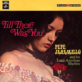
Till There Was You (1970) by Pepe Jaramillo.

This was the only cover singled out in the first Hipgnosis book, Walk Away René (1978), as something they didn’t like:

…straight down the line and utterly tasteless as a result — it doesn’t even work as a genteel piece of middle class tweeness.

Continue reading “Hipgnosis turkeys”

Hill figures

whitehorse.jpg

Last year I was searching out various works of American land art via Google Maps. This is a similar post looking for some of Britain’s hillside figures, all of which are far older than any 20th-century artworks even if some of them aren’t as old as people hope. The antiquity of the Uffington White Horse in Oxfordshire has been established, however, the figure being estimated to be at least three thousand years old. The debate in this case is whether it represents a horse, a dragon or some other creature. What’s most fascinating about the figure is that it can’t be seen from any of the surrounding area, it’s only visible at the top of the hill; all other hill figures are intended to be viewed from a distance. There are other white horse figures carved into southern England’s chalky hillsides but the rest look like distinctly modern creatures. The Uffington carving resembles the kind of animals seen in cave paintings.

longman.jpg

The Long Man of Wilmington in East Sussex provokes endless speculation as to its age and purpose. In the case of this figure and the Cerne Abbas Giant (below) there are no written records of them earlier than the 16th century whereas the Uffington horse is mentioned in medieval texts. This doesn’t rule out their being far older but it implies that their origin may be more recent and more mundane than some would like to believe. The satellite view of the Long Man currently on Google Maps shows that local wags have given the figure a smiley face.

cerneabbas.jpg

The most famous erect penis in Britain can be found near the village of Cerne Abbas in Dorset. In the 1930s the Bishop of Salisbury petitioned the Home Office to have the giant phallus covered over, to no avail.

cropcircle.jpg

Not a hill figure, this is the remains of a crop circle I noticed when looking at Avebury from the air. There are no doubt more to be found, Wiltshire is apparently a popular area for circle makers.

uno.jpg

Uno (1974) by Uno.

Given the usual subjects of concern here I have to mention these two album covers which make use of hill figures. The Uno sleeve is a design by Hipgnosis which is a lot more well-known than the album it decorates. The original XTC vinyl sleeve designed by Ken Ansell was textured card with the horse and lettering embossed into the surface. I’ve not been able to find a cover featuring the Cerne Abbas Giant although that doesn’t mean to say there isn’t one.

xtc.jpg

English Settlement (1982) by XTC.

Elsewhere on { feuilleton }
The album covers archive

Previously on { feuilleton }
Land art
How to make crop circles

Carel Struycken’s panoramas

struycken1.jpg

The Bradbury Building by Carel Struycken.

An idle search for a panorama view of the interior of the Bradbury Building in Downtown Los Angeles fetched me up at my favourite panorama site 360Cities and this photo by Carel Struycken. Mr Struycken is better known as an actor whose great height has seen him cast as The Giant in the Twin Peaks TV series, and Lurch in the Addams Family films. 360Cities has a page of his panorama views most of which are taken in and around Los Angeles. The strangely ossified landscape around California’s Monolake is more familiar from this photo by Hipgnosis for Pink Floyd’s Wish You Were Here album.

struycken2.jpg

Urban Light by Carel Struycken.

struycken3.jpg

Monolake in Winter by Carel Struycken.

Elsewhere on { feuilleton }
The panoramas archive

Previously on { feuilleton }
Through the darkness of future pasts
The Bradbury Building: Looking Backward from the Future