Jugend, 1897

jugend-97-01

Continuing the series of posts about Jugend magazine, all these samples are from the issues for 1897. This is where things start getting really interesting graphically so I’m only posting a very small selection from 900 pages of content. As before, anyone interested is advised to examine the complete volumes which can be viewed and downloaded here and here.

jugend-97-02

jugend-97-03

Cupid drawings abound in early issues of Jugend, with men and women falling prey to love’s vicissitudes. This is one of the more unusual examples.

Continue reading “Jugend, 1897”

La fièvre d’Urbicande by Schuiten & Peeters

urbicande1.jpg

La fièvre d’Urbicande (1985) by François Schuiten and Benoît Peeters is the second volume in the Cités Obscures series. This was the story that captured my attention the most when I first saw it. The book opens with a foreword by the central character, Robick, chief architect of the city of Urbicande, in which he discusses his plans to unify the city’s separate halves by extending the design of the city’s southern half into the chaotic northern section.

urbicande2.jpg

Urbicande is built on the steeply-sloped banks of a wide river. The rational, rectilinear southern bank is exposed to the sun while the northern bank is a place of shadow and mists; traffic between the two halves is strictly controlled by the administrators of the south who fear the chaos the north represents. The style of the southern region is a superb imagining of an Art Deco metropolis, the physical and psychological opposite of the north bank which is revealed as an older place of winding lanes and dishevelled buildings. In Robick’s foreword he refers to former “masters” who happen to be people from our world: architect Étienne-Louis Boullée and architectural renderer and theorist Hugh Ferriss. Mention of Ferriss was a surprise since he isn’t so well-known outside the architectural sphere. I’ve previously discussed his Metropolis of Tomorrow which is an evident influence in the style of some of Schuiten’s skyscrapers.

Continue reading “La fièvre d’Urbicande by Schuiten & Peeters”

Ballard and the painters

tanguy.jpg

Jours de Lenteur (1937) by Yves Tanguy.

Behind it, the ark of his covenant, stood two photographs in a hinged blackwood frame. On the left was a snapshot of himself at the age of four, sitting on a lawn between his parents before their divorce. On the right, exorcizing this memory, was a faded reproduction of a small painting he had clipped from a magazine, ‘Jours de Lenteur’ by Yves Tanguy. With its smooth, pebble-like objects, drained of all associations, suspended on a washed tidal floor, this painting had helped to free him from the tiresome repetitions of everyday life. The rounded milky forms were isolated on their ocean bed like the houseboat on the exposed bank of the river.

The Drought (1965).

Following my observations yesterday about Ballard’s Surrealist influences, this post seems inevitable. By no means a comprehensive listing, these are merely some of Ballard’s many art references retrieved after a quick browse through the bookshelves earlier. I’d forgotten about the Böcklin reference in The Crystal World. The Surrealist influence in Ballard’s fiction is obvious to even a casual reader, less obvious is the subtle influence of the Surrealist’s precursors, the Symbolists. André Breton frequently enthused over Gustave Moreau‘s airless impasto visions and many of Ballard’s remote femmes fatales owe as much to Moreau’s paintings as they do to Paul Delvaux. The Symbolist connection was finally confirmed for me when RE/Search published their landmark JG Ballard in 1984; there among the list of books on his library shelves was that cult volume of mine, Dreamers of Decadence by Philippe Jullian.

Continue reading “Ballard and the painters”

Carlo Scarpa’s Brion-Vega Cemetery

scarpa.jpg

“I would like to explain the Tomba Brion…I consider this work, if you permit me, to be rather good and which will get better over time. I have tried to put some poetic imagination into it, though not in order to create poetic architecture but to make a certain kind of architecture that could emanate a sense of formal poetry….The place for the dead is a garden….I wanted to show some ways in which you could approach death in a social and civic way; and further what meaning there was in death, in the ephemerality of life—other than these shoe-boxes.” Carlo Scarpa

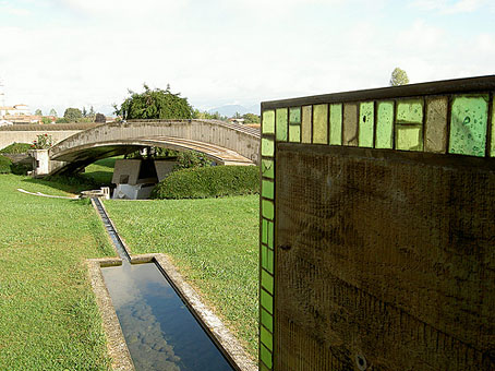
Dan Hill at City of Sound reminds us (okay, reminds me…) of Carlo Scarpa’s incredible private cemetery via a link to a Wallpaper* photo feature about the place. Scarpa’s final work (he’s buried in the grounds) was built for the Brion family at San Vito d’Altivole, Italy, and completed in 1978.

This construction and other Scarpa buildings often come to mind after encountering some disastrous use of concrete in architecture. Scarpa, like Frank Lloyd Wright, shows how well that meanest of building materials could be used with the application of care and imagination. And Scarpa, like Wright, also favoured attention to detail, with the cemetery providing copious examples of this, notably the motif of a pair of interlaced circles which feature as a prominent window design and recur in tiny elements elsewhere. Those paired circles and the garden itself remind me of the Jantar Mantar at Jaipur. I’m sure I read that one of Scarpa’s influences for the cemetery was Arnold Böcklin’s The Isle of the Dead but I’m unable to find any online reference. For more about that painting, there’s my earlier post on the subject.

• Flickr has a wealth of photographs of the cemetery
A black & white photo set by Gerald Zugmann

Previously on { feuilleton }
Hugh Ferriss and The Metropolis of Tomorrow
The Jantar Mantar
Arnold Böcklin and The Isle of the Dead
Frank Lloyd Wright’s future city

Masonic fonts and the designer’s dark materials

golden_compass.jpg

The trailer for The Golden Compass turned up this week, the first part of Philip Pullman‘s His Dark Materials trilogy, and I can’t help but note that the film’s designers have chosen Jonathan Barnbrook’s Mason font for the titles and the rest of the typography. This isn’t so surprising given that Mason has been used on the covers of several editions of the books already but I wonder if this flush of even greater popularity will spell (as it were) the end of a stylish typeface.

hdm.jpgMason (originally named Manson) was one of Barnbrook’s earliest published type designs, appearing in 1992 via the Emigré foundry, and over the past fifteen years has been widely imitated and become the default font for fantasy works, especially book jackets. The attraction for the genre is obvious in the way the design uses elegant and traditional serif letterforms that have been amended slightly to give them a distinctive quasi-ecclesiastical flavour, with flourishes derived from Greek, Renaissance and Biblical letters. The Gothic arch of the letter A has also helped make the font a popular choice for New Age or occult books. Mason was designed as a set of serif and sans serif variations but it’s Mason Serif Regular which is used the most. (The cover for The Science of His Dark Materials shown here is using both the sans serif variation and Mason Regular Alternate.)

Distinctive fonts take a while to get around and I don’t recall seeing Mason until at least 1994. From 1995 to 2000 it began to appear everywhere, even in newspaper ads for a while, before finding a permanent place in the book world. The trouble with this kind of ubiquity is that the novelty the design once possessed quickly vanishes and it begins to runs the risk of becoming a design cliché. Many typefaces go this way, especially in the publishing world where the choice of typeface is often dictated by genre expectations. So Orbit-B and its variants used to signify “science fiction” or “the future” in the 1970s, Caslon Antique and Rubens have become associated with horror while FF Confidential has been over-used for crime novels.

Continue reading “Masonic fonts and the designer’s dark materials”