Ecce homo redux

serrano.jpg

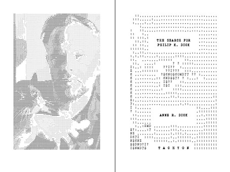
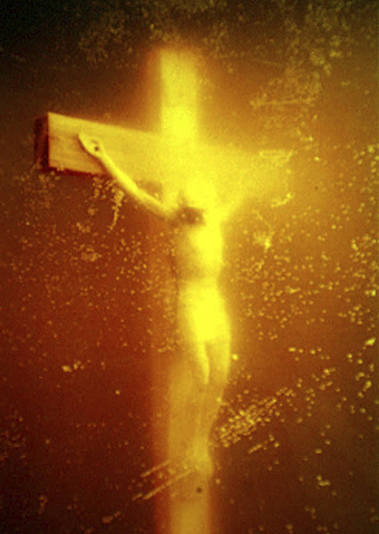
Piss Christ (1987) by Andres Serrano.

If the news of the past few weeks has felt like a re-run of the 1980s—ongoing recession, government cuts, riots in London, Tories casting aspersions on the undeserving poor, the threat of another royal wedding—then add to the list of déjà vu moments a flurry of outrage concerning art and religion in America that’s like a recapitulation of the Helms vs. NEA spats of 1989. On that occasion Andres Serrano’s Piss Christ was in the firing line, accused of being a blasphemous portrayal. This week it’s been the turn of a video installation of a short film made the same year, A Fire in My Belly, by David Wojnarowicz, a work featured in an exhibition I linked to a couple of weeks ago, Hide/Seek: Difference and Desire in American Portraiture at the National Portrait Gallery, Washington DC. A Los Angeles Times piece previewing the exhibition also connected Hide/Seek and the earlier attacks by the right against the NEA, ending by saying “Times and attitudes change”. Well, not always…

fire.jpg

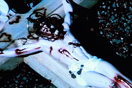
A Fire in My Belly (1987) by David Wojnarowicz.

Piss Christ notoriously shows a plastic crucifix immersed in urine; A Fire in My Belly is a 30-minute film which features among its blizzard of images a crucifix besieged by marauding ants. Wojnarowicz’s work wasn’t even mentioned in the LA Times piece but this week’s furore has made it the focus of the entire show after the gallery withdrew the video following protests from the usual suspects, the Catholic League and a right-wing politician, Rep. John Boehner. The complaints are the standard bluster about blasphemy (again) and taxpayers funding “filth”. None of the complainants appear to care that Wojnarowicz’s film is a tribute made by a gay artist to his friends as they were dying from AIDS during the 1980s, a disease which also killed him in 1992, they see the work only as an offensive act. It’s too much to expect anyone reacting with such fervour to consider that the artist may have been comparing the suffering and treatment of people with Aids in that decade with Christ’s suffering on the cross, to do so would be to admit that the artist might have a point. In response to the work’s withdrawal the Transformer Gallery in Washington DC has been screening the film and organised a protest at the National Portrait Gallery. (Update: They also issued an open letter urging the reinstatement of the work.)

Continue reading “Ecce homo redux”

Outcrops

hvitserkur.jpg

Hvítserkur, Vestur-Hunavatnssysla, Iceland. By Flickr user jónr.

I hadn’t come across this feature of north-west Iceland before until a view turned up in Flickr’s Explore. The place is a tourist site so there are many more such views.

ailsa_craig.jpg

Ailsa Craig by Flickr user atomicjeep.

Hvítserkur reminded me of Aisla Craig, a volcanic island a few miles from Girvan on the west coast of Scotland. I’ve seen Aisla Craig from the shore and can testify to its imposing presence, and also the way its appearance changes depending on the weather and time of day.

balls_pyramid.jpg

Both these pale into insignificance next to Ball’s Pyramid, a volcanic stack in the Tasman Sea which is 562 meters in height and looks like it might be Cthulhu’s second home. Flickr has further views of this spectacular eruption but not as many as you might hope.

Gilded volumes

thomson.jpg

The cover of an 1894 edition of Jane Austen’s novel designed by Hugh Thomson (1860–1920). The so-called “Peacock Edition” is illustrated throughout and a copy can be yours for £845 should you be so inclined. Or you can go to the Internet Archive and download the same edition for free. Thomson’s lavish cover design is absolutely right for the 1890s and as such would have suited Oscar Wilde far more than Jane Austen. AbeBooks drew my attention to this with a feature on rare books with gilded covers where, needless to say, all the titles are very expensive. A lot more reasonable but just as lavish is I Wonder by Marian Bantjes, the perfect gift for anyone who enjoys the art of book design.

Elsewhere on { feuilleton }
The book covers archive

Previously on { feuilleton }
I Wonder by Marian Bantjes

Ten titles and a cover

cdlcover.jpg

The Very Best of Charles de Lint. Art by Charles Vess.

Over the weekend I found the time to finally update the book design section of the site, adding new pages for most of the titles I’ve been working on recently. There’s still a couple of things missing but I’ll add those in due course. Many of these design jobs have been for the interiors only so what follows is a comparison of title spreads from books I’ve worked on that have been published this year. Lest it seem that I have an army of clones at my service it should be emphasised that I was working on several of these last year (and Engelbrecht was completed in 2008) but the nature of release schedules means they all carry 2010 publication dates.

sr.jpg

Steampunk II: Steampunk Reloaded, edited by Ann & Jeff VanderMeer.

I invariably make a feature of title pages, usually creating them as a spread in order to heighten their impact. The title page is a kind of gateway to the rest of the book which gives you an opportunity to establish a mood for what follows. It’s also the area where you can be most lavish with your graphic treatment and, where necessary, add illustrative material without worrying too much about intruding on the content. With a number of these designs I was following typographic choices from pre-designed covers so the challenge was to find something that would match the cover and connect to the rest of the interior. The Charles de Lint book was a variation on this process in that the author had chosen a Charles Vess drawing for the cover art. I designed a cover to accommodate the drawing then carried the design inside. The colours were chosen to match Vess’s artwork while the general Art Nouveau style came from an Alphonse Mucha poster he’d placed on the wall. With a different cover picture the entire book would have had a very different design.

pkd.jpg

The Search for Philip K Dick by Anne R Dick.

Continue reading “Ten titles and a cover”

Charles Méryon revisited

meryon1.jpg

Le Petit Pont (fifth state) (1850).

A short piece about the Paris etchings of Charles Méryon (1821–1868) was one of the first posts I made here. I’ve little to add to what I said four years ago other than to point out that the Internet Archive has The Etchings of Charles Méryon available for download, a rather fine collection of the artist’s Piranesi-like renderings of the city. The view below of Pont-Neuf through one of the Seine bridges is very Piranesian indeed and makes me wish Méryon had been as productive as his predecessor was with his Vedute di Roma.

meryon2.jpg

La Galerie Notre-Dame (third state) (1853).

meryon3.jpg

Le Pont-Neuf et La Samaritaine (third state) (1855).

Elsewhere on { feuilleton }
The etching and engraving archive

Previously on { feuilleton }
Vedute di Roma
Charles Méryon’s Paris