Leonardo’s warrior

leonardo.jpg

Bust of a warrior in profile (c. 1475–80) by Leonardo da Vinci.

A recent interview question reminded me of this splendid Leonardo piece when I was discussing early artistic influences. One crucial influence for me was the example of my mother who’d been an art student during the 1950s specialising in ceramics and textile design. From an early age I was fascinated by her student sketchbooks, and by one drawing in particular, a very careful copy of this work by the young Leonardo. The British Museum has the original, about which they tell us:

The drawing shows Leonardo studying the art of his teacher, Andrea Verrocchio. Giorgio Vasari’s biography of Verrocchio in his Lives of the Artists (1550 and 1568) mentions two metal reliefs with profile portraits of Alexander the Great, leader of the Greeks, and Darius, the Persian king. They were sent by Lorenzo ‘il Magnifico’ (‘the Magnificent’) de’ Medici, ruler of Florence (1469–92), as gifts to the king of Hungary. This drawing is probably based on one of these lost works by Verrocchio.

desmazieres.jpg

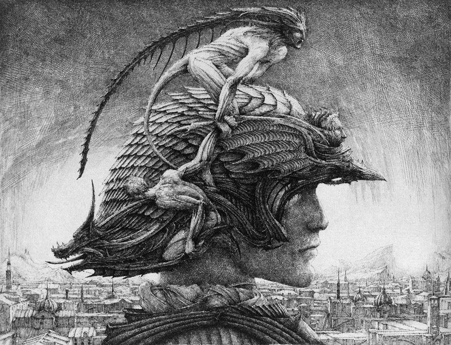
Casque d’apparat (1981) by Erik Desmazières.

Memories of the Leonardo drawing always follow the exaggerated logic of childhood and inflate its splendour and detail; I’d never seen anything like it and for years used to hope that Leonardo had produced many similar works. He hadn’t, of course, so it’s to other artists we have to turn for more of the same. French artist Erik Desmazières has produced a number of etchings depicting elaborately helmeted figures which are perhaps inspired by Leonardo’s warrior. Of the three in Imaginary Places, a 2007 collection of his work, the one above is my favourite. I have a feeling I’ve seen derivations by other artists but nothing is coming to mind. As usual, if anyone knows of further examples, please leave a comment. Elsewhere there’s Leonardo’s Diary (1972), a short film by Jan Švankmajer in which the haughty figure is subject to some typical Švankmajerian distortions.

• See also: Erik Desmazières at the Fitch-Febvrel Gallery.

Previously on { feuilleton }
Les lieux imaginaires d’Erik Desmazières
Jan Švankmajer: The Complete Short Films
The art of Erik Desmazières

Victorian typography

type1.jpg

“Victorian” isn’t really the correct term for the products of 19th century America but then “19th century” covers rather a lot of ground. Mr BibliOdyssey’s most recent post is a stunning collection of title pages from fire insurance maps of the late 19th and early 20th century. Rather than repost any you ought to go and see them for yourself, they’re excellent examples of the best and worst of “Victorian” graphic design, insanely and pointlessly ornate yet often very inventive in their elaborations and stylised letterforms. Being a typophile I’d often feel frustrated when looking at 19th century documents and seeing type designs in use for which there were no contemporary equivalents. There was such a profound reaction against ornamented design in the 20th century that it’s only relatively recently that typography of this period has been reappraised and, in some cases, resurrected. The book from which these examples are taken dates from 1897, and it fascinates for putting names to some of those neglected designs. This is a big catalogue of 740 pages so I’ve been sparing in my selection. Anyone wishing to see more can download the whole thing here.

type2.jpg

Despite my affection for curvilinear Art Nouveau, when it comes to typography I’m often drawn to the spikier styles. Atlanta was digitised by P22 in a style they call Victorian Gothic. Their accompanying ornament set replicated that curious shape from Victoria below.

type3.jpg

type4.jpg

This typeface, or ones which resemble it, is a common one in 19th century newspaper and advertising design but I’d never seen it given a name until now. The catalogue pages have a number of variations which is no doubt an indicator of its popularity. A bold weight of the design was digitised by Scriptorium as a font they call Mephisto.

type5.jpg

Rubens is my favourite of all the designs in this catalogue, probably because I always liked the way it looked when it enjoyed a surprising flush of popularity in the 1960s and 1970s. The narrow style made it very useful for book covers (as with the examples here) while those spiky serifs made it popular with art directors looking for a typeface that said “horror”. Wooden Type Fonts recently digitised a version of Rubens but their version lacks the elegance of the original. Anyone else want to have a go?

type6.jpg

Lastly the catalogue has many pages of clip art figures and decorations including the pointing hands which people always associate with 19th century design. I’d wondered a few times whether these jagged decorations were meant to be electrical or not. Electricity was a new thing in 1897 so these would have seemed distinctly modern.

Previously on { feuilleton }
Steampunk overloaded!
Penguin Labyrinths and the Thief’s Journal
Masonic fonts and the designer’s dark materials

The Choise of Valentines, Or the Merie Ballad of Nash His Dildo

nash.jpg

My little dilldo shall suply their kinde:
A knaue, that moues as light as leaues by winde;
That bendeth not, nor fouldeth anie deale,
But stands as stiff as he were made of steele;

A salacious post for chocolate-and-roses day. There’s a degree of confusion around this work and its author, an Elizabethan poet, playwright and pamphleteer. The poem, which was distributed privately, dates from around 1593 and has a variety of titles, while its author is variously credited as Thomas Nashe or Thomas Nash. Despite the bawdy reputation of the Elizabethan era Nash’s contemporaries were sufficiently scandalised by the poem for it to remain unpublished, with the result that it survives imperfectly in a few handwritten copies. It’s a lengthy piece so let’s go to Wikipedia for a précis:

It describes the visit of a young man named “Tomalin” to the brothel where his girlfriend Frances (“Frankie”) is employed. Having paid ten gold pieces for her favours, Tomalin is embarrassed to find that merely lifting her skirts makes him lose his erection. She perseveres in arousing him however and they make love, but to her disappointment he has an orgasm before her. Frankie then decides to take matters into her own hands: hence the informal title by which the poem was known, Nashe’s Dildo.

The Oxford English Dictionary credits Nash with the first appearance in English of the word “dildo”, a term “of obscure origin” we’re told, whose usage here predates John Florio’s Worlde of Wordes (1598), Ben Jonson’s The Alchemist (1610), and Shakespeare’s A Winter’s Tale (1611). Nash’s achievement is something of a cheat since his poem wasn’t actually published until 1899, and then in a private edition. As usual the Internet Archive has the book in question, and it’s their version which follows, albeit without the copious footnotes.

The Renaissance English Literature site has more about Thomas Nash (or Nashe), his life and his work.

Continue reading “The Choise of Valentines, Or the Merie Ballad of Nash His Dildo”

Weekend links: fifth anniversary edition

demuth.jpg

The Figure 5 in Gold (1928) by Charles Demuth.

It’s a little surprising to find I’ve been doing this for five whole years yet here we are. Having seen a number of blogs call it quits at the five-year point I should note that I don’t feel quite that exhausted although maintaining a discipline of daily posting can be a chore at times, especially when you’re pressured by work. On the whole the advantages continue to outweigh the disadvantages. Some of the discoveries here have fed back into things I’ve been working on or opened avenues for future exploration. Researching something for an audience (however slight that audience or the resulting post) encourages you to look more deeply into a given subject; sometimes you learn more as a result and occasionally make surprising discoveries. Obsessions are teased out which might otherwise have lain dormant. Yes, it’s an extra bout of work but I’ve spent much of my life saying to people “if you like that, you may like this”, and that’s all many of these posts are doing.

This year promises to be an interesting one so watch this space. And, as always, thanks for reading!

John x

On to the links…

Cathedral Scan translates the architectural plans of Gothic cathedrals into open-ended musical scores via custom software. There’s more at Blake Carrington‘s website.

Forty-three William Burroughs recordings (tape experiments and readings) at the Ubuweb archives.

• The opening scene of Deadlock (1970), an obscure German film with a theme by the mighty Can.

Strange Lands: A Field-Guide to the Celtic Otherworld, a new book by Andrew L Paciorek.

• The enduring nature of Frankenstein, currently on stage at the National Theatre, London.

shimojo.jpg

Owl One (2004) by Yuri Shimojo.

¡Activista! by Sonny Smith: Drag Queens, Borders, Rivers, Death and Transformation.

• Estonian sculptor Mati Karmin makes furniture out of Russian anti-submarine mines.

Alan Moore’s contribution to the Save Our Libraries campaign.

• Innsmouth Free Press is raising funds for their running costs.

A history of queer street art (Facebook link, unfortunately).

Illuminated book design for Heston’s Fantastical Feasts.

Physica Sacra, an engraving set at Flickr.

Egypt (1985) by Tuxedomoon | Egyptian Basses (1998) by Coil | Soleil D’Egypte (2001) by Natacha Atlas.

The specimen jars of Frederik Ruysch

ruischii1.jpg

Some plates for Darwin Day from Thesaurus Animalium Primus (1710) by Dutch botanist and anatomist Frederik Ruysch. As is evident from these examples, Ruysch wasn’t above some frivolous indulgence when it came to illustrating his scientific texts, and he often gathered specimens into little tableaux which verge on the bizarre, such as the conjunction below of a child’s arm and a hatching turtle. Gone are the days when a renowned man of science might be depicted plucking at the entrails of a dead baby. This site has more about Ruysch’s specimens while BibliOdyssey posted some examples of Ruysch’s anatomical tableaux (with baby skeletons this time) and links to the books which contain them.

ruischii2.jpg

Previously on { feuilleton }
Darwin at 200