Danby’s Deluge

danby1.jpg

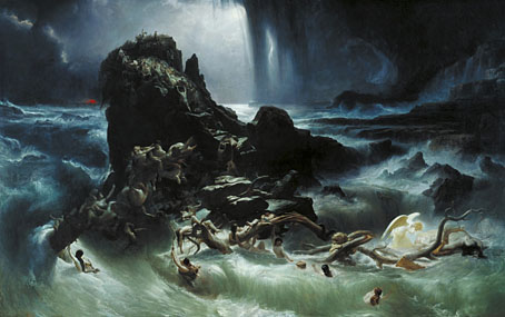
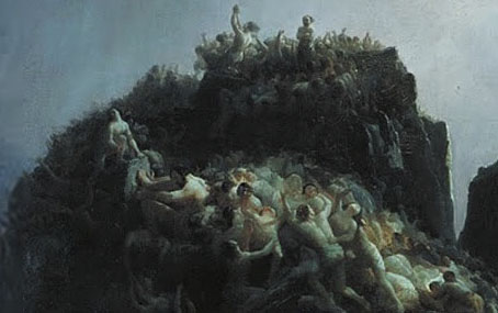
Since John Martin’s tumultuous canvases are back in the news it’s worth remembering another 19th-century painter of Biblical cataclysm, Francis Danby (1793–1861), whose enormous The Deluge (1840) used to hang in the same room as the Martins at Tate Britain. Danby was a contemporary of Martin although not as enthusiastic about this kind of subject matter. Visions of apocalypse proved to be popular, however, so Danby painted his Flood and similar works with reluctance. (Even Turner wasn’t above painting the occasional disaster.) Danby’s Deluge impressed me as much as Martin’s work when I first saw it not least for its having some believable human figures which give the vast canvas a tragic dimension. Martin’s figures are perfunctory and invariably dwarfed by the scale of events.

danby2.jpg

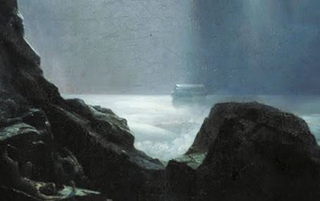
These details are from the Google Art Project which unfortunately don’t show us as much detail as they might. This is one of those paintings which encourages a lengthy contemplation, with a composition that draws the eye away from the swirling waters to a glowering sun and the shape of Noah’s ark on the distant horizon.

danby4.jpg

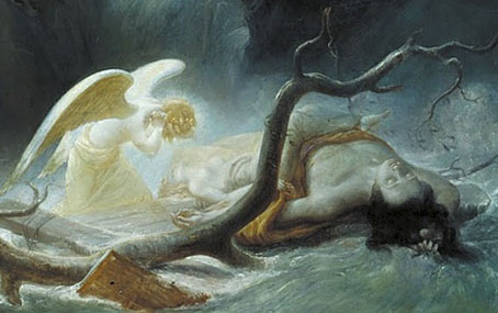
I’ve always been intrigued by the curious detail of the angel caught in the flood, and the even more curious detail of a drowned giant beside it. For the first time, however, I’ve noticed that the angel is peering into the face of a dead woman draped over the giant’s body. Paintings such as these often toured the country accompanied by the artist responsible who would lecture a paying audience about the various details. Besides the storytelling Danby gives the water in the foreground an astonishing transparent quality which Google’s photos can’t replicate. All the more reason to see his paintings for yourself if you’re in London.

Francis Danby at Tate Britain

danby3.jpg

Previously on { feuilleton }
John Martin: Heaven & Hell
Darkness visible
Death from above
The apocalyptic art of Francis Danby

Weekend links 75

darde.jpg

Eternal Pain (1913) by Paul Dardé. (And also here)

Rain Taxi caused a stir this week with its savaging of Hamlet’s Father by science fiction writer Orson Scott Card. The book is another of Card’s blatherings about the hell of being homosexual dressed in garments stolen from the unfortunate William Shakespeare. Rain Taxi made the obvious point about many of Shakespeare’s sonnets being homoerotic. For my part I was more appalled by the quoted extract which reduced one of the greatest plays in the language to that lifeless, cardboard-character-speak which is endemic in bad genre writing. News of the travesty quickly spread to gay news blogs, The Outer Alliance and elsewhere, ensuring that what’s left of Card’s reputation continues to spiral down a Mel Gibson-shaped black hole.

• “Sounds only like itself, like no one before or after.” Julian Cope on Tago Mago by Can which will be reissued in a new edition in November. Nice to see the return of the original sleeve design, something I saw once in a record shop then didn’t see again for years. For a long time I thought I’d imagined it. Related: two German art exhibitions inspired by the group.

The Responsive Eye (1965), a catalogue for the MoMA exhibition that launched Op Art. Also at Ubuweb: La femme 100 têtes, a film by Eric Duvivier based on the collage work by Max Ernst.

• More apocalyptic art: William Feaver on John Martin whose exhibition will be opening at Tate Britain later this month. There’s a trailer here.

Borges and I, an essay by Nandini Ramachandran. Related: Buenos Aires: Las Calles de Borges, a short film by Ian Ruschel.

• “Who was JG Ballard? Don’t ask his first biographer,” says Robert McCrum.

Biologically-inspired fabric and material design by Neri Oxman.

• Cross-pollinating subgenres: “Steampunk ambient” at Disquiet.

In the Shadow of Saturn, a photo by the Cassini spacecraft.

• The art and fashion designs of Alia Penner.

Fleet of hybrid airships to conquer Arctic.

• RIP Jordan Belson, filmmaker.

• Ten years of Ladytron whose new album is released on the 12th of September: Playgirl (2001), Seventeen (2002), Destroy Everything You Touch (2005), Sugar (2005), Ghosts (2008), Ace Of Hz (2011).

Initiations in the Abyss: A Surrealist Apocalypse

harter1.jpg

Among the many books inspired or influenced by the events of September 11th, 2001, Jim Harter’s Initiations in the Abyss: A Surrealist Apocalypse is one of the more obscure titles, and one you’re unlikely to hear about elsewhere. Harter is an American artist and archivist best known for his collections of wood engraving illustration published by Dover Publications, Harmony Books, Bonanza Books and others. I mentioned his work recently in a piece about steampunk illustration which will be appearing later this month at Tor.com. Harter’s books are invaluable source material for the style of collage popularised by Max Ernst and Wilfried Sätty. Harter was a friend of Sätty’s, with collages by the pair appearing in Harter’s Picture Archive for Collage and Illustration (1978).

harter5.jpg

The first collection of Harter’s collages, Journeys in the Mythic Sea: An Innerspace Odyssey, appeared in 1985. Initiations in the Abyss is the follow-up featuring work which dates from 1986, some of which was exhibited in 1988 at the Nicholas Roerich museum in New York. The book wasn’t published until 2003, however, and in his introduction Harter acknowledges the influence the events of the past two years had on his conception of the work as a whole. The book is reminiscent of Sätty’s Time Zone (1973), a book with a similar intent in its use of Surrealist collage techniques to make satirical or polemical points as well as to create striking and fantastic images. With both artists it’s the latter works which I find most successful. There’s a limit, for example, to how effectively our world can be represented using pictures which are over a hundred years old, and without the single-minded focus and attack of a John Heartfield the polemic can risk seeming diffuse or glib.

harter3.jpg

Harter’s book is divided into four parts—Mutant Faces of the Form Destroyer, The Holy Abattoir, The Archive of Dreams and Mystery Play—with 72 full-page plates printed on glossy paper. The quality of the printing is so good it makes me wish that Sätty and Ernst could receive the same treatment. In addition there’s a very long introductory essay by Harter which somewhat contradicts his Surrealist intent by explaining at great length some of the philosophy behind pictures whose interpretation he wants left to the reader. Near the end of his piece he says:

It could be said that the purpose of the collages in the present book’s first two sections is to ring an alarm bell. The canaries in the mine are dying and it is time to do something. At the same time, the images of the last two sections are intended as a kind of mystery play. They suggest a movement in another direction: a quest to seek a more universal vision, one where we can perhaps discard our religious fanaticism, ethnocentrism, and myths of apocalypse, and instead create a world of greater unity and harmony, eventually becoming one human family. On another level entirely, this work might be seen as a kind of shamanic soul journey, where all false attachments, beliefs, and illusions are destroyed through an ego death experience before the soil is allowed to proceed to dimensions of healing and revelation. Thus the first two sections might be seen as an encounter with what the Tibetans call the “wrathful deities,” spirits that mirror back one’s own unconscious darkness.

The last two sections of the book feature the best of his dream-like imagery, some of which are a match for Sätty’s superb creations. The examples here are mostly from the end sections. Further examples can be seen on this page where the plates have been coloured by the artist.

Initiations in the Abyss is available to buy direct from the publisher, Wings Press, while some of Harter’s psychedelic poster art can be seen here and here.

Continue reading “Initiations in the Abyss: A Surrealist Apocalypse”

Graphic design in Heat

heat4.jpg

Amy Brenneman.

In which Neville Brody’s early record sleeves lurk in the midst of a Michael Mann crime drama…

I picked up some cheap DVDs last week, among them a copy of Mann’s Heat (1995) which I hadn’t seen for over ten years. I like Mann best when he’s doing his high-tech thriller thing (although I also have a soft spot for The Keep), and enjoy this one despite its being too long for the thin story and characterisation. Something I’d completely forgotten when re-watching it was the scene where Eady (played by Amy Brenneman), a part-time graphic designer, is on the phone to her bank-robbing boyfriend, played by Robert De Niro. This is one of those cinematic moments where some stray cultural reference that no one is meant to notice leaps to your attention and for a few seconds upsets all interest in plot and dialogue. Offhand I can think of the moment in Alan Pakula’s Presumed Innocent where a copy of a Ramsey Campbell novel is seen on a bookshelf during a conversation. Much worse, since it’s an error as well as a distraction, is Picasso’s Les Demoiselles d’Avignon being shown onboard the Titanic in James Cameron’s fatuous disaster movie when the real painting has been hanging safe and sound for years in the Museum of Modern Art in New York.

heat1.jpg

In Heat we have a scene in Eady’s apartment where the walls are covered with what I assume are meant to be examples of her design work. 99.9% of the audience will pay no attention to this but anyone with a copy of The Graphic Design of Neville Brody would recognise a number of familiar designs. Something I hadn’t spotted before was the word “FUSE” on the computer screen, Fuse being the name of the experimental typography magazine created in the 1990s by Brody and Jon Wozencroft. On the window to the left of the computer there’s pinned a copy of Brody’s design for Wipe Out, a single by Z’ev on the Fetish label. Brody designed nearly everything for Fetish during the label’s brief existence in the early 1980s, and the most visible Brody examples in this scene are all Fetish designs. This seems an odd choice for a film made in the mid-90s although in an earlier conversation Eady mentions having designed some music CDs. Brody’s later design work was very influential and overshadowed his work for Fetish which I’ve always liked a great deal.

wipe_out.jpg

Wipe Out by Z’ev.

heat2.jpg

In another part of Eady’s apartment there’s a large reproduction of the sleeve for a Fetish compilation, The Last Testament.

testament.jpg

heat3.jpg

While further along the same wall there’s the sleeve for Diddy Wah Diddy by 8 Eyed Spy, yet another Fetish single. On the far right of the shot above there’s a face from one of Brody’s theatre posters which confirms that Mann’s set decorators must have plundered a copy of Brody’s book.

diddy.jpg

This isn’t a complaint, of course, I’d commend Mann and co. for their excellent taste, and for having used work by a real graphic designer rather than trying to fake something. It’s even possible to find a tenuous connection between the record sleeves and Mann’s eclectic soundtrack. Many of the Fetish artists—Throbbing Gristle, 23 Skidoo, Clock DVA, Stephen Mallinder—were in the first wave of Industrial music, and Mann briefly uses a great piece by Einstürzende Neubauten from their own Industrial phase. I’d have suggested he also use Blue Heat by Cabaret Voltaire (from an album with another Brody cover) but that’s just my obsessions showing.

Previously on { feuilleton }
Neville Brody and Fetish Records
Alex in the Chelsea Drug Store

Taj Mahal panoramas

tajmahal1.jpg

The standard view plus tourists by Michael Maniezzo.

Jeffrey Bartholet has a lengthy piece at Smithsonian Magazine entitled How to Save the Taj Mahal?, a brief history of the monument and also an examination of the preservation problems the site faces. Reading his essay it occurred to me that despite the Taj Mahal being one of the world’s most famous and recognisable buildings the pictures we’re shown of it are nearly always the same, showing a view along one of the canals that runs through the gardens towards the monument. The panoramas at 360cities immediately rectify this with some stunning shots showing the site up close or from a considerable distance. The latter selection are unlike any I’ve seen before, and give a great sense of the river which runs around the Taj Mahal complex and the countryside around the city of Agra. Bartholet notes that five million people visited Agra between March 2010 and March 2011, many of them adding to the damage the monument has already sustained. People may rail against virtual tourism as an iniquity but where sites such as this are concerned it’s a lot less polluting and destructive than the alternative.

tajmahal2.jpg

Sunset by Justin Imhoff.

tajmahal3.jpg

The Yamuna River by Justin Imhoff.

tajmahal4.jpg

A view by Roger Berry from nearby ruins.

Elsewhere on { feuilleton }
The panoramas archive