One of the covers I was working on during the summer months was revealed this week so here it is. Litany of Dreams by Ari Marmell is another title from games-related imprint Aconyte, and a further addition to their Lovecraft-related Arkham Horror series of games and novels:
The mysterious disappearance of a gifted student at Miskatonic University spurs his troubled roommate, Elliott Raslo, into an investigation of his own. But Elliott already struggles against the maddening allure of a ceaseless chant that only he can hear… When Elliott’s search converges with that of a Greenland Inuk’s hunt for a stolen relic, they are left with yet more questions. Could there be a connection between Elliott’s litany and the broken stone stele covered in antediluvian writings that had obsessed his friend? Learning the answers will draw them into the heart of a devilish plot to rebirth an ancient horror.
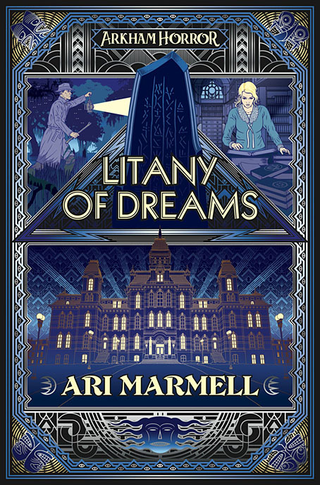
The new cover follows the form of The Last Ritual with an Art Deco style and a similar arrangement of triangular panels with an architectural focus. The building is Lovecraft’s Miskatonic University, and this is the first time I’ve attempted a proper depiction of the place. A couple of the panels in my unfinished adaptation of The Dunwich Horror showed Wilbur Whateley entering the university but the buildings there owed more to Manchester University’s Gothic facades with a pair of gateposts borrowed from Brown University in Providence. The building here is a better match, a typical Ivy League structure with added spikes. The latter are an unusual feature given the generally conservative appearance of these places but still a long way from the eccentricities of Gavin Stamp’s depictions in the George Hay Necronomicon. The faces in the corners of the cover design are based on tupilak figures carved from antlers or whale teeth by the Inuit of Greenland, figures which feature in the story.
Litany of Dreams will be published on April 6, 2021.
Elsewhere on { feuilleton }
• The Lovecraft archive
Previously on { feuilleton }
• The Last Ritual