All moveables of wonder, from all parts,
Are here—Albinos, painted Indians, Dwarfs,
The Horse of knowledge, and the learned Pig,
The Stone-eater, the man that swallows fire,
Giants, Ventriloquists, the Invisible Girl,
The Bust that speaks and moves its goggling eyes,
The Wax-work, Clock-work, all the marvellous craft
Of modern Merlins, Wild Beasts, Puppet-shows,
All out-o’-the-way, far-fetched, perverted things,
All freaks of nature, all Promethean thoughts
Of man, his dullness, madness, and their feats
All jumbled up together, to compose
A Parliament of Monsters.
William Wordsworth, The Prelude/Book VII
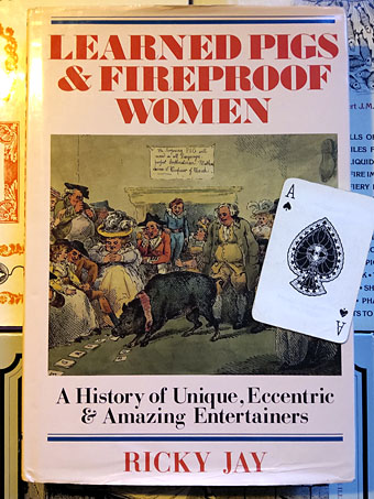
In the post this week, a book I’d missed buying in a charity shop a while ago which I spotted on eBay for a lot less than the usual asking price. Outside the USA the late Ricky Jay is probably known more for his occasional acting roles in film and TV than for his magic performances, although it was on British television that Jay established world records with his card-throwing act. Jay’s real business was stage magic, past and present, both performing it—sleight-of-hand and card tricks were his speciality—and operating as a historian of the art. His voluminous knowledge of conjuring and unusual stage acts was condensed into a self-published magazine, Jay’s Journal of Anomalies, and a number of books, not all of which concerned magic. Learned Pigs and Fireproof Women was published in 1986, being an account of favourite Jay anomalies from the theatres and circuses of the past. The US edition of the book was popular enough to inspire a related CBS TV film. I’d not seen this before but it reminded me about another TV film directed by Rex Bloomstein for the BBC’s Tx strand in 1996, Hustlers, Hoaxsters, Pranksters, Jokesters and Ricky Jay. As the title suggests, Jay himself is the subject of the latter documentary which includes contributions from friends Steve Martin (who also appears in Learned Pigs) and David Mamet. Bloomstein’s film contains two sequences that show Jay’s exceptional skill with a pack of playing cards. I have a vague idea how the trick in the second sequence might be performed but I’ve no idea at all how the wordless opening sequence is possible, where Jay unwraps a fresh pack of cards then proceeds to cut and shuffle them continually, after which all the cards are somehow still in perfect order.

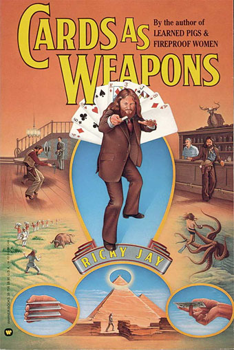
Ricky Jay is the kind of character I would have idolised when I was a magic-obsessed 13-year-old, not only for his skill as a performer but for his interest in the offbeat, the eccentric and the esoteric. We also share a taste for antique illustrations, Jay’s books and journals are littered with old playbills and engraved vignettes. In Britain in the 1970s little attention was given to conjuring on television beyond the perennial David Nixon, a decent enough magician but with a genial persona that was very English and consequently rather dull. (In Nixon’s defence, he did help finance the development of the Mellotron. Strange but true.) Jay’s character had an edge of menace and a touch of the mountebank or con artist, a quality exploited in David Mamet’s excellent directorial debut, House of Games (1987), for which Jay also acted as consultant. Jay’s most popular book after Learned Pigs is probably Cards as Weapons (1977), a typically humorous guide to the art of throwing playing cards. As with magic tricks, it’s very easy to show someone how to do the thing, but doing it well requires skill and a great deal of practice. In the Hustlers film we see Jay break a pencil in half with a thrown card.

Cover of the 1988 reprint.
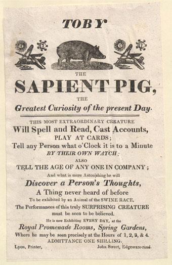
The popularity of Learned Pigs and Fireproof Women, together with Ricky Jay’s prominence as a historian of magic, has given us The Learned Pig Project, a single-volume collection of 47 books about magic and related matters by some of the celebrated magicians of the 19th and 20th centuries. This is an unwieldy document of over 5000 pages but it’s a treat if you’re interested in the history of conjuring. Stage magic has a peculiar sibling relationship with ritual magic; both are dependent on texts for the recording and transmission of their workings, and both have traditionally required that those texts be kept secret, to guard against persecution on the one hand, and unwanted revelation on the other. So too with covens, cabals and, in the case of stage performers, “Magic Circles”. Serious stage magicians are often serious book collectors, mining the past for new ways to startle the present; Ricky Jay was an exemplar in this regard, as we see in the Hustlers film which shows him browsing his personal library. I don’t know what he would have made of so much knowledge being made so easily accessible via the The Learned Pig Project—the whole purpose of Magic Circles is to keep the secrets inside the profession—but there have always been books about magic tricks, and young magicians have to start somewhere. As with card throwing, anyone can be shown the secret of a magic trick but that doesn’t mean that those who learn the secret can master the performance. Talented magicians, like sapient pigs, are rare creatures.
Previously on { feuilleton }
• Magicians
• Hodgson versus Houdini
• A London Street Scene
