Weekend links 563

tonto.jpg

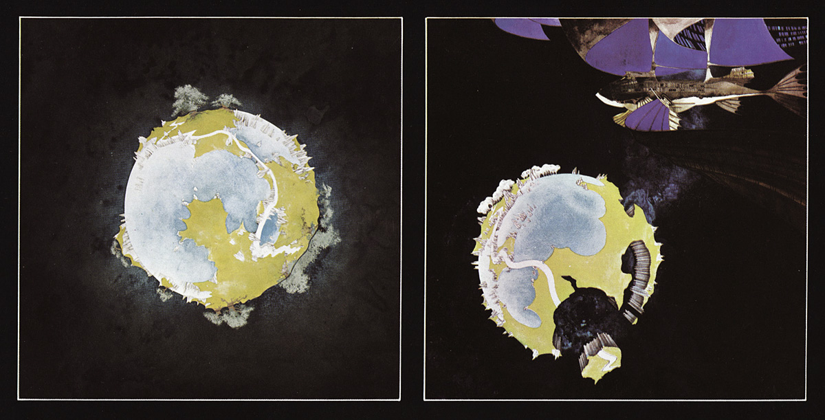
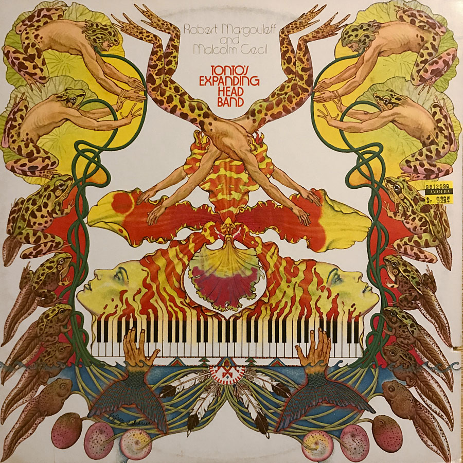
Cover art by Jeffrey Schrier for the 1975 reissue of Zero Time by Tonto’s Expanding Head Band.

• RIP Malcolm Cecil, electronic musician, and producer of Stevie Wonder, among many others. The term pioneer is over-used when discussing electronic artists, but it’s an accurate one when applied to Cecil and his partner in Tonto’s Expanding Head Band, Robert Margouleff. The first Tonto album, Zero Time (1971), was a collection of fully-realised all-electronic compositions recorded in the days when “electronic music” in the rock sphere usually meant rock-band-plus-synth-burbles. As I said in a post about Tonto’s debut album a few years ago, “Jetsex sounds like an outtake from Kraftwerk’s Autobahn (albeit three years early) while Timewhys wouldn’t have been out of place on The Human League’s Travelogue album almost a decade later”. Cecil may be seen in this short film showing off the bespoke synth gear that comprised The Original New Timbral Orchestra (aka TONTO), while he talks at length about his career in issue 4 of Synapse magazine here. Cecil and Margouleff parted company in the mid-70s shortly after releasing a second album, It’s About Time (1974), a collection of jazzy instrumentals that’s overdue a proper reissue.

• “Every film production company they showed it to said it was ‘too weird’ to ever be made. ” Next month Strange Attractor publishes The Otherwise, a script by Mark E. Smith and Graham Duff for an unmade horror film.

• More horror: Predator’s Ball by Uni; music video as horror scenario in which you can play spot-the-reference: Alice in Wonderland, Rocky Horror, Leigh Bowery (?), Pasolini’s Salò (?)…

• At Bibliothèque Gay: Narkiss by Jean Lorrain, another homoerotic classic newly translated into Spanish, and with new illustrations.

• The week in Gary Panter: Nicole Rudick on Gary Panter’s Punk Everyman, and the man himself writing about his life and art.

• At Wormwoodiana: Mark Valentine investigates the connections between Charles Williams and Sax Rohmer.

• At Dangerous Minds: New Age Steppers, “the only ever post-punk supergroup”.

• Mix of the week: XLR8R Podcast 689, a feast of funk compiled by Steve Arrington.

• At Public Domain Review: Agostino Ramelli’s Theatre of Machines (1588).

• At Dennis Cooper’s: Pier Paolo Pasolini Day.

Valentina Magaletti’s favourite music.

Louvre site des collections

Narcissus Queen (1958) by Martin Denny | Narciso (1974) by Pierrot Lunaire | Narkissos (2006) by Sadistic Mikaela Band

More Swans and Robots

robotartists01.jpg

Real Italian fantascienza is an authentic expression of Italian culture, which is brainy, nerdy, gutsy and pulp, it’s far-out but down-home, and raw but civilized. I would not proclaim that it’s the best fantasy writing ever created in the world, but it encourages and motivates me.

Bruce Sterling talking to Paul Semel about his collection of fantascienza stories, Robot Artists and Black Swans. My cover design was posted here last September; the book itself is published this week by Tachyon so I can at finally reveal the interior illustrations. Sterling’s collection presents seven stories written by his Italian alter-ego, Bruno Argento, with several of them appearing in English for the first time. The Italian theme informs the design as well as the content, although the associations aren’t always as obvious as they are in my illustrations for Sterling’s earlier fantascienza book for Tachyon, Pirate Utopia, the art and design for which adapted graphics by the Italian Futurists.

robotartists08.jpg

As I mentioned in the earlier post, while searching for more recent Italian graphics I came across the work of Franco Grignani (1908–1999), a designer whose most famous work was the Woolmark logo, one of those international symbols that most people will have seen even if few know who was responsible for its creation. The Woolmark’s black-and-white stripes are typical of Grignani’s designs, many of which work variations on the eye-jangling Op Art style pioneered by Bridget Riley. Grignani’s work seemed at first as though it might offer a suitable model for the cover design but it quickly became apparent that his style wasn’t suitable for this title so I went in another direction. Grignani’s influence is present inside the book, however, in the more abstracted illustrations, and in the parallel lines that provide a connecting thread between the stories and their illustrations. The Eurostile fonts used throughout the book also have an Italian flavour. They’re a little clichéd for science fiction but I liked the way they combined SF associations with more Italian design, being the work of Alessandro Butti and Aldo Novarese.

robotartists15.jpg

The other design influence, and a more identifiable source, is MC Escher, a choice prompted by the black swans in the title. Escher’s tessellated patterns feature a variety of animals, swans included, so I adapted two of the artist’s swan patterns to prevent the illustration from being robot-heavy. Escher also has an Italian side, as it happens; he enjoyed holidaying in Italy, and the vernacular architecture of the country’s small coastal towns may be found in many of his lithographs. The Escher swans led in turn to a self-indulgent illustration that fills two pages at the front of the book, something that came about after I was playing with Penrose triangles in Illustrator. I’d made a group of these impossible shapes into a construction which a little tweaking turned into a piece of equally impossible architecture, rather like those in the Escher-influenced mobile game, Monument Valley. All that was required to flesh things out was to cover the walls in a brick pattern then add a few swans and robots.

Continue reading “More Swans and Robots”

Solid Space: Jon Anderson’s cosmic voyage

olias1.jpg

Jon Anderson’s solo debut, Olias Of Sunhillow, is reissued this week in a double-disc set comprising a remastered CD plus an audio DVD. I’d been hoping for some time that this album might be given a proper reissue, it’s one I like a great deal but my old CD has never sounded as good as it ought to. The album may command cult status round here but you don’t see it mentioned anywhere outside Yes forums or partisan enclaves like the Prog Archives. This post may be taken as a small corrective to the neglect.

olias2.jpg

Olias Of Sunhillow was released in 1976, and was the most unusual of all the solo albums recorded by the individual members of Yes in the mid-70s, being a spin-off from some of the group’s early albums, or at least their cover art. Roger Dean’s first cover work for the group was on Fragile in 1971, for which he painted a miniature world rather like one of MC Escher’s planetoids. This was Dean’s idea, the band had suggested a broken piece of porcelain as the cover image. The back cover of the album showed the same planet in a state of fragmentation with a fish-like spaceship floating above it (see below). Another drawing of the fish-ship was added to the front cover before the album’s release, and it’s this ship, and the narrative it suggests, that leads eventually to Anderson’s solo album. Two years after Fragile, the planetary disintegration had turned into an exodus on the group’s triple-live album, Yessongs, the back cover of which shows pieces of planet being towed through space by a similar fish-ship. The other panels of the cover depict the arrival of these fragments on a newer, larger world. Anderson’s album takes this sequence of events then filters them through Vera Stanley Alder’s mysticism to craft a musical odyssey which Discogs describes as:

…the story of an alien race and their journey to a new world due to catastrophe. Olias, the title character, is the chosen architect of the glider Moorglade, which will be used to fly his people to their new home. Ranyart is the navigator for the glider, and Qoquaq is the leader who unites the four tribes of Sunhillow to partake in the exodus.

olias3.jpg

For many years in British music circles it would have been a grave error to even acknowledge this album’s existence, never mind admit to actually liking it. This was partly the old animus against progressive rock, an unexamined prejudice that lasted well into the 1990s, but Anderson’s album had so many strikes against it that it might have stood as the winner of a disapproval lottery for the more ideologically rigid writers and readers of the NME. It’s Jon Anderson (strike 1), the lead singer of progressive rock (2) group Yes (3), whose album is a science fiction (4)/ fantasy (5) concept (6), littered with Tolkien-like invented names and words (7), and with a multi-page sleeve embellished with detailed fantasy illustrations (8) by David Fairbrother-Roe. The design was art directed by Hipgnosis, who subsequently designed the next two Yes albums. Anderson originally wanted Roger Dean to create the packaging, which would have provided a further strike of disapproval against the album, but Dean’s career had gone into overdrive following the publication of Views so he either didn’t have the time or didn’t want to be involved. In Views Dean mentions “another project” based on the fish-ship’s journey which may be a reference to Anderson’s forthcoming album, the credits of which thank Dean for “planting the seed”.

views1.jpg

Roger Dean’s original artwork for Fragile (1971). Another fish-ship was added to the final cover art.

Continue reading “Solid Space: Jon Anderson’s cosmic voyage”

Weekend links 562

ernst.jpg

Teenage Lightning (Les Éclairs au-dessous de quatorze ans) (c. 1925) by Max Ernst.

• “There has never been another director who has lain in wait for us with the same wrath or disgust. He is so complicated that finally he became the very thing he was nervous of admitting, a true artist best measured in the company of Patrick Hamilton, Francis Bacon, or Harold Pinter. He saw no reason to like us or himself.” David Thomson on why Alfred Hitchcock’s films still feel dangerous.

• New music: “Habitat, an environmental music collaboration by Berlin based composer Niklas Kramer and percussionist Joda Foerster, is inspired by the drawings of Italian architect Ettore Sottsass. Each of the eight tracks represents a room in an imaginary building.”

• “You could describe Lambkin’s work as a rich sort of ambient music, but largely without the synthetic textures that ambient music often possesses.” Geeta Dayal reviews Solos, a collection of recordings by Graham Lambkin.

Tom of Finland: Pen and Ink, 1965–1989 is an exhibition at the David Kordansky Gallery, Los Angeles, which runs to 1st May. The website includes a virtual tour.

• More revenant gay art: Bibliothèque Gay reviews a new Spanish translation of Baiser de Narcisse by Jacques d’Adelswärd-Fersen.

• Introducing Ark Surreal: “Surreal collages by Allan Randolph Kausch. Some cute and sweet, others dark and intriguing.”

• At Artforum: Albert Mobilio on Extra Ordinary: Magic, Mystery, and Imagination in American Realism.

• At Spoon & Tamago: Shizuoka is installing monuments inspired by their plastic model industry.

• At Dennis Cooper’s: Jordan Belson Day.

Museum of Everything Else

• RIP Bertrand Tavernier.

Teenage Lightning 2 (1991) by Coil | Teenage Lightning (1992) by Skullflower | Teenage Lightning (Surgeon Remix) (2001) by Coil

Body Shocks

bodyshocks.jpg

Presenting my latest cover design for Tachyon Publications, and one which it hardly needs stating is another collection of horror stories edited by Ellen Datlow. Body horror is the general theme but these aren’t all accounts of evisceration and dismemberment of the type that made the later Pan horror collections an increasingly dismal read. Several of the stories are outright science fiction, while the final entry, Tissue Ablation and Variant Regeneration: A Case Report by Michael Blumlein, is a Ballardian critique of a former US President that unnerves with its dispassionate medical tone.

eyeballs.jpg

The cover design for this one went through many drafts before everyone was satisfied, the placing of the solitary eyeball being the crucial element. This is something of a stereotype on horror covers, a feature I’ve seen often enough to have it mentally tagged as “the Eyeball of Horror” (see above). But design stereotypes evolve because they serve their purpose so well, as this one does. Some of the earlier drafts incorporated anatomical diagrams but none of the results were really satisfying, especially when a large amount of text also needed to be placed on the cover. In the past I might have posted one or two of these early versions but I was dissuaded from doing this when Jonathan Barnbrook wrote about the gentle rebuke he received from David Bowie after he showed the preliminary stages of his cover design for Bowie’s The Next Day. Bowie’s attitude was that making public a working version changed the audience’s perception of the end result, a comment that comes to mind every time Spine has a new post showing drafts of recent cover designs.

Body Shocks will be published in October.

Previously on { feuilleton }
The Monstrous
Lovecraft’s Monsters unleashed
New work: Two forms of darkness