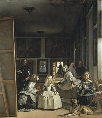
Las Meninas (1656) by Diego Velázquez.
The sight of one of Picasso’s many versions of Las Meninas (The Maids of Honour) by Velázquez earlier this week prompts this post. An endlessly fascinating painting whose influence runs through three hundred years of art history. That influence isn’t so surprising if you consider this as a painter’s painting; it certainly never seems to figure in the canon of favourite works among the wider public. But artists are beguiled by the games it plays with our ways of seeing: a self-portrait of the artist painting a subject (the royal couple) standing where the viewer would be, with the couple seen in reflection in the mirror on the back wall. We are the watchers and the watched. Wikimedia Commons has a decently large copy of the painting.

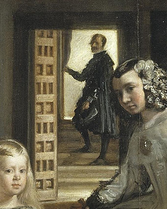
I’ve long been fascinated by the detail of the queen’s chamberlain, Don José Nieto Velázquez, standing on the steps at the back of the picture. Lines of perspective draw our attention to his figure, not only the perspective of the room but also the line which can be drawn across the heads of the three figures in the foreground right. I always look to see how Don José is treated in subsequent variations, some of which appear below.

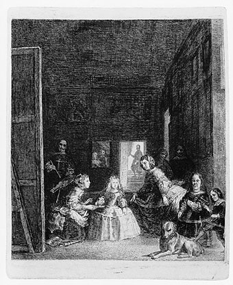
Las Meninas, after Velázquez (c. 1778) by Francisco de Goya y Lucientes.
One of the commonplaces of contemporary art is artworks about other artworks. Goya’s etching shows that this idea is by no means a new one. Goya was apparently dissatisfied with his attempt, and its main interest is the degree to which he distorts various parts of the picture.

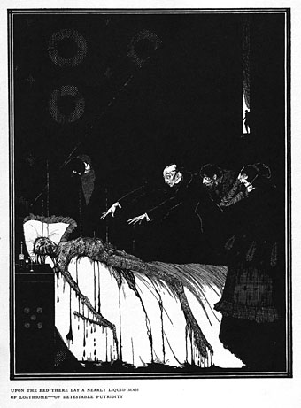
The Facts in the Case of M Valdemar (1919) by Harry Clarke.
Harry Clarke scholar Nicola Gordon Bowe proposed in The Life and Work of Harry Clarke (1989) that the figure in the background of this Poe illustration was a version of Don José. Clarke’s picture also has a similar grouping of foreground figures which adds to the speculation. The division of space in the Velázquez painting would have held considerable appeal for an artist used to dealing with similar divisions in his stained glass window designs. Will at A Journey Round My Skull recently uploaded a set of high-resolution scans of Clarke’s Poe drawings and paintings.

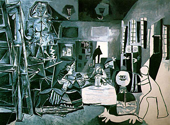
Las Meninas (after Velazquez) (1957) by Pablo Picasso.
In the 1950s Picasso took to producing a series of variations on favourite paintings. There are 44 versions of Las Meninas, some more abstract than others. This one reminds me of Guernica and I like the humour of presenting Velázquez’s dog—one of the great dogs of art history—as though it’s been drawn by Nicolas Pertusato, the child who attempts to rouse the animal with his foot. Velázquez here has a head surmounting a spindly body comprised of the Order of Santiago cross.

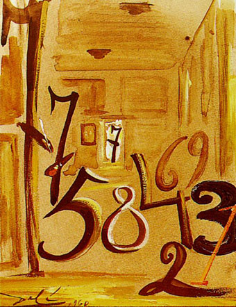
Las Meninas (1960) by Salvador Dalí.
Salvador Dalí venerated Velázquez and he happily quoted other artists throughout his career so it’s no surprise to find variations of Las Meninas. This wins the award for the most eccentric, with the figures reduced to numerals. Closer examination shows it to be quite clever the way each number corresponds to a different figure. The use of the number 7 for the artist and for Don José makes sense when you consider that they share the same surname. Don José turns up alone is another painting the same year, a work entitled Maelstrom: Portrait of Juan de Pareja fixing a string of his mandolin.

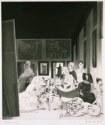
Picasso’s Meninas (1973) by Richard Hamilton.
Richard Hamilton’s aquatint is equally playful, substituting Velázquez with Picasso and his works.

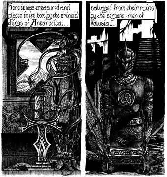
The Haunter of the Dark (1986).
I seem to have referred to my own work quite a lot recently, and here’s some more of it. The panel on the right quotes from Harry Clarke’s Poe illustration and so can be considered as continuing a trace element of the shadowy Don.

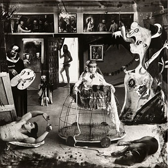
Las Meninas (Self Portrait) (1987) by Joel-Peter Witkin.
Joel-Peter Witkin has quoted Picasso’s works frequently in his photo-tableaux so the Picasso-esque figure on the right is perhaps inevitable. Witkin also has a considerable fondness for dead things so it’s quite likely that the dog in this photograph isn’t sleeping.
I’ll be surprised if there haven’t been a lot more variations during the past twenty years. If anyone knows of any which are better than this item by Antonio Guijarro Morales, please leave a comment.
Previously on { feuilleton }
• Picasso-esque
• Reflections of Narcissus
• My pastiches
• Guernica, seventy years on
• The art of Harry Clarke, 1889–1931
