Book talk

shevdon.jpg

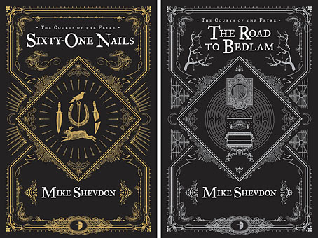
I posted my covers for the Angry Robot editions of Mike Shevdon’s Courts of the Feyre series last month. Last week Mike asked me to answer a few questions about the design process and related matters. The answers are now posted on his blog where I discuss art, book design, favourite reading and a couple of the things I plan to foist on the world in the near future.

Not mentioned there but due on the shelves later this year is The Graphic Canon, a collection of adaptations in comic strip and illustration form of literary works from the Epic of Gilgamesh on. Seven Stories Press is the publisher, Russ Kick is the editor, and my contribution is a condensation of The Picture of Dorian Gray. The first of the three volumes will be out in April. More about that later.

Previously on { feuilleton }
The Courts of the Feyre

Kafkaesque

kafkaesque1.jpg

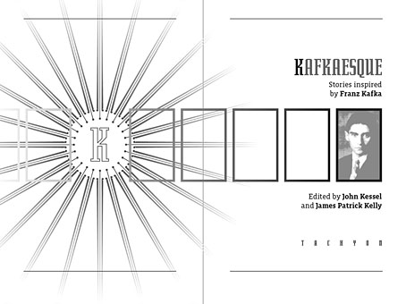
Another book design of mine (interiors only) which I completed last September for Tachyon and about which I had this to say at the time:

Kafkaesque [is] edited by John Kessel and James Patrick Kelly. It’s a collection of short stories either inspired by Franz Kafka, or with a Kafka-like atmosphere, and features a high calibre of contributions from writers including JG Ballard, Jorge Luis Borges, Carol Emshwiller, Jeffrey Ford, Jonathan Lethem and Philip Roth, and also the comic strip adaptation of The Hunger Artist by Robert Crumb.

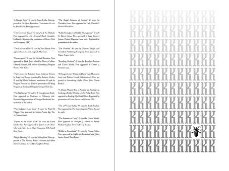
The book gained a positive review at SF Site recently, reminding me that I hadn’t written anything about the design. As with some of my other Tachyon work the interiors take their cue from a pre-determined cover by another designer, in this case Josh Beatman. I followed Josh’s type choices (Senator for the titles and headings) and also extended his use of an insect as a recurrent motif. Before I saw the contents I was fairly determined to avoid any further insect imagery but it became apparent that Kafka’s Metamorphosis is a repeated reference in many of the stories.

kafkaesque2.jpg

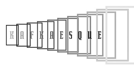
As for the recurrent “K”, that seemed inevitable given Kafka’s own use of the letter as well as its presence not only in Kafka’s own name but in the names of the editors. The frames were an idea borrowed from (and referring to) Steven Berkoff’s stage adaptation of The Trial in which portable frames serve on the stage as doorways, windows, corridors, picture frames and so on. I was hoping to do more with this idea but (as is often the case) ran out of time to develop it further.

kafkaesque3.jpg

And while we’re on the subject of Tachyon designs, I don’t seem to have mentioned my interiors for a Joe R Lansdale collection, Crucified Dreams, which also appeared last year. This is a hard-boiled anthology of Lansdale’s favourite stories for which I supplied suitably rough-and-tough graphics comprising scanned scalpel blades and lettering assembled from torn newspaper pages. I’m due to start on some new work for Tachyon this week. More about that at a later date.

Continue reading “Kafkaesque”

Cthulhoid and Artflakes

cthulhoid.jpg

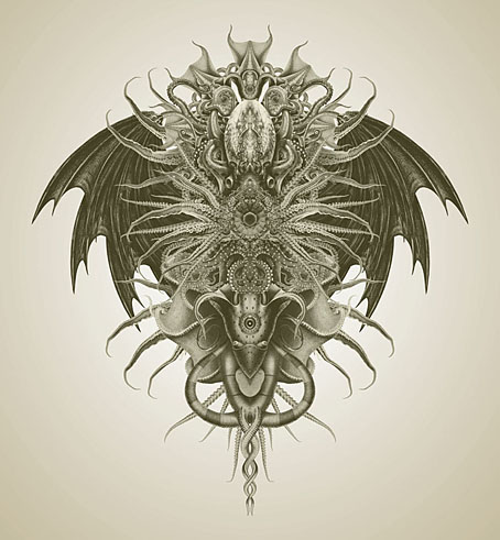
Cthulhoid (2012).

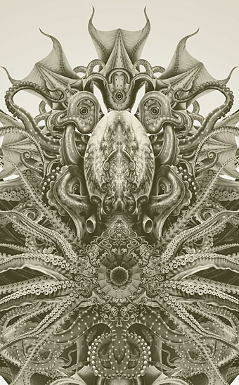
Hot on the scaly heels of my recent Cthulhu God comes a new collage work I was messing with over Christmas. This was done in part as a reaction to the earlier picture which I’m very happy with but which looks cleaner and flatter than I prefer for Lovecraft-related things. I’d also found some new books of copyright-free cephalopoda that I wanted to try playing with. There are trace elements here of Haeckel’s Kunstformen der Natur but I’ve plundered Haeckel so much in the past it’s better to search elsewhere for source material.

cthulhoid-detail.jpg

I’ve been selling reproductions of works such as this at CafePress but now have an additional outlet with a new print venture, Artflakes, who asked me late last year to contribute to their site. Artflakes is a German company operating as CafePress does: artists upload their pictures which can then be sold on a variety of products. The product range is smaller than their rivals but they do canvas prints which CafePress don’t. These are costly items but canvas prints tend to be expensive anyway, even at a high street copy shop. On the plus side, being based in Germany means the shipping costs will be slightly cheaper inside Europe. I’ve not uploaded much at the moment but this new piece is there together with six other works. More will be added in the next couple of months.

Elsewhere on { feuilleton }
The Lovecraft archive

The art of Ronald Searle, 1920–2012

searle01.jpg

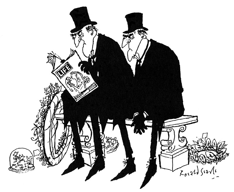
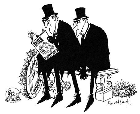
Undertakers. From Punch magazine (undated).

I started trying to draw like Ronald Searle when I was about eight. So there was Jabberwocky and Ronald Searle I was turning into by the time I was thirteen. You know, I was determined to be Lewis Carroll (giggles) with a hint of Ronald Searle.

John Lennon, 1968

Does the late Ronald Searle need any introduction? Everyone knows he created the anarchic schoolgirls of St Trinian’s in the 1940s, although their exploits had the greatest audience in the films based on Searle’s cartoons rather than the original drawings. Searle’s work first came to my attention through reprints of the Molesworth books he produced with Geoffrey Willans in the 1950s—Down with Skool! (1953), How to be Topp (1954), Whizz for Atomms (1956) and Back in the Jug Agane (1959)—a masculine riposte to St Trinian’s which allowed for a broader range of humour than the slapstick and short-skirted salaciousness the films drifted into. The Molesworth books are perhaps best appreciated at age 11 as this LRB review notes; looked at with older eyes all I see is a portrait of a rigidly class-bound nation whose boarding schools, gowned masters, “maters” and “paters” could only inspire affection in the Etonians currently attempting to govern Britain. But the drawings remain a treat: wiry and mordant with flashes of a viciousness that make Searle the godfather of Gerald Scarfe and Ralph Steadman.
searle.jpg

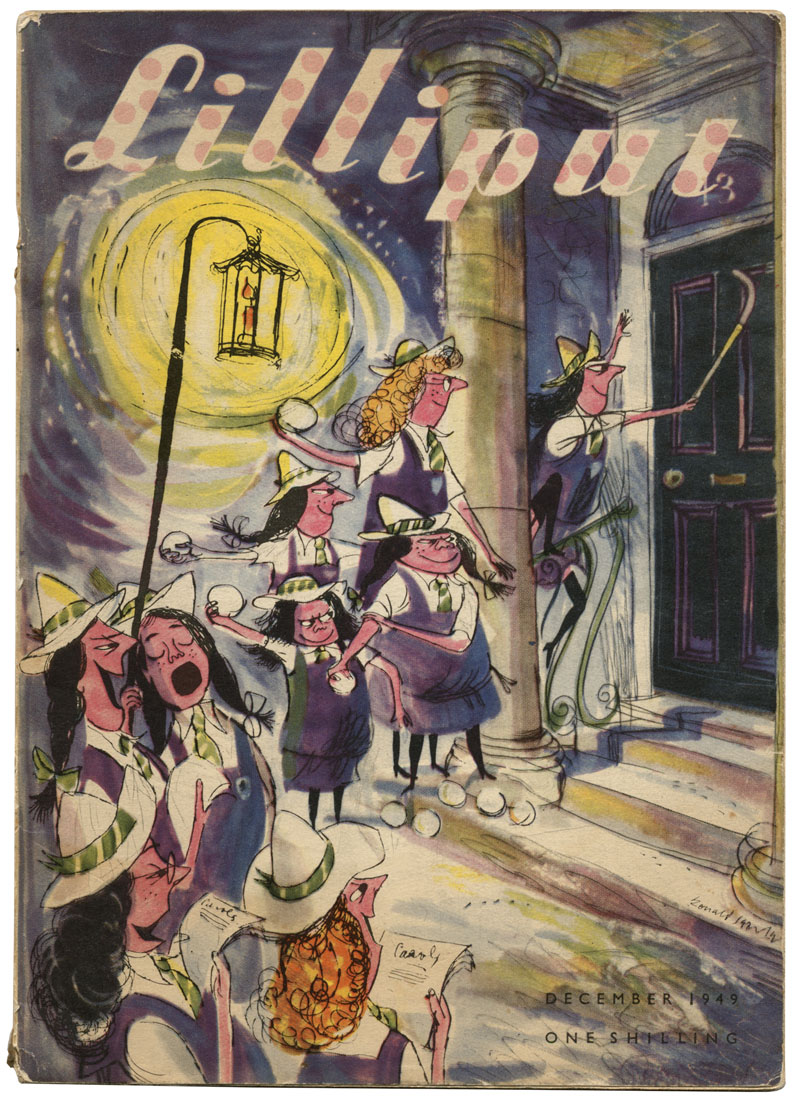
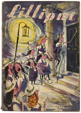
The girls of St Trinian’s, Lilliput magazine, December 1949.

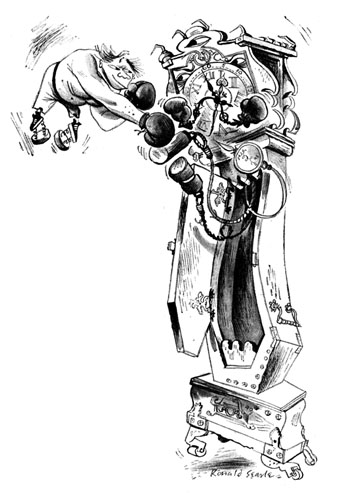
Given Searle’s influence on generations of newspaper cartoonists it’s no surprise that the British papers are being free with the plaudits. Links to various stories follow. The images here are taken from earlier posts or pulled from my bookshelves. The illustration of Engelbrecht below is from the Savoy Books edition of Maurice Richardson’s The Exploits of Engelbrecht which I designed in 2010.

Guardian obituary | Telegraph obituary | NYT obituary
• Ronald Searle in pictures: Telegraph | Guardian
Ronald Searle: a life in pictures by Steve Bell.
Mike Leigh: ‘Ronald Searle was my inspiration’.
Ronald Searle: Now let’s have some fizz: Gerald Scarfe remembers his friend and childhood hero.
Ronald Searle was our greatest cartoonist – and he sent me his pens, says Martin Rowson.

Other links:
Perpetua, the Ronald Searle tribute
Searle at VTS
Winespeak at BibliOdyssey

searle03.jpg

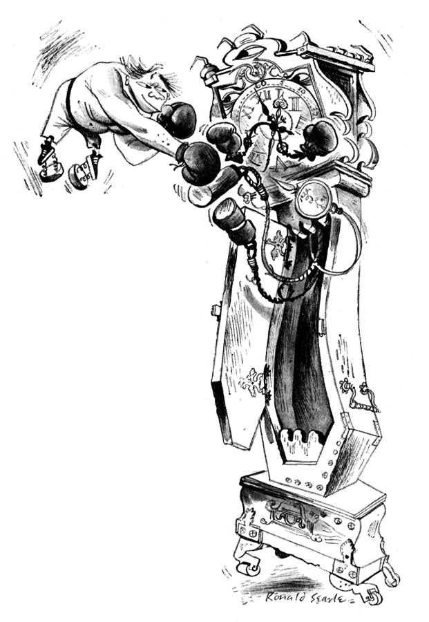
Engelbrecht versus Grandfather Clock. From The Exploits of Engelbrecht (1950) by Maurice Richardson.
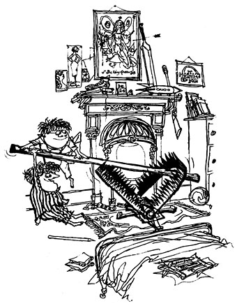
molesworth.jpg

“A trap for dere Santa”. From How to be Topp (1954) by Geoffrey Willans and Ronald Searle.
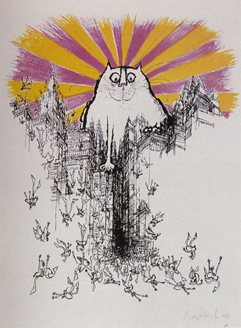
searle02.jpg

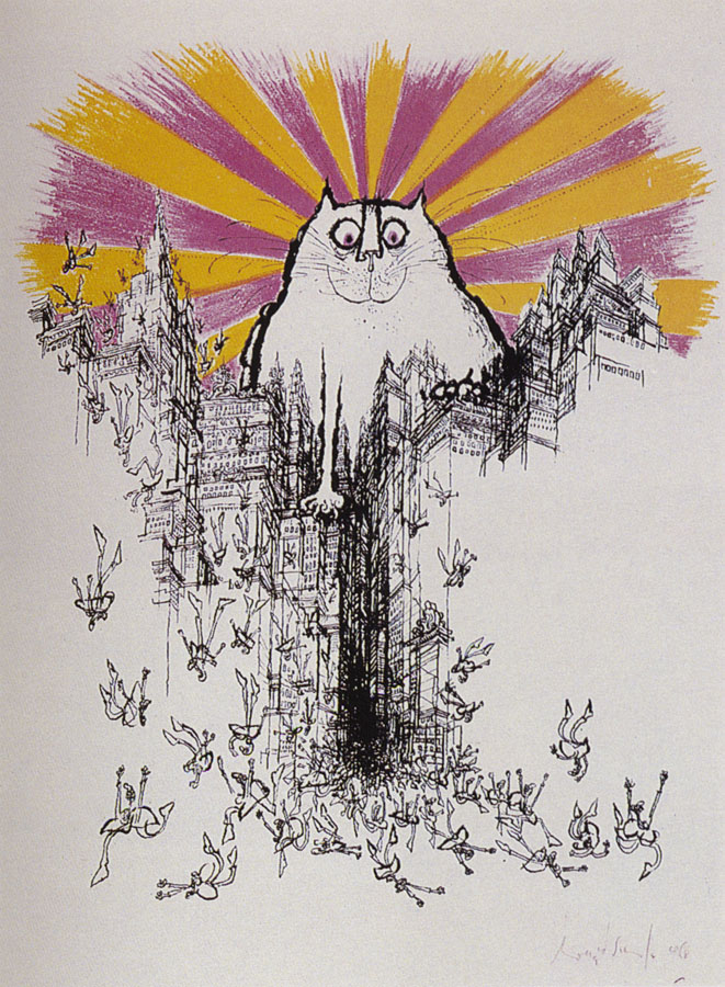
The Coming of the Great Cat God (1968).

Elsewhere on { feuilleton }
The illustrators archive

Previously on { feuilleton }
Engelbrecht lives to fight another day
Ronald Searle book covers
Engelbrecht again

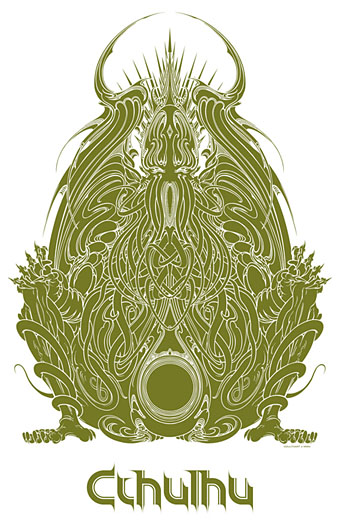
Cthulhu for sale

cthulhugod3.jpg

As promised last month, my latest piece of Cthulhu art has spawned itself over a range of CafePress products including posters, cards, T-shirts and CafePress’s recent line of iPod/iPad cases. For the latter items and the apparel I’ve used the simpler version of the drawing above. See the artwork larger size here.

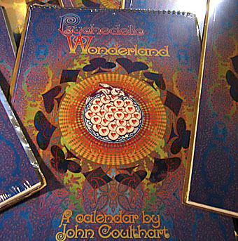
calendars.jpg

And it’s customary at the beginning of January to reduce the Coulthart calendars to a dollar above their base price. Psychedelic Wonderland and Through the Psychedelic Looking-Glass for 2012 can now be had for $17.99/£13.50/€16.00 each. My thanks to everyone who bought copies before Christmas.

Elsewhere on { feuilleton }
The Lovecraft archive