Heavy Metal, October 1979: the Lovecraft special

hm1.jpg

Mr Lovecraft by JK Potter.

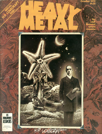
HP Lovecraft died seventy-five years ago on 15th March, 1937. Twenty-five years ago I was halfway through drawing my comic strip adaptation of The Call of Cthulhu, conscious at the time that, yes, it was fifty years ago today… I mentioned at the weekend the special Lovecraft edition of Heavy Metal that was published in October 1979; of the many stimuli that led to the drawing of CoC, this magazine was by far the most important. Given the date, now seems as good a time as any to say something about it.

hm2.jpg

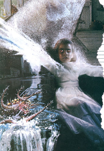
Illustration for the contents page by Stephen R. Bissette.

Heavy Metal was the US offshoot of Métal Hurlant, the sf/fantasy comics magazine founded by Jean Giraud (Moebius), Philippe Druillet and Jean-Pierre Dionnet in 1974. Copies of Métal Hurlant could be found in London but none ever made it further north. The advent of Heavy Metal provided an invaluable introduction to a generation of European artists whose work was otherwise difficult to find. Even better: their stories were being translated into English for the first time. The late 70s was a dizzying period for a Lovecraft reader: HR Giger appeared apparently out of nowhere in 1977 when Big O published the first UK collection of his art (which I couldn’t afford at the time), a book with Necronomicon in the title; a year later Thames & Hudson published Franz Rottensteiner‘s The Fantasy Book, an overview of the genre that devoted eight pages to Lovecraft and Arkham House, and which included many illustrations I’d never seen before; in 1979 Giger was all over the newspapers and magazines thanks to Alien; then in October the Lovecraft special dropped onto the shelves. I was stunned: this was that rare occasion when someone creates exactly the thing you want to see at precisely the right moment.

hm3.jpg

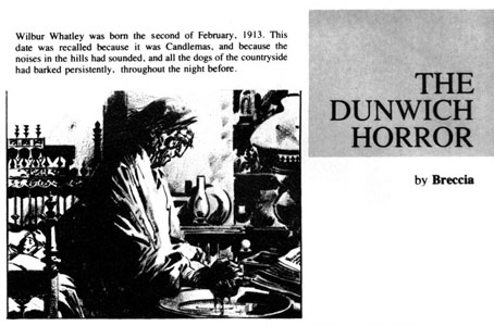
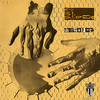
The Dunwich Horror by Alberto Breccia. A superb adaptation.

Looking back, the issue isn’t quite as good as it seemed at the time: many of the stories are slight, a couple have nothing whatever to do with Lovecraft, and, Breccia aside, none of the artists tackle the major works. What counted in the end was the idea of the issue, the implication that Lovecraft’s imagery was there to be seized and reworked in visual form. There were better issues of the magazine, before and after, but for the next six years this one remained for me a tantalising possibility. They hadn’t got it quite right…what if someone else did? After searching comic shop shelves in vain I eventually decided to have a go myself.

Continue reading “Heavy Metal, October 1979: the Lovecraft special”

Aether Cola

aethercola.jpg

Another piece of work from the end of last year has now been unveiled. The brief this time was from UK company Cybercandy who asked for a steampunk-themed cola can. If this sounds like the mechanical shark has been well-and-truly vaulted then it’s necessary to note that Cybercandy specialise in novelty food products with science fiction (or similar) themes. They also import food products from other countries. The cans are small size (250 ml) for which I chose a bronze/copper metallic ink that looks great on the finished articles. The job made a welcome change from work for books or CDs.

aethercola2.jpg

Aether Cola is available from Cybercandy’s UK outlets. I’m not sure about the availability elsewhere but there’s a dedicated site for the drink here with details of their shops here.

aethercola3.jpg

Previously on { feuilleton }
Crafting steampunk illustrations
SteamPunk Magazine
Morlocks, airships and curious cabinets
The Steampunk Bible
Steampunk Reloaded
Steampunk overloaded!
More Steampunk and the Crawling Chaos
Steampunk Redux
Steampunk framed
Steampunk Horror Shortcuts

Weekend links 95

skidoo.jpg

Seven Songs (1982) by 23 Skidoo. Sleeve by Neville Brody.

The first volume of The Graphic Canon will be published in May by Seven Stories Press, a collection of comic strip adaptations and illustrations edited by Russ Kick. The anthology has already picked up some attention at the GuardianWestern canon to be rewritten as three-volume graphic novel—and Publishers’ WeeklyGraphic Canon: Comics Meet the Classics. I know someone who’ll bristle at the lazy use of “graphic novel”. The Graphic Canon isn’t anything of the sort, it’s a three-volume voyage through world literature presented in graphic form with a list of contributors including Robert Crumb, Will Eisner, Molly Crabapple, Rick Geary, and Roberta Gregory. My contribution is a very condensed adaptation of The Picture of Dorian Gray that will appear in volume 2. More about that closer to the publication date.

• LTM Records announces a vinyl reissue for Seven Songs (1982) by 23 Skidoo, an album produced by Ken Thomas, Genesis P Orridge & Peter Christopherson that still sounds like nothing else. Related: an extract from Tranquilizer (1984) by Richard Heslop, cut-up Super-8 film/video with audio collage by 23 Skidoo.

• New exhibitions: Another Air: The Czech–Slovak Surrealist Group, 1991–2011 at the Old Town City Hall, Prague (details in English here), and Ed Sanders – Fuck You / A Magazine of the Arts 1962–1965 at Boo-Hooray, NYC.

• “…we have a situation where the banks seem to be an untouchable monarchy beyond the reach of governmental restraint…” Alan Moore writes for the BBC about V for Vendetta and the rise of Anonymous.

Announcing Arc: “a new magazine about the future from the makers of New Scientist“. Digital-only for the time being, as they explain here. Their Tumblr has tasters of the contents.

• From another world: Acid Mothers Temple interviewed. Also at The Quietus: Jajouka or Joujouka? The conflicted legacy of the Master Musicians.

• More from Susan Cain on introverts versus extroverts. Related: Groupthink: The brainstorming myth by Jonah Lehrer.

Ten Thousand Waves, an installation by Isaac Julien.

Afterlife: mouldscapes photographed by Heikki Leis.

• The book covers of Ralph Steadman. And more.

• “James Joyce children’s book sparks feud

Arkitypo: the final alphabet.

Book Aesthete

Kundalini (1982) by 23 Skidoo | Vegas El Bandito (1982) by 23 Skidoo | IY (1982) by 23 Skidoo

Book talk

shevdon.jpg

I posted my covers for the Angry Robot editions of Mike Shevdon’s Courts of the Feyre series last month. Last week Mike asked me to answer a few questions about the design process and related matters. The answers are now posted on his blog where I discuss art, book design, favourite reading and a couple of the things I plan to foist on the world in the near future.

Not mentioned there but due on the shelves later this year is The Graphic Canon, a collection of adaptations in comic strip and illustration form of literary works from the Epic of Gilgamesh on. Seven Stories Press is the publisher, Russ Kick is the editor, and my contribution is a condensation of The Picture of Dorian Gray. The first of the three volumes will be out in April. More about that later.

Previously on { feuilleton }
The Courts of the Feyre

Kafkaesque

kafkaesque1.jpg

Another book design of mine (interiors only) which I completed last September for Tachyon and about which I had this to say at the time:

Kafkaesque [is] edited by John Kessel and James Patrick Kelly. It’s a collection of short stories either inspired by Franz Kafka, or with a Kafka-like atmosphere, and features a high calibre of contributions from writers including JG Ballard, Jorge Luis Borges, Carol Emshwiller, Jeffrey Ford, Jonathan Lethem and Philip Roth, and also the comic strip adaptation of The Hunger Artist by Robert Crumb.

The book gained a positive review at SF Site recently, reminding me that I hadn’t written anything about the design. As with some of my other Tachyon work the interiors take their cue from a pre-determined cover by another designer, in this case Josh Beatman. I followed Josh’s type choices (Senator for the titles and headings) and also extended his use of an insect as a recurrent motif. Before I saw the contents I was fairly determined to avoid any further insect imagery but it became apparent that Kafka’s Metamorphosis is a repeated reference in many of the stories.

kafkaesque2.jpg

As for the recurrent “K”, that seemed inevitable given Kafka’s own use of the letter as well as its presence not only in Kafka’s own name but in the names of the editors. The frames were an idea borrowed from (and referring to) Steven Berkoff’s stage adaptation of The Trial in which portable frames serve on the stage as doorways, windows, corridors, picture frames and so on. I was hoping to do more with this idea but (as is often the case) ran out of time to develop it further.

kafkaesque3.jpg

And while we’re on the subject of Tachyon designs, I don’t seem to have mentioned my interiors for a Joe R Lansdale collection, Crucified Dreams, which also appeared last year. This is a hard-boiled anthology of Lansdale’s favourite stories for which I supplied suitably rough-and-tough graphics comprising scanned scalpel blades and lettering assembled from torn newspaper pages. I’m due to start on some new work for Tachyon this week. More about that at a later date.

Continue reading “Kafkaesque”