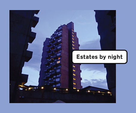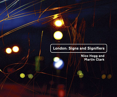
By coincidence, two of the projects I was working on in the summer are released this week. First up is London: Signs and Signifiers, a collection of Nico Hogg’s photographs of the streets and architecture of London’s East End. I’ve mentioned Nico’s photography before as his pictures have been used on several of the albums and singles I’ve designed for Keysound Recordings, some of which are featured in the book. This is being published as part of the Keysound catalogue, with a launch event taking place today (the 8th) at the Doomed Gallery, London. See this post for details, and a link to download a free chapter.
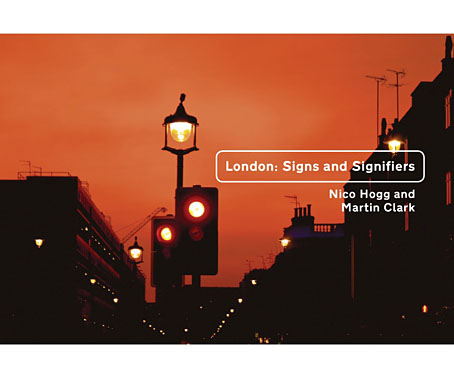
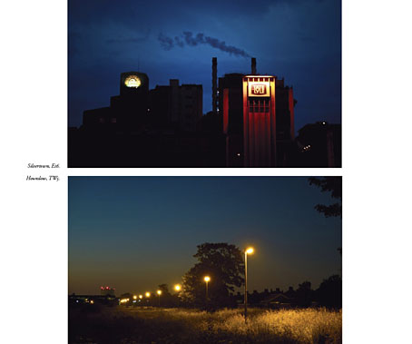
Nico’s work is notable for the way it avoids the stereotype of the style of urban photography that presents deprived or run-down areas in grim monochrome. Nico doesn’t avoid the decay—there are shots of burned-out flat-blocks, and a chapter devoted to the recent Tottenham riots—but the colour in his pictures shows a different side to these areas of the city.
My design for the book follows the minimal approach I’ve used on the Keysound albums, organising the information clearly and giving the photos as much room as possible. The font used for the titles and chapter headings is Transport, the typeface designed by Jock Kinneir and Margaret Calvert used on roads signs throughout the UK.