Of Mice and Minestrone

lansdale.jpg

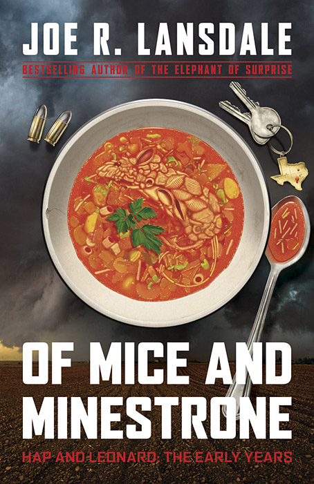
I’ve done a lot of cover work this year, and there are still more designs waiting to be announced. Of Mice and Minestrone isn’t my usual line of work but it’s actually the third cover I’ve done for a Joe R. Lansdale book, although the previous titles were horror and steampunk respectively. The latest volume is a collection of crime stories, and an addition to Lansdale’s Hap and Leonard books, a series about a pair of Texan detectives whose popularity now extends to a TV show.

Crime presents many of the same challenges you find in other genres, all of which come with their own set of clichés which you can either choose to engage with or avoid. In the case of crime there’s a tendency for degraded typefaces to proliferate, along with variations on a red/black/white colour scheme. One of the early drafts of this design did use a red/black/white arrangement but I was told that Joe Lansdale was (unsurprisingly) tired of seeing this scheme applied to his own books. The title of the collection comes from the opening story which concerns the young Hap’s involvement with an older woman and her abusive husband; the marital abuse is resolved via a bowl of soup which has been poisoned with a dead rat, hence the title and the cover image. I like using pareidolia when I can, and the slightly unusual imagery pushed the appearance away from generic clichés (if you discount the bullets) towards the marvellously surreal covers that Tom Adams painted for Agatha Christie’s novels.

The background photo is a rare example of my using a stock image. The soup bowl looked fine from the outset but the background lacked a suitably ominous quality, and was at risk of looking too much like a recipe book. (As it happens there are some recipes by Kasey Lansdale following the fiction although I don’t think any require the use of dead rats.) After trying a number of different table surfaces I decided on a lateral approach so went searching for pictures of Texan storm clouds. The image we eventually used—a tornado over farmland near Patricia, Texas by John Finney at Getty Images—was the second one I tried and it worked so well we decided to keep it.

Of Mice and Minestrone will be published by Tachyon in March 2020 but is available for pre-order now.

Previously on { feuilleton }
• The Gods of HP Lovecraft
• Lovecraft’s Monsters
• Ten titles and a cover
• Steampunk overloaded!
• New things for April

Weekend links 486

magma.jpg

Magma concert poster, 2017. Art by Jofre Conjota.

• The Dream Foundry is a new venture with a mission “to bolster and sustain the nascent careers of professionals working in the field of speculative literature.” This includes artists as well as writers, and to this end I was asked to answer a few questions about my work as a creator of book covers. I also offer some advice about visibility as an artist which I tried not to hedge with too many caveats. Related: my cover for The Resurrectionist of Caligo by Wendy Trimboli & Alicia Zaloga was one of the covers of the month at Muddy Colors.

• “…for a band that were so compositionally advanced, they were adept at producing primordially insistent and hypnotic rhythms.” John Doran on Magma (again), appraising the band’s music and history before presenting Christian and Stella Vander with questions from appreciative musicians.

• Mixes of the week: FACT mix 731 by Meemo Comma, mr.K’s Soundstripe vol 2 by radioShirley, The Ivy-Strangled Path Vol. XIX by David Colohan, and The Pumpkin Tide by Haunted Air.

• At Dangerous Minds: Roddy McDowall reads HP Lovecraft’s The Outsider and The Hound. Related: David McCallum reads HP Lovecraft’s The Dunwich Horror and The Haunter of the Dark.

• “Mathematics is not unique in drawing out charlatans and kooks, of course…” David S. Richeson on cranks, past and present.

• “I plan to take psychedelics again…” Helen Joyce, the finance editor of The Economist, takes a trip.

• The City of Light and its shadows: Brassaï’s Paris.

• At Dennis Cooper’s: Dennis Hopper Day.

• Paris (1958) by Perez Prado And His Orchestra | Paris 1919 (1973) by John Cale | Paris 1971 (1971) by Suzanne Ciani

Something from Below

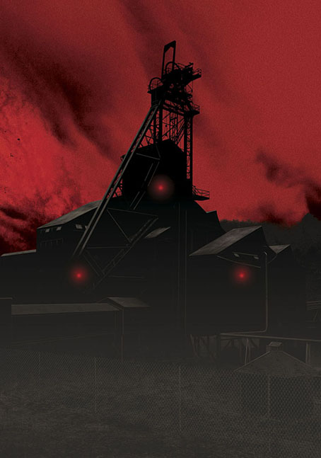
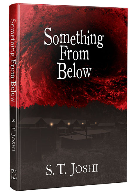
My first encounter with author, editor and Lovecraft biographer ST Joshi was in the form of an artwork request that arrived out of the blue in the late 1980s. My comic-strip adaptation of The Haunter of the Dark had just been published in a large-format edition by Caermaen Press, a small imprint run by Roger Dobson and Mark Valentine, and this prompted a flurry of interest among weird-fiction enthusiasts in Britain and the USA. Joshi was editing Lovecraft Studies for Necronomicon Press at the time, and asked if I’d be willing to contribute illustrations, something I ended up not doing for a variety of reasons. I always felt bad about this, and admitted as much when we eventually met at the Providence NecronomiCon in 2015, so my cover art for his new cosmic-horror novella may be regarded as a kind of recompense.

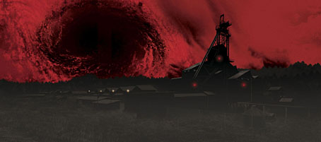
Something from Below is horror with an industrial setting and a Lovecraftian slant, hence the sinister coal mine dominating the artwork:

When 22-year-old Alison Mannering returns to her home in northeastern Pennsylvania after college, she finds a troubling situation. Her father, Guy Mannering, a longtime coal miner, has died recently under suspicious circumstances, and her mother refuses to provide any details of his passing. Alison feels she has no option but to investigate the matter herself, enlisting her high school sweetheart, Randy Kroeber, as well as Randy’s twin sister, Andrea called Andy, to assist her… (more)

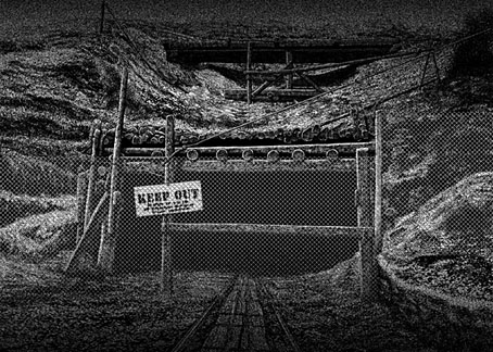
The brief for this one was to create a wraparound cover without showing anything overtly monstrous, something I was happy to do since I dislike horror covers that reveal too much. In addition to the wrap I also produced a black-and-white piece for the inner boards. As is evident from the pictures above, the artwork was flipped around in the design but that’s okay, it works both ways. The coal mine is the central location, however.

Something from Below is published this month by PS Publishing in signed and unsigned hardcovers.

Elsewhere on { feuilleton }
• The Lovecraft archive

Hawkwind: Days of the Underground

hawkwind.jpg

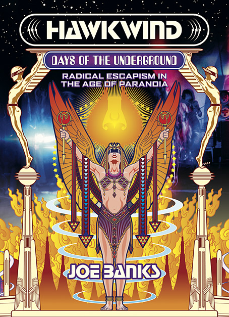
As mentioned at the weekend, Joe Banks’ account of the first ten years of Hawkwind will be published by Strange Attractor Press later this year with a wraparound cover of my design. I never expected to be doing anything else for Hawkwind after moving on to other things in 1985, but it was the group’s first decade of music that fuelled the drawings which brought me to their attention, so this cover design brings everything full circle. The earliest of my Hawkwind drawings dates to 1979 which means this cover is also an anniversary piece.

The design combines Barney Bubbles’ Space Ritual template with elements of the art he created before and afterwards, notably the inner and outer sleeve of Doremi Fasol Latido, and the futuristic Art Deco of his tour poster for The “1999” Party. All the Bubbles Hawk-art up to and including Space Ritual is a blend of the ancient (Egypt, tribal motifs, characters that resemble pirates or barbarians), the previous century (Art Nouveau in particular), and the far future as depicted in comics and pulp magazines. I wanted to reflect this blend without being too imitative of the details, so the cover works a variation on Space Ritual, with a similar hieratic woman as the focus, and a margin of stylised flames separating the foreground from Laurie Lewis’s photos of the band (the latter are unused shots from the same session used for Space Ritual).

haberfield.jpg

Art by Bob Haberfield, 1970.

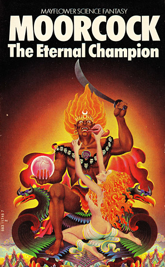
All the background elements run across the wrap but this hasn’t been revealed yet so you’ll have to wait a while to see the full design. The flames are based on Tibetan designs in a nod to the ancient side of the equation, as well as Bob Haberfield’s covers for the Moorcock novels published by Mayflower in the early 70s, many of which featured art derived from Tibetan Buddhism. (And one of the Mayflower Moorcocks, The Black Corridor, is the origin of the monologue of the same name on Space Ritual.) The full wrap shows a futuristic city whose Frank R. Paul-derived architecture is either on fire or menaced by a wall of encroaching flames. Many of Hawkwind’s songs of the period concern flight from cities or from the Earth itself—Born To Go, Time We Left (This World Today)—so the back cover also has a number of vehicles fleeing the scene: the radical escapism of the book’s subtitle in literal form. “Sign my release from this planet’s erosion,” as Nik Turner sings in Brainstorm.

Continue reading “Hawkwind: Days of the Underground”

Weekend links 480

yokoo.jpg

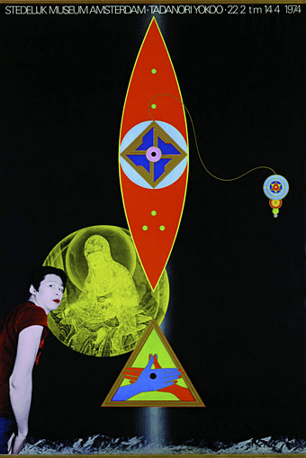
Tadanori Yokoo (1974) by Tadanori Yokoo and Will van Sambeek. A poster from the Colourful Japan exhibition at the Stedelijk Museum, Amsterdam.

• The first decade of space-rock pioneers Hawkwind is explored by Joe Banks in Hawkwind: Days of the Underground — Radical Escapism in the Age Of Paranoia, coming soon from Strange Attractor Press. I created the wraparound cover for this one, and will be talking about it here in a later post. Those interested in the book should note that the special edition hardback will include an extra book, plus a print and postcards. Limited to 500 copies so don’t wait around.

• “What we look for in our formative years can be very different from the demands we make later as analytical adults, and it was certainly more important to me that representations of gayness were complex or colourful than that they were positive, whatever that meant.” Ryan Gilbey on 50 years of Midnight Cowboy.

• Mixes of the week: Through A Landscape Of Mirrors Vol. II – France I by David Colohan, and As Imperceptibly As Grief The Summer Lapsed Away by Haunted Air.

If we imagine the material world about us having a concealed component of the fictional and the fantastic, visions buried in its stones and mortar waiting for their revelation, then we may suppose that 18th-century Lambeth was a teeming hub of such imaginal biodiversity. Bedlam alone could account for this ethereal population boom, but then nearby was the Hercules Buildings residence of William Blake, which can have only added to the sublime infestation.

Alan Moore on the visionary art of William Blake

• At the Internet Archive: Ten issues of Ed Pinsent’s The Sound Projector Music Magazine (1996–2002), with bonus Krautrock Kompendium.

• “Like many dictators Franco considered himself an artist.” Jonathan Meades on how fascism disfigured the face of Spain.

• Occulting Disk is a new album from the master of unnerving doomscapes, Deathprod, which will be released in October.

• Making MAD: Chris Mautner on the beginning and end of MAD magazine.

• John Margolies’ photographs of roadside America.

• Fair Sapphire by Meadowsilver.

• Jarboe‘s favourite music.

• Theme from Midnight Cowboy (1969) by John Barry | Astral Cowboy (1969) by Curt Boettcher | Dayvan Cowboy (2005) by Boards Of Canada