Heaven and Hell Calendar

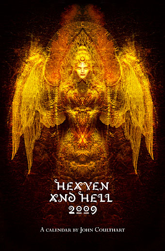
hhcalendar_cover.jpg

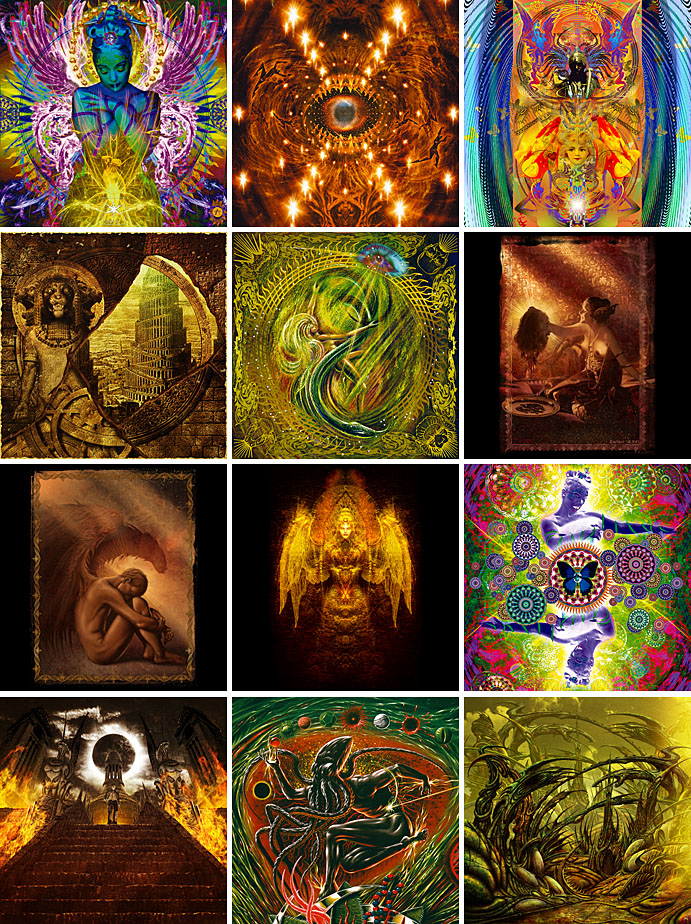
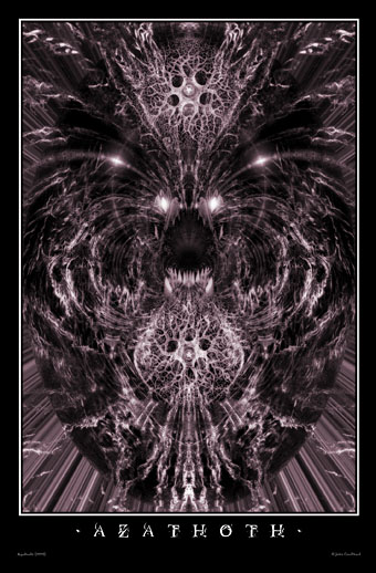
It was only a week ago I announced a new calendar for 2009 and now here’s an additional CafePress creation which manages to offer more than another collection of Lovecraft illustrations. This is a sampling of my work from the past few years gathered under the vague rubric of Heaven and Hell. A couple of pieces are variations on earlier designs reworked so as to fit the square page format. Details follow below.

hhcalendar_pages.jpg

1: Angel Passage (CD cover)
2: The Lucid View (detail; book cover)
3: MBV Arkestra (magazine cover)
4: Emissaries (CD cover)
5: Snakes and Ladders (CD cover)
6: Salomé
7: Fallen Angel
8: The Highbury Working (CD cover)
9: Acid Mothers Temple (poster design)
10: Steps of Descent (CD cover)
11: Metal Sushi (detail; book cover)
12: “Mirage in time—image of long-vanish’d pre-human city” (detail)

Previously on { feuilleton }
Coulthart Calendar 2009

Coulthart Calendar 2009

calendar1.jpg

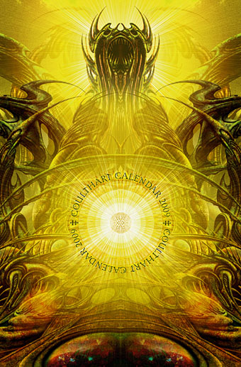
I’ve been a bit late with the new calendar this year but it’s finally available at CafePress. I’ve also been somewhat remiss in reusing last year’s pages rather than uploading new ones. Preparing 12 pages of art takes time even if you’re using old images—they have to be the right dimensions, after all—and I’ve been preoccupied this year with too many other things. So while the cover is new (based on this HP Lovecraft-derived picture), the pages are the same tinted versions of the art for The Great Old Ones from my Haunter of the Dark book. Considering the popularity of these pictures I’m guessing that some people will be quite happy with that; a selection from the series also appeared in the enormous Lovecraft Retrospective from Centipede Press earlier this year.

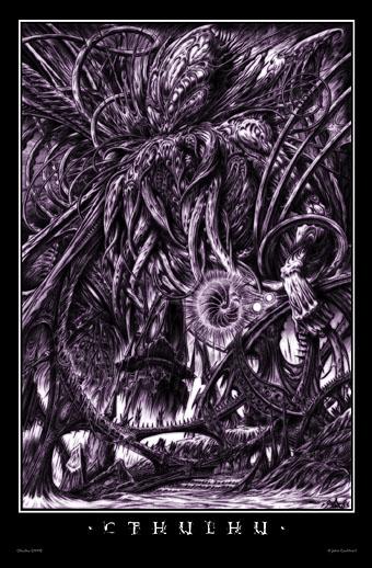
In other Lovecraft-related news, I’ve been slowly drawing a new Cthulhu portrait since demand for Cthulhoid work remains high. I’m not sure when this will be finished yet as other work takes precedence but this is where you’ll hear about it first.

calendar2.jpg

calendar3.jpg

Previously on { feuilleton }
The monstrous tome

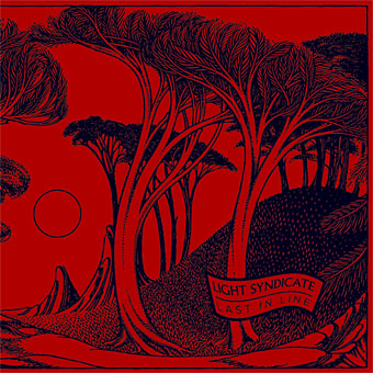
Last in Line by Light Syndicate

ls1.jpg

Last in Line is the debut album by Manchester band Light Syndicate and the CD packaging is something I put together after being asked to rescue a design which wasn’t quite working. I kept the band’s original idea of black trees on a red background but substituted their drawing with an adaptation of a 1910 folk tale illustration by Reginald Lionel Knowles. Knowles’ name is an obscure one today, his most visible work being the florid endpaper design which the Everyman Library used on their books up to 1935.

Last in Line is available locally from today (I guess that means Piccadilly Records) and nationwide from January 12th.

ls2.jpg

ls3.jpg

ls4.jpg

Elsewhere on { feuilleton }
The illustrators archive

The best font won

gotham.jpg

The beautifully elegant Gotham typeface by Hoefler & Frere-Jones was already becoming pretty ubiquitous even before the Obama brand designers chose it for all their campaign graphics. I’ve used it myself a couple of times recently, notably on the jacket for Keith Seward’s Horror Panegyric. Some typefaces have a flush of popularity then fade as they start to look dated but I can’t see this happening with Gotham. Hoefler & Frere-Jones have pulled off the very difficult task of creating a new sans serif that not only works as well as classics such as Futura and Gill Sans but is on the way to being a classic in its own right.

gotham2.jpg

Previously on { feuilleton }
New things for December

Design as virus 7: eyes and triangles

eye0.jpg

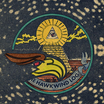
Continuing this occasional series. The above motif is the Golden Dawn’s Wedjat or Eye of Horus emblem as reproduced in the hardback edition of The Confessions of Aleister Crowley, an “autohagiography”. Crowley was under discussion here a few days ago and the eye in a triangle symbol can also be seen on the sleeve of the single featured in that posting, forming a part of the seal of the Ordo Templi Orientis, the occult order which Crowley joined in 1910. Crowley’s use of the eye in a triangle caught the attention of writer Robert Anton Wilson and the first part of his Illuminatus! trilogy (written with Robert Shea) is titled The Eye in the Pyramid. That latter symbol appears on the reverse of the American dollar bill, of course, and some of the conspiracy theories surrounding that usage are explored in the novel. Wilson went on to make the eye in a triangle something of a personal symbol and his obsessive use of the motif caught my attention in turn when I began reading his books.

All of which leads us to Hawkwind and a person whose name keeps turning up on these pages, designer Barney Bubbles.
eye1.jpg

Hawklog cover (detail) by Barney Bubbles.

The booklet which BB designed for Hawkwind’s second album, In Search of Space (1971), featured a version of the dollar bill symbol on its cover. This is the only eye in a triangle design I’ve seen among Barney Bubbles’ work although he was so prolific there may well be others. When I began producing my own significantly inferior Hawkwind graphics in the late Seventies I incorporated eyes in triangles partly as a way of avoiding having to draw hawks all the time but mainly because of Robert Anton Wilson. BB had already established a precedent and it so happens that the eye in the Golden Dawn/Crowley version is the eye of a hawk-headed Egyptian god.

Continue reading “Design as virus 7: eyes and triangles”