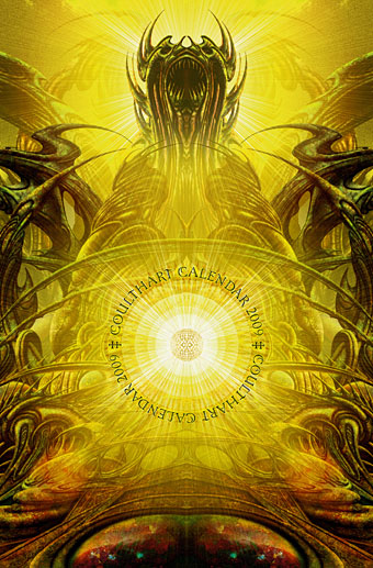
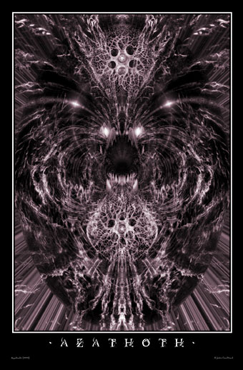
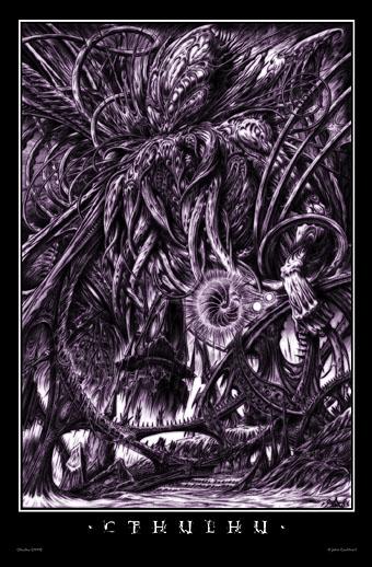
Horror comics

horror.jpg

More horror…. It’s been a while since I posted anything work-related here, not because I haven’t been busy but because much of the work this year is still waiting to see the light of day as a result of protracted schedules.

The Mammoth Book of Best Horror Comics is an anthology from Running Press (US) that really is mammoth—over 540 pages—and includes a reprinting of my Dunwich Horror pages from The Haunter of the Dark. You can see the selections in the Sprout widget below. (Not any more you can’t. Sprout decided to make everyone pay for their previously free service. Bye bye, Sprout.) It feels a bit fraudulent being in there since my drawings are more illustrations than a comics adaptation but I imagine most people buying the book will be happy to see poor old Wilbur Whateley’s demise receive another airing. Many of the featured strips are in the hokey EC mould which is often more comic than horror (one reason I was never very taken with EC) but the material gets better as it goes along and it’s a pleasure to be in anything with an artist as good as Mike Kaluta.

tdh.jpg

The Dunwich Horror, title page (1988).

Elsewhere on { feuilleton }
The Lovecraft archive

Pasticheur’s Addiction

ttl9.jpg

The Boojum Press edition of the Guide (1997).
(Frame supplied by Mark Roberts.)

A few days ago we had the CD cover meme which encourages people to create cover designs for invented groups generated by random means. In a similar vein but minus the random element there’s the growing selection of books by reclusive author Constance Eakins. A Flickr pool has been established for newly-discovered Eakins volumes and you can read more about the mysterious writer here.

This flourishing of pasticheury encourages me to post some of the cover designs I created for the various editions of The Thackery T Lambshead Pocket Guide to Invented and Discredited Diseases, a fake disease guide published in 2003 and edited by Jeff VanderMeer and Mark Roberts. The anthology featured a host of notable contributors and was great fun to work on. Although these were done in colour, they were all printed in black & white inside the book, with a shrunken glimpse of the colour versions on the rear of the dust jacket. My jacket design wasn’t used on subsequent printings so this is the first many people will have seen of these.

Continue reading “Pasticheur’s Addiction”

The CD cover meme

Okay, here’s a web meme I can really get behind…. I’ve never been tempted to try one of those long list affairs filled with questions such as “what was your favourite breakfast cereal when you were a child?” The CD cover meme is more my kind of thing and it goes like this:

1. http://en.wikipedia.org/wiki/Special:Random
The first article title on the page is the name of your band.

2. www.quotationspage.com/random.php3
The last four words of the very last quote is the title of your album.

3. www.flickr.com/explore/interesting/7days/
The third picture, no matter what it is, will be your album cover.

4: Combine all three elements in your photo editing software.

5: Share

Et voila! Without further ado I give Someone or Something Else by Tolnaftate, that well-known Berlin Techno outfit.

tolnaftate.jpg

Someone or Something Else by Tolnaftate, Feuilleton Records, 2008.

For the record (as it were), Tolnaftate is “a synthetic over-the-counter anti-fungal agent. It may come as a cream, powder, spray, or liquid aerosol, and is used to treat jock itch, athlete’s foot and ringworm”, and the quote, I’m pleased to say, was from HL Mencken, “All successful newspapers are ceaselessly querulous and bellicose. They never defend anyone or anything if they can help it; if the job is forced on them, they tackle it by denouncing someone or something else.” The pylons were unwittingly supplied by this Flickr user. Flickr has a pool devoted to this meme and they encourage you to add your own creations.

Via Sleevage which features some choice examples.

Elsewhere on { feuilleton }
The album covers archive

The skull beneath the skin

skull1.jpg

All Is Vanity by Charles Allan Gilbert (1892).

The subliminal skull is another of those perennial motifs that recur in art from time to time, and one which has become especially prevalent since the late 19th century. There seem to be a number of reasons for this, the most obvious being that if you’re going to show how clever you are by hiding one image inside another you may as well make the hidden thing something that everyone recognises. A secondary reason would seem to be the waning power of the vanitas theme. As painting became more pictorially sophisticated it wasn’t enough to simply show a skull and expect people to accept this with a stern moral as the principal content. Hence the development of death as a non-skeletal character in Symbolism and the reduction of skulls in pictures to a kind of playful game.

Holbein’s anamorphic skull in The Ambassadors is probably the grandfather of all the later versions but the more recent popularity of the hidden motif can be traced back to Charles Allan Gilbert whose 1892 picture, All is Vanity, drawn when he was just 18, was sold to Life Publishing in 1902, and subsequently spread all over the world in postcard form. Despite giving birth to a host of imitators, Gilbert’s picture is the one that still inspires artists and photographers up to the present day.

Continue reading “The skull beneath the skin”