Weekend links 694

sutton.jpg

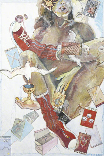
Reading the Tarot at Southend-on-Sea (c.1968) by Linda Sutton.

• “Starship Africa, released in 1980, was a densely textured audio collage emulating the sensation of intergalactic space travel, though it freaked out some in the scene. According to [Adrian] Sherwood, DJ David Rodigan told him: ‘What do you think you’re doing to reggae music?'” David Katz on the return of Creation Rebel.

• Coming soon from Strange Attractor: Subcontinental Synthesis, a history of India’s first electronic music studio, edited by Emptyset’s Paul Purgas. There’s also a related compilation album, The NID Tapes: Electronic Music from India 1969–1972.

• New music: The Lamentations Of Jeremiah by Vince Clarke, and Tidescape by Roger Eno.

But even when it’s a signal, even when it’s a microbe, we’ll likely never know if it’s aliens. Not just because of the vast distances involved or because of the wild possibilities presented by chemistry and biology, but because science seldom works that way. Discoveries almost never arrive as we think they will, as lightning bolt eurekas. They are slow, gradual, communal. Alien life may not be something we ever ‘find’, but instead inch towards, ever closer, like a curve approaching its asymptote. For all our desire to know who’s out there, that may have to be enough.

Jaime Green on the scientific method and the search for extraterrestrial life

• At Public Domain Review: Charles H. Bennett’s Shadows (ca. 1856).

• Steven Heller’s font of the month is JAF Herb.

Make a Spawn of Cthulhu mask.

Theon Cross’s favourite music.

Herb (1980) by Sly And The Revolutionaries With Jah Thomas | Pause In Herbs (1995) by Ken Ishii | Herb Is Burnin’ (2010) by Method Of Defiance

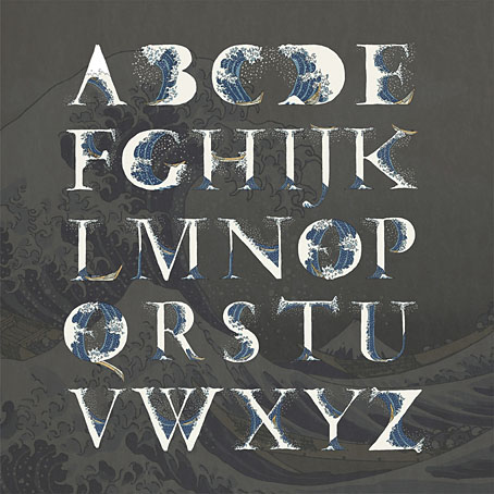
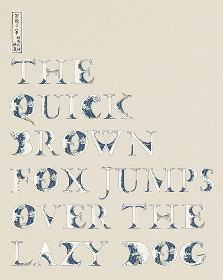
Okinami letterforms

okinami4.jpg

A couple of years ago I posted an incomplete collection of record covers based on Hokusai’s prints, many of which included his most famous work, The Great Wave off Kanagawa. In our age of mechanical reproduction Hokusai’s wave has become as much an emblem for Japan itself as any of the official national symbols, reproduced endlessly in a variety of media while being subject to the usual 21st-century derivations and pastiches. This is a common fate for well-known artworks but Hokusai’s wave is one of the few that are flexible enough to be mutated into a seres of letterforms (you can’t really call this a font) like the ones we have here, a design created by Indonesian designer Aditya Tri which grafts portions of the print onto Garamond serifs. The name of the design, Okinami, is the Japanese word for an offshore wave.

okinami1.jpg

Okinami is an unusual design but this isn’t the first time that Hokusai’s wave has been combined with letterforms. When Tomita’s “Musical Fantasy of Science Fiction”, The Bermuda Triangle, was released in the West it was given new cover art, with a gatefold illustration by Don Punchatz and a title design that added the Great Wave to the modified Sinaloa typeface which by this time had become Tomita’s signature font.

tomita.jpg

Design by Joseph J. Stelmach.

Are there other examples out there? I wouldn’t be surprised. Meanwhile, Hokusai’s print will be even more visible next year when it appears on the back of the new 1000 Yen banknote. A good argument for the retaining of physical currency, and further evidence that Japan gets all the best things.

okinami2.jpg

Previously on { feuilleton }
Hokusai record covers
Waves and clouds
Tomita album covers

The Journal of Decorative Art

joda01.jpg

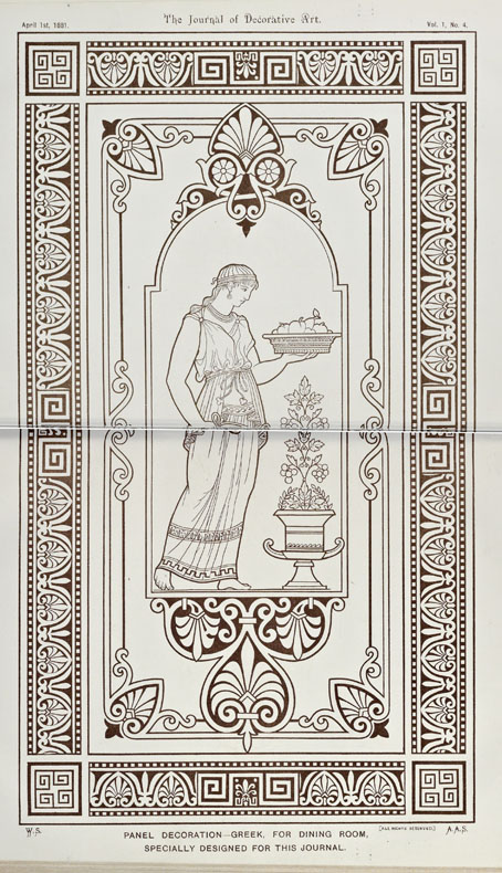
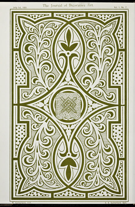
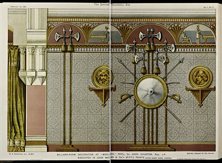
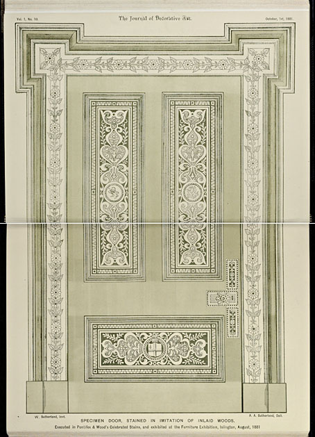
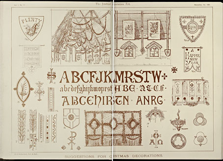
My workload has increased of late to a degree where I’ve not been looking at many websites that aren’t intended to fulfil some research quest or other. To this end, the Getty Research Institute has become a regular port of call, especially when the GRI section of the Internet Archive is updated regularly with many fine books that you won’t easily find elsewhere. For my purposes, the GRI is especially good with books about architecture, design and ornamentation, like this three-volume collection of The Journal of Decorative Art, “An Illustrated Technical Journal for the House Painter, Decorator, and all Art Workmen” published from 1881 to 1883. The illustrated examples are typical late Victoriana of a type I don’t always have much use for but for anyone who does the illustrations are very good, especially the spreads which were obviously intended to be copied by decorators. Some of these include lettering samples for sign-writers that range from simple post-Pugin Gothic to the excessively detailed styles that were de rigueur in the 1880s.

joda02.jpg

joda03.jpg

joda04.jpg

joda05.jpg

Continue reading “The Journal of Decorative Art”

Weekend links 690

sosnowski.jpg

The Voice of St. Teresa (1928) by Oskar Sosnowski.

• The House is the Monster: Roger Corman’s Poe Cycle forms “a body of work not only deeply coherent but uniquely inspired,” says Geoffrey O’Brien.

• Steven Heller’s font of the month is Amberwood, while at The Daily Heller there’s a profile of Otto Bettmann, “an unsung visionary of commercial art”.

• At Public Domain review: The Works of Mars (1671), plans for military architecture by Allain Manesson Mallet.

The “underlying oneness of all things,” the conviction “that everything is connected” (Gravity’s Rainbow 703), is a thesis that appeals to many mystics and even to some scientists, but Fort complains that the latter too quickly dismiss unexplainable coincidences, or feebly explain them away. Scorning “scientific procedure” and inept police investigations, Fort turns for answers to denizens of the occult—poltergeists, invisible people, vampires, werewolves, miracle healers, fakirs, psychic criminals, dowsers—and to such notions as teleportation, human-animal metamorphoses, spontaneous combustion and pyrokinesis, “psychic bombardment,” telekinesis, animism, “secret rays,” telepathy, spirit-photography, clairvoyance, and modern instances of witchcraft.

Steven Moore in a perceptive essay about the overlooked connections between Thomas Pynchon, William Gaddis and Charles Fort. Having discussed Fort’s preoccupation with coincidences, the author notes that he shares a name with the late Steve Moore, former editor of Fortean Times magazine

• Pynchonesque headline of the week: The Paradox of the Radioactive Boars.

James Balmont’s guide to the masterworks of New Taiwanese Cinema.

• New music: Solo for Tamburium by Catherine Christer Hennix.

Winners of Bird Photographer of the Year 2023.

Idris Ackamoor’s favourite music.

Radio-Active (1984) by Steps Ahead | Radioactivity (William Orbit Remix) (1991) by Kraftwerk | Radioactivity (1998) by Hikasu

The exposition moiré

expo2000-1.jpg

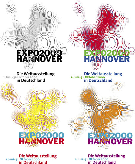
Logos designed by QWER, Iris Utikal and Michael Gais.

Hannover’s Expo 2000 wasn’t very successful as expositions go but it had an attractive logo, a combination of bold sans-serif type with a moiré background pattern which ideally had to be seen in its animated form. World expositions tend to be concerned with technical innovations and novelties, and this animated design was certainly novel, if impossible to replicate in print. All the static versions of the logo are essentially screenshots of the moving version, with the moiré image frozen at a various places to generate many shape and colour variations. Not all of these are satisfactory. I think it was Matisse who said that anyone can put two colours together; the real challenge is putting three together in a harmonious manner.

expo_logo.gifThe pattern was a little more animated on the original exposition website, albeit reduced to this tiny gif. The site is mostly intact and browsable at the Internet Archive, a primitive thing by today’s standards but Expo 2000 was the first world exposition with a dedicated website, something which really did set it apart from its predecessors. Many of the exposition’s buildings and exhibits would have seemed bizarre or alarmingly ugly to the people who attended the Paris Exposition Universelle in 1900 but much that was on display in Hannover would at least have been comprehensible to a visitor from the past. Trying to explain what “a website” was to someone in 1900, even a futurologist like HG Wells, would have required considerable effort.
expo2000-2.jpg

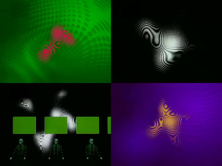
Video for Expo 2000 by Kraftwerk.

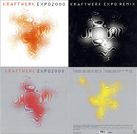
Ephemerality is a distinguishing characteristic of world expositions, all those splendid pavilions and eye-catching constructions don’t last very long even though the events themselves involve years of planning. A list of exposition features that have managed to survive would be a disparate collection, taking in well-known landmarks like the Eiffel Tower, Seattle’s Space Needle and the Atomium in Brussels, architectural projects such as the Grand Palais in Paris and the Biosphere in Montreal, and one-off oddities like the Unisphere in Queens and the cement dinosaurs in Crystal Palace Park. If Expo 2000 is remembered for anything today it’s the one-off song that Kraftwerk wrote for the occasion, Expo 2000, which arrived with graphics and visuals based on the expo logo. Kraftwerk had been hired at great cost to create the jingles in different languages that accompany the animated logo. This is turn led to the song, the group’s first new studio composition in 14 years.

expo2000-4.jpg

I thought these abstract images were a good match for Kraftwerk, I prefer them to the other designs for the single which show the four computer-generated figures that later appeared on the cover of Minimum-Maximum. The CD case at the top left was made with lenticular plastic which imitated the moiré effect of the animated logo. I didn’t buy this one when I had the chance, choosing instead the “enhanced” version which came with a minuscule copy of the video in a CD-ROM section. Like most CD-ROM singles, the audio tracks still play but the enhanced section no longer works. Welcome to the future.

Continue reading “The exposition moiré”