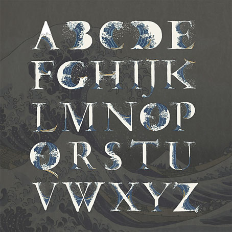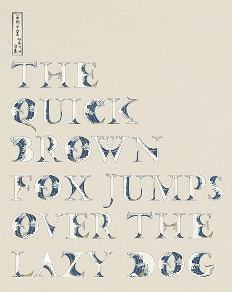
A couple of years ago I posted an incomplete collection of record covers based on Hokusai’s prints, many of which included his most famous work, The Great Wave off Kanagawa. In our age of mechanical reproduction Hokusai’s wave has become as much an emblem for Japan itself as any of the official national symbols, reproduced endlessly in a variety of media while being subject to the usual 21st-century derivations and pastiches. This is a common fate for well-known artworks but Hokusai’s wave is one of the few that are flexible enough to be mutated into a seres of letterforms (you can’t really call this a font) like the ones we have here, a design created by Indonesian designer Aditya Tri which grafts portions of the print onto Garamond serifs. The name of the design, Okinami, is the Japanese word for an offshore wave.

Okinami is an unusual design but this isn’t the first time that Hokusai’s wave has been combined with letterforms. When Tomita’s “Musical Fantasy of Science Fiction”, The Bermuda Triangle, was released in the West it was given new cover art, with a gatefold illustration by Don Punchatz and a title design that added the Great Wave to the modified Sinaloa typeface which by this time had become Tomita’s signature font.

Design by Joseph J. Stelmach.
Are there other examples out there? I wouldn’t be surprised. Meanwhile, Hokusai’s print will be even more visible next year when it appears on the back of the new 1000 Yen banknote. A good argument for the retaining of physical currency, and further evidence that Japan gets all the best things.

Previously on { feuilleton }
• Hokusai record covers
• Waves and clouds
• Tomita album covers
