La route d’Armilia by Schuiten & Peeters

armilia1.jpg

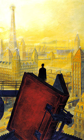
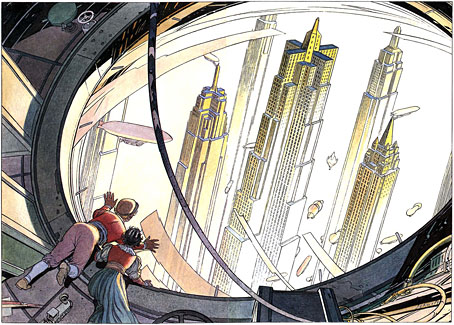
Ferdinand and Hella look down on the skyscrapers of Brüsel.

La route d’Armilia (1988) by François Schuiten and Benoît Peeters is the next substantial story in the Cités Obscures series after La Tour; there was also a book about transportation in the Obscure World, L’Encyclopédie des transports présents et à venir, published the same year. La route d’Armilia is the book where Schuiten and Peeters’ Jules Verne influence comes to the fore, with the story of a young boy whose name is derived from Verne characters, Ferdinand Robur Hatteras, undertaking an airship journey to Armilia at the Obscure World’s northern pole. As with the earlier L’archivist, this is mainly an excuse for Schuiten to demonstrate his prodigious architectural invention and draughtsmanship, although the story this time is more of a piece. The journey takes us from the city of Mylos—a dismal place of factories, chimneys and smoke, like one of the polluted cities of the early Industrial Revolution—over the cities of Porrentruy, Mukha, Brüsel, Bayreuth, Calvani, Genova and København. Each city is substantially different from the last, and one of the pleasures is seeing what the next stop along the way will be like.

armilia2.jpg

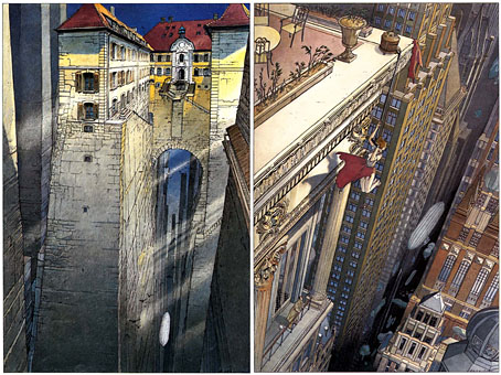
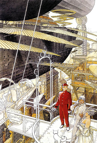
left: the airship passes through the canyon streets of Porrentruy; right: in Brüsel a woman hangs perilously from a ledge. Acrobatics or accident, we never discover which.

Continue reading “La route d’Armilia by Schuiten & Peeters”

The art of François Schuiten

schuiten1.jpg

Paris au XXieme Siecle by Jules Verne (1994).

Following a comment I made last week in the post about the Temples of Future Religions by François Garas I’ve decided it’s time to give some proper attention to one of my favourite comic artists, François Schuiten, a Belgian whose obsession with imaginary architecture resembles the earlier endeavours of Garas and others. Schuiten’s parents were both architects which perhaps explains his predilection. In addition to a large body of comics work, he’s produced designs for film—notably Taxandria by Raoul Servais—Belgian stamps, and a steampunk makeover for the Arts et Métiers station of the Paris Métro. In 1994 he created cover designs and a series of illustrations for the publication of Jules Verne’s rediscovered manuscript, Paris au XXieme Siecle.

schuiten2.jpg

Cover for Spirou (2000).

I first encountered Schuiten’s work in a 1980 issue of Heavy Metal magazine which was reprinting translated stories from the French Métal Hurlant along with original work. Schuiten’s story, The Cutter of the Fog, was an erotic and futuristic tale of a small community and the obsession of the local “fog-cutter”. François’s brother Luc wrote the piece and it bears some similarity with JG Ballard’s Vermilion Sands story, The Cloud Sculptors of Coral D. Unusually for Schuiten, the architecture was downplayed in this one although the small homes with their geodesic roofs are like extrapolations of architectural plans from one of the Whole Earth Catalogues.

The next time I saw his work was several years later when artist Bryan Talbot showed me some of the comic albums he’d brought back from a European convention. Among these there were several of the Cités Obscures books that Schuiten had been creating during the Eighties and Nineties with writer Benoît Peeters. These knocked me out with their apparently effortless creation of an imaginary world comprised of several city states, each with their own unique architectural style, and a wealth of retro-future technology, from dirigibles of all shapes and sizes to ornithopters and huge motorised unicycles. One of the many things I liked about European comic artists, and something which made me favour their work over their American counterparts, was the creation of richly detailed imaginary universes with inhabitants one could expect to meet in our world, not facile superheroes or vigilantes. Schuiten went further than his contemporaries by making the architecture meticulously believable and foregrounding its design to an extent that in some of the Cités Obscures stories architecture itself is the subject.

Continue reading “The art of François Schuiten”

Eduardo Paolozzi’s Jet Age Compendium

paolozzi.jpg

Detail from the cover of Ambit # 40, 1969.

A teenage enthusiasm for Pop Art meant I was familiar with the paintings and collages of Eduardo Paolozzi (1924–2005) long before I became aware of his association with sf magazine New Worlds, and his friendship with JG Ballard. Paolozzi was famously credited on the masthead of New Worlds as “Aeronautics Advisor”, a listing which impressed the relevant authorities when Brian Aldiss petitioned for an Arts Council grant and saved the magazine from collapse. Paolozzi’s work was featured in New Worlds now and then, and he provided a cover for issue 174, but it was to Ambit magazine one had to turn to see regular work by the artist.

paolozzi2.jpg

New Worlds #174, Aug 1967.

My favouritism towards New Worlds has always led me to see Ambit as NW-lite; frequent NW contributor JG Ballard was Ambit‘s fiction editor, and both stood to the side of the British literary scene, although Ambit editor Martin Bax didn’t share Michael Moorcock’s preference for pursuing generic or experimental means to Romantic or visionary ends. Quibbles aside, it’s good to see Paolozzi’s work for the magazine is now the subject of an exhibition, The Jet Age Compendium, at Raven Row, London, and also a book, The Jet Age Compendium: Paolozzi at Ambit from Four Corners Books. If you can’t see the former, the latter is priced £12.95 which strikes me as very reasonable.

The Jet Age Compendium runs until 1 November 2009. For an insight into the artist’s interests and attitudes, there’s a great Studio International interview here from 1971 with Paolozzi and Ballard talking to art critic Frank Whitford.

Previously on { feuilleton }
Sculptural collage: Eduardo Paolozzi
Revenant volumes: Bob Haberfield, New Worlds and others

Outer Alliance Pride Day

outer.jpgToday is Outer Alliance Pride Day so let’s begin with a statement:

As a member of the Outer Alliance, I advocate for queer speculative fiction and those who create, publish and support it, whatever their sexual orientation and gender identity. I make sure this is reflected in my actions and my work.

Various members of the Outer Alliance are either posting fiction, or reviewing something or otherwise attempting to fill that declaration of intent. For my part I decided today to do a sketch based on my favourite chapter of The Ticket that Exploded by William Burroughs, the sequence entitled the black fruit which Burroughs wrote with Michael Portman. Ticket was the first Burroughs book I read at the age of 16 or so, having discovered a copy in a local library, and it really felt like something exploding in the head. For a start, the text is some of his least accommodating for an average reader, although I was already familiar enough with literary experiment to cope with that. Far more electrifying was seeing familiar scenarios from science fiction and fantasy infused with a raw and relentless gay sexuality of endless erections and spurting cocks. The black fruit begins with a science fiction scene of lost astronauts encountering alien fishboys intent on having sex; it then progresses through a series of descriptions which read like a pornographic rewriting of similar scenes from HP Lovecraft or Clark Ashton Smith. In the opening pages of Ticket, Burroughs describes his book as “science fiction” but this was like no sf I’d read; I started to wish there was more like it. There are flashes of similar stuff in The Soft Machine (including an idea borrowed from Henry Kuttner) and elsewhere, and Cities of the Red Night is pretty much a full-on fantasy in its second half, but I’d still like to read more about the fishboys…

fishboy

Fishboy and Astronaut (detail).

So here’s an explicitly erotic sketch based on the black fruit (click the picture for the full thing). This should have been a lot better but I’m out of practice drawing at the moment and I didn’t give myself enough time. The scene doesn’t really match the book either, and the astronaut figure is pretty crappy. Feeble excuses aside, Burroughs’ rotting swamp gardens with their marble statues of copulating boys deserve better. And where his fiction leads, I’m still hoping that more writers will follow, not by copying his obsessions but by being as fearless and honest in mining their own.

Previously on { feuilleton }
William S Burroughs: A Man Within
The art of NoBeast

More book design

hotel.jpg

Yes, it’s been a busy year. These are books three and four respectively of the titles I’ve been designing for Tachyon Publications, and there are more on the way.

Kage Baker’s The Hotel Under the Sand is a charming fantasy for children concerning the hotel of the title and its curious inhabitants, which include a ghost bellboy and a pirate captain. The illustrations were by Stephanie Pui-Mun Law and I tried to complement these with the lettering design and graphic elements. I always enjoy working on illustrated books.

fandsf.jpg

The Very Best of Fantasy & Science Fiction is a very different beast, a big (480 pages) selection by Gordon Van Gelder of some of the many first-class stories from the sixty-year history of the fiction magazine. F&SF has published so many classic stories over the years the book could easily have been twice as big. As it is there are pieces by Alfred Bester, Ray Bradbury, Shirley Jackson, Philip K Dick, Harlan Ellison, Stephen King and Neil Gaiman, among others. The design in this case came from studying a copy of the magazine from 1967; I was already thinking of using Bodoni for the story titles and that choice was confirmed when I saw it used for the same purpose in the magazine. The calligraphic titles were also scanned from there, their design going back to the very first issue.

Both these books are on sale now, and Keith Brooke gave a glowing appraisal to the latter in The Guardian at the weekend.

Previously on { feuilleton }
Medicine Road by Charles De Lint
The Best of Michael Moorcock