The title comes from a newspaper headline, one of many that the tabloid press bestowed on occultist Aleister Crowley whilst titillating their readers with lurid descriptions of orgies and Black Masses throughout the 1920s. Before the Second World War it was still possible to label a self-aggrandising magus “The Wickedest Man in the World”. If only they knew what was coming…
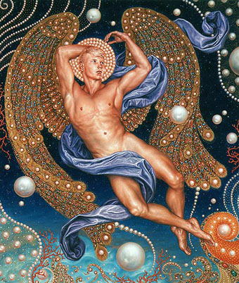
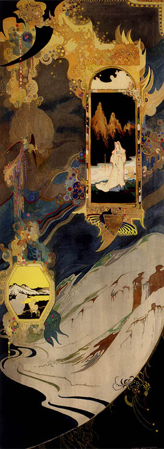
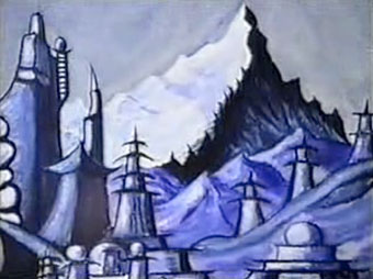
The picture above is a still from Kenneth Anger’s 2002 film of Crowley’s paintings which you can see in two parts at YouTube. The paintings were filmed in exhibition at the October Gallery in 1998 and Anger turns the original tabloid headline around by making the “hang” refer to hanging a painting. Crowley’s crude artwork often turns up in books but there are several pictures in the film I hadn’t come across before. Crowley’s depiction of the Himalayas, where he spent some time mountaineering, look very similar to those of Nicholas Roerich, the painter whose work HP Lovecraft references in At the Mountains of Madness. It would have been nice to have some more information about the pictures but that’s not Anger’s style.
• The Man We Want to Hang pt 1 | pt 2
Previously on { feuilleton }
• Relighting the Magick Lantern
• Kenneth Anger on DVD…finally
• The art of Cameron, 1922–1995
• Austin Osman Spare