A Penrose pentagram

hofstadter.jpg

A classic text although that cover art always looks a little off. I’m sure MC Escher would have insisted on the triangle being equilateral.

Most people are familiar with the Penrose triangle by sight even if they don’t know who “Penrose” was. (Psychiatrist Lionel, together with his son, Roger, the celebrated mathematician and physicist.) I’ve been playing with these things for years, most notably on the cover art I created for Zones by Hawkwind, although the triangle also formed the basis for the robot pathways I created a couple of years ago when illustrating Bruce Sterling’s Robot Artists and Black Swans.

pentagram.jpg

Earlier this week it occurred to me that I hadn’t tried applying the Penrose effect to a pentagram. For a fleeting moment I thought the idea might be a novel one but a quick web search disabused me of this; plenty of similar examples exist already. Here it is anyway, after 20 minutes or so in Illustrator. I’m tempted to try a few more things like this when I have the time. Many possibilities present themselves.

Previously on { feuilleton }
More Swans and Robots

Jan Parker’s witches

parker01.jpg

Also witch-finders, demons, magi, and a skeletal Adolf Hitler clutching a glowing crystal ball… Jan Parker is a British artist who was working as an illustrator in the early 1970s, during which time he produced a small number of covers for SF and fantasy titles. One of these, The Worlds of Frank Herbert, is a book I used to see a lot on the secondhand shelves although I never owned a copy. As with Victor Valla’s cover art, the 70s was a decade when idiosyncratic imagery of the type created by Parker and co. was a more common sight on genre covers than it is today. Witchcraft and Black Magic, published by Hamlyn in 1971, brought Parker’s brand of naïve weirdness to a Peter Haining history of the more lurid forms of occultism. This is a book that I did own for a while until someone borrowed it and never returned it, a persistent hazard for the books in my not-very-extensive occult library. Haining’s study is the kind of thing that publishers often call a pocket guide, although this suggests something you’d carry around to be used as an identification tool during chance encounters; you wouldn’t want to encounter most of the people (never mind the creatures) in these paintings.

parker02.jpg

A handful of Parker’s illustrations turned up some years ago at the now-defunct Front Free Endpaper, then were reblogged at Monster Brains and elsewhere. The copies here are from another recent upload at the Internet Archive where the book is part of a sub-archive of titles scanned from Indian libraries. The very tight binding evidently presented difficulties for the scanner, hence the appearance of fingers holding open most of the pages. It’s good to see this one again; I always valued the book more for the artwork than the text which isn’t bad but was simply another commission for the very prolific Haining, a writer who was a better anthologist than a historian. If you want a general history of the occult there are more authoritative options elsewhere.

parker03.jpg

As for the artwork, I wonder now how long it took Parker to paint all these pictures. There are about 80 original illustrations plus a number of others taken from antique books or from artists such as Frans Hals and Goya; that’s a lot of original art for a book of only 160 pages. Many of Parker’s pieces are copies of pre-existing portraits or of familiar illustrations like the perennially popular demons from de Plancy’s Dictionnaire Infernal. This makes me wonder why Hamlyn commissioned copies from Parker rather than simply paying a picture library for the original images as Marshall Cavendish were doing in 1971 with their multi-part encyclopedia, Man, Myth and Magic. Whatever the reason I’m pleased they gave Parker so much free reign. His depictions of historical figures wouldn’t be out of place in the portrait gallery in Dance of the Vampires, while some of his other pieces stray into outright Surrealism; the picture of people being menaced by flying eyeballs was used for the cover art of the US reprint from Bantam.

parker04.jpg

Haining’s book had at least one reprint in the UK before going out of print. The early 1970s saw the peak of the occult revival which had begun in the previous decade, and which made room in publishers’ lists for odd little books like this one. Secondhand copies are still floating around although they’re seldom cheap. If you do find one just be careful who you lend it to.

parker05.jpg

Continue reading “Jan Parker’s witches”

Hidden Hands: A Different History of Modernism

hh1.jpg

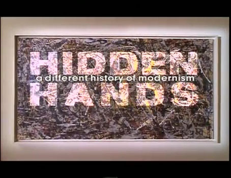
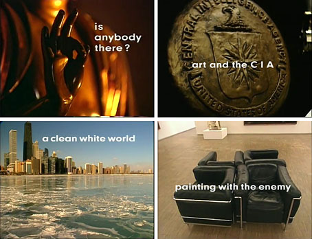
I thought I’d finished with the arts documentaries until I remembered this four-part series from 1995. Hidden Hands was based on researches by Frances Stonor Saunders who also co-produced. As the subtitle suggests, the programmes examined aspects of Modernist art and architecture that weren’t exactly unknown but were often downplayed (sometimes deliberately ignored) by the art establishment. The episodes were as follows:

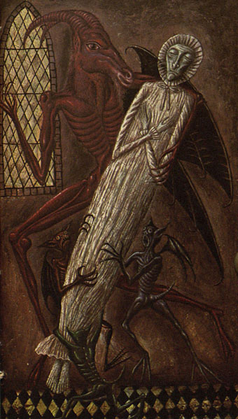
1: Is Anybody There? The occult roots of abstract painting, especially the influence of Theosophy on Vasily Kandinsky and Piet Mondrian. Kazimir Malevich and František Kupka are also mentioned at the beginning of the programme but we don’t hear anything more about them.

2: Art and the CIA. A history of the Congress for Cultural Freedom, a CIA front for channelling money to avant-garde exhibitions and literary magazines during the Cold War.

3: A Clean White World. Modernist architecture as a reaction to, and proposed solution for, the squalor of 19th-century city life. Also the similarity between the impulses that drove the Modernist architectural ideal, and the later health and purity obsessions of European fascist states.

4: Painting with the Enemy. The inadvertent way in which the animus towards “degenerate art” shared by the Nazis and the Vichy regime in occupied France helped sustain Modernism during the war years.

hh2.jpg

This is a very good series on the whole, informative and with a roster of authoritative interviewees. The narration overstates the contrarian angle in places but that’s television for you. Much of the history under investigation wasn’t necessarily hidden, more sidestepped by general discussions of 20th-century art. Even so, fifteen years earlier in the architecture episode of The Shock of the New, Robert Hughes covered similar territory and with similar criticisms, following the development of what would become known as the International Style while noting Mussolini’s adoption of a Modernist idiom for the architecture of Fascist Italy.

Elsewhere, when Hughes reviewed a major Kandinsky retrospective he paid sufficient attention to Kandinsky’s Theosophical beliefs; this was in 1982 for TIME magazine, not exactly an obscure publication. Theosophy’s ectoplasmic tentacles are all over the art of the late 19th century so you’d expect some crossover into the art of the new century, as there was in the careers of the artists themselves. (Matisse was a pupil of Gustave Moreau, for example, an inconvenient detail that often irritated critics.) Given the amount of artists swayed by Madame Blavatsky’s writings, a more interesting argument might have been to propose Theosophy as the prime cause of early abstraction rather than another inconvenient factor in its development. Hilma af Klint’s pioneering abstract paintings were as much products of her Theosophical studies as were those of Kandinsky but in the 1990s nobody was paying her very much attention.

hh3.jpg

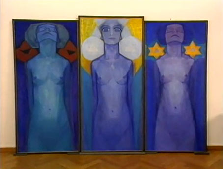
Mondrian’s mysticism: Evolution (1910–1911).

As for the CIA, the agency’s clandestine cultural adventures were exposed by a leak in the late 1960s—Stephen Spender famously resigned in shame from his editorship of Encounter magazine—so this could almost be classed as old news. What you wouldn’t have had in the past, however, is the agents involved in the scheme openly discussing their activities.

Continue reading “Hidden Hands: A Different History of Modernism”

Weekend links 620

varo

Premonition (1953) by Remedios Varo.

• “Classical mythology, Arcadian idylls, occult speculation, and an interest in cultural curiosities coexisted in the grotto, allowing for the playful exploration of a new tension emerging between Nature and Artifice.” Laura Tradii explores the artificial grottoes of the Renaissance and beyond.

• “Some of the symbols and signs seem like bridges to nowhere, and perhaps Nabokov was lovingly teasing our endless quest to find patterns and generate meaning.” David M. Rubin on writing a response to a Nabokov short story.

• New music: “KMRU & Aho Ssan erupt in post-apocalyptic extremity with Resurgence“. I did the layout for this latest release on the Subtext label but I still haven’t got round to updating my web pages so you’ll have to take my word for it.

• Powell & Pressburger’s Black Narcissus “unleashes a level of eroticism that’s surprising for 1940s British cinema,” says Adam Scovell.

• “Premonitions are impossible, and they come true all the time.” Fiona Sturges reviews The Premonitions Bureau by Sam Knight.

• Between Hell and Paradise: paintings by Hieronymus Bosch and his followers at the Museum of Fine Arts, Budapest.

• At The Collector: Olivia Barrett on the Voodoo Queens of New Orleans.

• Steven Heller’s font of the month is Astronef Super.

• Mix of the week: Isolatedmix 118 by Pan American.

TMP-01 Vintage Synth TV Series from Benge.

• Vale, A Year In The Country.

Premonition (1979) by Simple Minds | Premonition (1980) by Cabaret Voltaire | Premonition (Giant Empty Iron Vessel) (1987) by David Sylvian & Holger Czukay

Led Zeppelin IV: Jimmy Page versus Little Bo-Peep

lz4.jpg

Background graphics by Aubrey Beardsley, 1893.

You’d think by now that everything would be known about an album with a Godzilla-sized cultural footprint like Led Zeppelin IV. I certainly thought so until last week when I turned up the source of something that the more obsessive Zepp-heads have been pondering for years. If this puts a bustle in your hedgerow then read on.

symbols.jpg

Led Zeppelin’s fourth album has been around now for half a century which means there really is a lot known about every detail of its production. Mysteries that used to confound friends of mine when we were teenagers have long been solved, questions such as what the hell the four symbols assigned to each member of the group actually signified; not only do we know the origin and meaning of those symbols, the enigmatic “Zoso” sigil chosen by Jimmy Page has an entire website dedicated to its various manifestations. We know where the photo on the cover was taken (Birmingham), and why the sleeve is devoid of identification (Page was annoyed with the press reaction to the previous album); we know that the hermit painting inside the gatefold is based on the Tarot card by Pamela Colman Smith, and we also know a great deal about the writing and recording of Stairway To Heaven. Erik Davis logged much of this in his 33 1/3 study of the album, and while he examines the band symbols in some detail he doesn’t say much about the rest of the hand-written inner sleeve beyond this comment:

Is there a meaning to the nifty Arts and Crafts typeface that Page lifted for the Stairway To Heaven lyrics on the other side of the sleeve? Or just a vibe?

The source, if not the meaning, of this script has been intriguing Zeppelin fans for many years, but I wasn’t aware of this until I happened to be reading the Wikipedia entry about the album and found myself equally intrigued. The game was afoot, Watson.

soh1.jpg

It makes them wonder: the hand-lettered lyrics.

A persistent question you see in fan circles is “What font was used to create X?” People will ask this question even when the design is a one-off, like Syd Mead’s logo for Tron, or something that’s obviously been lettered by hand. Led Zeppelin IV is an album guaranteed to raise the “What font?” question because the lyrics of the group’s most famous song, Stairway To Heaven, cover an entire side of the inner sleeve. On one of the fan forums I was reading someone was eager to identify “the font” because they wanted to apply the words to a bedroom wall. Many more people must have copied out those lyrics since 1971; I once had to do this myself for a female friend who was so besotted with Jimmy Page that she wanted the lyrics in a frame on her own bedroom wall.

tracks.jpg

According to the Wikipedia entry, Page revealed the source of the lettering to be an issue of The Studio, the British art and design magazine which helped launch Aubrey Beardsley’s career and did much to develop and promote the Art Nouveau style in the 1890s. I’m very familiar with The Studio, many posts here refer to it, and I happen to have a complete collection of issues downloaded from the journal archive at Heidelberg University. Seeing the magazine mentioned in this context immediately made me want to find the design that Page had adopted, but before I started flicking through thousands of pages I looked around to see if any of the Zepp-heads had tried searching for the magazine themselves. Evidently not; all the discussion I’ve seen about the inner sleeve tends to recycle the Wikipedia entry, nobody seems to have bothered looking for copies of the magazine. Okay then…

Continue reading “Led Zeppelin IV: Jimmy Page versus Little Bo-Peep”