Patrick Wolf interviewed

patrick_wolf.jpg

‘There was a fire inside me’

His life was made a misery at school, but all that bullying just fuelled Patrick Wolf’s ambition to become a pop star. Looks like he will have the last laugh, says Maddy Costa.

The Guardian, Friday, February 9th, 2007

PATRICK WOLF was 11 when he saw his first dream shatter. Aged six, he had vowed to become a solo violinist. “I’d heard a violin solo by Rachmaninov on the radio,” he recalls, “and it was so divine my little brain thought: that’s what I want to do.” His parents had booked him piano lessons but he told them: “I don’t like this piano, it’s like playing a calculator.” Sadly, his orchestral career didn’t unfold as planned. “I was always second violinist. They do good harmonies, but I wanted to play that solo.”

To most people, playing second violin would be a fine achievement. But Wolf—a singer, songwriter and multi-instrumentalist—isn’t most people. You can tell by the way the 23-year-old is dressed for an average day ambling about central London. His gangly frame is clad in a checked shirt, knitted hoodie and tattered rabbit-fur jacket, his trousers rolled high above his thin gold shoes. His ash-brown hair is dyed burnt orange. Clearly, this man was born to be a pop star. And at the age of 11, disillusioned with his violin prospects, that’s what he decided to become.

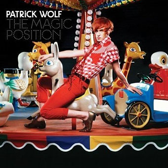
It has taken 12 years and two uncompromising albums but Wolf is finally on the verge of the success he craved. Recently signed to a major label (Polydor subsidiary Loog), he’s about to release The Magic Position, an album of rapturous songs designed to soundtrack summer days and sunny adverts in which strangers hug in the street. The sleeve art captures the mood: it pictures Wolf posing on a carousel. Which hasn’t gone down too well in some quarters. “People think I’m trying to be Gary Glitter,” he says.

The trouble is that, whereas Wolf describes The Magic Position as “the most honest representation of how I live my life and what I want out of life”, the album couldn’t be more different from its two predecessors, Lycanthropy (2003) and Wind in the Wires (2005), both troubled testaments to his difficult youth. Wolf’s tale is one of bullying and depression, rebellion and melodrama, and he prefers to narrate it “with the music”. He’s been known to fabricate details: in early interviews, “I would make up stories about my life, until this legend emerged that I had been born in a lighthouse in Cork. It got out to my relatives in Ireland and I couldn’t live it down.” Since then, he admits: “It sounds quite arrogant, but I realised my life was more interesting than the fantasy.”

(Continues here)
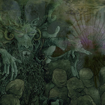
The art of Arik Roper

arik1.jpg

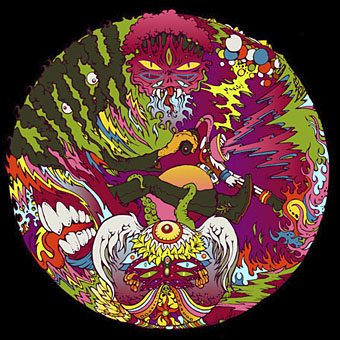
Semyaza (2007).

arik2.jpg

Witch Banner (2006): Witch South x Southwest banner.

arik3.jpg

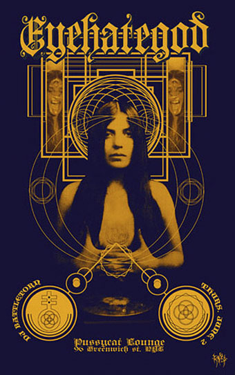
Eyehategod NYC (2005): NYC show poster.

Arik Roper produces much band artwork and design (including for Boris who I’ve been listening to a lot this week). He’s also part of the splendid Arthur posse. Go thou to his work and marvel.

Previously on { feuilleton }
• Underground history
• Barney Bubbles: artist and designer

Lou Reed goes ambient

hudson2.jpg

Technically speaking, not his first ambient work, since the mighty Metal Machine Music is certainly ambient given the way it immerses the listener in 64 minutes of total noise. When you’ve been that far out, why not go in the opposite direction?

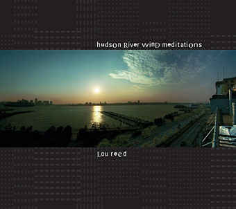
We are pleased to announce plans for the release of Lou Reed’s first ever album of non-vocal electronic music for meditation, Body work, and Tai Chi. This album Hudson River Wind Meditations, will be released by Sounds True Records on April 1st, 2007 (www.soundstrue.com). Go to Lou Reed’s official myspace (www.myspace.com/officialloureed) and stream Wind Coda, a new track from this forthcoming Lou Reed album.

Thanks to Eroom Nala for the tip.

Previously on { feuilleton }
• Thomas Köner
• A playlist for Halloween
• Main

Juice from A Clockwork Orange

clockwork_poster.jpg

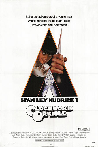
Philip Castle’s poster design. Castle also created the artwork for Full Metal Jacket.

Searching through old magazines whilst researching the epic Barney Bubbles post turned up this, a short reaction by Anthony Burgess to the success of Stanley Kubrick’s Clockwork Orange. Burgess became increasingly ambivalent about the attention brought about by Kubrick’s adaptation, not least because of the way it dominated the rest of his career; some of that ambivalence is already in evidence here.

Juice from A Clockwork Orange
by Anthony Burgess

Rolling Stone, June 8th, 1972

WHEN IT WAS first proposed about eight years ago, that a film be made of A Clockwork Orange, it was the Rolling Stones who were intended to appear in it, with Mick Jagger playing the role that Malcolm McDowell eventually filled. Indeed, it was somebody with the physical appearance and mercurial temperament of Jagger that I had in mind when writing the book, although pop groups as we know them had not yet come on the scene. The book was written in 1961, when England was full of skiffle. If I’d thought of giving Alex, the hero, a surname at all (Kubrick gives him two, one of them mine), Jagger would have been as good a name as any: it means “hunter,” a person who goes on jags, a person who doesn’t keep in line, a person who inflicts jagged rips on the face of society. I did use the name eventually, but it was in a very different novel—Tremor of Intent—and meant solely a hunter, and a rather holy one.

I’ve no doubt that a lot of people will want to read the story because they’ve seen the movie—far more than the other way around—and I can say at once that the story and the movie are very like each other. Indeed, I can think of only one other film which keeps as painfully close to the book it’s based on—Polanski’s Rosemary’s Baby. The plot of the film is that of the book, and so is the language, although naturally there’s both more language and more plot in the book than in the film. The language used by Alex, my delinquent hero, is called Nadsat—the Russian suffix used in making words like fourteen, fifteen, sixteen—and a lot of the terms he employs are derived from Russian. As these words are filtered through an English-speaking mind, they take on meanings and associations unknown to Russians. Thus, Alex uses the word horrorshow to designate anything good—the Russian root for good is horosh—and “fine, splendid, all right then” is the neuter form we ought really to spell as chorosho (the ch is guttural, as in Bach). But good to Alex is tied up with performing horrors, and when he is made what the State calls good it is through the witnessing of violent films—genuine horror shows. The Russian golova—meaning head—is domesticated into gulliver, which reminds the reader he is taking in a piece of social satire, like Gulliver’s Travels. The fact that Russian doesn’t distinguish between foot and leg (noga for both) and arm and hand (ruka) serves—by suggesting a mechanical doll—to emphasise the clockwork-view of life that Alex has: first he is self-geared to be bad, next he is state-geared to be good.

Continue reading “Juice from A Clockwork Orange”

Barney Bubbles: artist and designer

barney1.jpg

Image-heavy post! Please be patient.

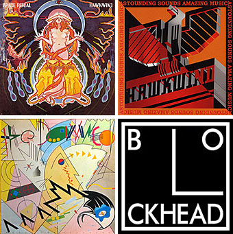
Four designs for three bands, all by the same designer, the versatile and brilliant Barney Bubbles. A recent reference over at Ace Jet 170 to the sleeve for In Search of Space by Hawkwind made me realise that Barney Bubbles receives little posthumous attention outside the histories of his former employers. Since he was a major influence on my career I thought it time to give him at least part of the appraisal he deserves. His work has grown in relevance to my own even though I stopped working for Hawkwind myself in 1985, not least because I’ve made a similar transition away from derivative space art towards pure design. Barney Bubbles was equally adept at design as he was at illustration, unlike contemporaries in the album cover field such as Roger Dean (mainly an illustrator although he did create lettering designs) and Hipgnosis (who were more designers and photographers who drafted in illustrators when required).

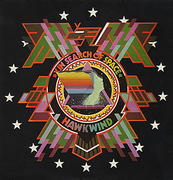
Colin Fulcher became Barney Bubbles sometime in the late sixties, probably when he was working either part-time or full-time with the underground magazines such as Oz and later Friends/Frendz. He enjoyed pseudonyms and was still using them in the 1980s; Barney Bubbles must have been one that stuck. The Friends documentary website mentions that he may have worked in San Francisco for a while with Stanley Mouse, something I can easily believe since his early artwork has the same direct, high-impact quality as the best of the American psychedelic posters. Barney brought that sensibility to album cover design. His first work for Hawkwind, In Search of Space, is a classic of inventive packaging.

Update: BB didn’t work with Mouse in SF, I’ve now been told.

in_search_of_space.jpg

Hawkwind: In Search of Space (1971).

It’s fair to say that Hawkwind were very lucky to find Barney Bubbles, he immediately gave their music—which was often rambling and semi-improvised at the time—a compelling visual dimension that exaggerated their science fiction image while still presenting different aspects of the band’s persona. In Search of Space is an emblematic design that opens out to reveal a poster layout inside. One of the things that distinguishes Barney Bubbles’ designs from other illustrators of this period is a frequent use of hard graphical elements, something that’s here right at the outset of his work for Hawkwind.

This album also included a Bubbles-designed “Hawklog”, a booklet purporting to be the logbook of the crew of the Hawkwind spacecraft. I scanned my copy some time ago and converted it to a PDF; you can download it here.

Continue reading “Barney Bubbles: artist and designer”