
RIP Arthur magazine.
Bad news.
Category: {magazines}
Magazines
Sculptural collage: Eduardo Paolozzi
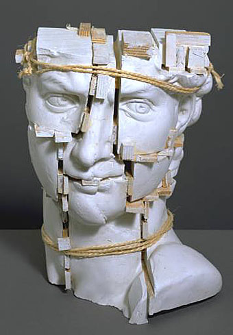
Michelangelo’s ‘David’ (1987).
In a similar vein to the dismembered Soviet monument in the previous post, there’s the sculpture of the late, great Eduardo Paolozzi (1924–2005). The giant head of Invention is especially impressive when seen in situ outside London’s Design Museum, its pieces separated by the words of a Leonardo da Vinci quotation: “Human subtlety will never devise an invention more beautiful, more simple or more direct than does Nature, because in her inventions, nothing is lacking and nothing is superfluous.”
It should be noted, in light of another recent post, that Paolozzi was associated with New Worlds when the magazine was at its height, credited (jokingly) as “Aeronautics Advisor” even though he had little or nothing to do with the publication aside from being friends with contributor JG Ballard. There’s a great Studio International discussion here from 1971 between Paolozzi, Ballard and critic Frank Whitford, in which they talk around the subjects of Surrealism, violence in life and the arts, and other typically Ballardian concerns.
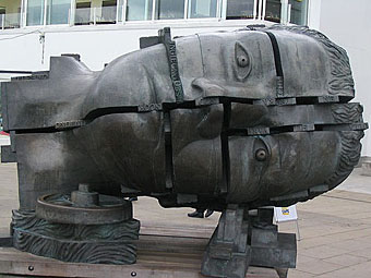
Invention.
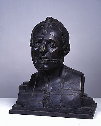
Portrait of Richard Rogers (1988).
Previously on { feuilleton }
• Revenant volumes: Bob Haberfield, New Worlds and others
• JG Ballard book covers
• Ballard on Modernism
Revenant volumes: Bob Haberfield, New Worlds and others
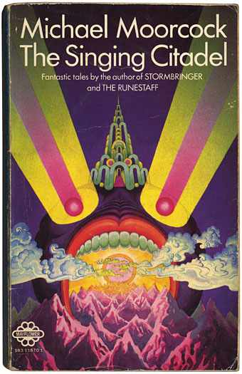
The Singing Citadel (1970).
Michael Moorcock’s Elric books are being prepared for republication by Del Rey in the US next year. I’ve assisted with some minor parts of this preparation, including sourcing pictures from Savoy’s edition of Monsieur Zenith the Albino. (Anthony Skene’s albino anti-hero is a precursor of Moorcock’s albino anti-hero.)
Discussion of the Elric books with Dave at Savoy prompted my excavation of this battered Mayflower paperback from the retired book boxes. This slim volume collected four fantasy stories: the title piece (possibly the first Elric story I read), Master of Chaos, The Greater Conqueror and To Rescue Tanelorn…. I’d forgotten about the garishly strange cover, one of many that Bob Haberfield produced for Moorcock’s books during the 1970s. Haberfield is one of a number of cover artists from that period who worked in the field for a few years before moving on or vanishing entirely. The swirling clouds derived from Tibetan Buddhist art identify this as one of his even without the credit on the back; later pictures were heavily indebted to Eastern religious art and while technically more controlled they lack this cover’s berserk intensity. Haberfield’s site has a small gallery of his splendid paintings, including a rare horror work, his wonderfully eerie cover for Dagon by HP Lovecraft.
Searching for more Haberfield covers turned up these two examples, both part of the SciFi Books Flickr pool, a cornucopia of pictures by vanished illustrators. Browsing that lot is like being back inside the In Book Exchange, Blackpool, circa 1977. The digitisation of the past continues apace at the Old-Timey Paperback Book Covers pool and the Pulp Fiction pool. Don’t go to these pages if you’re supposed to be doing something else, it’s easy to find yourself saying “just one more” an hour later.
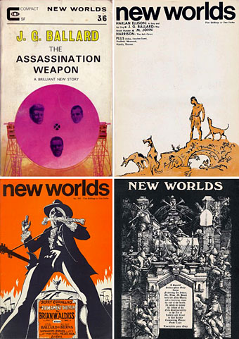
And in other Moorcock-related news, Jay alerts me today to the existence of an archive of New Worlds covers, something I’d been hoping to see for a long time. New Worlds was one of the most important magazines of the 1960s, mutating under Moorcock’s editorship from a regular science fiction title to a hothouse of literary daring and experiment. As with so many things in that decade, the peak period was from about 1966–1970 when the magazine showcased outstanding work from Moorcock himself, JG Ballard, Brian Aldiss, Harlan Ellison, Samuel Delany, M John Harrison, Norman Spinrad and a host of others. For a time it seemed that a despised genre might be turning away from rockets and robots to follow paths laid down by William Burroughs, Salvador Dalí, Jorge Luis Borges and other visionaries. We know now that Star Wars, Larry Niven and the rest swept away those hopes but you can at least go and see covers that pointed to a future (and futures) the world rejected.
Elsewhere on { feuilleton }
• The book covers archive
• The illustrators archive
Previously on { feuilleton }
• Barney Bubbles: artist and designer
• 100 Years of Magazine Covers
• It’s a pulp, pulp, pulp world
Monocle

Monocle is Tyler Brûlé’s international news magazine which launches today, although it wasn’t available in Sainsbury’s or at the mundane newsagents of South Manchester. Maybe they’re only stocking it at the airport.
I like the cover layout. Black is a surprising choice and the decision to feature a cover photo uncluttered by stray type and a barcode is very welcome. The design is carried over to the equally elegant website whose creation was overseen by Dan Hill of City of Sound.
Previously on { feuilleton }
• 100 Years of Magazine Covers
Radical architects and their magazines
Such Cheek! Those Were the Days, Architects
by Nicolai Ouroussoff
New York Times, February 8th, 2007
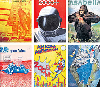
IF YOU ARE revolted by today’s slick and fashion-obsessed architecture scene, hurry over to ‘Clip/Stamp/Fold: The Radical Architecture of Little Magazines‘ at the Storefront for Art and Architecture. You’ll feel even worse.
Organized by the architectural historian Beatriz Colomina, the show examines the world of those small magazines from the early 1960s to the end of the 1970s, when the field of architecture was still marked by a playful intellectual and political independence. It’s packed with gorgeous cover images, from copulating robots to an elephant attacking the Solomon R. Guggenheim Museum in Manhattan to a skyscraper made of Swiss cheese. Often thrown together on a shoestring budget, the magazines have an intoxicating freshness that should send a shudder down the spine of those who’ve spent the last decade bathed in the glow of the computer screen.
But this is not an exercise in nostalgia. It’s a piercing critique, intended or not, of the smoothness of our contemporary design culture. These magazine covers map out an era when architecture was simmering with new ideas. You’re bound to leave the show with a nagging sense of what was lost as well as gained during the electronic juggernaut of the last three decades.
Part of the magic of this show, which was recently extended for three more weeks, is in the works’ crude immediacy. One side of the gallery is wallpapered in hundreds of colorful magazine covers. On the opposite wall a more detailed timeline maps out the evolution of the culture of architectural magazines, from an obsession with politics and pop culture to a descent into increasingly abstruse and self-involved theoretical debates. The rarest magazines are encased in clear plastic bubbles (made of cheap plastic skylights that the show’s curators bought on Canal Street), evoking time capsules descended from outer space.