Kaleidoscope: the switched-on thriller

kaleidoscope1.jpg

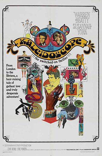
I’ve not seen Jack Smight’s 1966 caper movie for years, and don’t remember much about it beyond Maurice Binder’s kaleidoscopic title sequence. But I like this collage poster, a suitably frenetic piece for one of Hollywood’s many attempts throughout the 1960s to capitalise on modish fashion. I can’t find a credit for the designer so if anyone knows who was responsible, please leave a comment.

kaleidoscope2.jpg

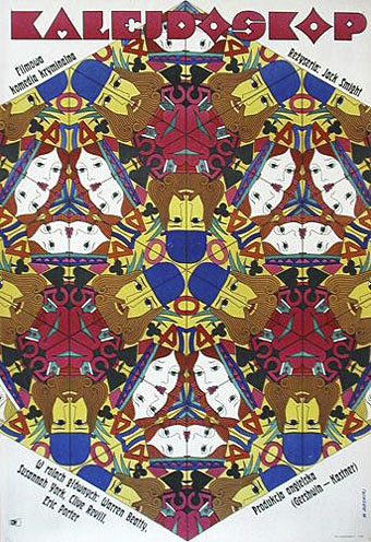
This Polish poster, on the other hand, is the work of Witold Janowski who successfully combines the film’s title with its playing card theme. Too arty and cerebral for Hollywood (No girls!…no guns!) but that’s how it is with all those great Polish poster artists.

Update: the US poster was by the great Bob Peak.

Previously on { feuilleton }
The Robing of The Birds
Franciszek Starowieyski, 1930–2009
Dallamano’s Dorian Gray
Czech film posters
The poster art of Richard Amsel
Bollywood posters
Lussuria, Invidia, Superbia
The poster art of Bob Peak
A premonition of Premonition
Metropolis posters
Film noir posters

Telling Tales at the V&A

table.jpg

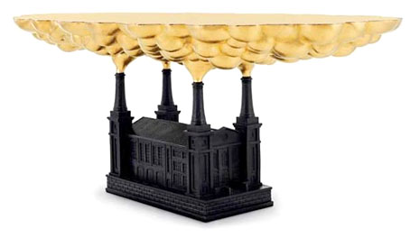
Robber Baron Table (2006) By Studio Job.

Telling Tales, a free exhibition now running at the V&A, London, is subtitled Fantasy & Fear in Contemporary Design. Looking at Studio Job’s timely and prescient Robber Baron Table, “fear and loathing” might be more suitable; a must for the current crop of squalid parasites in the banking industry. And speaking of parasites, among the exhibits there’s also the gilded grubs of Kelly McCallum whose work was featured here last September.

This exhibition explores the recent trend among European designers for unique or limited edition pieces that push the boundaries between art and design. It showcases furniture, lighting and ceramics, designed by a new generation of international designers, including Tord Boontje, Maarten Baas, Jurgen Bey and Studio Job, who are all inspired by the spirit of story-telling. Each tells a tale through their use of decorative devices, historical allusions or choice of materials, sharing common themes such as fantasy, parody and a concern with mortality.

Telling Tales runs until October 18, 2009.

Previously on { feuilleton }
Al Farrow’s Reliquaries
Kelly McCallum’s insect art

Charles Ricketts’ Hero and Leander

ricketts1.jpg

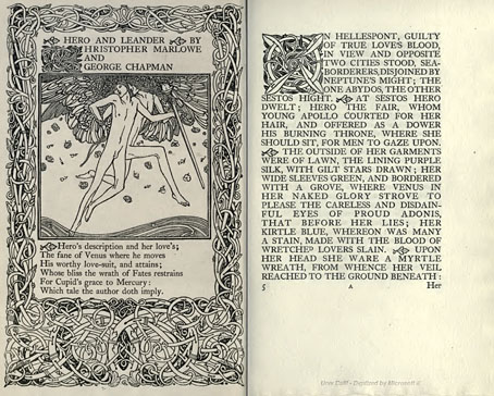
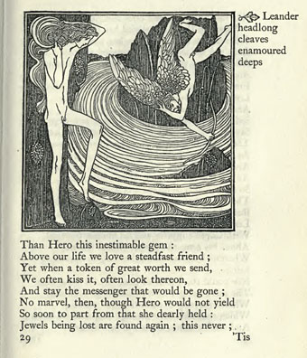
Enthusiasts of Charles Ricketts’ illustrations can find book collections of his drawings and paintings but the artist (with partner Charles Shannon) was also a printer, typographer and book designer who would no doubt have preferred his illustrations to be seen in their intended setting. The Internet Archive has a few choice examples of Rickett’s books, of which the most profusely illustrated is Hero and Leander (1894), Christopher Marlowe’s poem (completed by George Chapman).

ricketts2.jpg

Also of interest is Danaë (1903) by Thomas Sturge Moore with its black and red type, A Bibliography of the Books Issued by Hacon & Ricketts (1904), and A Defence of the Revival of Printing (1899). The latter is of interest to book designers and typographers for its presentation of Ricketts’ aesthetic philosophy. Ricketts’ and Shannon’s books made continual use of a small leaf motif as a pilcrow to mark a fresh paragraph. In A Defence of the Revival of Printing Ricketts discusses his replacement for the ampersand (&), which he disliked, preferring instead a new character combining the letters E and T, ampersands being a contraction of the Latin word “et”. There’s also some discussion of his unique type designs which he charmingly refers to as “founts”, preferring, like contemporary William Morris, the antique terminology.

ricketts3.jpg

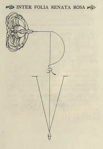
Colophon from Hero and Leander. A rose forms the monogram of Ricketts’ and Shannon’s Vale Press.

Elsewhere on { feuilleton }
The illustrators archive

Previously on { feuilleton }
Art Nouveau illustration
Dorian Gray revisited

Layered Orders: Crowley’s Thoth Deck and the Tarot

magus.jpg

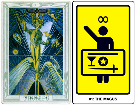
left: The Magus from the Thoth Tarot by Frieda Harris and Aleister Crowley (1938–1940?); right: The Magus from The Major Arcana by John Coulthart (2006).

Phantasmaphile presents another magickal art event in NYC next week. Layered Orders: Crowley’s Thoth Deck and the Tarot is described as “a personal narrative by Jesse Bransford”, an artist with a very distinctive approach to traditional occult symbolism. Bransford’s talk will focus on the peerless Thoth Tarot deck which Frieda Harris painted over several years under the careful direction of Aleister Crowley. The Thoth deck for me is still the ultimate Tarot deck. Crowley and Harris sought to create a Tarot for the 20th century, throwing out much of its tired and degraded iconography. This they replaced with dramatic interpretations which brought new layers of symbolism to the cards—including references to contemporary science—and also acknowledged the developments of Cubism and Futurism in the visual sphere. Tarot decks have proliferated since the 1960s but the Thoth deck has few (if any) rivals. I made use of Crowley’s controversial reordering and renaming of the cards in 2006 when I produced my set of Major Arcana designs based on international symbol signs.

The Tarot in general and Aleister Crowley’s Thoth Tarot in particular represent a miasmic confluence of image and thought into a single structure that is both liberating and overwhelming in its scope. In creating the deck, Crowley (in collaboration with painter Lady Frieda Harris) sought to integrate the mythological structures of the major mystical systems of both Western and Eastern occult traditions and to bring them into line with contemporary scientific thinking. The symbolism of the cards blends Kabbalah, Alchemy, Astrology, Egyptian mythology, quantum physics and even the I-Ching in ways that are at the same time clear and utterly confounding.

In an image-soaked personal narration Bransford, whose research-based artwork has delved into many of the territories Crowley sought to unify, will discuss some of the basic concepts of Tarot symbolism, returning to Crowley’s deck as among the most total example of the cards’ syncretism and as the most controversial.

Layered Orders: Crowley’s Thoth Deck and the Tarot takes place at Observatory, 543 Union Street, Brooklyn, NYC on Friday, July 17 at 7:30pm. Admission is free and there are further details at the Observatory website and Phantasmaphile.

Previously on { feuilleton }
Fata Morgana: The New Female Fantasists
Aleister Crowley on vinyl
The Man We Want to Hang by Kenneth Anger
The art of Cameron, 1922–1995
Der Orchideengarten

orchideengarten.jpg

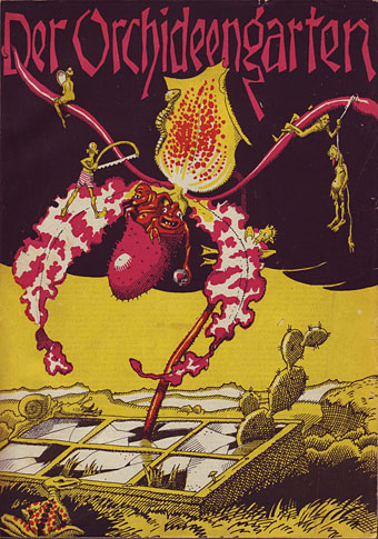
Will at A Journey Round My Skull turned up some gold this week in the form of several covers from a German periodical, Der Orchideengarten, which ran for 51 issues from 1919 to 1921. This is generally credited as being the world’s first fantasy magazine which makes its unaccountable obscurity all the more surprising. Both Will and I first encountered the magazine in Franz Rottensteiner’s essential history of fantasy, The Fantasy Book, published by Thames & Hudson in 1978, with a US edition produced by Collier Books. As well as being a wide-ranging history, Rottensteiner’s book is profusely illustrated throughout and includes two tantalising and distinctly weird covers from Der Orchideengarten, a magazine which Rottensteiner describes as “one of the most beautiful fantasy magazines ever published.” Over the years I’ve found myself becoming thoroughly acquainted with most of the book’s contents as authors were discovered and various gaps filled. One of the few points of obscurity left was that column which describes Der Orchideengarten and those two covers. So you can perhaps appreciate the excitement at seeing more of these rare specimens brought to light.

strobl.jpg

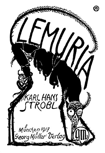
There’s no need to repeat the history when you can read it for yourself on Will’s page and see the covers. One of the magazine editors was author Karl Hans Strobl whose collection of weird tales, Lemuria, had been published two years earlier. This monochrome copy of the cover design is by Richard Teschner, taken from one of my Art Nouveau design books where it stands out like a rather grotesque sore thumb. I don’t know if Teschner was a contributor to Der Orchideengarten but on the strength of this he should have been.

Update: Will posts some interior illustrations.

Elsewhere on { feuilleton }
The illustrators archive

Previously on { feuilleton }
The Great God Pan
Jugend Magazine
Meggendorfer’s Blatter
Simplicissimus