October

october1.jpg

The Burning of the Houses of Lords and Commons, October 16, 1834 (1834 or 1835) by JMW Turner.

The tenth month of the year at the Google Art Project, or the Google Cultural Institute as it now calls itself.

october2.jpg

October (1903) by Károly Ferenczy.

october3.jpg

Near the Village, October (1892) by George Inness.

october4.jpg

October (1878) by Jules Bastien-Lepage.

october5.jpg

Poster for Sergei Eisenstein’s October (1928); Unidentified artist.

Design as virus 18: Sound Effects

sound1.jpg

BBC Sound Effects No 1 (1969). Design by Roy Curtis-Bramwell.

I used to own this album, the first in a series of sound effects collections from the BBC tape library intended for use by musicians, theatre technicians and anyone else who might need a recording of a thunderstorm, fire alarm or creaking door. Going through my diminished stock of vinyl recently reminded me that I got rid of my rather battered copy some time ago. Now that we can sample any sound we come across these library albums are a lot less useful than they were in the analogue era. One result of their ubiquity was that some of the sounds became distractingly familiar; I still can’t listen to Hawkwind’s Warrior on the Edge of Time album without recognising all the cues (wind, seagulls, etc) borrowed from this collection.

sound2.jpg

Sound Affects (1980) by The Jam. Design by Bill Smith with The Jam. Photography by Martyn Goddard & Andrew Rosen.

And speaking of borrowings, the cover design has proved as durable as the sounds. The Jam purloined the grid design and the title for their fourth album in 1980, although the florid typeface of the original was evidently too circusy for the group’s Mod sensibilities. The music inside also tips into pastiche, this being the album featuring Start!, Paul Weller’s plundering of The Beatles’ Taxman.

sound3.jpg

Good Vibrations (2013). Design by Julian House.

Roy Curtis-Bramwell’s grid of photos and drawings was reworked recently by retro-master Julian House in one of a number of poster designs for Good Vibrations, a BBC feature film. House’s designs for the Ghost Box CDs also feature a similar grid arrangement of enigmatic details in their booklet artwork. I hadn’t considered until now that the Ghost Box details may have their origin in the Sound Effects covers.

sound4.jpg

Detail from the sleeve of Seven Songs (1982) by 23 Skidoo. Design by Neville Brody.

All of which had me trying to think of other examples of this idea. The only one that came to mind was the row of seven symbols on Neville Brody’s sleeve for the first 23 Skidoo album. Brody said these don’t necessarily relate to the seven tracks on the album although it’s possible to view them that way. (The running dog appeared later on Brody’s design for the Throbbing Gristle album box.) As usual, if you know of any further examples then please leave a comment.

There’s more about the BBC albums (and pictures of the rest of the series) here.

Elsewhere on { feuilleton }
The album covers archive

Previously on { feuilleton }
Design as virus 17: Boris and Roger Dean
Design as virus 16: Prisms
Design as virus 15: David Pelham’s Clockwork Orange
Design as virus 14: Curse of the Dead
Design as virus 13: Tsunehisa Kimura
Design as virus 12: Barney’s faces
Design as virus 11: Burne Hogarth
Design as virus 10: Victor Moscoso
Design as virus 9: Mondrian fashions
Design as virus 8: Keep Calm and Carry On
Design as virus 7: eyes and triangles
Design as virus 6: Cassandre
Design as virus 5: Gideon Glaser
Design as virus 4: Metamorphoses
Design as virus 3: the sincerest form of flattery
Design as virus 2: album covers
Design as virus 1: Victorian borders

Weekend links 179

tomaselli.jpg

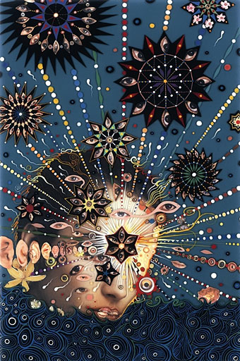
Summer Swell (2007) by Fred Tomaselli. The artist is interviewed at AnOther.

• Mixes of the week for the season of mists and mellow fruitfulness: Forever Autumn Mixtape by The Outer Church, and celebrating what would have been Trish Keenan’s 45th birthday: Trish’s Toys & Techniques Birthday Tape (with cover art by Julian House).

Jirí Kolár: His Life, Work and Cultural Significance to the Czech Republic. Leah Cowan looks into the life and work of this influential Czech artist. Related: Jirí Kolár: poet and collage artist, and collages, rollages and prollages by Jirí Kolár.

• “Name any well-known poet from any age, any country. He or she wrote at least one poem about death, most likely several poems.” Russ Kick introduces his new book, Death Poems.

[M]any pictures in the splendid exhibition at the British Museum show men having sex with men. One of the earliest erotic handscrolls, from the 15th century, shows a Buddhist priest casting longing glances at his young acolyte. Indeed, among some samurai, male love was considered superior to the heterosexual kind. Women were necessary to produce children, but male love was purer, more refined.

The question is why were Japanese – compared not just with Europeans, but other Asians, too – so much more open to depicting sex? One reason might be found in the nature of Japanese religion. The oldest native ritual tradition, Shinto, was, like most ancient cults, a form of nature worship, to do with fertility, mother goddesses, and so forth. This sometimes took the form of worshipping genitals, male as well as female.

Ian Buruma on The joy of art: why Japan embraced sex with a passion. Shunga: Sex and Pleasure in Japanese Art is a forthcoming exhibition at the British Museum.

Harold Offeh on how the cosmic life and music of Sun Ra inspired the artwork decorating the Bethnal Green, Notting Hill Gate and Ladbroke Grove Tube stations in London.

• Fearful symmetry: Roger Penrose’s tiling by Philip Ball. Related: Penrose Tiles Visualizer, and lots more Penrose tiling links at The Geometry Junkyard.

Masculine / Masculine. The Nude Man in Art from 1800 to the Present Day, a new exhibition at the Musée d’Orsay.

• Into the Croation Zone: more derives from Christina Scholz here, here, and here.

Stephen Eskilson on Heteronormative Design Discourse.

Applied Ballardianism

The Zero of the Signified (1980) by Robert Fripp | The League of Gentlemen (Fripp/Lee/Andrews/Toobad, 1981): Minor Man (with Danielle Dax) | Heptaparaparshinokh

More Art Nouveau

artnouveau01.jpg

The Poetry of József Kiss (1897), design by Nándor Gottermayer.

There’s always more Art Nouveau. Searching for term at the Google Art Project turns up a surprising number of paintings, drawings and other objects which are nothing of the sort, as well as many things which are, of course. These are a selection of the latter (mostly), and a reminder that it’s worth returning to the site every so often to look for new additions. Nándor Gottermayer’s book cover is a gorgeous design I’ve never seen before.

artnouveau02.jpg

Vase (before 1890) by Émile Gallé.

artnouveau03.jpg

Flower of Death (1895) by Akseli Gallen-Kallela.

artnouveau04.jpg

The Offering of Mephistopheles (c.1930) by Roland Paris.

Continue reading “More Art Nouveau”

Ikarie XB 1

ikarie1.jpg

A science fiction novel by Stanisław Lem (The Magellanic Cloud, 1955).

ikarie2.jpg

Illustration by Teodor Rotrekl.

A film by Jindřich Polák, adapted from Lem’s novel by Polák and Pavel Jurácek. (1963).

ikarie3.jpg

A Second Run DVD (2013).

With the exceptions of Tarkovsky’s Solaris and Stalker (both in a league of their own), I’ve never been very enthused about Eastern Bloc science-fiction cinema. If I hadn’t been watching some Czech films recently, and listening to the soundtrack music of Zdeněk Liška, I might not have bothered with this one despite its being promoted as a visual influence on 2001: A Space Odyssey. Ikarie XB 1 won the Grand Prize at the Trieste International Science Fiction Film Festival in 1963, a tie with Chris Marker’s La Jetée. (Umberto Eco was one of the judges.) Fifty years on, Marker’s film has hardly dated at all while Ikarie XB 1 seems very much of its time. But Polák’s film still has some things going for it, surprisingly so considering the director was more used to making comedies.

Ikarie XB 1 is a spaceship travelling to Alpha Centauri in the year 2163. The DVD subtitles don’t translate the name Ikarie so unless you already know it means “Icarus” there’s no foreshadowing of any possible threat, at least until the opening shots of a deranged crewman stumbling through empty corridors. Many of the scenes which follow seem over-familiar but only because the scenario of space-crew as interstellar family has become such a standard feature of filmed space opera from Star Trek on. The production design is dated, of course, but the film makes great use of black and white in the lighting patterns, on-screen visuals, clothing designs, etc. It’s easy to see why Kubrick thought it was a cut above other SF films of the period, especially with its widescreen compositions. The DVD booklet (and Kim Newman’s interview on the disc) mention Kubrick’s stylistic borrowings; judge for yourself with these screen-grabs. I was hoping the Liška soundtrack might be more electronic than it is. It’s very much a Liška score—at times you can’t help but imagine a Švankmajer puppet lurking round a corner—but with added reverb and spectral organ chords. The latter assist a sequence where two of the crew members explore an apparently derelict space station.

This page reviews the film in some detail (complete with plot spoilers). For the curious, the entire film is a free download at the Internet Archive.

Previously on { feuilleton }
Fiser and Liska
Two sides of Liska
Liska’s Golem
The Cremator by Juraj Herz