Brion Gysin record covers

gysin01.jpg

Shots (1977) by Steve Lacy.

Continuing an occasional series about artists or designers whose work has been used on record sleeves. The life and work of Brion Gysin (1916–1986) is the subject of a new exhibition, Unseen Collaborator, that opened last week at October Gallery, London. The gallery page mentions Gysin’s connections to the music world: among other things, it was Gysin’s enthusiasm for the Master Musicians of Jajouka that gave those people and their music global prominence, with a little help from Brian Jones. But there are other connections, whether as a collaborator with Steve Lacy, or as a decorator of album covers. Some of these uses are posthumous but this small collection includes a few releases I’d not come across before.

gysin02.jpg

Troubles (1979) by The Steve Lacy Quintet.

gysin03.jpg

Orgy Boys (1982) by Brion Gysin.

A 12-inch single with Gysin reading from William Burroughs and his own writings. “Songs dedicated to his orgy pals: William S. Burroughs, Mick Jagger, Keith Richards, Iggy Pop, David Bowie, Fafa de Palaminy, Patti Smith, Allen Ginsberg and John Giorno…”

Continue reading “Brion Gysin record covers”

Invisible Cities: Miscellanea

cities01.jpg

Cover art: The Castle in the Pyrenees (1961) by René Magritte.

A final post for this week devoted to Italo Calvino’s Invisible Cities, and it occurs to me that “Miscellanea” could easily be the name of one of Marco Polo’s cities.

One thing that’s become apparent over the past few days is that this subject is a very popular one with artists, especially in Italy. This is understandable but it also means you could probably fill another week of posts pursuing further illustrations and homages. Rather than belabour things I’m ending with a few of the more notable derivations including some cover designs. The Einaudi volume above was the first printing in Italy in 1972.

cities03.jpg

Cover design by Arnold Skolnick.

And this was the first American edition from Harcourt, Brace and Jovanovich in 1974. The cover is printed in silver foil which makes the book a particularly desirable item. This might explain why it’s also rather expensive today.

cities04.jpg

Cover art: Martyrdom of a Saint by Monsù Desiderio.

The 1979 Picador edition is one of two paperback editions I own. The enigmatic “Monsù Desiderio” has a confused identity (see this post), and specialised in curious architectural paintings so this is an apt choice.

Continue reading “Invisible Cities: Miscellanea”

Weekend links 265

rainbowhouse.jpg

The White House, Washington DC, on the evening of June 26, 2015.

I can remember that after the cops cleared us out of the bar we clustered in Christopher Street around the entrance to the Stonewall. The customers were not being arrested, but a paddy wagon had already hauled off several of the bartenders. Two or three policemen stayed behind, locked inside with the remaining members of staff, waiting for the return of the paddy wagon. During that interval someone in the defiant crowd outside called out “Gay Power”, which caused us all to laugh. The notion that gays might become militant after the manner of blacks seemed amusing for two reasons—first because we gay men were used to thinking of ourselves as too effeminate to protest anything, and second because most of us did not consider ourselves to be a legitimate minority.

At that time we perceived ourselves as separate individuals at odds with society because we were “sick” (the medical model), “sinful” (the religious model), “deviant” (the sociological model) or “criminal” (the legal model). Some of these words we might have said lightly, satirically, but no amount of wit could convince us that our grievances should be remedied or our status defended. We might ask for compassion but we could not demand justice. Many gays either were in therapy or felt they should be, and the words gay liberation would have seemed as preposterous to us as neurotic liberation (now, of course, Thomas S. Szasz in the United States, RD Laing in Britain and Felix Guattari on the Continent have, in their different ways, made even that phrase plausible enough).

What I want to stress is that before 1969 only a small (though courageous and articulate) number of gays had much pride in their homosexuality or a conviction that their predilections were legitimate. The rest of us defined our homosexuality in negative terms, and those terms isolated us from one another. We might claim Plato and Michelangelo as homosexuals and revere them for their supposed affinities with us, but we could just as readily dismiss, even despise, a living thinker or artist for being gay. Rich gays may have derived pleasure from their wealth, educated gays from their knowledge, talented gays from their gifts, but few felt anything but regret about their homosexuality as such. To be sure, particular sexual encounters, and especially particular love relationships, were gratifying then as now, but they were explained as happy accidents rather than as expected results.

Edmund White writing on The Political Vocabulary of Homosexuality (1980). Reprinted in The Burning Library: Writings on Art, Politics and Sexuality (1994).

• “…after seeing Don’t Look Now, The Wicker Man looked just so dull and flat. What Don’t Look Now has that The Wicker Man doesn’t is a complete mastery of cinema. Don’t Look Now is almost a silent movie, a brilliant, coherent, original and fantastic film that has an enormous emotional impact.” Bernard Rose emoting at length about Nicolas Roeg. Related: Wild Hearts Run Out Of Time, the Roy Orbison video that Rose mentions directing.

• “The male sex organ is depicted not so much as a body part, but more as a fetish object in its own right—a thing independent of the male body, worthy of intense, delirious veneration.” Jason Farago reviewing Tom of Finland: the Pleasure of Play. Related: Same-sex desire through the ages at the British Museum.

• “Sphinx is a typical love story only in the way that it’s the tale of two people who have fallen in love, and things don’t go smoothly. Beyond that…as reader, you have no idea of the gender of either half of this romantic equation.” Chris Clarke reviewing Sphinx, a novel by Anne Garréta.

• “To give space to the musical elements was really a thrill—how far can you get without using too much stuff?” Moritz von Oswald on “the sounds of emptiness”.

• “The problem is not always Helvetica but that Helvetica is all too often the default, the fall-back, the I-really-can’t-be-arsed choice,” says John Boardley.

• Mix of the week: Shaft’s Old Man: An Imaginary Soul Jazz Soundtrack by Aquarium Drunkard.

• “What is the Cut-Up Method?” Ken Hollings explains in a BBC magazine piece and radio feature.

• Nigel Kneale’s Quatermass, the final TV serial, will be released on Blu-ray next month.

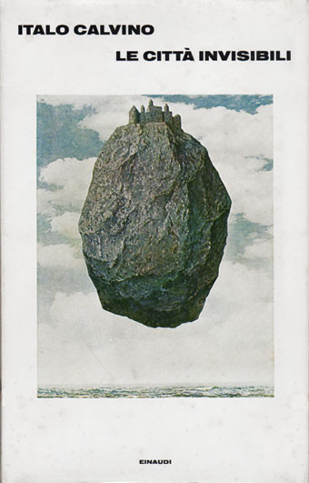
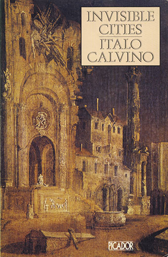
• Relevant to the week’s reading: an archived Italo Calvino site.

Drÿad: a Tumblr.

Sphinx (1989) by Syd Straw | The Sodom And Gomorrah Show (2006) by Pet Shop Boys | Pattern 1 (2009) by Moritz Von Oswald Trio

English printers’ ornaments

ornaments01.jpg

As a book designer you can never have too many printers’ ornaments, especially if you’re required to mimic period designs. These are from a historical overview, English Printers’ Ornaments (1924) by Henry Robert Plomer. Ideally I’d prefer several volumes gathering hundreds of these things from different periods but such a hoard seems a distant dream. Collections like this, and contemporary ones by Dover et al, usually have to suffice instead.

ornaments06.jpg

Continue reading “English printers’ ornaments”

Rock shirts

shirt1.jpg

Arriving in the post at the end of last week was this T-shirt for British Doom band The Wounded Kings. The Shadow Over Atlantis (2010) was the band’s second album, and they asked permission a while ago to use my Cthulhuesque De Profundis piece on this limited edition shirt. Permission was granted happily enough, my only concern was that the fine detail and dark tones might not reproduce well on black fabric. The printing is remarkably good, however, and the circular design and type layout works very well. The shirts are on sale here.

shirt2.jpg

All of which reminded me that I have a couple of shirts from the Hawkwind era in the 1980s. I’ve not aired these designs before, mainly because the Earth Ritual design is one of my many pieces of Hawk-art that I find amateurish. I used to put considerable effort into the cover designs (some of them, anyway; a few were pieces of art sent to Dave Brock as samples that were later used as official covers); but much of the art I produced for the tour programs and merchandise was done in haste, and should have been a lot better considering it was being used for costly souvenirs.

Earth Ritual was the title of an EP released in 1984 that was notable for having Lemmy as guest bassist, his first appearance on a Hawkwind record after being sacked from the band in 1975. I did the cover for that one but I don’t like it very much. The 1984 tour was named after the EP, hence the shirt, although the show was nothing remotely like the elaborate Space Ritual concept. The triangle with a bar on the skull is the alchemical symbol for Earth, a detail the band used in their stage set. I’ve never liked that skull which is very badly drawn, I’d have been better off using a photocopy of the skull on this drawing from the same year. The design was drawn in black ink on white paper; I had no say in the colouring which was done by the merchandise company. From the same drawing they also made small enamel badges (where the skull looks even worse!), and a sew-on patch which looks much better since they dispensed with the skull.

shirt3.jpg

This was the shirt design for the 1985 tour, one of the final designs for the Chronicle of the Black Sword project, and one of the very last pieces I did for Hawkwind. The design of this one is a little more successful although once again the colours weren’t my choice.

These aren’t the only shirts I’ve done for the music world, in addition to other occasional work for metal bands I produced many exclusive designs for Cradle of Filth from 2001–2005 but they never sent me any of those. To return to De Profundis, I ought to note that the artwork is available as a print from CafePress.

Previously on { feuilleton }
The Cosmic Grill
Void City
Hawk things
The Sonic Assassins
New things for July
Barney Bubbles: artist and designer