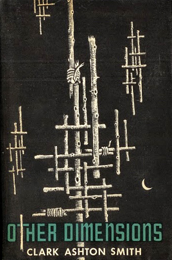
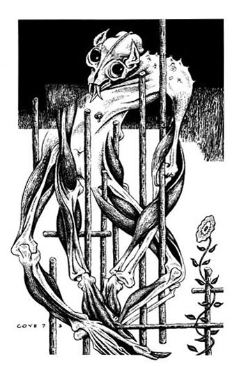
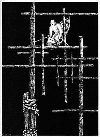
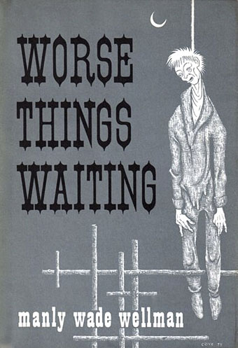
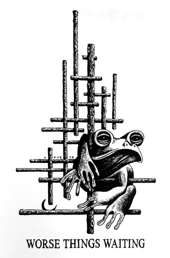
1: Illustrations by Lee Brown Coye
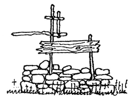
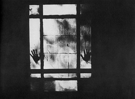
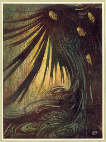
One recurring feature in Coye’s work is the motif of wooden sticks, often in latticework-like patterns. This was inspired by a 1938 discovery in an abandoned farmhouse.
Coye had returned to the North Pitcher, New York, area where he spent much of his childhood. While wandering deep in the woods, Coye discovered an abandoned farmhouse. Boards and pieces of wood which had been set perpendicular to one another surrounded the site. Neither inside nor out could Coye find an explanation for the presence of these crossed sticks. In the years following, Coye remained interested in the significance of his discovery.
When Coye returned to the site in 1963, there was nothing left of the building or the sticks (the area had suffered severe flooding), and he never found out why the sticks were there or who it was that had arranged them in such a manner. Because of the strangeness of the entire experience, these forms never left Coye, and they appear in many of his paintings and illustrations. [Via]
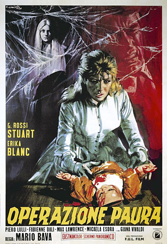
2: A short story by Karl Edward Wagner
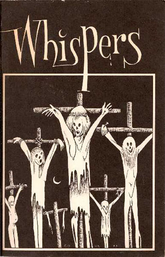
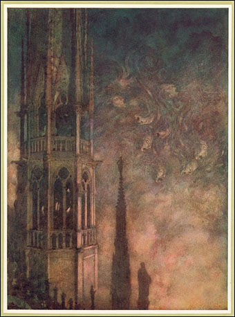
Whispers #3, March 1974. Cover art by Lee Brown Coye.
The story [Sticks] is really Lee Brown Coye’s and is about Lee Brown Coye, as the Afterword [in Whispers #3] explains. Coye had described the events upon which Sticks was based to me, and when Stuart David Schiff decided to bring out a special Lee Brown Coye issue of Whispers, I stole time from my final few months of medical school to write a story inspired by Coye’s experiences. Sticks is shot through with in-jokes and references which the serious fantasy/horror fan will recognize. I wrote the story as a favour and tribute to Lee, and I never expected it to be read by anyone beyond the thousand or so fans who read Whispers. To my surprise, Sticks became one of my best known and best liked stories. It won the British Fantasy Award and was a runner-up in the World Fantasy Award for best short fiction. The story has been anthologized numerous times and translated into several languages. It was broadcast on National Public Radio on Hallowe’en 1982 and was to have been produced for the short lived television series, Darkroom. Not bad for an in-joke. [Via]
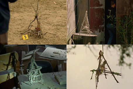
3: Season one of True Detective
4: An invented soundtrack album by Kish Kollectiv
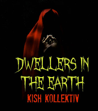
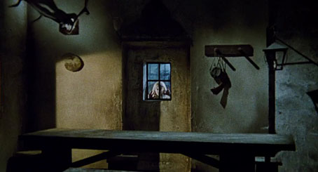
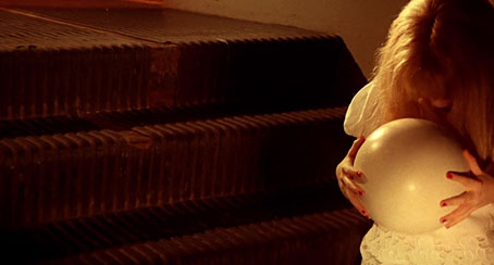
Produced for UK television in 1982 by ATV, the undeservedly obscure Dwellers in the Earth is a loose adaptation of the late Karl Edward Wagner’s short story Sticks (itself an inspiration for The Blair Witch Project). The film—thought lost for many years until a somewhat degraded can of film reel turned up in a private collection in Hong Kong in 2009—has been routinely described as one of the scariest made-for-television horror movies of all time. It was directed by the late Freddie Francis and starred Robert Powell and Jenny Agutter with Michael Ironside, Ian McCulloch and Linda Hayden in supporting roles.
With the kind permission of the composer’s widow, Nadezhda Mastandrea, Kish Kollektiv has painstakingly recreated Staszek Korolenko’s long lost soundtrack score for the mysterious film. The UK-based Kollektiv gratefully acknowledges Mr. Korolenko’s huge influence on its own work. The Anglo-Belarusian composer died at the age of only 43, while the master recordings of many of his scores were later destroyed when the cellar of his family home flooded in 1989. [Via]
Previously on { feuilleton }
• Owls and flowers
• In the Key of Yellow