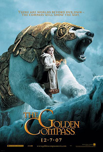
The trailer for The Golden Compass turned up this week, the first part of Philip Pullman‘s His Dark Materials trilogy, and I can’t help but note that the film’s designers have chosen Jonathan Barnbrook’s Mason font for the titles and the rest of the typography. This isn’t so surprising given that Mason has been used on the covers of several editions of the books already but I wonder if this flush of even greater popularity will spell (as it were) the end of a stylish typeface.
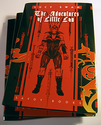
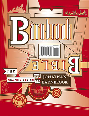
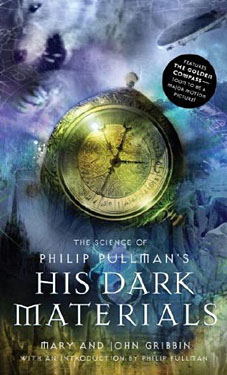 Mason (originally named Manson) was one of Barnbrook’s earliest published type designs, appearing in 1992 via the Emigré foundry, and over the past fifteen years has been widely imitated and become the default font for fantasy works, especially book jackets. The attraction for the genre is obvious in the way the design uses elegant and traditional serif letterforms that have been amended slightly to give them a distinctive quasi-ecclesiastical flavour, with flourishes derived from Greek, Renaissance and Biblical letters. The Gothic arch of the letter A has also helped make the font a popular choice for New Age or occult books. Mason was designed as a set of serif and sans serif variations but it’s Mason Serif Regular which is used the most. (The cover for The Science of His Dark Materials shown here is using both the sans serif variation and Mason Regular Alternate.)
Distinctive fonts take a while to get around and I don’t recall seeing Mason until at least 1994. From 1995 to 2000 it began to appear everywhere, even in newspaper ads for a while, before finding a permanent place in the book world. The trouble with this kind of ubiquity is that the novelty the design once possessed quickly vanishes and it begins to runs the risk of becoming a design cliché. Many typefaces go this way, especially in the publishing world where the choice of typeface is often dictated by genre expectations. So Orbit-B and its variants used to signify “science fiction” or “the future” in the 1970s, Caslon Antique and Rubens have become associated with horror while FF Confidential has been over-used for crime novels.
Continue reading “Masonic fonts and the designer’s dark materials”