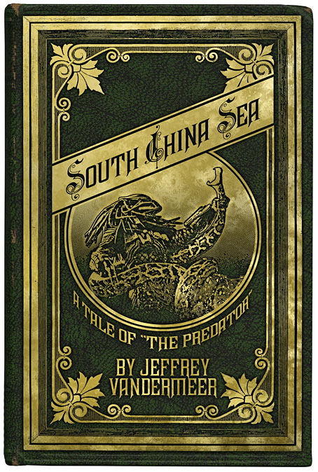
My period reworking of Jeff’s new Predator novel.
Previously on { feuilleton }
• Fungal observations
A journal by artist and designer John Coulthart.

Books
My period reworking of Jeff’s new Predator novel.
Previously on { feuilleton }
• Fungal observations

The Hireling Shepherd by William Holman Hunt (1851).
Holman Hunt and the Pre-Raphaelite Vision is an exhibition of Victorian paintings at Manchester’s City Art Gallery which they describe as “the first international exhibition in over 40 years dedicated to the life and work of Pre-Raphaelite master William Holman Hunt.” It helps that they own some prime examples of Hunt’s work, including The Hireling Shepherd, a painting I used to look at a great deal when I first moved to Manchester.
This isn’t my favourite Holman Hunt work—that would be The Lady of Shalott—but The Hireling Shepherd has a wealth of the insane detail which was his forte. For anyone who’s tried painting in this hyper-real manner it’s good seeing how he rendered the flowers, grass and fabrics. The picture is laden with typical Victorian morality, of course; the shepherd is distracted so his flock is straying. That never interested me, far more fascinating was looking at the original of the work which Brian Aldiss uses in his experimental science fiction novel, Report on Probability A (1968). In one of Aldiss’s parallel universes Holman Hunt’s painting is exactly the same as the one we know but for the addition of a book entitled Low Point X which can be seen lying incongruously on the grass. Whenever I’ve been in the City Gallery I’m always disappointed that the book is missing from the picture.
Holman Hunt and the Pre-Raphaelite Vision runs to 11 January 2009.
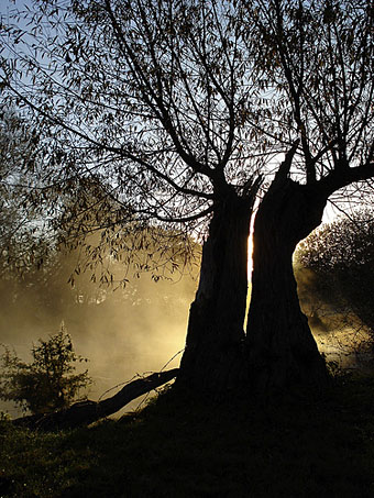
Light play on the river Thame by net_efekt.
…the major products of Mr. Blackwood attain a genuinely classic level, and evoke as does nothing else in literature an awed convinced sense of the imminence of strange spiritual spheres of entities.
The well-nigh endless array of Mr. Blackwood’s fiction includes both novels and shorter tales, the latter sometimes independent and sometimes arrayed in series. Foremost of all must be reckoned The Willows, in which the nameless presences on a desolate Danube island are horribly felt and recognised by a pair of idle voyagers. Here art and restraint in narrative reach their very highest development, and an impression of lasting poignancy is produced without a single strained passage or a single false note.
Thus HP Lovecraft in 1927 from his lengthy overview of horror fiction, Supernatural Horror in Literature. Lovecraft was enthusiastic about many of Blackwood’s weird tales, rating him as one of the contemporary masters along with Arthur Machen. A year before his essay he prefaced The Call of Cthulhu with a Blackwood quote and regularly referred to The Willows as one of his favourite stories. Blackwood’s tale continues to find enthusiasts today, among them the Ghost Box music collective whose Belbury Poly CD titled after the story manages to reference in the space of 44 minutes Blackwood, Machen, CS Lewis and The Morning of the Magicians.
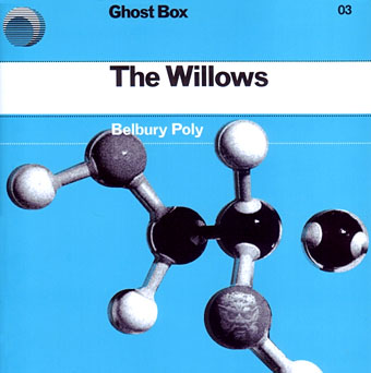
If your curiosity is sufficiently piqued by this point, you can read the story online at Wikisource or Project Gutenberg. Or you can listen to a reading in a new posting at LibriVox. The perfect thing for autumn and the month of Halloween.
Previously on { feuilleton }
• Horror in the shadows
• Wanna see something really scary?
• Ghost Box
• The Absolute Elsewhere
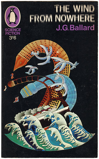
I’ve never been all that keen on Alan Aldridge‘s brand of psychedelic art but it’s worth noting here the (London) Design Museum retrospective which runs from 10 October to 25 January, 2009. Aldridge’s work as a designer and illustrator for Penguin Books in the Sixties impresses me more than his subsequent illustrated Beatles lyrics and The Butterfly Ball and the Grasshopper Feast (1973), a pair of books which seemed ubiquitous in the 1970s. Flickr has a decent selection of his book covers which included a run of sf paperbacks in 1967. Ballard’s The Wind from Nowhere is the very slight debut novel which the author prefers to forget. Where Ballard in Penguin is concerned, David Pelham’s work a few years later was a far more suitable match.
Seeing Aldridge honoured with a big retrospective make me wonder why Roger Dean hasn’t yet been given the same accolade. Dean for me is by far the better artist in terms of distinctive and memorable imagery; he’s also a better draughtsman and far more imaginative designer (not to mention having always been a speculative architect). I suspect Dean’s reputation is still blighted by his associations with Yes and the general antipathy which that band’s name generates in a certain middle-aged sector of Britain’s cultural commentariat. Ballard’s name was equally blighted in literary circles by his science fiction associations and it was Barcelona, not London, which honoured him with a major exhibition recently. There may be some home-grown reappraisals in the offing but I won’t hold my breath.
Elsewhere on { feuilleton }
• The book covers archive
• The illustrators archive
Previously on { feuilleton }
• Ballard in Barcelona
• The New Love Poetry
• Penguin Labyrinths and the Thief’s Journal
• Penguin designer David Pelham talks
• Barney Bubbles: artist and designer