Wicker mania

wicker1.jpg

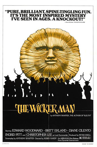
US reissue poster (1979).

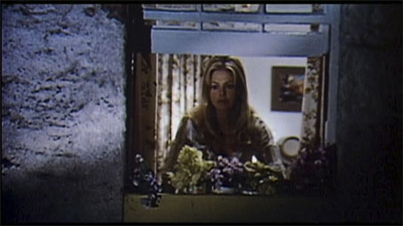
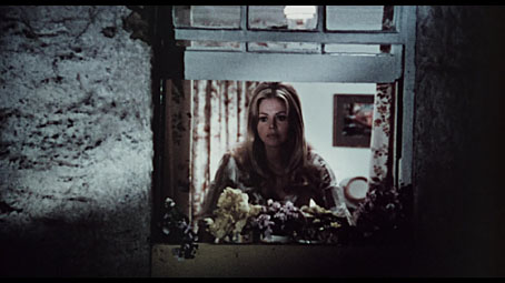
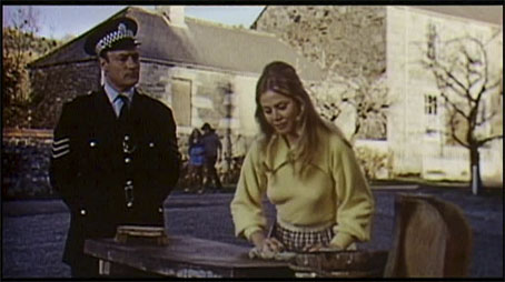
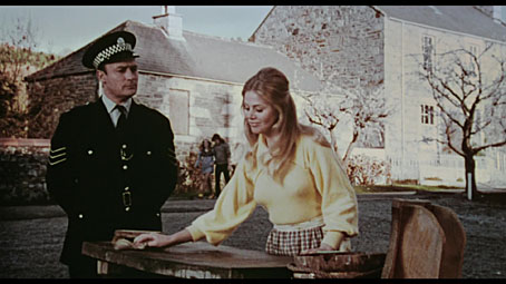
The restored version of The Wicker Man (1973) has been showing in UK cinemas recently, and the Blu-ray edition of the film is released this week. My copy arrived from Moviemail, and while I’m not in a great hurry to watch it again—this is one film that’s so familiar I could lip-synch along with it—it’s been a pleasure to compare the restored scenes to the long-version DVD which appeared in 2002. The earlier version had its missing scenes taken from a 1-inch videotape which was considerably poorer quality than the rest of the film. The restored scenes still look grainy and slightly washed out but now they at least look like pieces of film, not interpolations from video. The screengrabs below show the difference between scenes from the 2002 DVD compared to their equivalents on the Blu-ray. The rest of the film looks pristine, of course.

wicker5.jpg

wicker6.jpg

wicker7.jpg

wicker8.jpg

The new version isn’t as long as the longest version, however, a preliminary sequence in and around the mainland police station having been excised. In a lengthy feature in the October edition of Sight & Sound director Robin Hardy explains that he disliked what he calls “the Z-Cars section” (referring to an old UK TV series), and it’s true that it doesn’t help the story at all. Whether they like it or not, viewers of the film have to accept constable Howie as their proxy within the story, and he’s an insufferable prig throughout. That’s bearable in the context of his presence on Summerisle but the mainland sequence throws his character into relief against his less priggish colleagues.

wicker4.jpg

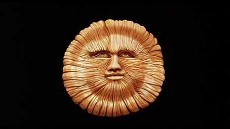
Another slight omission is the title card which used to precede the film thanking Lord Summerisle and the islanders for allowing the filmmakers to observe their rituals. In its place we have a zoom into the face of Nuada the Sun God, a painted rendering of a carved figure seen in the film. I’ve always liked this face which has become an emblem of the film even though it’s not present in all versions. (For more detail about the tangled history of the various prints, see this site.)

wicker2.jpg

Cover photo by Oliver Hunter.

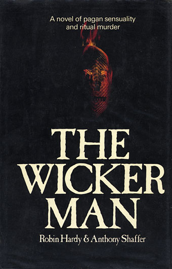
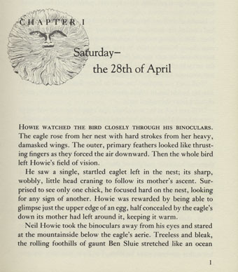
A rather bad drawing of the Nuada face appears at the beginning of each chapter of the novelisation which Hamlyn published in 1979 (and on the cover of the US edition from the year before). This was the year when the film’s reputation began to take off, and also the year it was reissued in the US. Although Hardy and screenwriter Anthony Shaffer are both credited for the novel I suspect the writing is mostly Shaffer’s work. It’s pretty good, and goes into considerable detail, fleshing out the story and Howie’s character, and also showing how much research the pair put into the pagan side of things. You also get the lyrics of some of the songs. Until the complete soundtrack appeared in 2002 the novel was the only place you could find the salacious missing verse from Willow’s Song which describes a maid milking a bull.

wicker3.jpg

And speaking of the soundtrack, the three-disc Blu-ray edition includes the complete soundtrack on one of its discs, a considerable bonus if you don’t have it already. I should note that my good friend Gav insists I mention that the film’s final brass fanfare—labelled as Sunset on the soundtrack album—is a Bulgarian folk tune entitled Rodopska Devoika Zamrakanala Mona Jana, something neither of us has ever seen credited.

Previously on { feuilleton }
Children of the Stones

Beardsley reviewed

studio1.jpg

More Aubrey Beardsley ephemera. These pages are from the bound edition of The Studio for 1894, reviews of two of Beardsley’s earliest publications: the first editions of Le Morte d’Arthur (which was published in multiple volumes), and the illustrated edition of Oscar Wilde’s Salomé which sealed Beardsley’s reputation as a major force in the art of the 1890s. The reviews lavish praise on both works, unsurprisingly since Beardsley had received the magazine’s support from the very first issue. It’s interesting to note even at this early stage mention of the rumblings of discontent which would grow increasingly loud in the following years. Also that The Peacock Skirt is here given the name The Peacock Girl.

studio2.jpg

NEW PUBLICATIONS. Le Morte d’Arthur. By Sir Thomas Mallory. Illustrated by Aubrey Beardsley. (London: J. M. Dent & Co.)—Salome. By Oscar Wilde. English version. Illustrated by Aubrey Beardsley. (London: Elkin Mathews & John Lane.)—It is no use, for the sake of maintaining the dignity of Sir Thomas Mallory, to deny that for this portly quarto, with its gold emblazoned cover, the interest centres in the designs which decorate rather than illustrate its text. Even Professor Rhys’ able introduction on the famous romances fails to detain one long from going on to the wealth of “black and white” in the volume. Since Mr. Joseph Pennell introduced Mr. Aubrey Beardsley in the first number of The Studio, barely ten months have passed, yet already (as the designs we receive in the Prize would alone suffice to prove) he has his disciples, imitators, and even (in a clever menu of a Glasgow dinner) his parodist. France and America have praised or attacked him, and to a following of younger men he is the latest and strongest force in decorative art. Here analytical criticism would be obviously out of place, but the volume before us may be cordially praised as a whole, and the four illustrations here reproduced (by the publishers’ kind permission) advanced as proof of the fancy and invention of the artist, and of his powerful handling of masses of black.

While Mr. Pennell, in his criticism—with reference more especially to certain separate drawings each complete in itself—laid the greatest stress upon “the use of the single line with which he weaves his drawings into a harmonious whole, joining extremes and reconciling oppositions,” here it is rather the balances of masses and the simplifying of forms to their most naive presentation that are so fascinating. Ornament for its own sake is plentiful and composition of figures, some individual to an almost dangerous degree, others perhaps slightly reminiscent of earlier work; but all these are most impressive from their bold use of white upon black. It is curious to see how often the design seems dug out of the wood, rather than drawn upon paper and reproduced by a mechanical process. A more perilous style to imitate could hardly be found, for its faults are easier copied than the astounding fertility and freshness of invention which more than redeem them. Only very rash or very foolish draughtsmen would attempt to do so; yet the suggestive influences of this book will probably affect modern design for some time to come.

As a feast of fantastic and eerie conceptions, some of rare beauty and not a few wrought with grotesque diablerie, it will delight (or exasperate as the case may be) all who take an interest in the applied arts. As the work of an artist who has not long been out of his teens, it is peculiarly noteworthy; for if one joined Mr. Beardsley’s few detractors and set aside all they failed to appreciate, the residue would offer enough motives for the stock-in-trade of a dozen less prodigal pattern-makers for years to come. To the publishers, whose enterprise made such a luxurious edition possible, to the artist, who has put so much of himself into it, the public should be grateful. For, like or dislike it, it will be long before a book so interesting and unconventional issues from the press, and one is left eagerly awaiting the remaining portion of the work.

studio3.jpg

In the new edition of Salome we find the irrepressible personality of the artist dominating everything—whether the compositions do or do not illustrate the text—what may be their exact purpose or the meaning of their symbolism, is happily not necessary to consider here. Nor is it expedient to bring conventional criticism to bear upon them for nothing in ancient or modern art is so akin that you could place it side by side for comparison. Audacious and extravagant, with a grim purpose and power of achieving the unexpected—we had almost written the impossible—one takes it for itself, as a piquant maddening potion, not so much a tonic as a stimulant to fancy. Those who dislike Mr. Beardsley’s work will be happy in the possession of the documentary evidence to support their opinion, while those who find it the very essence of the decadent fin de siècle will rank Salome as the typical volume of a period too recent to estimate its actual value, and too near to judge of its ultimate influence on decorative art. All collectors of rare and esoteric literature will rank this book as one of the most remarkable productions of the modern press. We have to thank the publishers for allowing us to reproduce The Peacock Girl, a full-page design that is typical of the work, The binding, a coarse pale blue canvas, with decorations in gold, Mr. Beardsley’s chosen device, being on the back cover, is entirely admirable.

Elsewhere on { feuilleton }
The Aubrey Beardsley archive

Weekend links 181

eye.jpg

Cover of Eye no. 86 vol. 22, 2013, a type special. Detail from 1970s Letratone brochure, overprinted by character from the Marsh stencil alphabet.

The new edition of Eye magazine includes my essay on the evolution and aesthetics of steampunk. In the same issue Rick Poynor’s feature on the prints of Eduardo Paolozzi mentions a forthcoming book by David Brittain about the artist’s associations with New Worlds magazine in the 1960s. I designed the Paolozzi volume which will be published by Savoy Books in a few weeks’ time. More about that later.

Still on steampunk, KW Jeter notes its popularity among the younger crowd: “If some old fogey peering through his smudged bifocals can’t discern the cool and important stuff going on, such as the tsunami of anarchic multiculturalists using the steampunk scalpel to dissect the past and reassemble it like a two-dollar watch, that’s his loss; the readers are picking up on it.”

• Musicians interviewed: Rhys Chatham: “The reason I got into trumpet playing is because I wanted to play like [Black Sabbath guitarist] Tony Iommi.” | James Ginzburg: “One of the strongest feelings I had was that the act of sitting down and making dance music was like playing a video game…I felt disconnected from it…” | Julia Holter: “I love working with the voice, I love mystery, I love creating atmosphere.” | Roly Porter: “I sit at home and listen to folk and blues from before I was born. I listen to a lot of dub and reggae and classical music. These are all genres which to me seem really interlinked and influential.”

• At Kickstarter: From the director of Lovecraft: Fear of the Unknown, a short film entitled Do Not Disturb. “Two men are forced to share a motel room on a dark & stormy night. One man’s snoring starts to summon creatures into our world.”

The Notting Hill of the 1960s – with Moorcock’s marriage, children, celebrity, the editorship of New Worlds, the collaboration with JG Ballard, Brian Aldiss and the rest – became the proving ground for the shape-shifting Carnaby Street dandy Jerry Cornelius. But all the numerous Moorcock characters, those undying and born-again clones, have a part to play in his “multiverse”, a concept he developed alongside the earlier model suggested by John Cowper Powys. Moorcock’s astonishing catalogue of speculative fiction works to prove his key equation, which is based on meta-temporal parallel worlds drawn from HG Wells, Chaos Theory, String Theory, the Edgar Rice Burroughs of John Carter of Mars and the William Burroughs of Nova Express and the “Interzone”. Publishing all the strange rafts and pods of Moorcock’s prodigious science fiction and fantasy output, as Gollancz have done, is like assembling a ghost fleet, under the joint command of Dr John Dee and Admiral John Ford, with which to invade that uncertain continent we know as the past.

Iain Sinclair on the new series of Michael Moorcock editions from Gollancz.

• “What does science tell us about the relative dangers of drugs? Alcohol is by far the No. 1 most dangerous drug.” Some graphs from the American Enterprise Institute who no one would accuse of being a bunch of stoners.

• “I loved Eudora Welty, Flannery O’Connor, Katherine Ann Porter, Carson McCullers. There was a feeling that women could write about the freakish, the marginal.” Alice Munro at The Paris Review.

Elena Smith on Literary Parkour: @Horse_ebooks, Jonathan Franzen, and the Rise of Twitter Fiction. Related: Boris Kachka has a list of Everything Jonathan Franzen currently hates.

• Mixes of the week: Joseph Burnett compiles Adventures in Modern Jazz while Kier-La Janisse puts together a British Horror mix for Fangoria.

Explore the planet Mars, one giant image at a time.

• At BibliOdyssey: The Turner’s Manual.

A Crimson Grail (for 400 Electric Guitars) (2007) by Rhys Chatham | Arrakis (2011) by Roly Porter | City Appearing (2013) by Julia Holter | Debris (2013) by Faint Wild Light

John Batten’s Celtic fairy tales

batten22.jpg

Yet more illustrations from John Dickson Batten, the pages this time being from Celtic Fairy Tales (1892), and More Celtic Fairy Tales (1895). Once again, both books were written by Batten’s regular collaborator Joseph Jacobs. As is often the case where less familiar stories are concerned, they yield some striking imagery.

batten23.jpg

batten24.jpg

batten25.jpg

batten26.jpg

Continue reading “John Batten’s Celtic fairy tales”

John Batten’s English fairy tales

batten09.jpg

More from illustrator John Dickson Batten with pages from two further collaborations with writer Joseph Jacobs, English Fairy Tales (1890), and More English Fairy Tales (1894). The latter (on the lighter paper below) are much better than the earlier set. The second book also includes The Hobyahs, a surprisingly violent story about a gang of mischievous creatures that the artist illustrates in an almost comic-book style. There’ll be more Batten tomorrow.

batten10.jpg

batten11.jpg

batten12.jpg

Continue reading “John Batten’s English fairy tales”