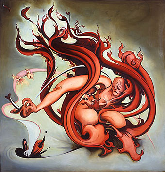
Hell scene (2003).
Paintings by American artist Inke Essenhigh whose work is currently on exhibition at the Victoria Miro gallery, London.
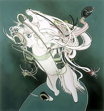
Optimistic Horse And Rider (2002).
A journal by artist and designer John Coulthart.

Painting
Hell scene (2003).
Paintings by American artist Inke Essenhigh whose work is currently on exhibition at the Victoria Miro gallery, London.
Optimistic Horse And Rider (2002).
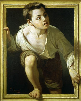
Escaping Criticism by Pere Borrell del Caso (1874).
A few eye-fooling paintings for All Fools Day.
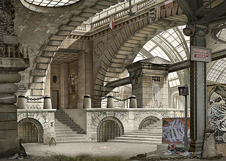
Urban Chiaroscuro 6: Paris (after Piranesi) (2007) by Emily Allchurch.
Pitzhanger Manor-House in Ealing, London, hosts an exhibition with architecture as its theme, a suitable subject given that the house was designed by notable 18th century architect (and friend of Piranesi) Sir John Soane. Artist Emily Allchurch has some meticulous and clever photo-collage reworkings of Piranesi on display while painter Stefan Hoenerloh—whose work I hadn’t seen before—is worthy of a dedicated post here seeing as he produces exactly the kind of imaginary architectural renderings I love. Some of his paintings could be colour views of similar scenes by Gérard Trignac.
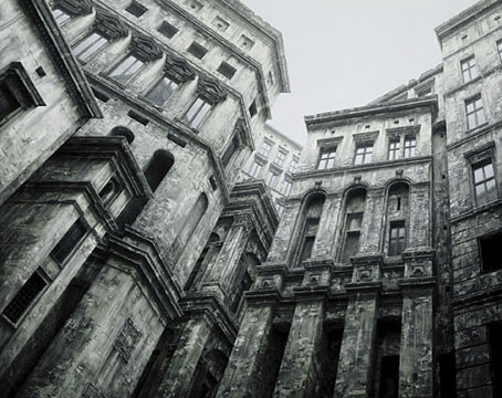
Via Subalterna (1990) by Stefan Hoenerloh.
Set in Stone runs from 28 March–26 April 2008.
Artists: Emily Allchurch, Stephen Carter, Michael Durning, Stefan Hoenerloh and Ben Johnson.
PM Gallery present the work of five artists who share a fascination in the power and importance of architecture, as an inspiration for works in paint and photography.
Emily Allchurch makes collages from many photographs to create a seamless new ‘view’, creating imaginary buildings or recreating buildings that no longer exist. A series of works, inspired by the 16th Century (sic) artist Giovanni Battista Piranesi’s ‘Carceri d’Invenzione’ (Imaginary Prisons), seamlessly constructs Piranesi’s original work but shows buildings constructed in a mass of architectural styles, complete with warning signs, CCTV cameras, razor wire and security mirrors to give a sense of foreboding and claustrophobia. In ‘Crystal Palace, (recomposed)’, she took what remains of the platform as a basis to recreate the palace, using architectural details of the period, such as at the Palm House at Kew Gardens and Paddington Station.
The detail of London’s Westway has been examined by Stephen Carter, with a series of paintings taken from photographs shot beneath the huge concrete flyover. Carter sees the Westway as representing both an escape for city dwellers to the beauty of the countryside and for country dwellers to get to the exciting heart of the city. But this optimism is tempered by the fact that the perspective is often viewed from below the Westway in a forgotten, uncelebrated and polluted part of the city.
Michael Durning’s beautiful paintings of neglected and broken monuments and buildings, question attitudes to Scottish heritage and culture. Often buildings are shown in relation to Scotland’s grand landscapes and unforgiving weather, reducing their prowess in the face of the natural environment.
German painter Stefan Hoenerloh creates monumental buildings with accurate, detailed architectural features, in oil and acrylic. The works appear photographic, but in fact are all invented by Hoenerloh. The buildings loom, often so large that the viewer is only able to see part of them within the frame of the picture. There is little sign of life in these structures, which appear old and weather-beaten, but solid in the face of everything they have withstood over the years since they were built.
Ben Johnson paints calm, often majestic interiors and large city panoramas. Although painted in meticulous detail, Johnson ‘ investigates’ the built space, to create far more than simple photo-realism, allowing the viewer to gain an intense experience of the presented space. Here we show work dating from 1973 to 2007.
Elsewhere on { feuilleton }
• The etching and engraving archive
• The fantastic art archive
Previously on { feuilleton }
• The art of Gérard Trignac
• Aldous Huxley on Piranesi’s Prisons
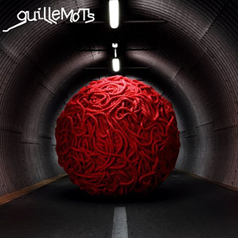
Red, the second album by the wonderful Guillemots is released today with a striking cover image that seems rather familiar.
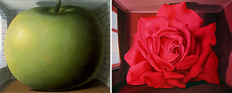
left: The Listening Room (1958) by René Magritte.
right: The Wrestler’s Tomb (1961) by René Magritte.
Previously on { feuilleton }
• Guillemots
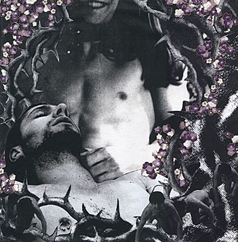
Nick + Matt (2004).
Collage and painting by Canadian artist Scott Treleaven who says of his work “occult language and symbology often remains the most accurate way of describing and dignifying the human condition.”
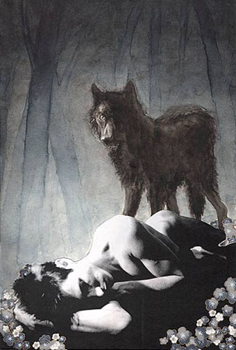
Black Shuck (i) (2007).
• Scott Treleaven at Gay Utopia: I | II
Elsewhere on { feuilleton }
• The gay artists archive
Previously on { feuilleton }
• The art of Andrey Avinoff, 1884–1949
• The art of Robert Flynt
• Austin Osman Spare