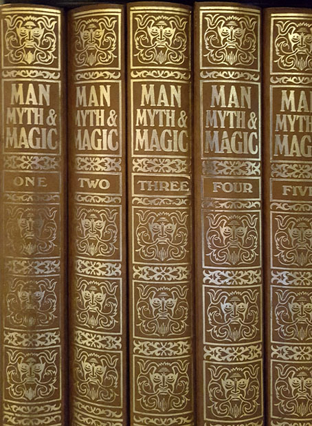
Collect the set!
I don’t really need a digital copy of Man, Myth and Magic—I’ve been the fortunate owner for many years of the bound set of original magazines you see above—but I imagine a few readers of this post will welcome a download of all 3144 pages of the 1995 edition. For the impatient I’ll put the link up front: go thou here.

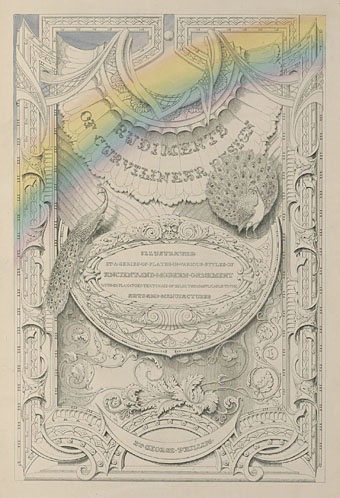
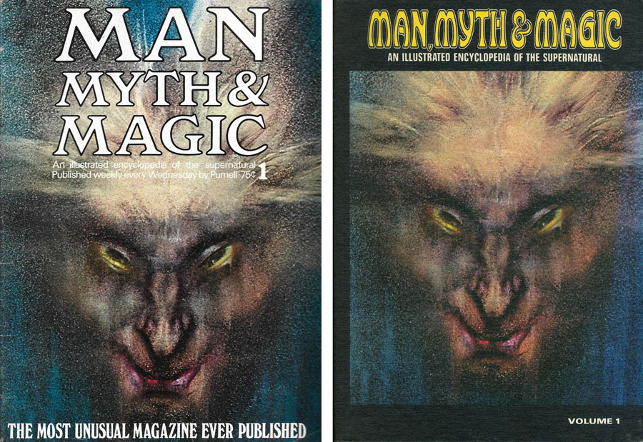
The world goes Spare: A US copy of issue no. 1 and the first volume of the 24-volume set. Austin Spare’s cover art is known either as The Elemental or The Vampires are Coming.
Man, Myth and Magic exists in several different versions along with a number of spin-off books which mined its texts for information and reused its picture archive. The first edition was the “Illustrated Encyclopedia of the Supernatural” which appeared in the UK each week from 1970 to 1971 as 112 magazine-sized issues, a series that built eventually into a collection of seven volumes. The first issue famously used a detail of a picture by Austin Osman Spare on its cover, giving Spare and his art a prominence unlike anything he received during his lifetime. The same part-work was published a couple of years later in the USA with an accompanying TV ad. Magic and the supernatural was the selling point but the encyclopedia was as much about religion and general anthropology as the occult, with the editorial stance being unsensational, factual and neutral. The seven-volume set was later republished in book form as 24 hardcover volumes, then revised in 1995 as a new set of 21 volumes with a different subtitle, “The Illustrated Encyclopedia of Mythology, Religion and the Unknown”. In the early 1970s you could also find a hardback collection of the first six issues bearing the subtitle “The most unusual book ever published”, a rather unrealistic claim. My mother bought one of these, giving me my first encounter with the encyclopedia itself and many other things besides, not least the Austin Spare drawings in Kenneth Grant’s piece of borderline cosmic horror about Spare and “resurgent atavisms”.

Richard Cavendish was Editor-in-Chief of all the editions of Man, Myth and Magic, with Brian Innes acting as picture editor and subsequently co-editor for the 1995 edition. Cavendish had been the author of The Black Arts in 1967, a book which I still rate as one of the best general introductions to Western occultism. The Black Arts may have a title designed to grab the attention of Dennis Wheatley readers but it was a serious study that set the tone for the encyclopedia. The editorial board of Man, Myth and Magic was composed of heavyweight academics, together with John Symonds (Aleister Crowley’s literary executor and biographer), while the group of special consultants included Katharine Briggs (folklore), William Gaunt (art) and Francis Huxley (anthropology). Symonds brought Kenneth Grant on board. Grant at this time was the official head of Crowley’s Ordo Templi Orientis, and his presence gave the editorial team access to his large collection of Austin Spare artwork.
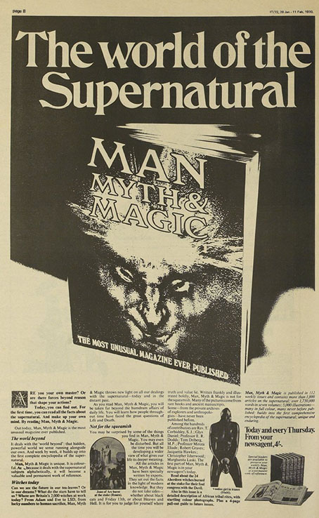
“From Adam and Eve to LSD, from lucky numbers to human sacrifice…” International Times, Jan 28, 1970.
Among the never-to-be-repeated list of contributors were Geoffrey Ashe, Robert Baldick, Robert Graves, Celia Green, Douglas Hill, Christina Hole, Christopher Isherwood, Patrick Moore, Kathleen Raine and JB Rhine. Kenneth Grant and John Symonds weren’t the only contributors who’d known Aleister Crowley, there was also Tom Driberg MP, a man whose promiscuous homosexuality and alleged treachery made him one of the more notorious members of Parliament. The other British politician among the contributors was the comparatively prosaic John Selwyn Gummer, a future government minister and current member of the House of Lords. (I wish I could tell you which article was Gummer’s but he’s listed in the contributor section without a credit. I’d have to hunt through the volumes to find out.) Elsewhere you’ll find entries by both Francis Kings—confusingly listed without their identifying initials—in what may be the only time the pair appeared together in the same publication. Francis H. King, writing here about Japan, was a well-regarded author whose novels included a number of gay romances; Francis X. King was an occultist and author of non-fiction books whose research was packaged under lurid titles such as Sexuality, Magic and Perversion, and Satan and Swastika. The contents of Man, Myth and Magic have long been rendered superfluous by the internet but the contributor list gives the encyclopedia a curiosity value if nothing else. All of the entries are unique pieces of writing which are unavailable outside these pages.
I confess that I hadn’t known that Man, Myth and Magic had been revised and reprinted until I discovered this scanned edition, I’d always thought the encyclopedia was too much of its time to be republished. Richard Cavendish in the editorial preface for the 1995 edition says that some of the articles were amended or expanded to take account of new researches and developments. So they have been, although at first glance the page layout looks very much as it did in the original printing. Closer examination reveals that some of the more dated pictures have been replaced, like the photo of a typical hippy girl in the entry about bells. Dated pictures aside, what you see here is still 95% the original “illustrated encyclopedia of the supernatural”.
Frontiers of Belief.
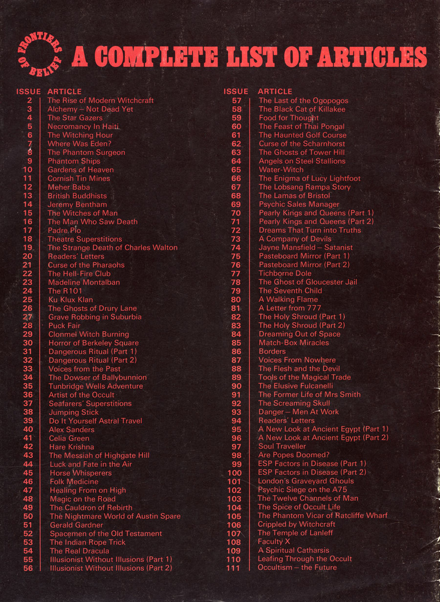
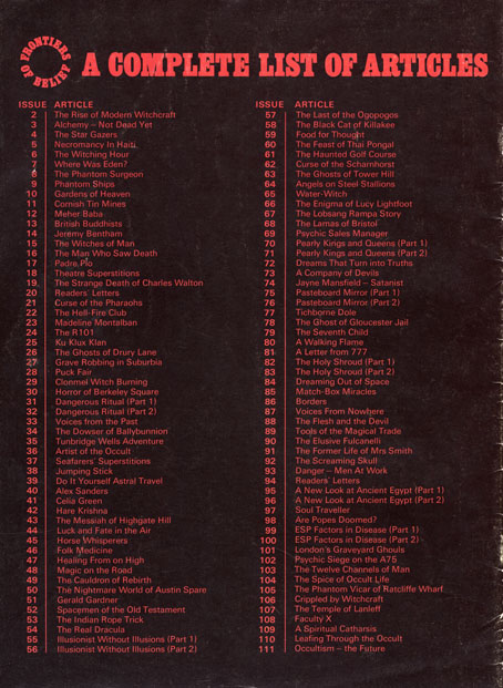
The most substantial change in the later reprintings was the absence of the “Frontiers of Belief” section, a series of mostly topical essays which ran each week across the inside back cover and the back of the magazine. Collectors of the volume binders could also purchase an additional binder to store the issue covers and the FoB supplements. Whoever compiled my own volumes failed to do this, but I did once own a partial set of the magazine as separate issues, and still have the FoB articles from those issues. Two of these pieces—a profile of artist Wilfried Sätty and Kenneth Grant on HP Lovecraft—have appeared here in the past. As far as I know none of the FoB pieces have ever been officially reprinted. The very last piece was “Occultism—The Future”, in which a number of writers were asked for their prognostications. The ubiquitous Dennis Wheatley—who, for once, didn’t contribute to the previous pages— delivered a typically ominous warning against involvement in the Black Arts. A more sober final word was provided by Colin Wilson:
In science a new cycle has begun, a revolt against the old rigid reductionism, a recognition that ‘materialism’ leaves half the universe unexplained. Biologists, psychologists, even physicists, are cautiously trying to feel their way into new worlds. They are acknowledging at last that they are dealing with a living universe, a universe full of strange forces. The magic of the past was an intuitive attempt to understand and control these forces: the science of the future will be a fully conscious attempt. Magic will be the science of the future, or should we say that science will be the magic of the future?
Previously on { feuilleton }
• Jan Parker’s witches
• Typefaces of the occult revival
• Dreaming Out of Space: Kenneth Grant on HP Lovecraft
• MMM in IT
• The Occult Explosion
• Wilfried Sätty: Artist of the occult
• Owen Wood’s Zodiac