Zones on wheels

zones.jpg

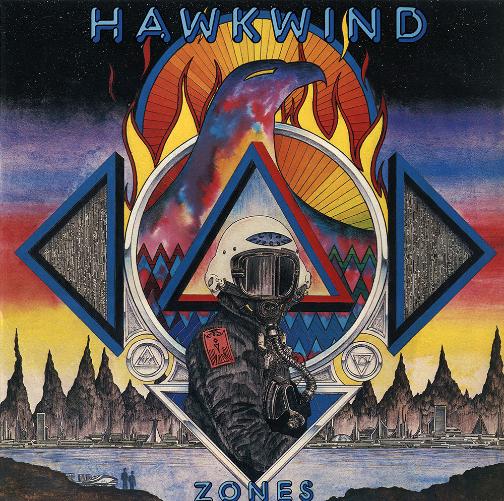
Zones (1983).

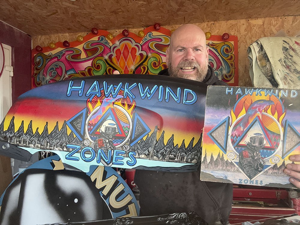
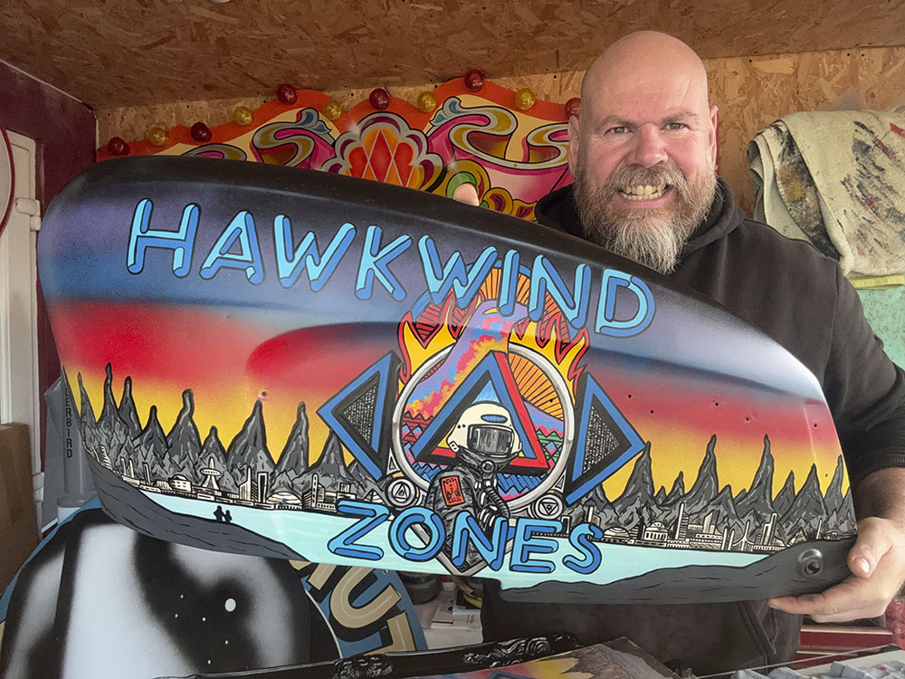
My thanks to Nigel Day for sending me the following photos of the rear end of a Lambretta scooter that he was recently asked to decorate with art based on my cover for Zones by Hawkwind. He’s done a marvellous job, and even improved a little on the colour gradations behind the hawk’s head which in my painting don’t evolve as smoothly as they should. Nigel trades under the name Harry’s Hotrod Shop; there’s a website here as well as pages under the same name at Facebook, Instagram and TikTok.
lambretta1.jpg

lambretta2.jpg

As I’ve no doubt said before, the Zones sleeve is one of the few Hawkwind covers I don’t feel abjectly embarrassed by. The album was released in October 1983, and was my second cover for Hawkwind, following an album released the month before whose terrible artwork was something I sent to Dave Brock that I never intended to have used anywhere. The Zones art was something I’d created on spec the year before, shortly after what would have been my cover for the Church Of Hawkwind album was forced onto the album’s lyric book by an art director at RCA who hated the material he’d been given to work with. This wasn’t the only unpleasant incident from the group’s short tenure at RCA. Zones was released on Flicknife Records, an independent label that proved to be a much better home for the band.
zones-japan.jpg

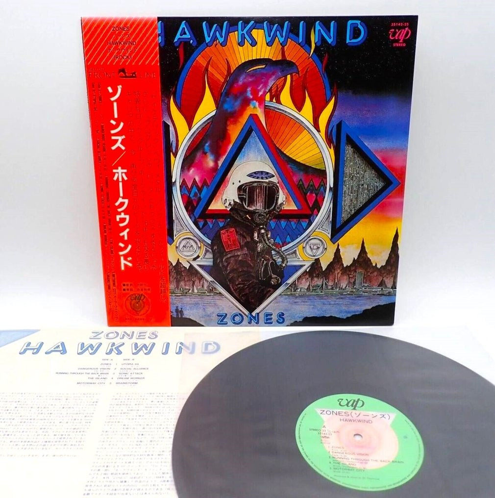
A rare Japanese vinyl release.

The album itself is a pretty good collection of live recordings from 1980 to 1982, with highlights that include a Michael Moorcock song, Running Through The Backbrain, with Moorcock himself on vocal. This was an exclusive piece until the entire concert (Lewisham, 1980) was released as part of the Levitation box set in 2009. Zones also contains several songs featuring Nik Turner, from the brief period when he returned to the group he’d been expelled from in 1976. And there’s also another live version of Motorway City, a song that first appeared on the Live Seventy Nine album. Having always liked Motorway City I was pleased when the Zones version was released as a single that used another spec piece of mine as the cover art (see this post).
zones-pic-disc.jpg

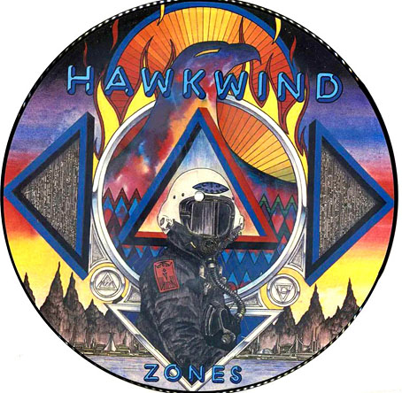
And a picture-disc.

As I said in the post about the single artwork, I was 18 when I did that drawing. I was only 20 when I painted the Zones cover. Imagine something you’d created when you were 20 years old continually turning up again decades later. It’s gratifying, of course, but it can also be disconcerting. People seem to like it anyway, which is more than can be said for some of my other album covers. The weather here is finally getting warmer; prepare for the summer with a Zones T-shirt!

Previously on { feuilleton }
• Space is one trip: the Hawkwind takes off
• New Wave Strangeness: Hawkwind’s Calvert years
• Twinkle, twinkle little stars
• Motorway cities
• Reality you can rely on
• Silver machines
• Notes from the Underground
• Hawkwind: Days of the Underground
• The Chronicle of the Cursed Sleeve
• Rock shirts
• The Cosmic Grill
• Void City
• Hawk things
• The Sonic Assassins
• Barney Bubbles: artist and designer
Weekend links 819

ohrai.jpg

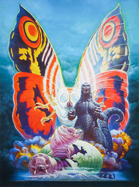
Godzilla vs. Mothra (1992), poster art by Noriyoshi Ohrai.

• At Wormwoodiana: Douglas A. Anderson on the first English translation of The Luminous Fairies and Mothra, a multi-author serial that formed the basis for Ishirō Honda’s film about the giant moth.

• At the Library of Congress: “Lost 19th century film by Méliès discovered at the Library“. 45 seconds of Gugusse and the Automaton (1897).

• At Public Domain Review: The Blinkered Flâneur: Walking with Franz Hessel in 1920s Berlin by Paul Sullivan.

• At Juno Daily: Kevin Richard Martin lists ten albums that shaped his Sub Zero album.

• New music: And All The Clocks Ran Dry by Andreas Voelk & Scott Monteith.

• “Behold Belgium’s beauty in these 15 scenic photographs.”

• A Spoon and Tamago Guide to Tohoku.

• The Strange World of…Shane Parish.

• At Dennis Cooper’s: Occults.

• RIP Éliane Radigue.

• Mothra’s Song (1961) by Yuji Koseki | Mothra (1984) by Frank Chickens | Mothra (2014) by The 5.6.7.8’s

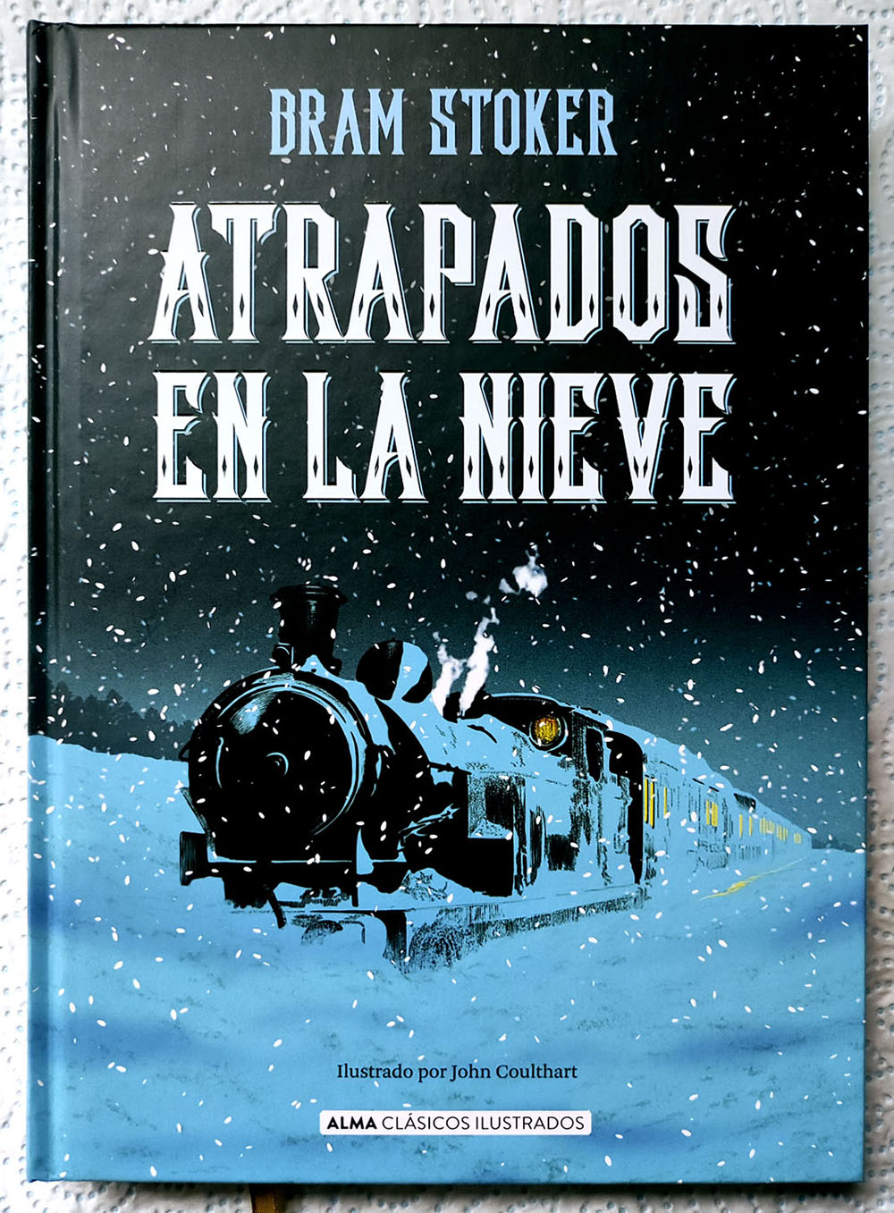
Snowbound by Bram Stoker

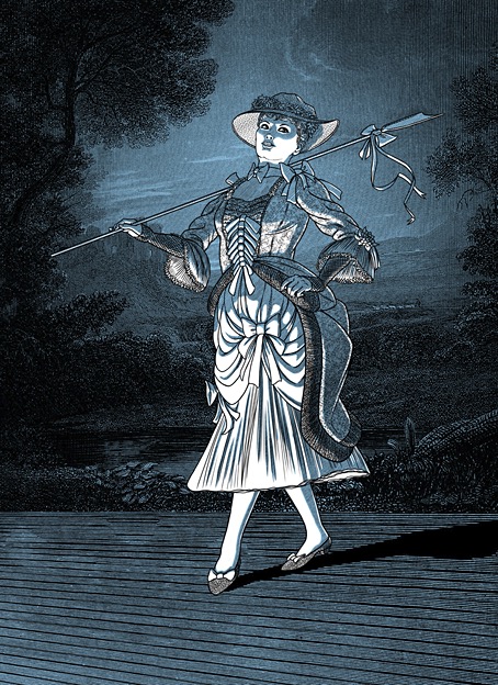
snowbound00.jpg

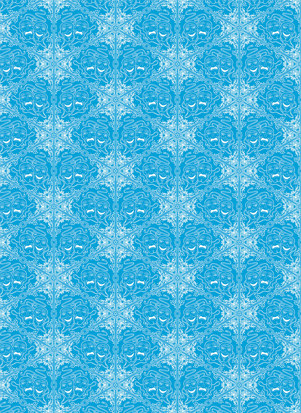
The artwork is mine; the cover design is by Lookatcia.

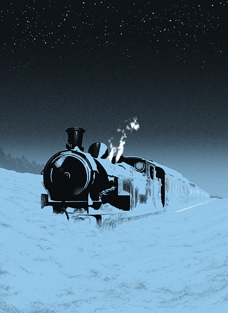
Presenting my latest book for Alma, the Spanish publisher for whom I’ve illustrated several classic novels and story collections. The new volume is my second Bram Stoker title after Dracula in 2018 which, for the sake of convenience, I’ll refer to it by its English title. Snowbound: The Record of a Theatrical Touring Party was a collection of connected stories first published in 1908, 11 years after Dracula had established Stoker’s reputation. I wouldn’t call Snowbound a bad book but if you’ve read Dracula or Stoker’s more popular short stories it’s a disappointment, with no supernatural content and little to recommend it elsewhere. The first episode introduces the framing device: a group of travelling players are marooned by heavy snow while travelling on a train through the wilds of Scotland. To pass a dark and freezing night the troupe entertain themselves by relating memorable anecdotes from their careers, anecdotes which I imagine Stoker either heard from others or experienced himself during his years working for actor-manager Henry Irving. In place of the spooky tales one might expect from such a premise we’re offered a succession of vaguely comic episodes mixed with more serious drama, with a couple of the pieces being related in very broad “Oirish” and Cockney accents. The Irish episode is especially bizarre considering that Stoker was Irish himself; it reads like the kind of thing you’d get from an English writer trotting out lazy stereotypes.

endpapers.jpg

My endpapers design.

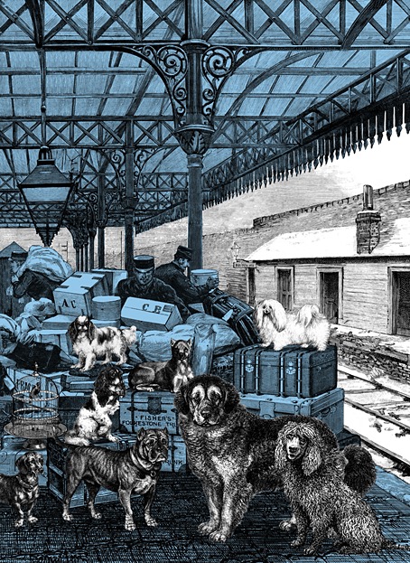
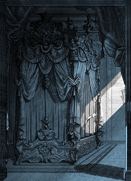
There are other flaws I could mention but I’ve undersold the book enough as it is. Snowbound has never received much attention in the past, it wasn’t even reprinted in English until 2000. In my previous books for Alma I utilised a style which combined collaged backgrounds with hand-drawn elements in order to create illustrations whose engraved appearance made them seem like products of the period in which the stories were written. More recently I’ve been moving away from this style but the success of the previous Alma editions, Frankenstein in particular, obliged me to maintain some continuity with the look I’d created for Dracula. As it turned out, several of the Snowbound illustrations are entirely hand-drawn, with engraving-like textures used in the shading. The biggest departure from the previous books is the addition of an extra ink colour to the artwork, an effect that was fun to play with when creating different lighting effects. As to the pictorial details, several of the anedotes take place in the United States, hence the presence of an American steam train with an elevated smokestack, the spelling of the word “theater” on a poster, and so on.

snowbound01.jpg

Having mentioned Frankenstein I ought to also mention the recent Polish edition of the novel which reprints my Alma illustrations. This is a large-format hardback from Materia, a pubisher who don’t seem to have a proper web presence outside those Meta plague sites that I never link to. The book is on sale anyway. Meanwhile, I’m currently working on another new book for Alma which will feature ten full-colour double-page illustrations. More about this later.

snowbound02.jpg

snowbound03.jpg

snowbound04.jpg

Continue reading “Snowbound by Bram Stoker”

Weekend links 818

paunzen.jpg

The Bookworm (no date) by Arthur Paunzen.

• New Cabaret Voltaire: Nag Nag Nag (Live 2025 Single Edit). Good to hear they’ve reinstated the Patrick Moore dialogue sample, something that’s on the studio version but usually missing from live recordings. The single is a trailer for a forthcoming album based on the group’s recent anniversary tour.

• The Mysterious Castle in the Carpathians (1981), a wacky Czech comedy, one of many directed by Oldřich Lipský. With a story by Jules Verne, music by Luboš Fišer, and steampunk props by Jan Švankmajer.

• More new music: Butch’s Guns by Sunn O))); Sidings by Craven Faults; Frequencies In The Fog by Rod Modell.

What strikes me most is the difference between people who’ve learned to construct what I call “containers for attention”—bounded spaces and practices where different modes of engagement become possible—and those who haven’t. The distinction isn’t about intelligence or discipline. It’s about environmental architecture. Some people have learned to watch documentaries with a notebook, listen to podcasts during walks when their minds can wander productively, read physical books in deliberately quiet spaces with phones left behind. They’re not rejecting technology. They’re choreographing it.

What we think is a decline in literacy is a design problem, says librarian Carlo Iacono

• At Colossal: “Striking photos by Peter Li capture the soaring majesty of sacred spaces.”

• At Public Domain Review: The Eight Horses of King Mu, Son of Heaven (ca. 1300).

• At the BFI: Brogan Morris selects 10 great political thrillers.

• At Dennis Cooper’s: Roland Topor’s Brain.

• RIP Robert Duvall and Tom Noonan.

• The Book Lovers (1997) by Broadcast | Tiny Golden Books (2000) by Coil | Library Of Solomon Book 2 (2011) by Demdike Stare

The Kingdom of the Gods

quail01.jpg

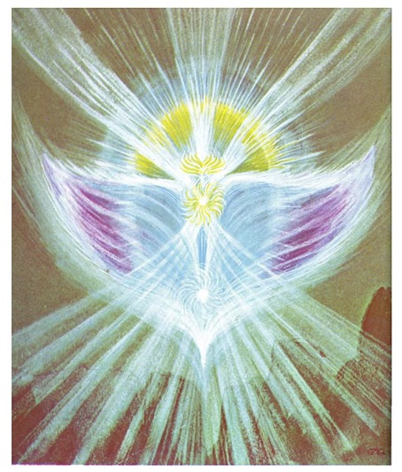
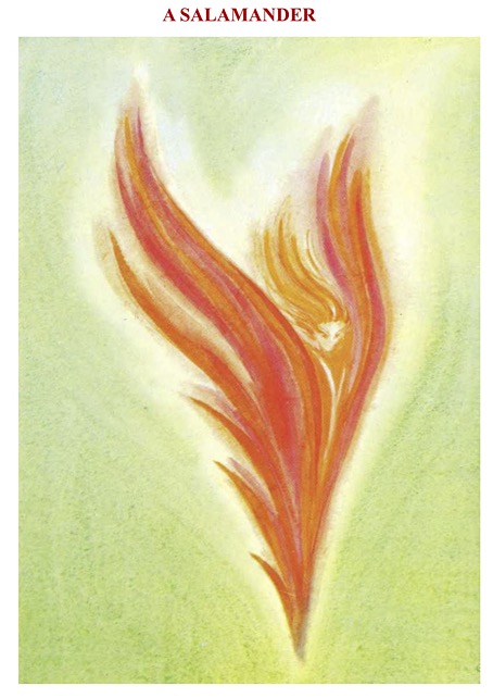
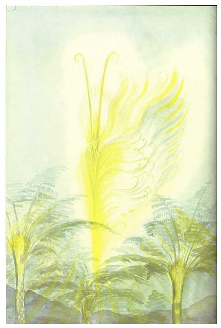
Looking for more Theosophist art turned up The Kingdom of the Gods (1952), a book by Geoffrey Hodson with illustrations by Ethelwynne M. Quail. Hodson was a Theosophist scholar with a predilection for the clairvoyant visualising of transcendent beings. Several of his books are descriptions of encounters made on his travels, commencing at a modest level in 1925 with Fairies at Work and Play. Fairies are a somewhat trivial subject for Theosophical students, which may explain why Hodson’s later books move on to accounts of angels in their various forms, before arriving at descriptions of fully-fledged gods, a type of divine life which in Hodson’s telling is more populous than we realise. A note at the beginning of The Kingdom of the Gods states that Ethelwynne Quail’s paintings were made originally for slide projections which Hodson used in his lectures.

quail02.jpg

Most of Hodson’s gods are lower-order beings of a kind that the Romans termed genius loci, the spirit of a place, while their depictions are nebulous, bird-like renderings like some of the “thought-forms” depicted in the 1905 book of that name by Charles Webster Leadbeater and Annie Besant. The determination of the Theosophists to make the invisible manifest on paper or canvas may explain the attraction of the religion for so many artists. One of the illustrations in Thought-Forms shows Gounod’s music forming over a cathedral tower like a polychrome mushroom cloud; a decade later, the Theosophy-inspired Luigi Russolo was doing something similar with his Futurist painting, La Musica. Geoffrey Hodson would have been delighted by the mystical artists of the 1970s, especially Gilbert Williams and Robert Venosa. Some of Ethelwynne Quail’s spirits might be sketches for Venosa paintings, his early works in particular, which have the same sweeping lines but rendered in a meticulous, crystalline manner.

quail03.jpg

quail04.jpg

quail05.jpg

Continue reading “The Kingdom of the Gods”