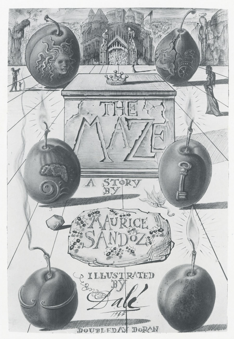
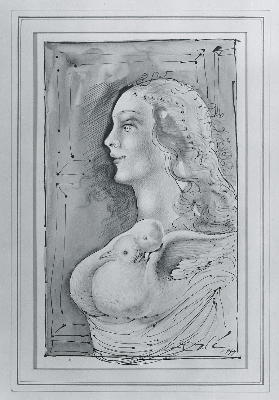
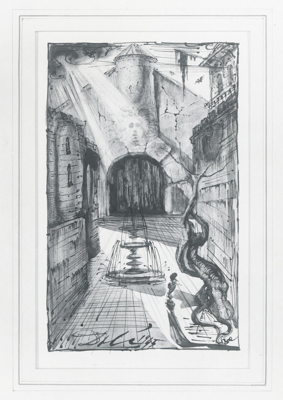
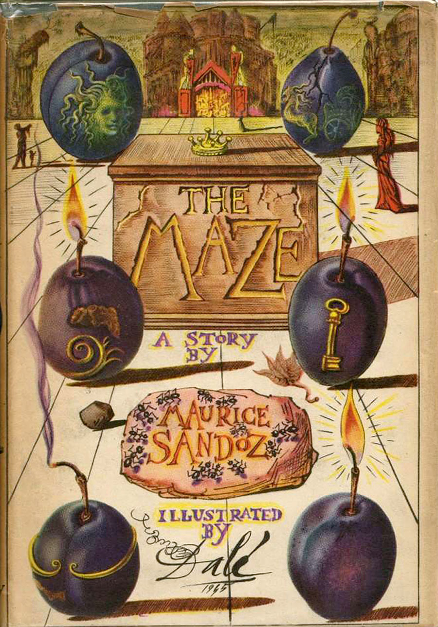
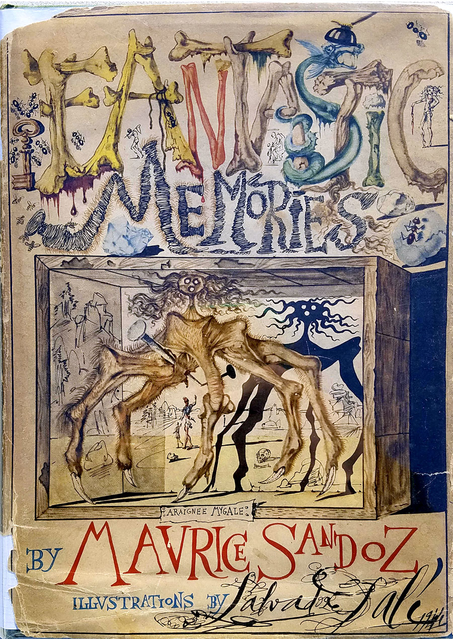
Bibliothek des Hauses Usher

rottensteiner.jpg

As promised a couple of weeks ago, this book-cover post is one of several that originates with Franz Rottensteiner’s horizon-expanding The Fantasy Book: The Ghostly, the Gothic, the Magical, the Unreal (1978). Rottensteiner’s study was important for me not only for its introduction to many hitherto unknown writers but also for its wide-ranging collection of illustrations and cover designs. Most of the artwork has since become very familiar but a few examples were by artists or designers I hadn’t encountered elsewhere. Hans Ulrich Osterwalder was one of these, his art for a series of German horror titles appearing inside the book and, in the case of the US edition of The Fantasy Book, on the cover. Searching for Osterwalder’s work a few weeks ago I was delighted to discover that the German covers were part of a series of horror/dark fantasy reprints for the Bibliothek des Hauses Usher imprint from Insel Verlag, for which Osterwalder created many more striking and unusual covers.

Bibliothek des Hauses Usher published 26 novels or story collections from 1969 to 1975. I thought at first that this was a paperback series but all the books were hardbacks with uniform black covers and white spines. The imprint logo is a rather ordinary looking House of Usher cracking down the middle (a nod to Arkham House, perhaps) with a slogan on the back cover borrowed from Ambrose Bierce: “Can such things be?” Each volume was printed on light green paper, at least until the paper stock ran out. The last three volumes were printed on white paper then on green again when further stocks were found.

page.jpg

Osterwalder’s work on this series stands out for being innovative, surreal and free of the cliches that persist on horror titles. Most of the artwork is illustrative of the contents but it manages this without being too overt or obvious which isn’t an easy thing to do. The list of authors is an interesting mix as well (if you overlook the typically lamentable absence of women writers): many of the names are those you’d expect in a series such as this but there are also some such as Jean Ray and Stefan Grabiński who you wouldn’t find in an Anglophone series. Grabiński was a Polish writer of weird fiction who receives a mention in Rottensteiner’s book (and is a favourite of China Miéville) but whose work is still largely unknown to Anglophone readers. Just as obscure to English readers is Thomas Owen who was a Belgian writer (real name Gérald Bertot) and a friend of Jean Ray’s. Tartarus Press published a collection of Owen’s stories in 2012 but I’ve not read it so can’t vouch for their quality.

All 26 covers are shown below in their order of publication. Hans Ulrich Osterwalder still works as an artist and designer, and has a website here. Franz Rottensteiner was interviewed at 50 Watts a few years ago.

usher01.jpg

usher02.jpg

usher03.jpg

Continue reading “Bibliothek des Hauses Usher”

James Cawthorn: The Man and His Art

cawthorn-cover.jpg

The past year would have been busier than usual with the amount of illustration work I had to deal with, but it was made even busier with my having to design this book at the same time. James Cawthorn: The Man and His Art was originally intended to be a modest memorial by Maureen Cawthorn Bell for her artist brother following his death in 2008, but the book grew into a heavyweight volume of 448 pages containing over 800 individual pieces of art: book covers, illustrations for magazines and fanzines, private pieces for friends and relatives, and many sketches or preliminary works, most of which have never seen print before.

cawthorn-coverspread.jpg

Given Jim Cawthorn’s long association with Michael Moorcock, as both friend and collaborator, the task of collating the artwork and editing the book went to Moorcock bibliographer John Davey, who also serves as the book’s publisher. John spent three years locating over 3000 pieces of artwork, large and small. Some of these pieces are now lodged with the Moorcock archives in the Bodleian Library, Oxford, while others may only be found in the pages of the many science fiction and fantasy fanzines that Jim illustrated, copies of which are stored at the British Library. From this body of material Maureen and John selected a core of representative work from Jim’s private as well as public life, although no-one at the outset of the project was expecting the final picture tally to be so high.

cawthorn-spread-01.jpg

My task as the book’s designer involved making the text presentable (easy) and corralling the artwork (not so easy, and I also had to either clean or colour-adjust every single piece). Maureen had divided the book into several sections, beginning with a lengthy biographical reminiscence. Following this was “Jim by Jim”, a selection of interviews, magazine pieces, some fiction, essays and book reviews. There was also a lengthy extract from Fantasy: 100 Best Novels (1988), a book credited to Jim and Michael Moorcock but, by Moorcock’s admission, mostly Jim’s work. Jim Cawthorn was very well-read, especially in the genres—he was old enough and interested enough to have read The Lord of the Rings when it was first published—and could also present his erudition engagingly for a reader, so the text section of Maureen’s book is far from indulgent.

cawthorn-spread-02.jpg

The book design isn’t as elaborate as some I’ve worked on but it didn’t need to be when the pictorial material is rich with what Moorcock calls “wizardry and wild romance”. Maureen wanted a particular picture of Moorcock’s Elric character on the cover so I took details and motifs from some of Jim’s many Elric illustrations to give the book a thematic thread and internal consistency. Cawthorn was present at the creation of Elric in the early 1960s; he not only provided Moorcock’s characters with their first illustrations but even helped plot one of the earliest stories, Kings in Darkness.

cawthorn-number.jpg

Page numbers are framed by the swords from the Elric stories.

Using motifs such as the sword silhouette and Elric head is something I frequently do with book designs but for this book I also went to the trouble of creating a one-off font for the drop capitals based on Jim’s hand-drawn lettering. Jim drew titles and other lettering throughout his career, so again this was a decision warranted by the book’s contents. The few times we met I never asked him about this but I’ve always thought his lettering designs were derived from the stylised titles that J. Allen St. John created for many of the early Edgar Rice Burroughs books. Jim spent most of his life drawing Burroughs’ characters, and was very familiar with the work of Burroughs’ original illustrators. I was hoping to find a title design of Jim’s that I could rework for the book’s title but none of the examples worked as well as I hoped. For this reason the title lettering is based on different styles from the John Carter novels that were Jim’s favourites among Burroughs’ works.

cawthorn-spread-03.jpg

Other features include a foreword by Alan Moore, an afterword by Michael Moorcock, a gallery of Jim’s Lord of the Rings drawings and character sketches from the early 1960s (which predate all others bar those by Tolkien himself), artwork for Hawkwind (including Dave Brock’s “Meliadus” T-shirt), and even a handful of photos from the set of The Land that Time Forgot (1975), the ER Burroughs-derived feature film scripted by Jim with Michael Moorcock. The page samples here are necessarily few given the size of the book.

cawthorn-spread-04.jpg

For the moment James Cawthorn: The Man and His Art is available exclusively from publishers Jayde Design at a special pre-publication price of £20. After publication on 6th August the price will rise to £35. Further page samples follow.

Continue reading “James Cawthorn: The Man and His Art”

Weekend links 418

vertigo.jpg

Poster by Roman Cieślewicz for the 1963 Polish release of Vertigo. Via The Hitchcock Zone.

• Alfred Hitchcock’s Vertigo is sixty years old this year. It’s a film I’ve always found to be preposterous and very over-rated, despite the considerable strengths of its cast, production, etc; consequently, any claims to its being an unalloyed masterpiece (such as being voted the best film of all time in the 2012 Sight & Sound poll) have been difficult to accept. For the latest anniversary, David Thomson examined the film in the light of changing social attitudes.

• Currently seeking funding at Unbound: Stars, Fools and Lovers: An illustrated guide to the art and history of the Tarot by Joanna Ebenstein, Laetitia Barbier and Mark Pilkington. Another Tarot-related book, Pamela Colman Smith: The Untold Story by Stuart R. Kaplan with Mary K. Greer, Elizabeth Foley O’Connor and Melinda Boyd Parsons, will be published next month.

• Everybody wants to talk to Jon Hassell at the moment, which is no bad thing: recent interviews have appeared at The Vinyl Factory, Red Bull Radio and Vice.

• Coming soon from Lazarus Corporation: England’s Dark Dreaming by Paul Watson.

• Sean Kitching on The Strange World of Charles Hayward (This Heat et al).

• At Dennis Copper’s: The title sequences of 56 mostly horror movies.

• Stone circles: Adam Scovell chooses 10 notable cinematic examples.

• “You gotta be selfish. It’s a terrible thing,” says David Lynch.

Wolf’s Kompaktkiste shows off a serious record collection.

Boy with Cat (1966), a short film by Donald Richie.

• Mix of the week: Secret Thirteen Mix 256 by Nina.

Tank (2018), a short film by Stu Maschwitz.

Phantom Islands—A Sonic Atlas

Letraset, design and music

• Vertigo (1988) by Flash Cero | Psyko (Themes from Psycho and Vertigo) (1993) by Laika & The Cosmonauts | Vértigo Magnético (2014) by Liquidarlo Celuloide

Weekend links 414

polackova-vyletalova.jpg

Czech poster for Robert Bresson’s Une Femme Douce (1969) by Olga Polácková-Vyletalová. There’s more about Polácková-Vyletalová’s striking poster designs (and this one in particular) at Mubi. See also the Polácková-Vyletalová collection at Terry Posters.

• “I heard that in Japan the tendency is to hammer down the nails that stick out. I think that Haruomi Hosono is a nail that sticks out. And has maintained that.” Van Dyke Parks on Haruomi Hosono, best known in the West for being one third of Yellow Magic Orchestra but a prolific artist in his own right. Hosono’s early solo albums are being reissued by Light In The Attic later this year.

Hua Hsu on The Spectacular Personal Mythology of Rammellzee. “Rammellzee will always feel like part of the underground,” says Geeta Dayal in a review of the Rammellzee exhibition currently showing in New York.

• Mixes of the week: Hassell’s Children, a Fourth World mix by Ban Ban Ton Ton, The Island of Bright Tombs by SeraphicManta, and a Radio Belbury mix by The Advisory Circle.

• More Robert Aickman: The Fully-Conducted Tour, a complete short story. Related: Matthew Cheney reviews the new Aickman collection, Compulsory Games.

• Another Kickstarter bid, this time for a reprint of Art Nouveau designs and illustrations by Carl Otto Czeschka.

Oliver Burkeman reviews How to Change Your Mind: The New Science of Psychedelics by Michael Pollan.

Art/design/architecture magazines online at the International Advertising & Design Database.

• Tonedeaf in our nose: Gerri Kimber on the musicality of James Joyce’s writing.

• More William Hope Hodgson: Greydogtales examines Hodgson’s poetry.

• The Art of Elsewhere: Jed Perl on the world of Edward Gorey.

• At Dennis Cooper’s: Records.

Beat Bop (1983) by Rammellzee vs. K-Rob | Equation (1989) by Material ft. Rammellzee | No Guts No Galaxy (1999) by Ramm Ell Zee & phonosycographDISK

The artists of Future Life

future.jpg

My earlier post about Future Life magazine mentioned the regular Portfolio series which featured interviews with illustrators and space artists, the latter group being the people who providing conceptual paintings for astronomy books and government entities such as NASA. Since the magazine files at the Internet Archive aren’t searchable I thought it worth making note of the interviews here, for my own benefit as much as anything else. (This blog has often served as a useful notebook.)

fl01-bonestell.jpg

Issue 1: Chesley Bonestell.

Many of the artists featured in Future Life were receiving their first (in some cases, only) high-profile feature at a time when little attention was given to the producers of this kind of work even in popular science-fiction magazines. The story magazines have always run interviews with writers but prior to Future Life, Science Fiction Monthly was the only magazine that I’d seen with a regular illustration feature, and that title didn’t last very long. Future Life covered some of the same people, Chris Foss, for example, while seeking out the prominent figures of the US illustration world. Not all the art is to my taste at all but the interviews are of interest even if you don’t like the pictures. One surprise was finding an interview in one of the issues that I’d missed with Ludek Pesek, a Czech artist whose views of the Solar System and depictions of the evolution of life on Earth I knew from the Puffin books he worked on with Peter Ryan. Those books were aimed at a young readership and were great favourites of mine before I’d seen anything by Foss and co. Another of the space artists interviewed is David Hardy, a British contemporary of Pesek’s whose view of an alien planet will be familiar to Hawkwind enthusiasts on the back cover of Hall Of The Mountain Grill. Another notable feature of the series is the lack of women artists, although this isn’t so surprising given that women creating pictures of space hardware are few even today. All the same, they might have featured Rowena Morrill, a popular cover artist for SF and fantasy novels at the time, and someone whose work I prefer to many of the people they did profile.

fl03-boris.jpg

Issue 3: Boris Vallejo.

fl04-mccall.jpg

Issue 4: Robert McCall.

fl05-nagaoka.jpg

Issue 5: Shusei Nagaoka.

A Japanese artist best known in the West for his album-cover art for ELO, Earth, Wind and Fire, and many others.

fl06-miller.jpg

Issue 6: Ron Miller.

fl07-hildebrandt.jpg

Issue 7: The Brothers Hildebrandt.

fl08-hardy.jpg

Issue 8: David Hardy.

Continue reading “The artists of Future Life”