Amphitheatrum Sapientiae Aeternae

khunrath1.jpg

Laboratorium.

More alchemical business which should be familiar to anyone who’s cracked open an occult history or two. Familiar as these illustrations often are, it’s only recently that we’ve been able to scrutinise their mysteries in detail thanks to the services of various libraries and online archives. These plates are from Amphitheatrum Sapientiae Aeternae (1609) by Heinrich Khunrath, and the Laboratorium is often reproduced as a rather grand example of the alchemist’s workplace. As for the picture below, it’s a shame it didn’t turn up a few years ago when Jay Babcock asked me if I had a decent copy of the illustration for an Arthur magazine article. All I had was a tiny reproduction so I think the piece ran without the picture in the end. The ETH Bibliothek has further illustrations from this volume including a portrait of Meister Khunrath and his pet hound.

Another tip via the BibliOdyssey Twitter feed.

khunrath2.jpg

Designatio Pyramidum.

Elsewhere on { feuilleton }
The etching and engraving archive

Previously on { feuilleton }
Cabala, Speculum Artis Et Naturae In Alchymia
Digital alchemy

Deutsche Kunst und Dekoration #8

dkd08-00.jpg

Continuing the delve into back numbers of Deutsche Kunst und Dekoration, the German periodical of art and decoration. Volume 8 covers the period from April–September 1901 and continues to use the ornamental capitals by Karl Lürtzing featured in the previous volume. In this edition the emphasis is predominately upon the Darmstadt Artists’ Colony, a remarkable venture in which many of the artists involved designed and decorated their own houses, the intention being to create living examples of the Jugendstil, or German Art Nouveau, style. This is explored in greater detail in the next volume but for now I’ve chosen a selection of work by Darmstadt artist Paul Bürck. As usual, anyone wishing to see these samples in greater detail, or the rest of the edition, is advised to download the entire volume at the Internet Archive. There’ll be more DK&D next week.

dkd08-01.jpg

These peacock border designs are uncredited but they show how flexible the ubiquitous fin de siècle bird could be. The last page gives us something unique: an ape in peacock finery.

dkd08-02.jpg

dkd08-03.jpg

Continue reading “Deutsche Kunst und Dekoration #8”

Deutsche Kunst und Dekoration #5

dkd05-01.jpg

Continuing the delve into back numbers of Deutsche Kunst und Dekoration, the German periodical of art and decoration. Volume 5 covers the period from October 1899 to March 1900, and the Art Nouveau style is in full flower at this point, as it was across most of Europe. This is also the place at which the journal becomes so laden with impressive design work that it’s impossible to easily do justice to over 300 pages of contents. Anyone wanting to see more is encouraged to download the whole thing as either page scans or a PDF. As before I’ve tended to concentrate on the graphic material but this issue also features more lavish interior designs, a range of jewellery, and ponderous monumental architecture including proposals for some of Germany’s many Bismarck Towers. Examples follow below. There’ll be more DK&D next week when we take a trip to the Exposition Universelle in Paris.

dkd05-02.jpg

Sascha Schneider was Karl May’s favourite illustrator and one of the few openly gay artists in Germany at the time. He’s represented here with a small feature on his paintings among which there’s this depiction of a team of strapping oarsmen.

dkd05-03.jpg

Continue reading “Deutsche Kunst und Dekoration #5”

The psychedelic art of Howard Bernstein

bernstein1.jpg

Lord of Light by Roger Zelazny (1967).

I made a post a while back about the work of Bob Pepper, an artist whose illustrations from the 1960s can also be described as psychedelic and who was equally visible in the music and book publishing worlds. Howard Bernstein (not to be confused with musician Howie B) wasn’t as prolific as Pepper but this post was prompted by the appearance at Sci-Fi-O-Rama of the swirling abstractions of his Roger Zelazny cover. Like Pepper, Bernstein produced album cover art as well as book covers although it’s possible the Zelazny piece may have been a one-off. This was the jacket of the first edition and a rather flagrant attempt by Doubleday to co-opt the trendiness of the psychedelic style for a science fiction readership. They tried something similar with the cover for Harlan Ellison’s landmark anthology Dangerous Visions in the same year, the art in that case being the work of Leo & Diane Dillon. The Zelazny cover caught my attention for another reason, the typography is a variation on the 19th century Kismet typeface by John F Cumming which I used for my two Alice in Wonderland calendars and which turns up regularly in psychedelic design. And while we’re considering conjunctions of music and science fiction, I ought to note that the Hawkwind song Lord of Light lifts its title from Zelazny’s novel.

bernstein4.jpg

The Heliocentric Worlds Of Sun Ra, Vol. I (1965).

As for Bernstein’s music work, most of this appears to have been for Bernard Stollman’s eccentric ESP Disk label where the roster of artists included many free-jazz greats along with The Fugs, William Burroughs, Timothy Leary and fringe psychedelic groups such as Pearls Before Swine, Cromagnon, The Godz and others. Bernstein’s Cromagnon cover (below) exists in both monochrome and coloured versions but the monochrome one seems to be the original. In fact much of his art looks like it was drawn in black-and-white with the colours being created by separations at the print stage. His poster for The Godz is especially striking, so much so I’m surprised to find there isn’t more of his work around. Wolfgang’s Vault has a blacklight poster and there are some other blacklight works here. If anyone knows of other posters, please leave a comment although I suspect if there was much more then Wolfgang’s Vault would have the goods.

Continue reading “The psychedelic art of Howard Bernstein”

Echoes of Aubrey

life2.jpg

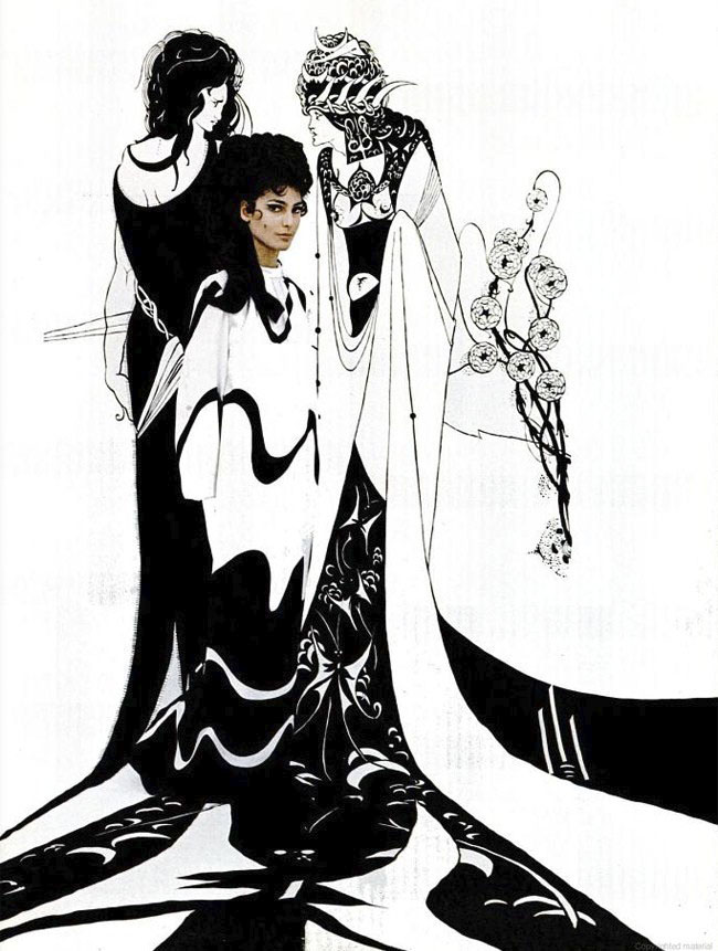
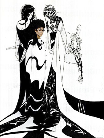
More of Aubrey Beardsley’s posthumous influence and more of the delightful collision between the 1890s and the 1960s. Monsieur Thombeau turned up this striking fashion shoot from LIFE magazine for 1967 showing a model posed against one of the Salomé drawings. A couple of days after this was posted, a reader wrote to point me to this list of films featuring Beardsley artwork. Most of those I knew about already but I certainly hadn’t heard of Death Bed: The Bed That Eats (1977), a low-budget horror film about which we’re told:

A large, black, four-poster bed, possessed by a demon, is passed from owner to owner. The demon was a tree, who became a breeze and seemingly fell in love with a woman he blew past. The demon then took human form and conjured up a bed. While he was making love with the woman she died and his eyes bled onto the bed, causing it to become possessed. Those who come into contact with the bed are frequently consumed by it (victims are pulled into what is apparently a large chamber of digestive fluids beneath the sheets). The bed demonstrates a malevolent intelligence as well as some psychokinetic and limited telepathic abilities to manipulate dreams. A running commentary or chorus is supplied by the ghost—if that is the correct word—of an artist (who would appear to be Aubrey Beardsley, though this is never stated directly) trapped behind a painting on the wall.

That’s a posthumous fame Aubrey never would have anticipated. If anyone has seen this, let us know what you thought.

carryon.jpg

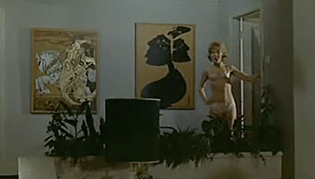
Carry On Loving (1970).

Absent from the list of films is Ken Russell’s Salome’s Last Dance, which features the Salomé pictures again in its title sequence, and Carry On Loving, one of the dreadful British sex comedies which has an entire scene set in a modish pad decorated with Beardsley prints. Watch the scene in question here, if you must.

galleryfive.jpg

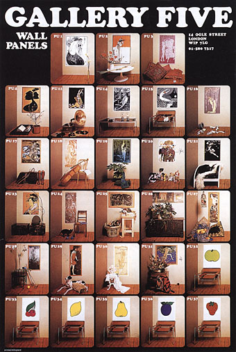
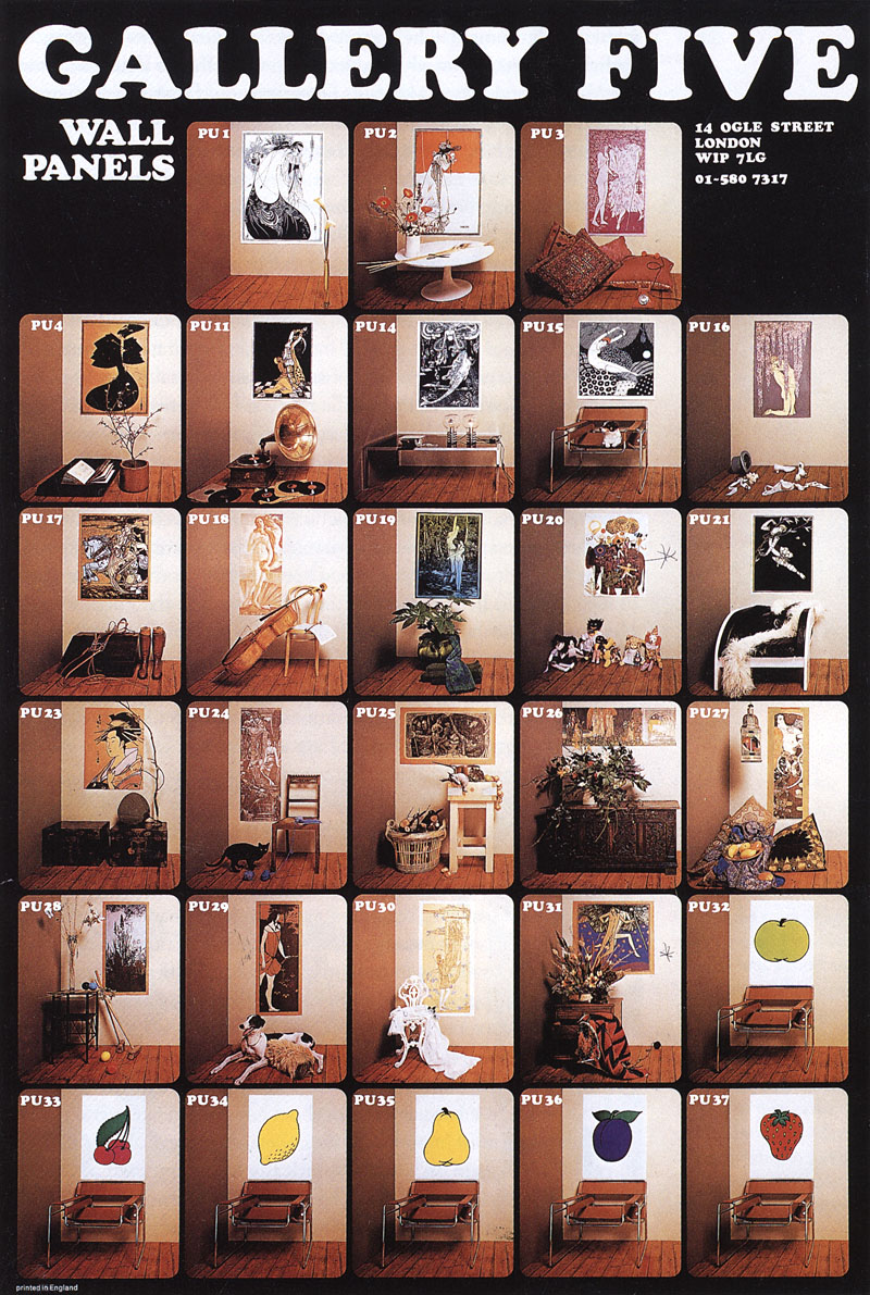
The prints were produced by a London company, Gallery Five, in the late 60s, and their ad shows they were also selling works by Kay Nielsen (seen in the Carry On clip), John Austen, Charles Ricketts, George Barbier, Jessie King and others. Gallery Five did much to popularise Beardsley’s art among people who might otherwise have never noticed his work, and their products turn up in many films and TV dramas of the period. Finally—although it’s by no means the last word on this subject—the V&A has two great Beardsley-derived ads for Elliott Boots by Paul Christodoulou here and here.

Elsewhere on { feuilleton }
The Aubrey Beardsley archive