The Red Book by Carl Jung

jung.jpg

This month is a major one in book publishing as Carl Jung’s magnum opus The Red Book, or Liber Novus, which has remained unpublished for 80 years, is issued in a facsimile edition. Selections of pages have been turning up in reviews and online previews which easily whet the appetite.

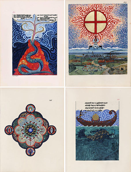
In his late 30s, Jung started writing a book called The Red Book. The Red Book is part journal, part mythological novel that takes the reader through Jung’s fantasies — hallucinations he self-induced to try and get to the core of his unconscious. … The book detailed an unabashedly psychedelic voyage through his own mind, a vaguely Homeric progression of encounters with strange people taking place in a curious, shifting dreamscape. Writing in German, he filled 205 oversize pages with elaborate calligraphy and with richly hued, staggeringly detailed paintings. (More.)

Jung maintained a lifelong fascination with alchemical symbolism and many of these pages resemble the kind of plates one finds in alchemical treatises such as the Splendor Solis, if that book had also contained additions from William Blake and Hildegard von Bingen. The only drawback is the price: at £120 this isn’t a casual purchase, but then this is over 400 pages of full-colour at a big size, 45.7 x 30.5 x 5.1 cm. Time to start petitioning rich relatives for Christmas.

The Holy Grail of the Unconscious

Previously on { feuilleton }
The art of Julien Champagne, 1877–1932
Digital alchemy
In the Shadow of the Sun by Derek Jarman

Psychedelic Wonderland: the 2010 calendar

pw00.jpg

So I had a bright idea at the end of September… Instead of rehashing old work for a CafePress calendar design, I thought I’d try something new. I hadn’t done any artwork for myself all year, everything I’d been working on was a commission of some sort. In addition to that, I’d spent a large portion of the year delving deeper into the psychedelic music of the late Sixties, especially the wealth of obscure British bands to be found on the seemingly endless series of compilations which have trickled out over the past two decades. Everyone is familiar with Jefferson Airplane’s White Rabbit but, as I’ve noted before, themes from, and allusions to, the Alice books run through British psychedelia to an even greater degree. The Beatles put Lewis Carroll in their pantheon of influences on the cover of Sgt. Pepper, and Wonderland’s atmosphere of Victorian surrealism chimed perfectly with a resurgence of interest in Victorian art and design.

So at the end of September, mulling over ideas, I picked up one of my Lewis Carroll volumes and looked at the chapter list: 12 chapters…12 months…I could do a psychedelic Alice in Wonderland! The only drawback was being weighed down by ongoing work which meant that anything I did would have to be created quickly and easily. I reckoned it was manageable if I put a few rules in place first: try and rough out a chapter a day; make copious use of clip art decoration and scanned engravings; keep things bold and florid without worrying too much about fidelity to minor story points. In theory I could do the whole thing in about two weeks if I kept on schedule. As it turns out the whole thing took me three weeks as I got increasingly involved with illustrating the story. You can see the results below and larger copies of the pictures here. Two years ago I was saying I probably wouldn’t ever illustrate Lewis Carroll. That was true at the time since I couldn’t find an approach to the stories that would sustain my interest and (possibly) bring something new to the books. Seeing Alice’s adventures through the psychotropic prism of the late Sixties showed me the way into Wonderland. What’s needed now is to do the same next year for Looking-Glass Land. Watch this space.

Some notes on the pictures follow below.

Update: By popular demand, this calendar is now available again.

Continue reading “Psychedelic Wonderland: the 2010 calendar”

Album cover postage stamps

albums1.jpg

top row: The Division Bell by Pink Floyd; A Rush of Blood to the Head by Coldplay.
bottom row: London Calling by The Clash; Tubular Bells by Mike Oldfield.

The Royal Mail follows its series of British Design Classics postage stamps with a series dedicated to what they call “classic” album covers. The design classics in the earlier series deserved the term—a  Mini motor car, a Penguin book cover, the London Underground map, etc—whereas here we have the word “classic” being used in its lazy journalist sense where it becomes a synonym for “popular” and “familiar”, two attributes which often diminish with time.

albums2.jpg

top row: Parklife by Blur; Power, Corruption and Lies by New Order.
bottom row: IV by Led Zeppelin; Screamadelica by Primal Scream.

It should be noted that the choice of cover art was limited to releases by UK artists, and the designs had to be readable at the very small size of a postage stamp. Even so, I can’t help but regard this as a missed opportunity. There was no need to feature the Beatles since they’d been given their own set of stamps in 2006, but I’ve never thought of the cover of Let It Bleed (below) as a classic, even though musically it’s one of the best Stones albums. I’d rather choose Andy Warhol’s cover for Sticky Fingers but you can imagine the upset at stamp users being forced to lick a picture of a bulging pair of jeans. As for Pink Floyd’s Division Bell, it’s a typically striking design from Storm Thorgerson but does anyone really think it’s more classic than earlier Floyd covers, not least the Dark Side of the Moon prism which even people who hate the band can instantly recognise? Nearly all these choices seem confused or compromised; the Clash cover is the token punk offering—Royal Mail wouldn’t dare choose Never Mind the Bollocks—but Ray Lowry’s design was copied from an Elvis Presley sleeve; Led Zeppelin’s IV is a great album but other releases had far better covers; Primal Scream, another great album but the whole sleeve design is perfunctory; the Blur choice is merely bewildering.

albums3.jpg

left: Let It Bleed by The Rolling Stones; right: The Rise and Fall of Ziggy Stardust and the Spiders from Mars by David Bowie.

As far as designers go, Hipgnosis (via Storm T), Peter Saville (New Order), and Stylorouge (Blur) are included here but there’s nothing from Barney Bubbles, Malcolm Garrett, 23 Envelope, Neville Brody, Designer’s Republic or any of the other pioneering British designers of the past 30 years. The trouble with those names, of course, is that many of the artists they worked for aren’t popular or familiar enough to the average British stamp purchaser so their work can’t be deemed “classic”. A best of British, then, which could have been a lot better.

Classic Album Covers will be issued on January 10th, 2010.

Elsewhere on { feuilleton }
The album covers archive

Previously on { feuilleton }
British Design Classics
Stamps of horror
Endangered insects postage stamps
James Bond postage stamps
Please Mr. Postman

Emil Cadoo

cadoo.jpg

Untitled (1963).

One of a small number of pictures from a recent exhibition of work by American photographer Emil Cadoo (1926–2002) whose nude studies and often homoerotic themes were controversial in America of the Fifties and Sixties but welcomed in France, as was often the case at that time.

In April 1964, all 21,000 copies of the April/May issue no.32 of the American magazine Evergreen Review – containing (among others) texts by Norman Mailer, Jean Genet, William Burroughs, Bryon Gysin, Michael McClure, Karl Shapiro (a who’s who of the day’s practitioners of perceived outrage), and an erotic photo-essay by Cadoo – was seized by the police whilst it was still being bound. The edition had been deemed ‘obscene’ by the county’s district Attorney, whose particular disapproval was leveled at Cadoo. It took the special intermission of Edward Steichen, who compared the images to the work of Auguste Rodin “the greatest living sculptor of our time”, to obtain the condemnation of three judges of this action as ‘unconstitutional’, and to return the magazine to the public domain. (More.)

Cadoo favoured the double-exposure to achieve painterly or (for want of a better word) “poetic” effects, and some of these photos were used on book jackets by Grove Press (also the publishers of Evergreen Review), among them this Genet title which I posted a couple of years ago. More of Cadoo’s work can be found on various gallery sites but there’s no dedicated site unfortunately.

genet2.jpg

Photo by Emil Cadoo; design by Roy Kuhlman (1963).

Previously on { feuilleton }
Penguin Labyrinths and the Thief’s Journal
Un Chant d’Amour by Jean Genet