Antonio Basoli’s Pictorial Alphabet

basoli1.jpg

My thanks to Paul Rumsey for reminding me of the Alfabeto pittorico (1839) by Antonio Basoli (1774–1848). This is the same idea as yesterday’s pictorial alphabet but with an architectural theme. Basoli’s series of prints depicts each letter in an architectural style which matches the initial: A is for Arabia but also for aranciera (orangery). The attention to detail and the rendering of light and shade is very Piranesian, and it so happens that Piranesi had earlier designed a small number of capitals for use in books, the letterforms being created by architectural scenes. It’s tempting to see Basoli’s series as an elaboration of this idea done in the manner of Piranesi’s Prima parte di Architettura e Prospettive.

Given how much I enjoy this kind of thing I would have posted something about them by now, but seeing as they’d already been covered by the late-lamented Giornale Nuovo I stayed my hand. Mister Aitch’s post on the subject is still worth a look for the detail he supplies regarding the prints and their creator. For scans of the entire volume, go here.

basoli2.jpg

basoli3.jpg

basoli4.jpg

Continue reading “Antonio Basoli’s Pictorial Alphabet”

Grand capitals

larousse1.jpg

It’s no doubt true to say that they don’t make them like this any more, but it’s also likely that they didn’t make many of them like this in 1866 when the first volume of Pierre Larousse’s Grand dictionnaire universel du XIXe siècle was published. Despite the title this is a 15-volume encyclopedia, each volume of which opens with a spread showing the initial letters of the section that follows. The illustrations fill most of each page, the left-hand side displaying the section initial in letterforms or typefaces from different ages, while the right-hand side embellishes a huge decorated letter with objects or scenes sharing the same initial. These are all in French, of course, so a pig (cochon) sits under the letter C. Illustrated alphabets are an old idea, and still a very common one since they make good teaching aids. Seeing these elaborate examples makes me wonder how far back the idea can be traced.

These pictures are from an incomplete set of the books at the Internet Archive. A more complete set can be found via this Wikipedia page but the scans linked to there are all bitmap images which have lost much of their detail.

larousse2.jpg

larousse3.jpg

Continue reading “Grand capitals”

Weekend links 195

ethellerossignol.jpg

Untitled painting (c. 1920–1933) by Ethel le Rossignol depicting “the Sphere of the Spirit”. An exhibition of  Ethel le Rossignol’s channelled paintings takes place at the Horse Hospital, London, next month.

• “It’s always disconcerting to discover a favourite writer was kind of a jerk. How does this realization effect our understanding of Walter Benjamin’s work?” asks Morgan Meis.

• Mixes of the week: Georges Vert (aka Jon Brooks) presents The Pan-Europa Mix. Mr Brooks also unveiled another seasonal mix which he calls Winter Velvet.

Knopheria by Chrome Hoof ft. Shingai Shoniwa. A video from the band’s latest album.

Without sci-fi trappings of any kind, The Metamorphosis forces us to think in terms of analogy, of reflexive interpretation, though it is revealing that none of the characters in the story, including Gregor, ever does think that way. There is no meditation on a family secret or sin that might have induced such a monstrous reprisal by God or the Fates, no search for meaning even on the most basic existential plane. The bizarre event is dealt with in a perfunctory, petty, materialistic way, and it arouses the narrowest range of emotional response imaginable, almost immediately assuming the tone of an unfortunate natural family occurrence with which one must reluctantly contend.

David Cronenberg on Franz Kafka’s story.

• “I was very much into now-ism.” Laraaji talks to Bobby Barry about his music.

The Edge Question for 2014: “What scientific idea is ready for retirement?”

Storybook Apocalypse: Beasts, Comets, and Other Signs of the End Times.

• Return of the wunderkammer: Philip Hoare on cabinets of curiosities.

• Birditis: Ian Penman on the “full catastrophe” of Charlie Parker.

Rick Poynor on The Compulsively Visual World of Pinterest.

• RIP psychedelic poster artist Gary Grimshaw.

• At PingMag: The automaton clocks of Tokyo.

Dust & Grooves: Vinyl music culture.

Wunderkammern at Pinterest.

Ligeti: String Quartet No. 1 “Metamorphoses nocturnes” (recorded 1978) The Arditti Quartet | Thru Metamorphic Rocks (1979) by Tangerine Dream | Metamorphosis (2012) by Demdike Stare

Lynd Ward’s Frankenstein

ward1.jpg

Mary Shelley’s novel illustrated in woodcuts by the great Lynd Ward (1905–1985). This edition appeared in 1934, a couple of years after the release of James Whale’s first Frankenstein film whose popularity may have led to its commission. It’s good to see Dover Publications keeping this one in print when first editions go for hundreds of pounds. VTS has more of the illustrations (there’s also this site), and many more examples of Ward’s work.

ward2.jpg

ward3.jpg

ward4.jpg

Elsewhere on { feuilleton }
The illustrators archive

Previously on { feuilleton }
Two Brides
Berni Wrightson’s Frankenstein
Cain’s son: the incarnations of Grendel
Gods’ Man by Lynd Ward

Einstein on the Beach

einstein1.jpg

Well this was a revelation. Einstein on the Beach (1976) is Philip Glass’s first opera, a collaboration with theatrical producer Robert Wilson, and the only Glass opera with which I’m familiar. With a running-time of almost five hours it’s not light listening, and when many of the pieces consist of little more than slabs of keyboard or choral arpeggios it’s always been evident that visuals are required to augment music that otherwise threatens to outstay its welcome.

einstein2.jpg

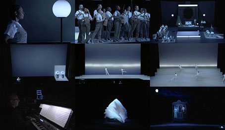
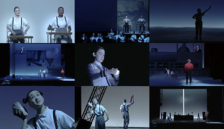
The opera has been revived several times, and in 2012 a touring presentation was staged. Despite it being one of the most celebrated works by Glass and Wilson a complete performance has never been filmed, until this month, that is, a staging at the Theatre du Chatelet in Paris. The shots here are from a video stream of the entire four-and-a-half hour show, and it’s astonishing to discover how much your appreciation is elevated—and the music enhanced—by the performance and the production.

Einstein’s life is the ostensible subject but it’s up to the audience to interpret the many allusive symbols and motifs that may (or may not) be derived from either the man’s biography or his scientific theories. The libretto is strictly formal and fragmented, and while the score alone may drive some listeners to distraction the visuals change continually, maintaining the interest while the text and music work through their cycles. Philip Glass had this to say about the work in 2012:

The opera isn’t a narrative about Einstein’s life. What connected Bob and I was how we thought about time and space in the theatre. We worked first with the time—four hours—and how we were going to divide it up. Then we thought about the images, and then the staging. I discovered that Bob thinks with a pencil and paper; everything emerged as drawings. I composed music to these, and then Bob began staging it.

Yet the piece is actually full of Einstein. Practically every image comes from Einstein’s life or ideas: trains, spaceships, clocks. And I suggested we have a musician taking his part, because Einstein played the violin—although he was such an amateur musician he couldn’t possibly have played the music I composed for him. (more)

einstein3.jpg

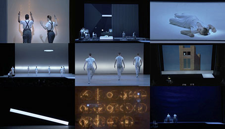
I’ve seen many photos of Wilson’s designs for the opera in the past but static views do nothing to convey the drama and impact of his designs when you see them coming together on the stage. The same goes for the performers, many of whom are required to be trained dancers as well as actors: several scenes are elaborate dance pieces. It’s been a pleasure to see at last the presentation of the mysterious “Knee Play” sections which separate the four acts. And I was surprised by the similarity—intentional or not—of some sequences to the shots of the slaving workers in Fritz Lang’s Metropolis, especially the climactic (and incredible) “Spaceship” scene where the whole stage erupts into light and movement. It’s easy to see why New York’s art crowd were so beguiled by this opera following its first performances in the 1970s, it really is a remarkable piece of work. The streaming version will apparently remain active for a while (there’s also a DVD release planned), and while I wouldn’t want anyone to indulge in piracy I’ll note that there’s currently a torrent of the entire video circulating if you know where to look. If you’ve any time for Philip Glass I can’t recommend this too highly. (Via Metafilter.)

Previously on { feuilleton }
Milton Glaser album covers