Elric 1: Le trône de rubis

elric1.jpg

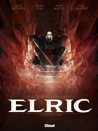
The closest I ever got to illustrating Michael Moorcock’s Elric character was the sleeve for The Chronicle of the Black Sword in 1985, a Hawkwind concept album based on the first couple of Elric books. That design favoured a decorative approach over anything illustrative, however. At the time I felt too intimidated by the renderings of Elric’s first illustrator, James Cawthorn, and subsequent depictions by book cover artists such as Michael Whelan, to attempt my own version of the character. These days I pay little attention to heroic fantasy of any kind but I do look out for new depictions of Moorcock’s anti-hero. Earlier this year the French bande dessinée publisher, Glénat, released the first album in a planned series of five comic-strip adaptations of the Elric books. Many creditable Elric comics have appeared since the 1970s, not least the Cawthorn version of Stormbringer, one of the earliest and best, and Philippe Druillet’s own somewhat eccentric production. Mike Moorcock very generously sent me a copy of the Glénat volume this week, and I’d say this is now the one to beat.

elric2.jpg

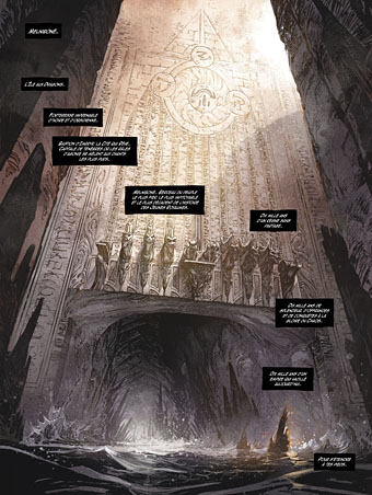
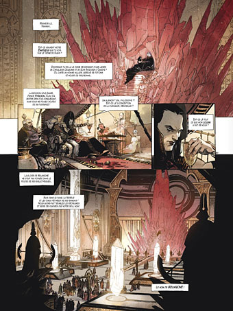
Writer Julien Blondel has adapted the books with the art duties being taken by Didier Poli and Robin Recht. Jean Bastide is the colourist. I’ve always preferred the French and Belgian approach to comic art over the American style so I’m naturally biased towards a book such as this. That said, the art is marvellous, and so many of the details feel just right. Moorcock portrays the Melnibonéans as decadent and cruel, something that Poli and Recht portray with scenes of naked slaves being bled, butchered, and even used as human torches for the blithe amusement of their masters. The general atmosphere in the opening pages is like something from Flaubert’s Salammbô with its combination of antique depravity and the massing of great armies prior to battle. They don’t slouch with the monstrosities, either, there’s a spot of Lovecraftian weirdness when Elric is rescued by Straasha, the Sea King. I look forward to seeing how they deal with Arioch (who puts in an appearance at the end) and the other Chaos Lords. The dialogue is all in French, of course, but if you know the books it’s easy to follow even with French as limited as mine.

elric3.jpg

The Glénat site has a few more page samples. Moorcock has been watching these books being adapated and re-adapted for decades, and he says this is among the very best. For anyone with more than a passing interest in the brooding albino prince it’s well worth seeking out.

Previously on { feuilleton }
Salammbô illustrated
Jim Cawthorn, 1929–2008

Ralf and Florian

randf.jpg

Ralf and Florian, 1973. Back cover photo by Barbara Niemöller.

Kraftwerk’s third album, Ralf and Florian, is forty years old this year. It was recorded and mixed from May to July, 1973, and released three months later. As with the first two Kraftwerk albums, it still hasn’t been given an official CD reissue. When so many albums by the big names of the 1970s have been reissued multiple times Kraftwerk are pretty much unique in suppressing part of their catalogue.

raf.jpg

Photo by Robert Franck.

The reason usually given for this is that the fourth album, Autobahn (1974), was the first to adopt the conceptual style that became a hallmark of the group’s output. Well, yes and no. The celebrated sleeve design for Autobahn went through several variations, and the motoring theme only applies to the first side of the album. The second side doesn’t match the theme at all, and with its melodies and instrumentation (Florian was still using his flute) is much closer to the previous albums, especially the third one, than those that came after. What Kraftwerk prefer to see as a clean break is really more of a gradual evolution.

randf.jpg

The sleeve for the first UK release. No designer credited.

I’ve always liked the Ralf and Florian album, and don’t mind so much that it’s not been given a proper reissue. Bootleg copies circulate, and even the original vinyl isn’t so scarce. A couple of things related to the album are more difficult to find, however. The first German copies came with a large poster-insert illustrated by the group’s artist/designer Emil Schult. This item more than anything shows a charming, human side to Ralf and Florian which was later overshadowed by the machine-obsessed conceptualism. Large scans of the insert were recently posted at Mostly Retro.

kohoutek.jpg

Then there’s Kohoutek – Kometenmelodie, a 7-inch single released in December 1973 which forms a bridge between the third and fourth albums. Kometenmelodie subsequently appeared in two versions on Autobahn but the single sleeve is very much in the R&F zone with the faces from the album cover, while the back of the sleeve sports Emil Schult’s Kling Klang Verlag logo from the album insert. Kohoutek was a comet visible in the night skies in 1973. This was Kraftwerk’s debut single, presenting two unique versions of Kometenmelodie. It’s never been reissued but both tracks can be heard here. Elsewhere on YouTube there’s a performance of the R&F track Tanzmusik on a German TV programme, a clip which features new group member, Wolfgang Flür, playing his electronic drum pads.

Previously on { feuilleton }
Reworking Kraftwerk
Autobahn animated
Sleeve craft
Who designed Vertigo #6360 620?
Old music and old technology
Aerodynamik by Kraftwerk

Tokyo details

tokyo01.jpg

Another enormous gigapixel panorama appeared this week, this one being a view from the Tokyo Tower by Jeffrey Martin. Some cities suit this detailed bird’s-eye view more than others. A similar panorama of Prague wasn’t as interesting for me as the view over London which appeared at the beginning of this year. Tokyo from this vantage may be an endless clutter of concrete and tarmac but it still yields some interesting details.

tokyo02.jpg

Tokyo’s Ginza district, and Chuo-dori Avenue, are locatable by these signs.

tokyo03.jpg

Further away there’s this cat-and-kitten sign.

tokyo04.jpg

While elsewhere Colonel Sanders proves inescapable. The Colonel’s Wikipedia entry contains this, er…nugget:

The Japanese Nippon Professional Baseball league has developed an urban legend of the “Curse of the Colonel”. A statue of Colonel Sanders was thrown into a river and lost during a 1985 fan celebration, and (according to the legend) the “curse” has caused Japan’s Hanshin Tigers to perform poorly since the incident.

Continue reading “Tokyo details”

Alas Vegas Tarot cards

alasvegasdevil.jpg

Back in February I bought a Wacom drawing tablet and said I’d show some proper results from its use later. For the past few months I’ve been working on this project using a combination of Wacom drawing and vector graphics. The initial brief from games designer James Wallis was for six Tarot-style card designs for his Alas Vegas role-playing game which has as its theme a fantasy extrapolation from Las Vegas and its gaudy mythology. The Kickstarter funding for the game turned out to be more successful than was anticipated so James asked me to expand the six cards idea into a full set of black-and-white Major Arcana designs.

This has been a fun series to work on although a number of the cards presented problems at first, the antique nature of the Tarot symbolism being a difficult thing to map across a very commercial American city. The symbolism from the Rider-Waite-Smith (RWS) deck was used as a rough guide although we deviated in a few places from the more traditional attributes. Las Vegas has changed over the years so rather than represent a single period of the city’s history there are references to different eras, from the huge casinos of today back to the buildings of the 50s and 60s with their distinctive “Googie” architecture. Notes for the cards follow below. The artwork can be seen at larger size here.

alasvegas00.jpg

The Fool is usually a young man about to step off a cliff edge with a dog barking a warning at his heels, hence the dog on the sign.

alasvegas01.jpg

Several of the cards convert the Tarot characters into cabaret acts. This one was pretty inevitable, and I’m sure it’s not the first time a stage conjuror has appeared on this card.

alasvegas02.jpg

The chair is based on the 1965 “Ball Chair” design by Eero Aarnio (as seen in The Prisoner TV series), adapted here to resemble the Priestess’s crescent moon.

alasvegas03.jpg

The style on this one is more 70s than 60s: patterned wallpaper (the hearts derive from the symbolism of The Empress, and from playing cards, of course), white rug, Kung Fu pyjamas.

Continue reading “Alas Vegas Tarot cards”

More Cameron

cameron3.jpg

Untitled (Peyote Vision), 1955, Cameron (from Semina journal, no. 1).

Thanks to Erik Davis for drawing my attention to a small online exhibition of Marjorie Cameron artwork and documentary material. Semina was the magazine founded by Cameron’s artist friend, Wallace Berman. The exhibition note tells us that:

Wallace Berman’s only exhibition at Ferus Gallery in 1957 was raided by the LAPD vice squad because of the small reproduction of this sexually graphic work by Cameron that was part of Berman’s assemblage, Temple.

Allen Ginsberg’s Howl successfully fought off an obscenity charge in the same year but the immediacy of visual art means it always fares less well with disapproving authorities. We can assume that Cameron had personal experience of peyote given some verse written by her husband, Jack Parsons, that Robert Anton Wilson quotes in Cosmic Trigger (1977):

I hight Don Quixote, I live on peyote,
marjuana, morphine and cocaine,
I never know sadness, but only a madness
that burns at the heart and the brain.

cameron4.jpg

On the same site is this wonderful still (or is it a location photo?) from the shooting of Curtis Harrington’s Night Tide in 1961. Seeing this makes me want to watch the film again.

Previously on { feuilleton }
The Wormwood Star
Street Fair, 1959
House of Harrington
Curtis Harrington, 1926–2007
The art of Cameron, 1922–1995