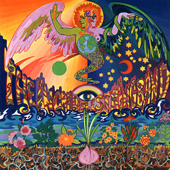
Love Life (1966).
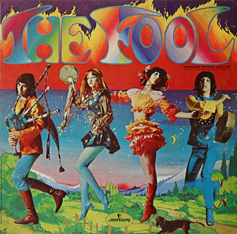
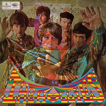
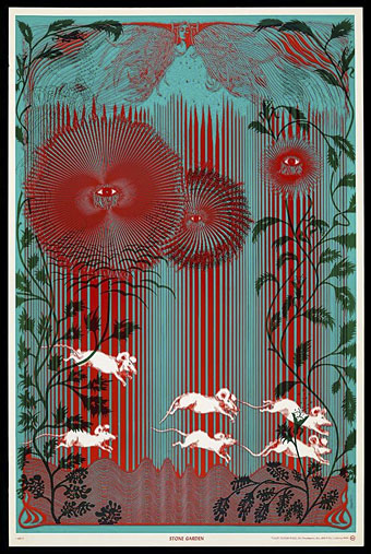
A slight return to The Fool, and specifically the work of Marijke Koger. Since The Fool was a collective it can be difficult separating out the work of individuals but all of these examples are credited as hers in Norman Hathaway & Dan Nadel’s excellent Electrical Banana (2011) book. The nature of the collective also tends to downplay the contribution of women to psychedelic art, with Koger tending to receive less individual credit than Bonnie MacLean does for her US concert posters. Koger’s Love Life design is very advanced for 1966, and could easily have been created at almost any time in the next decade. The Bob Dylan poster below is the most florid representation of Mr Zimmerman I’ve seen, an image that fits the times more than Dylan’s persona which remained resolutely untouched by acid culture.
It’s no surprise with this subject that Sweet Jane has already looked at the work of The Fool. There’s more photos and designs to be found at A Dandy in Aspic (many of them from the Electrical Banana book) while Bang The Drum All Day has some of the graphics produced for Brian Epstein’s Sunday Night at the Saville concerts.
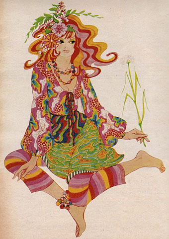
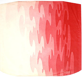
Fashion drawing (1966).
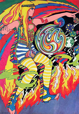
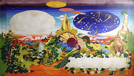
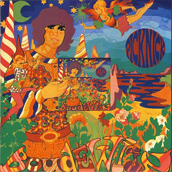
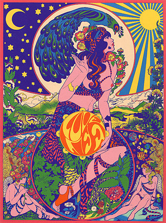
Lucy (1966).
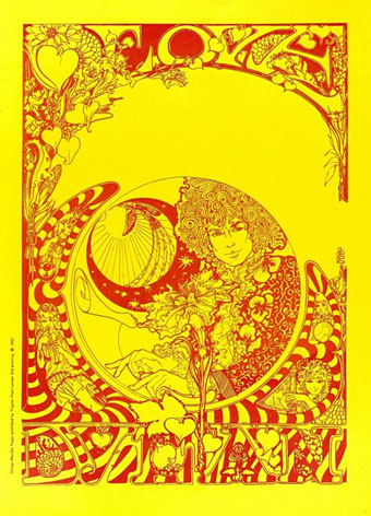
Love Bob Dylan (1967).
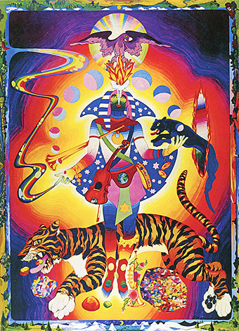
Tiger Man (1970).
Previously on { feuilleton }
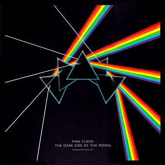
• The Fool album covers
• Through the Wonderwall