Fenella Fielding reads Colette

fenella1.jpg

The latest post at Strange Flowers reminded me of some work of mine that appeared earlier this month which I can finally mention. Fenella Fielding reads Colette is another of those long-gestating recordings from Savoy’s audio division which has been released at last after a lengthy hiatus. This is a double-disc CD set of Fenella’s own selection from the writings of Colette, an author Fenella knows well having portrayed her in Colette, a play by Elinor Jones.

fenella2.jpg

The CD set is a digipak which I designed using a variety of Art Nouveau motifs printed in metallic gold on white card. All the photos are either of Colette or Fenella herself, past and present; the lengthy booklet notes were by the late Monty Haltrecht, a novelist and friend of Fenella’s who followed her career for many years. Monty approved of my initial draft of the design so it’s a shame he wasn’t able to see the finished thing. For the moment the CDs are available only through Savoy but the readings should be on iTunes in due course.

fenella3.jpg

fenella4.jpg

The art of Ted Coconis

dorian.jpg

This poster for Massimo Dallamano’s 1970 updating of The Picture of Dorian Gray was featured here several years ago, and it’s taken me all this time to finally discover the name of the artist responsible, Ted Coconis. Better late than never. It could be argued that the illustrations below for Nabokov and Goldman tend more towards the artist’s own interests than representing the content of the books; I’ve not read Goldman’s novel (or seen the film) but online comments suggest that this was an unsuitable cover; Nabokov’s Ada is an erotic novel which presents its eros in a manner that’s a lot less direct than the painting implies. All I can say to this is that strict accuracy is for pedants; Aubrey Beardsley’s illustrations for Wilde’s Salomé aren’t in the least accurate yet they’re regarded as definitive. Sometimes illustrators are trying to convey in pictorial form an otherwise intangible impression of a book (or a film or play) which is what I see Ted Coconis doing here. There’s a lot more of his work at his website. It’s gorgeous stuff.

coconis1.jpg

Cover illustration for Ada by Vladimir Nabokov.

coconis2.jpg

Pola Negri.

coconis3.jpg

Cover illustration for The Princess Bride by William Goldman.

Elsewhere on { feuilleton }
The illustrators archive

Weekend links 160

floyd.jpg

Collage by Jeneleen Floyd.

• “…slowly, block-by-block, pedestrians are starting to take back the streets.” Wayne Curtis on the hazards of being a pedestrian in a world of cars.

• Michael Hann looks back at LA’s Paisley Underground, and also talks to some of its key members.

Meighan O’Toole interviews JL Schnabel about her Blood Milk jewellery designs.

My central thesis is that camp was always a kind of signifying practice invented out of necessity (both for survival and for sheer creative pleasure) by “queer” (in the classic sense) outsiders – fags, drag queens, transsexuals, deviants, sexual renegades – and that it was always by its very nature deeply political and committed: Some people dedicated their entire lives to it! Sontag’s interpretation always seemed a bit dismissive to me somehow.

The seldom unprovocative Bruce LaBruce talking to Mark Allen about camp in the 21st century.

• Studiocanal launches an appeal to find the lost materials of The Wicker Man.

• At Flickr: Tales from a Parallel Universe and London’s Lost Music Venues.

Michael Wood tells us what we learn when we read Italo Calvino’s letters.

• Fragments of a Portrait: Francis Bacon and David Sylvester in 1966.

• An extract of a live session from Adrian Sherwood and Pinch.

• In Baba Yaga’s Hut: Amelia Glaser on Russian folk tales.

Buckminster Fuller Book Covers from the 1970s.

A Century of Proust.

The Real World (1982) by The Bangles | With A Cantaloupe Girlfriend (1982) by The Three O’Clock | Medicine Show (1984) by The Dream Syndicate | No Easy Way Down (live in Tokyo, 1984) by The Rain Parade

Several more Salomés

durnov.jpg

Cover of Salome by Oscar Wilde (1903) by Modest Alexandrovich Durnov.

Gathering a few more Salomé renderings which have caught my attention recently. The biggest surprise is the one from Picabia since he’s an artist who these days is almost always associated with the Cubists and Dadaists. In the 1920s he returned to figurative painting and produced a number of pieces in this style. The overlaying of images reminds me of some of Hans Bellmer’s drawings.

Michael Zulli is an American comic artist whose work I’ve always liked a great deal. No information about his drawing, unfortunately, so I can’t say whether it’s a one-off or part of a larger project.

wilmer.jpg

Salomé (1917) by John Riley Wilmer.

picabia.jpg

Salomé (c. 1928) by Francis Picabia.

kalmakov.jpg

Salomé Sphinx (1928) by Nicholas Kalmakoff.

zulli.jpg

Salomé (no date) by Michael Zulli.

Elsewhere on { feuilleton }
The Salomé archive

Ogdens’ Nut Gone Flake

ogdens1.jpg

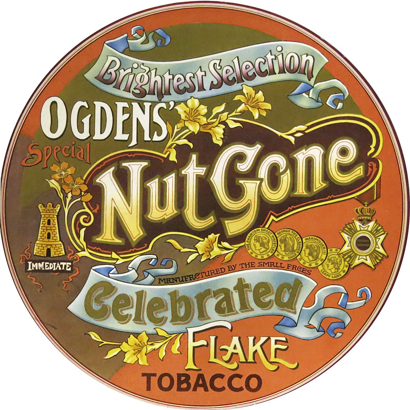
More psychedelia (there’s always more psychedelia). Listening to this Small Faces album this week I couldn’t remember whether my vinyl reissue from the 1980s had survived the vinyl purge I instituted a few years ago. It turns out I do still have the vinyl copy, a facsimile of the original circular sleeve. Ogdens’ Nut Gone Flake was released in 1968. Despite the innovative sleeve design and the generally tripped-out atmosphere (especially on side two) it seldom gets included in retrospectives of psychedelic album art. This is surprising since for design and execution it’s far better than the sleeves for Their Satanic Majesties Request and Magical Mystery Tour, the latter a great album with a really awful cover. I suspect the Small Faces’ album gets overlooked because the most typically psychedelic aspect of the artwork—the drawing/collage below—is hidden inside, the rest of the cover being a careful imitation of an “Ogdens’ Nut-brown Flake” tobacco tin. XTC borrowed the circular sleeve idea for their 1984 album The Big Express.

ogdens2.jpg

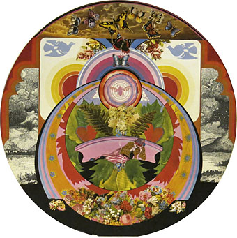
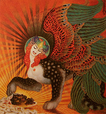
Interior panel. Illustration by P. Brown.

The drawing is credited to one “P. Brown”; the sleeve design, we’re told, was the work of Mick Swan who did nothing else in this area. If I’m vague about the details it’s because my copies of the album (CD and vinyl) contain no information other than the label copy. I imagine recent reissues which have had booklet notes will are more enlightening. This page has some comments from the band as to how the tobacco tin idea came about.

ogdens3.jpg

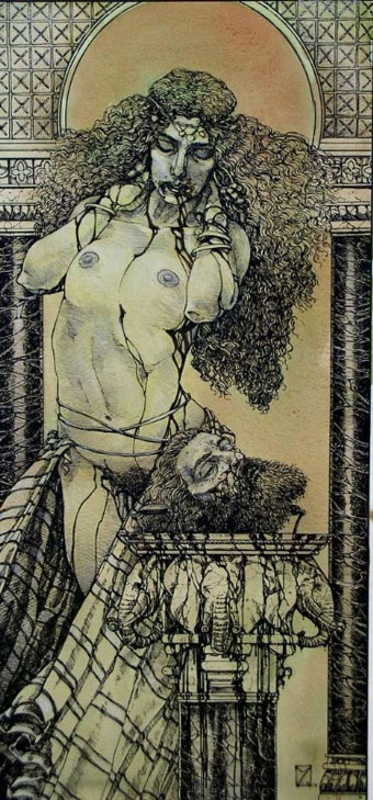
The opened-out sleeve.

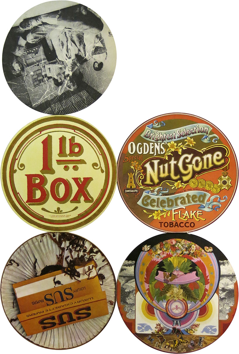
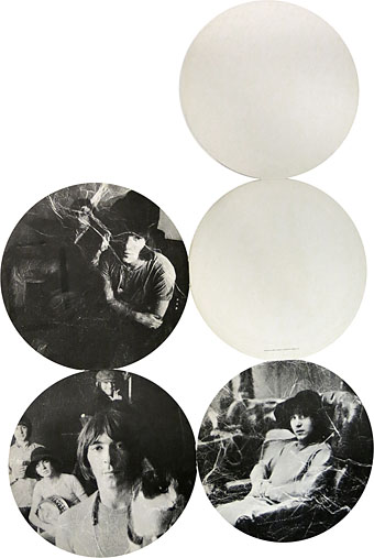
Original copies of this album used to command high prices (so to speak) since the fragile nature of the hinges holding together each part of the sleeve meant they rapidly wore out. Subsequent editions tended to be in regular square sleeves. My CD edition from 1989 was the first to make the most of the tobacco tin concept by packaging the whole thing in a tin. Inside you get a small reproduction of the fold-out sleeve and six somewhat redundant beer mats or coasters.

The band played two-thirds of the album on the BBC’s Colour Me Pop in 1968, complete with an appearance by Stan “The Man” Unwin who provides the “loony links” on the second side of Ogdens’ Nut Gone Flake. Most editions of Colour Me Pop are lost but that episode survived, and may be watched here.

ogdens4.jpg

The opened-out sleeve (obverse).

Elsewhere on { feuilleton }
The album covers archive