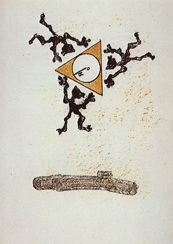
Ésser del Cap (1977–78).
A pair of works by a Catalonian artist whose varied and occasionally Surrealist output can be viewed here. There’s further work and career details here but not in English. Via.
Sin título (1982).
A journal by artist and designer John Coulthart.

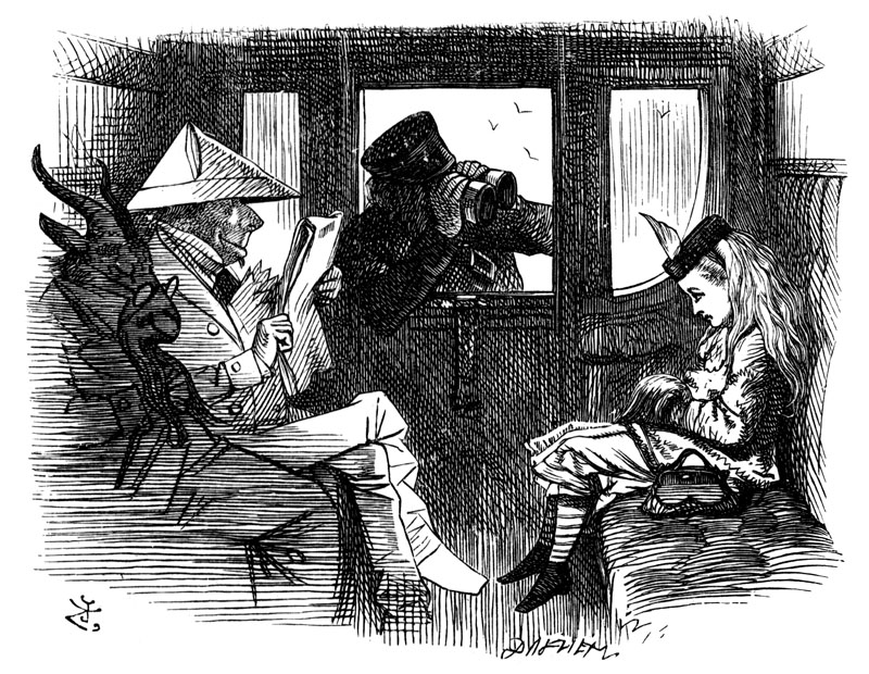
One of John Tenniel’s illustrations for Through the Looking-Glass (1871).
The collaboration with Carroll, and the production of this clairvoyant illustration gave Tenniel the chance to accuse the killer, whose identity he knew – because he had, at some level, shared in the crime. His capped (or crowned) Guard wears the Diamond and stares, eyeless, at the girl: because he is, or stands for, the Red King. He is checkmated. The Goat accuses him, a Tarot Devil, representing ‘ravishment, force, fatality’. So Tenniel is able to put into his depiction of Alice the details of the murders that the police have never made public. The hands of the victims were always tied in front of them – as Alice’s are, within her muff. They were all strangled with a knotted scarf, such as the one that Alice wears. And a single feather was knotted into their hair. I rest my case.
There’s further divination by Iain Sinclair of Tenniel’s carriage scene in his 1991 novel Downriver but you’ll have to search out the book if you want the rest. The picture above is scanned from my 1908 edition of the two Alice novels which has the sharpest reproductions of Tenniel’s illustrations I’ve seen, not least because they’re printed on quality paper. Later editions often print second- or third-generation copies with the cross-hatched areas reduced to black smudges.
Oedipus by Max Ernst from Une semaine de bonté (1934).
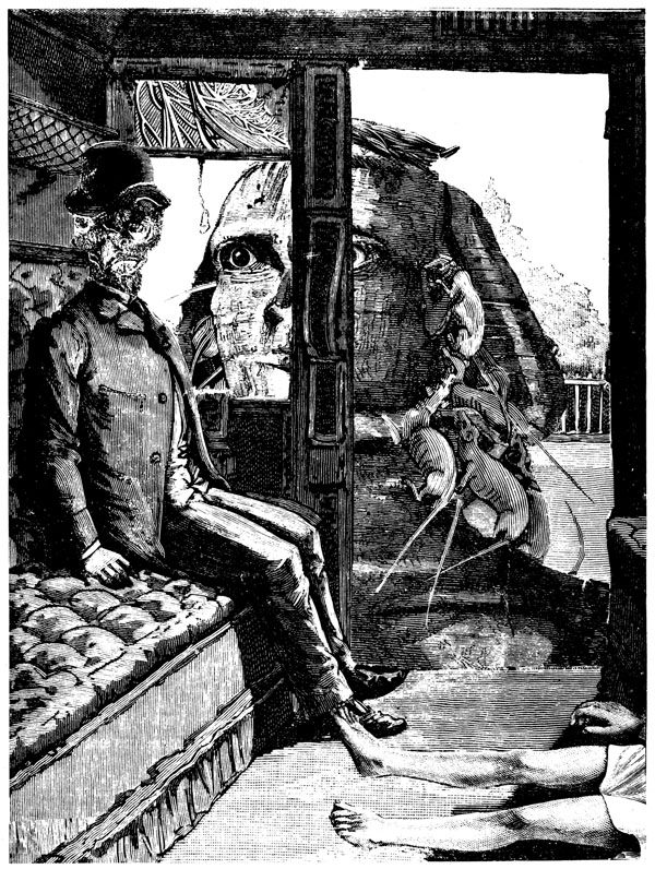
Tenniel’s carriage scene has always been linked for me with this collage by Max Ernst from his Surrealist masterwork, Une semaine de bonté. Sinclair’s proposed murder scenario gives the two pictures an additional resonance when you notice the body on the floor of Ernst’s carriage. Is this Oedipus’s father, recently slain by his son, or some other victim?
Lithograph by Max Ernst from Lewis Carroll’s Wunderhorn (1970).
Salvador Dalí illustrated Alice’s Adventures in Wonderland in 1969 which perhaps prompted Ernst’s own set of mysterious Alice-inspired lithographs a year later. I’ve yet to see a complete set of the Ernst prints, if anyone has a link then please leave a comment. The artist’s collage novel is a lot easier to find since it’s one of the many great books that Dover Publications keep in print.
Previously on { feuilleton }
• Through the Psychedelic Looking-Glass: the 2011 calendar
• Jabberwocky
• Alice in Acidland
• Return to Wonderland
• Dalí in Wonderland
• Virtual Alice
• Psychedelic Wonderland: the 2010 calendar
• Charles Robinson’s Alice’s Adventures in Wonderland
• Humpty Dumpty variations
• Alice in Wonderland by Jonathan Miller
• The Illustrators of Alice
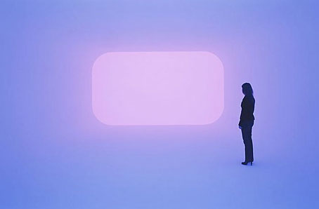
Dhatu (2010).
The intensities of colour found in some of James Turrell’s light works might warrant the description “psychedelic” at times, although “transcendental” is probably more apt when it comes to his immersive environments. Dhatu is one of the latter, a new installation at the Gagosian Gallery, London, where a room filled with changing shades of light has been named after a bodily element from Buddhism. The gallery says of the work:
Light like this is seen rarely with the eyes open, yet it is familiar to that which can be apprehended with the eyes closed in lucid dream, deep meditation, and near-death experiences.
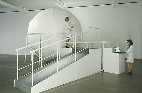
Bindu Shards (2010).
As for Bindu Shards, also at the Gagosian, the name refers to a kind of cosmic singularity in Hinduism and for this Turrell has created a bathysphere-like chamber which visitors are required to enter one at a time in order to experience its light show. This one really does sound psychedelic if Jonathan Jones’ frothing description is anything to go by:
Then I see a cityscape of vertiginous skyscrapers, with no earth below. All these forms and volumes that pulse and metamorphosise are defined by colours that change convulsively – the most intensely saturated greens and reds you can imagine, colours that seem solid, then burst into microscopic patterns of oranges, blacks, gold and misty white; all these colours bubble and whir at breakneck speed, as if you were in a particle accelerator. (More)
And a frothing description is all that’s available unfortunately, now that visiting sessions are fully-booked, but the other Turrell works will be on view until December 10, 2010.
• Greeting the Light: An Interview with James Turrell
• Other Turrell works at Flickr
Previously on { feuilleton }
• Colorscreen
• New Olafur Eliasson
• New work from James Turrell
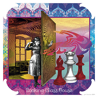
Looking-Glass House.
So here it is at last, this year’s much-delayed calendar design, the sequel to last year’s well-received Psychedelic Wonderland. I’ll get the business stuff out of the way first: would-be purchasers should go to the CafePress shop here while for a better preview of all the artwork look here.
Update: This calendar is now available again.
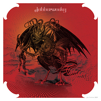
Jabberwocky.
“Seeing Alice’s adventures through the psychotropic prism of the late Sixties showed me the way into Wonderland,” I wrote last year, “What’s needed now is to do the same next year for Looking-Glass Land.” Where the first design was a pleasure to work on—and somehow only took me three weeks—this one turned into a considerable chore. It was my fault, I got started too late, hadn’t really thought what I was going to do (although the earlier design was completely improvised) and, worst of all, was trying to get this done whilst engaged with a stack of far more important work at the same time. As a result it’s a relief to have finished it at all since I nearly abandoned things on more than one occasion.
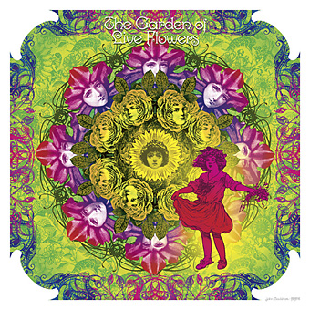
The Garden of Live Flowers.
Another problem was the nature of the two Alice books. Wonderland is a lot easier to illustrate than Looking-Glass although I didn’t quite realise this until I’d begun. The chapters of the first book are very distinctive scenes, each with a differing flavour from those that precede them. The second book either repeats settings—there are many woodland encounters since the chessboard across which Alice moves is a landscape—or the chapters are wholly confused, as in Wool and Water which begins in a train carriage, switches to a shop then ends up in a rowing-boat. As you’ll see below, I opted to illustrate the boat.
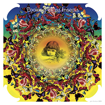
Looking-Glass Insects.
Excuses and complaints aside, I’m very pleased with a couple of these pictures; the Jabberwock came out better than I expected considering I was working at a rate of knots while the Wasp in a Wig (from the book’s lost chapter) could be given a Whistlerian title like Arrangement in Yellow and Black. As with the previous calendar design, the Alice figures change dramatically since they’re all taken from 19th century illustration or advertising art. And I’m now rather tired of looking at insipid pictures of Victorian children… If I do a calendar next year I think I’ll return to compiling earlier work unless inspiration and free time miraculously coincide. For now I hope that everyone who enjoyed the earlier calendar appreciates this one to the same degree.
Continue reading “Through the Psychedelic Looking-Glass: the 2011 calendar”
I was hoping to get my delayed 2011 calendar launched today but other work needed completing so here’s an interim post.
Think of your journey through mortality as a sequence of valid movies and the pain is ameliorated. Forget the tedious 60-minute division of the lecture hall or dead television (quartered by adverts): arrange just enough markers for the 90-minute slots of Golden Age cinema. And then it’s only a question of nominating the eight guides, culture-figures who will dominate your thoughts (and reveries) for as long as you stay upright. The road is endless, you aren’t. Iain Sinclair
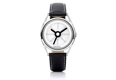
There may be a recession on but people still keep putting out the luxury goods; maybe the bankers are buying all this stuff with their unwarranted bonuses. Compass Road is a limited edition wristwatch from Mr Jones Watches, London, and sports a design commissioned from writer Iain Sinclair, a somewhat surprising choice given that these things are more usually farmed out to those individuals we have to call celebrities. Sinclair is too intelligent and interesting to be a mere celebrity and consequently designs a watch I’d probably buy if I had an excessive income. The watch middle and the hands are based on the British road signs designed by Margaret Calvert and Jock Kinneir while the typeface used for the compass points is Calvert and Kinneir’s Transport (below) which is also used across Britain’s road signs. For the destinations Sinclair has chosen eight writers with London associations: John Clare, Gerald Kersh, Bram Stoker, Joseph Conrad, William Blake, HG Wells, JG Ballard and Louis-Ferdinand Céline. The last seems an odd choice but he did work in London for a while.
Sinclair’s design is a flexible enough to be applied to other literary cities which raises the question of which names you’d choose for Paris, say, or New York. And which signage systems? Subways or the local roads? Compass Road meanwhile can be yours for £145.