I’m out of town for a few days so the archives plug-in has been enabled to throw up some previous postings at random.
A journal by artist and designer John Coulthart.

I’m out of town for a few days so the archives plug-in has been enabled to throw up some previous postings at random.
There’s nothing new about drawing attention to the viral nature of design, whether in the repeated use of motifs and styles or the way in which typefaces breed and proliferate; Jonathan Barnbrook alludes to this process directly by calling his font house Virus.
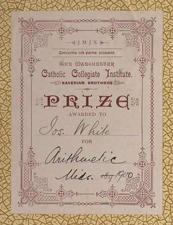
The plate above comes from a Victorian book I bought several years ago, The Pictorial Cabinet of Marvels, a reasonably lavish volume for children concerning places and things of interest around the world. Since I like playing with excessive Victorian flourishes now and then I’m always on the look out for new examples and the border here immediately caught my eye. I have a decent selection of clip art books from Dover and Pepin containing this kind of thing but nothing quite like this particular design. When I was putting the Damnation and A Day album together for Cradle of Filth I took one of the corner pieces as a starting point for a border design I used on the front and back of the booklet and the tray.
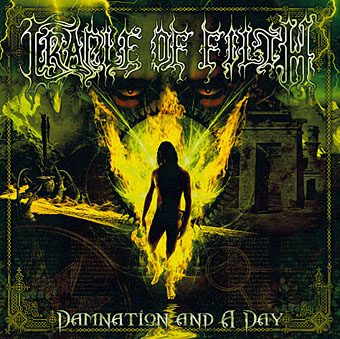
The poor old Xaverian Brothers of Manchester’s Catholic Collegiate Institute would no doubt be mortified to see part of their prize bookplate being used to decorate such a blasphemous artefact. The album was released by Sony Music in 2003 so this little border motif has travelled the world by now. I seem to recall sending the record company the border design separated from the artwork so they could make up some posters.
And so we come to what I’m assuming is its latest manifestation, a poster design for Manifest Destiny, a Los Angeles music event organised by Tee Pee Records.

I say “assuming” since I’ve no idea whether this example is from my design or not. But it seems a safe bet seeing as the original is from such an obscure source. Not that I mind if it is, of course. I can’t very well complain when I swiped the thing in the first place, now can I?
Update: Tee Pee designer Sarah MacKinnon writes to say her Victorian motif is from one of Dover’s clip art books. Now I know that I wouldn’t mind finding the book for my own collection. This makes the occurrence of the original more unusual, at least from my point of view, since it’s the only time I’ve spotted one of these reprinted elements in its period setting.
Previously on { feuilleton }
• Masonic fonts and the designer’s dark materials
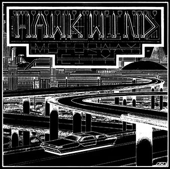
Motorway City by Hawkwind, Flicknife Records single (1983).
This month’s issue of Record Collector magazine has a feature about Hawkwind which featured my Motorway City sleeve among its illustrations. It was odd seeing this again, being a single it doesn’t turn up so often and it has the distinction of being one of the oldest of my works in print. Although the single was released in 1983, the drawing was done in 1980 (I was 18 at the time) and it ended up with Dave Brock somehow.
The A-side is taken from the Zones album, which sports one of my more successful cover illustrations for the band, and the song is a Ballardian eulogy to driving on motorways at night. Despite their reputation for being a bunch of spaced-out hippies, Hawkwind were frequently drawn to the harder side of things (Lemmy used to shout “Die! Die!” at their tripping audience and was proud of freaking people out), and this song isn’t even science fiction, despite my flat futuristic cityscape in the background. Before he finished with the band for good, singer Robert Calvert wrote two songs based on JG Ballard books, High Rise and the punk- and Crash-derived thrash piece Death Trap, both on the PXR5 album from 1979. Motorway City was written around the same time and it’s a shame it didn’t have Death Trap on the B-side instead of yet another version of Master of the Universe. My drawing was done as black on white but the record company smartly (for once) reversed out the design which I always felt made it look a lot better, as well as fitting more with the night-driving theme.
Also this month, I’m in the process of reworking the website a bit which means making more prints of artwork available. I’ve started with some of the Lovecraft pictures, which is always the most popular stuff but I’ll gradually be working through everything and setting up PayPal facilities for other items. Many pictures and designs can already be had as prints at CafePress but that system is best for t-shirts and other goods, it lacks the personal touch which people often want from a signed print.
Previously on { feuilleton }
• Hawkwind: They’re still feeling mean
• Barney Bubbles: artist and designer
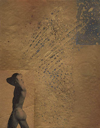
Au-gel (2006).
Resuming my mixed-media, collage work, and experimenting with gold-on-gold effects, this small painting incorporates the figure, printed on tissue paper with “printed” bird wings. The textural effects in the wings suggests a more “butterfly” metaphor, but the texture of the feathers can be more clearly seen in the actual work.
More of Fred Chuang’s obverse angels (and other beings) here.
Elsewhere on { feuilleton }
• The gay artists archive
Previously on { feuilleton }
• Czanara’s Hermaphrodite Angel
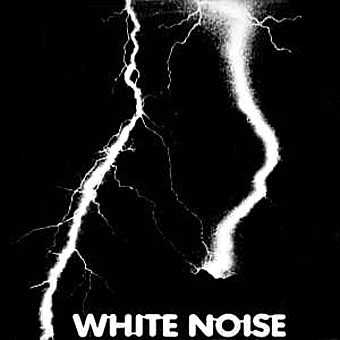
Many sounds have never been heard—by humans: some sound waves you don’t hear—but they reach you. “Storm-stereo” techniques combine singers, instrumentalists and complex electronic sound. The emotional intensity is at a maximum. Sleeve note for An Electric Storm, Island Records, 1969.
An Electric Storm by White Noise is reissued in a remastered edition this week. It’s a work of musical genius and I’m going to tell you why.
Hanging around with metalheads and bikers in the late Seventies meant mostly sitting in smoke-filled bedrooms listening to music while getting stoned. Among the Zeppelin and Sabbath albums in friends’ vinyl collections you’d often find a small selection of records intended to be played when drug-saturation had reached critical mass. These were usually something by Pink Floyd or Virgin-era Tangerine Dream but there were occasionally diamonds hiding in the rough. I first heard The Faust Tapes under these circumstances, introduced facetiously as “the weirdest record ever made” and still a good contender for that description thirty-four years after it was created. One evening someone put on the White Noise album.
It should be noted that I was no stranger to electronic music at this time, I’d been a Kraftwerk fan since I heard the first strains of Autobahn in 1974 and regarded the work of Wendy Carlos, Tangerine Dream, Brian Eno and Isao Tomita as perfectly natural and encouraging musical developments. But An Electric Storm was altogether different. It was strange, very strange; it was weird and creepy and sexy and funny and utterly frightening; in places it could be many of these things all at once. Electronic music in the Seventies was for the most part made by long-hairs with banks of equipment, photographed on their album sleeves preening among stacks of keyboards, Moog modules and Roland systems. You pretty much knew what they were doing and, if you listened to enough records, you eventually began to spot which instruments they were using. There were no pictures on the White Noise sleeve apart from the aggressive lightning flashes on the front. There was no information about the creators beyond their names and that curious line about “the emotional intensity is at a maximum”. And the sounds these people were making was like nothing on earth.
Continue reading “White Noise: Electric Storms, Radiophonics and the Delian Mode”