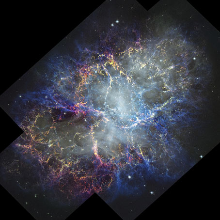
Georges de Feure’s Gate of Dreams

defeure01.jpg

The gate in question, La Porte des Rêves (1899), is a collection of stories by Symbolist writer Marcel Schwob, illustrated in its first edition by Georges de Feure (1868–1943). The collection is actually a kind of “best of Schwob”, being compiled from stories which had already appeared a few years before in other collections. Both Schwob and de Feure were French, and the artist is one of the few whose work may be found in collections of Symbolist art as well as books about Art Nouveau design; you’d think there’d be many more among the conterminous movements but this isn’t the case.

defeure02.jpg

Women are a persistent subject in de Feure’s work, especially the sinister variety who were a staple in fin-de-siècle fiction. Some of these may be found in La Porte des Rêves which features a larger quantity of de Feure’s black-and-white drawing than I’ve seen elsewhere. In a reversal of my usual preferences, I prefer de Feure’s colour work, but anything of his is worth seeing. For a taste of Marcel Schwob’s approach to writing, which included textual collage, see this interview with translator Kit Schluter.

defeure03.jpg

A triple-page spread.

defeure04.jpg

defeure05.jpg

Continue reading “Georges de Feure’s Gate of Dreams”

The Parade and Baron Verdigris

parade01.jpg

Design by Paul Woodroffe.

The Parade, subtitled An Illustrated Gift Book for Boys and Girls, is something that children with wealthy parents or relatives might have received as a Christmas present in December 1897. The contents are an unusual mix of fairy tales, frivolous seasonal fare—A Christmas Mummery, complete with songs and music—and adventure stories set in other parts of the world. The collection was edited by Gleeson White, an art critic whose former position as editor of The Studio magazine explains the very Studio-friendly choice of illustrators.

parade02.jpg

The design on the title page is a curious piece by Aubrey Beardsley, one with less authority than the most of the other drawings he was producing in his penultimate year. Those dots filling out the arabesque plant forms are the kinds of things that amateurs do when they’re uncertain about whether or not to decorate a design. The tendril which terminates in a tasselled confection is, however, a typical example of the artist’s bizarre invention, the kind of caprice that used to infuriate the critics who disliked his work. Beardsley’s career had been launched four years earlier with a profile in The Studio, but by 1897 he was often struggling for money after being fired from The Yellow Book in the wake of the Oscar Wilde scandal. Gleeson White is to be commended for supporting him at a time when many others refused to do so.

parade03.jpg

L. Leslie Brooke.

Elsewhere in The Parade there are contributions both written and pictorial from Beardsley’s friend, Max Beerbohm; also a story by Richard Burton, a writer you wouldn’t usually expect to find in a book aimed at children. The list of illustrators includes Charles Robinson, Laurence Housman and Manchester’s own Alfred Garth Jones. Beardsley didn’t draw anything else for The Parade but he’s mentioned again in a list of titles advertised in the book’s final pages as having provided a frontispiece for Baron Verdigris, “A Romance of the Reversed Direction” by one Jocelyn Quilp. The title was unfamiliar, and I wasn’t sure at first whether I’d seen the illustration, but the drawing shown below appears in two of my Beardsley books—albeit at small sizes—including the copious Brian Reade collection from 1967.

beardsley.jpg

“Baron Verdigris” sounds like a minor character from Michael Moorcock’s Dancers at the End of Time trilogy, while the improbable “Jocelyn Quilp” turns out to be a nom de plume of Halliwell Sutcliffe whose book is described as a “singular novella, a curious amalgam of parodies based on a time-travelling theme“; shades of the Dancers again. It’s tempting to think that this may be the sole example of Aubrey Beardsley illustrating science fiction (or something like it)—the book is generic enough to be listed at ISFDB—but Brian Reade describes the story as “pseudo-mediaeval and facetious”, “dedicated to ‘Fin-de-Siécle-ism, the Sensational Novel, and the Conventional Drawing-Room Ballad'”. That does at least explain the peculiarities of the drawing. Maybe the Moorcock comparison is an apt one after all.

More illustrations from The Parade:

parade04.jpg

Charles Robinson.

parade05.jpg

Léon V. Solon.

Continue reading “The Parade and Baron Verdigris”

Alastair’s Manon Lescaut

alastair01.jpg

The illustrated works of Alastair aren’t always easy to find, not when Hans Henning Voigt (as the artist was known to his German parents) chose a nom de l’art shared by a large portion of Scottish manhood, past and present. This 1928 edition of Manon Lescaut by the Abbé Prévost is a recent arrival at the Internet Archive. The publisher, John Lane, specialised in illustrated editions, and their Manon Lescaut gives an idea of what we might have seen from Aubrey Beardsley had he survived into the 20th century. John Lane had published collections of Beardsley’s drawings together with related works like Robert Ross’s memories of the artist. It was in their interest to continue the posthumous association, hence the pairing of Alastair with a novel that Beardsley himself might have illustrated. Alastair not only positioned himself as an inheritor of Beardsley’s filigreed drawing style but in photographs appears to be adopting the persona of one of Beardsley’s etiolated characters.

alastair02.jpg

This edition of the novel is an English translation by DC Moylan, with an introduction by Arthur Symons, Beardsley’s friend and collaborator when the pair were teamed as editor and art editor of the short-lived Savoy magazine. Symons was an astute critic, his essays are always worth reading; he remembers his friend here while stepping lightly around Alastair’s imitation of Beardsley’s decorations. As for Alastair himself, he did a good job with the illustrations. The figure-drawing isn’t as uncertain as in some of his earlier works, and each piece is printed in two colours (“the colour of fire and night” as Symons describes it), a process he favoured elsewhere. The leading study of Alastair’s art, Alastair: Illustrator of Decadence (1979) by Victor Arwas, reproduces five of the fourteen drawings, only one of which is shown in colour.

alastair03.jpg

alastair04.jpg

alastair05.jpg

Continue reading “Alastair’s Manon Lescaut”

Weekend links 697

munnings.jpg

The Haunted Room, Painted at a Farmhouse on Exmoor (1952) by Alfred James Munnings.

• “In Scotland, children made terrifying jack-o’-lantern turnips and piled cabbage stalks around doors and windows, baiting fairies to bring them new siblings.” It’s that time of year again. Public Domain Review looks at The Book of Hallowe’en (1919) by Ruth Edna Kelley.

• At Wormwoodiana: Mark Valentine on the centenary of Visible and Invisible, EF Benson’s collection of horror stories.

• At Dennis Cooper’s: DC’s ostensibly favourite haunted attractions of Halloween season 2023 (international edition).

Mostly it was down to the environments of their sound. The aerial acrobatics of Fraser’s voice. The architecture of sound that came from Guthrie’s effects-treated guitars; not just the often-cited often-derided ‘cathedrals of sound’ but all manner of sunken ballrooms, tunnels, factories, attics, foundries, observatories, caverns. If any category was required, Cocteau Twins could have been placed within Symbolism, a hallucinatory death-rattle of romanticism in the industrial age, when all that had been discarded returned in dreams and decadence, orgiastic excess, disembodied spectral heads and ornate altars, lonely demons and alluring succubi, jewels and masks and apparitions, all the minutiae of things that the steam engine and the printing press had yet to fully exorcise.

Darran Anderson on the Cocteau Twins’ Head Over Heels at 40. His digs at the music press are a welcome riposte to the nostalgia that often attends discussion of the weekly snark-machine that was the NME, Sounds et al in the 1980s

• Follow the footsteps of the Beast in a guide to Aleister Crowley’s British haunts, with text by Gary Lachman and design by Michelle Merlin. Also at Herb Lester: Occult Paris: City of Night.

• At Print Magazine: Charlotte Beach talks to illustrator and author Edward Carey about his spooky drawings.

• “Silent movies are full of friendly ghosts.” Kathleen Rooney on Caspar, Colleen [Moore] and the Beyond.

• New music: Mizuniwa by Yui Onodera.

Spooksville (1963) by The Nu-Trends | Spooks (1981) by Tom-Tom Club | Spooky Rhodes (1997) by Laika

Spellbinders in Suspense

spellbinders1.jpg

Cover art by Harold Isen, 1967.

I watched Alfred Hitchcock’s The Birds again recently, after which I went looking for the contents list of the collection where I first read Daphne du Maurier’s story. The book in question, Alfred Hitchcock’s Spellbinders in Suspense, is one of the many anthologies that used the director’s name to lure potential purchasers, even though Hitchcock didn’t choose any of the stories and didn’t write any of the introductory notes or mini essays that these volumes usually contain. Spellbinders in Suspense was first published in 1967, and is one of the few such collections to feature a story that relates to one of Hitchcock’s films, so it’s odd that Random House chose to depict a scene from Richard Connell’s The Most Dangerous Game on the cover. The copy that I owned was a Fontana Lions paperback from 1974 which rectified this with a cover that certainly stimulated my interest; growing up in a seaside town I didn’t need much convincing about the viciousness of the common seagull. The book has two further Hitchcock connections via Roald Dahl’s The Man from the South, which had been dramatised in 1960 for the Alfred Hitchcock Presents TV series, and Yours Truly, Jack the Ripper, a story by Psycho author Robert Bloch that first appeared in Weird Tales and which turns up in many anthologies.

spellbinders2.jpg

Cover artist unknown, 1974.

I don’t know when I first saw The Birds but it must have preceded my reading of the book since I remember being surprised at how different du Maurier’s story was to the film. Hitchcock and screenwriter Evan Hunter kept the basic idea of inexplicable bird attacks but moved the location from Cornwall to northern California, retaining a single incident in the scene where a dead seagull is found on a doorstep. The page for Spellbinders in Suspense at the Hitchcock Zone—an excellent information resource—has some of the illustrations by Harold Isen that appeared in the hardback edition, including a drawing of yet more marauding seagulls.

birds.jpg

If you want an idea of Hitchcock’s personal popularity and the power of the Hitchcock brand, look no further than the US poster for The Birds in which the director’s name is almost as large as the title (and much more prominent than those of the actors), while the man himself is also there to offer further enticement. Hitchcock was the first film director I became aware of by name, although when I was 10 or 11 I doubt I could have told you what it was that a film director actually did. The ubiquity of the Hitchcock brand made his presence unavoidable in the 1950s, 60s and 70s in a manner more usually reserved for film stars and pop stars; in addition to books, radio shows and the TV series there was Alfred Hitchcock’s Mystery Magazine, which launched in 1956 and was still running 50 years later; also a long-playing record, Music To Be Murdered By, in which the director’s familiar drawl delivers snatches of black humour between each musical selection. In the book department, the Hitchcock Zone lists 127 Hitchcock-themed anthologies, many of which (like Spellbinders in Suspense) received multiple reprints. And those 127 volumes are just the collections. There’s also Robert Arthur’s mystery novels for younger readers, Alfred Hitchcock and the Three Investigators (1964–87), a 43-volume series in which a trio of Californian boys undertake investigations—many of them with a spooky flavour—whose outcome they report to Mr Hitchcock at the end of each story. I read the first few books in the series, also another story collection compiled by Robert Arthur, Alfred Hitchcock’s Ghostly Gallery (1962), a book which in its Puffin reprint gave me my first encounter with The Upper Berth, F. Marion Crawford’s frequently anthologised tale of clammy nautical horror. Ghostly Gallery was another illustrated collection, with scratchy drawings by Barry Wilkinson.

ghostly.jpg

Cover art by Barry Wilkinson. The Puffin edition dates from 1967 but this edition has a decimal price which places it circa 1971.

The extension of the Hitchcock brand into books aimed at children is a curious thing when none of his films are intended for a young audience. My edition of Spellbinders in Suspense was published by a juvenile imprint yet all the stories are ostensibly adult fare. Children in Hitchcock’s cinema are either treated as a nuisance (the small boy who has his balloon burst by Bruno in Strangers on a Train) or end up in serious peril, as they do in The Birds, The Man Who Knew Too Much (kidnapped and threatened with murder), Strangers on a Train (an out-of-control merry-go-around), and, notoriously, in Sabotage, where another small boy is made to unwittingly carry a time-bomb that blows him and a busload of passengers to pieces. Strangers on a Train also reinforces the Hitchcock brand by showing Farley Granger’s character with one of the earliest anthologies, Alfred Hitchcock’s Fireside Book of Suspense Stories, in the scenes on the train at the beginning of the film.

strangers.jpg

Product placement: Robert Walker and Farley Granger in Strangers on a Train (1951).

All of this retrospection has had me wondering whether Hitchcock might have been interested in adapting another Daphne du Maurier story, Don’t Look Now, since The Birds was his second adaptation after Rebecca. Supernatural stories turn up in the Hitchcock TV series, and there are several more anthologies like Ghostly Gallery yet the films mostly avoid the paranormal (although Vertigo toys with the idea for its first half hour or so). Nevertheless, the subject is given ambivalent treatment in du Maurier’s story which has other qualities that might have appealed. The story wasn’t published until late 1970, however, by which time Hitchcock was planning his return to London with Frenzy. And besides which, the film we have is more than adequate, as well as being a much more faithful adaptation than Melanie Daniels’ journey into avian nightmare.

Previously on { feuilleton }
Painted devils
The poster art of Josef Vyletal
The Magic Shop by HG Wells