Weekend links 833

hyde.jpg

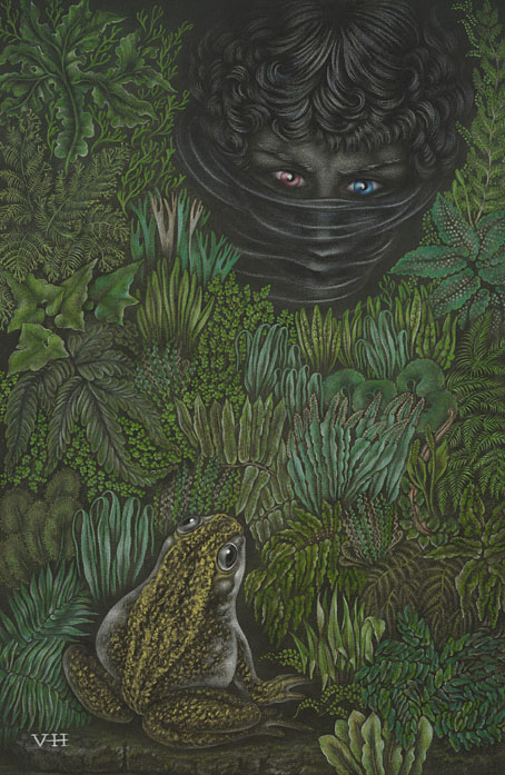
Tony Hyde’s original artwork for the front cover of Astounding Sounds, Amazing Music by Hawkwind. The painting is being auctioned later this month.

• At the Daily Heller: Steven Heller reprints his 2012 Atlantic review of The Graphic Canon, a three-volume collection of visual adaptations of works of literature. The collection was edited by the late Russ Kick, and includes my own condensation of The Picture of Dorian Gray.

• At Dennis Cooper’s: Bill Hsu presents…21st Century Nightmares: Dark Animations by Cristóbal León/Joaquín Cociña, Hugo Covarrubias, Christiane Cegavske, John Frame, Saori Shiroki, Joe Hsieh, Phil Tippett, Robert Morgan, Shengwei Zhou.

• At Colossal: In Los Angeles, 70 artists transform a vacant hospital into a sprawling art experience.

What we were doing was rooted in that specific moment, but looking back, it also seems to resonate strongly with the present—particularly in terms of how we understand media, perception, and reality itself. This is something I’ve been thinking about again recently, especially with the renewed activity around Cabaret Voltaire. It brings into focus the extent to which earlier work now reads almost as a form of prefiguration. At the time, though, much of it was intuitive. We didn’t necessarily have a fully formed theoretical framework for what we were doing—we were artists, and we were working instinctively. It’s really only in retrospect that some of those ideas begin to take on a clearer shape and meaning.

Stephen Mallinder talking to Nicolas Ballet about Cabaret Voltaire, the group’s history and working methods

• New music: The Endless Dance by Hannah Peel; Helt by Fjall; Air Signs by Anthéne.

Adam Rowe is writing a new book about science fiction art.

• Steven Heller’s font of the month is Brutal Types.

• Mix of the week: Isolatedmix 135 by Aspetuck.

Brute Reason (1983) by Bernard Szajner | Let’s Get Brutal (1986) by Nitro Deluxe | Brutal But Clean (1994) by Cabaret Voltaire

Rhino Head

rhino1.jpg

A new book arrived in the post this week. Rhino Head is a collection of words (in both German and English) by Carlos Atanes and drawings by Jan van Rijn which describes itself thus:

This illustrated fantastical narrative consists of 21 chapters and features short, self-contained stories told from shifting narrative and temporal perspectives. It is a collaboration between author/director Carlos Atanes and illustrator Jan van Rijn, and explores the realms of eroticism and magical realism.

What lies behind a simple fable about wolves and rabbits? An actress fleeing in terror from an underground film shoot on the slopes of Mount Fuji? A New Mexico scrap dealer serving coffee to two visitors from outer space? A fashion designer who believes she is being dreamed by a mythical figure? An antiques forger who discovers an old tale has come true? A female cult disrupting the cosmic order with terrifying rituals?

This interwoven web of stories includes a summons to a fictitious event, sunflowers acting as orgasmic energy batteries, rhino heads at the farthest reaches of the world, pornographic films projected inside the viewer’s mind, dolls transformed into women and women transformed into dolls – a constellation of strange intertwined incidents creating a hyperfable, moving beyond its individual characters because the meaning of the whole can only be revealed to each individual reader.

rhino2.jpg

Having known Jan for some time—I contributed to the Genet-themed collection he put together in 2021—I was happy to write a foreword for his new publication. In books like this you tend to find the pictures acting solely as illustration but here there’s more of a dialogue going on between the different media. The drawings show you things the texts don’t provide, and vice versa.

Rhino Head doesn’t appear to be on sale just yet but anyone wanting further information should contact Kraut and Rubies.

Huszti Horvath’s Three Dragons

horvath01.jpg

Book of the Three Dragons is an unusual illustrated volume, being an American edition of a retelling of Welsh myths by a Welsh writer, Kenneth Morris, with illustrations by a Hungarian artist, Ferdinand Huszti Horvath (1891–1973). Morris was, among other things, a Theosophist who was living in California when he wrote Book of the Three Dragons which no doubt explains the American publication. There doesn’t appear to be any Theosophy in this book at least. Dragons are an important symbol for the Welsh, with a red dragon being a prominent emblem on the flag of Wales. Morris’s book opens with a guide to the pronunciation of the Welsh names and words that appear in the text.

horvath02.jpg

Ferdinand Horvath, meanwhile, moved to the USA in the 1920s where he eventually found employment as an illustrator before working (without credit) for Disney. It’s at Disney-related websites that you’ll find most of the information about his life and work, where the discussion inevitably concerns his designs for animated films. A list of his other book productions would be welcome. There’s a very nice edition of The Raven that was published in the same year as Book of the Three Dragons but with art in much more of an Expressionist style.

I often wonder what Disney’s animations might have been like if the studio had given artists like Horvath and Kay Nielsen a freer rein. Disney only began to change its style in the late 1950s as a result of competition from other animation studios, and even then the results were compromised. Sleeping Beauty used the designs of Eyvind Earle to distinguish the film from the studio’s previous fairy tales but Earle was dissatisfied with the treatment his work received and he left the project before it was finished; the art direction for One Hundred and One Dalmatians was based on the cartoons of Ronald Searle but Walt Disney hated the results and refused to try anything similar again.

horvath03.jpg

horvath04.jpg

horvath05.jpg

Continue reading “Huszti Horvath’s Three Dragons”

Icarus Descending

tmwfte02.jpg

UK, 2009.

Newton leaned forward, putting his elbows carefully on the table. “Nathan. Nathan. I was afraid of you then. I am afraid now. I have been afraid of all manner of things every moment I have spent on this planet, on this monstrous, beautiful, terrifying planet with all its strange creatures and its abundant water, and all of its human people. I am afraid now. I will be afraid to die here.”

Before my recent rewatch of The Man Who Fell to Earth I decided to read the novel in order to spice up yet another viewing by comparing the film with its source. And as is often the case when reading books of a certain vintage, curiosity had me wondering how the book has been cover-designed over the years.

The Man Who Fell to Earth was published in 1963. Prior to this Walter Tevis had only published one other book, The Hustler, his first novel about pool-player “Fast Eddie” Felson. Such a debut wouldn’t have marked Tevis as a putative writer of science fiction although he had written a handful of stories for SF magazines before attempting anything at novel length. The Man Who Fell to Earth is artistically satisfying science fiction, and a good novel in a literary sense, something you can’t always expect from those writers of Tevis’s generation who seemed to read nothing but technical reports and fiction by other SF writers.

The story opens in 1985, presenting a future which isn’t too different to the 1985 that many of us lived through. Speculation is minor and mostly relegated to the background, with occasional mentions of monorails, food shortages and warring African nations who threaten each other with nuclear weapons. Into this world there arrives the alien who calls himself Thomas Jerome Newton (we never learn his original name), a clandestine emissary from the dying planet his people know as Anthea. Newton has been sent to Earth with plans to build a financial empire using his advanced technical knowledge. This will, he hopes, enable him to build a craft in order to ferry the remaining Antheans to a world where they can survive. Once they’re secure, the Antheans also plan to rescue the inhabitants of Earth from imminent nuclear destruction.

tmwfte22.jpg

The US one-sheet of Vic Fair’s poster. After decades of illustrators and designers working with both the book and the film, Fair’s poster is still the most successful condensation of the story into a single, memorable image.

If you’ve seen the film then the broad strokes are all very familiar. Nicolas Roeg’s direction and Paul Mayersberg’s script treat the material elliptically but the film stays closer to the novel than you might expect, with Mayersberg even reusing some of Tevis’s dialogue. Both novel and film are very much concerned with portraying the Earth itself as an alien planet. For the first half of the novel, “1985: Icarus Descending”, we see our world through Newton’s eyes while he makes his way among the clever but dangerous primates. The second half, “1988: Rumpelstiltskin”, concentrates equally on Newton’s attempts to retain his sanity in a world that must never discover his real intentions or his true nature; and on the curiosity of Nathan Bryce, the chemist helping to construct Newton’s spacecraft, whose suspicions about his employer are eventually confirmed. Bryce believes that Anthea must be the planet Mars, but when asked about this directly Newton simply replies “Does it matter?”

Roeg and Mayersberg’s film received mixed reviews in 1976 but its cult status has grown thanks to its connection with David Bowie’s person and career. Bowie’s Newton has become a dominant motif for book covers even though Tevis’s Newton is a negative inversion of the screen alien, being six-and-a-half feet tall, with tanned skin and pure white hair. For art directors and illustrators the challenge since 1976 has been to present the novel in a manner which does more than merely repeat the imagery of the film. Not everyone succeeds in doing so.

tmwfte12.jpg

USA, 1963. Cover art by Leo and Diane Dillon.

The first printing was as a paperback original with untypical cover art by Leo & Diane Dillon. Without reading the novel it’s hard to tell what this is about at first glance, but the figure on the left is supposed to represent Newton’s unusual lightweight skeleton whose height and shape are contrasted with its human counterpart. The eye presumably refers to the contact lenses that Newton wears to disguise his cat-like pupils.

tmwfte07.jpg

Italy, 1964. Cover art by Karel Thole.

The few covers that pre-date the film are what you might call the innocent ones, free of David Bowie’s face or Bowie-like figures. Here the prolific Karel Thole also favours Newton’s diguises over any other imagery.

tmwfte03.jpg

USA, 1970. Cover art by Howard Winters.

Continue reading “Icarus Descending”

Léon Carré’s In the Garden of Gems

carre01.jpg

Léonard Rosenthal’s follow-up to In the Kingdom of the Pearl was this volume with illustrations by Léon Carré. In the Garden of Gems was published in 1924 in an edition that matches the earlier book for page layout, print quality and decoration. The illustrator, Léon Carré (1878–1942), was more of a painter than a book illustrator, being one of the many Orientalist artists that France produced in the 19th century. Given the quality of his illustrations it’s a shame he didn’t work on more books, although there was a French edition of the Thousand and One Nights that he illustrated a few years later.

carre02.jpg

Rosenthal’s note to the reader describes his own book as “the study of the passionate, obstinate, cruel, and sometimes tragic struggle waged by humankind to conquer precious stones, the examination of beliefs, allegories, legends, and symbolisms…”. Individual chapters are devoted to the history of the emerald, ruby and sapphire. As with the earlier book, each chapter is embellished with a decorative header and drop cap whose details change according to the subject. This peacock obsessive approves of the profusion of pavonine motifs.

carre03.jpg

carre04.jpg

carre05.jpg

Continue reading “Léon Carré’s In the Garden of Gems”