Lovecraft’s Monsters

Lovecraft's Monsters

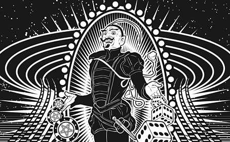
Graphic for the title page and ends of chapters.

I don’t usually post things so far away from publication, but editor Ellen Datlow put these pictures on her Facebook page a few hours ago so I may as well do the same here.

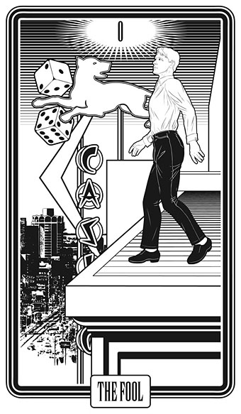
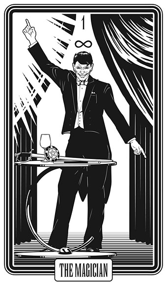
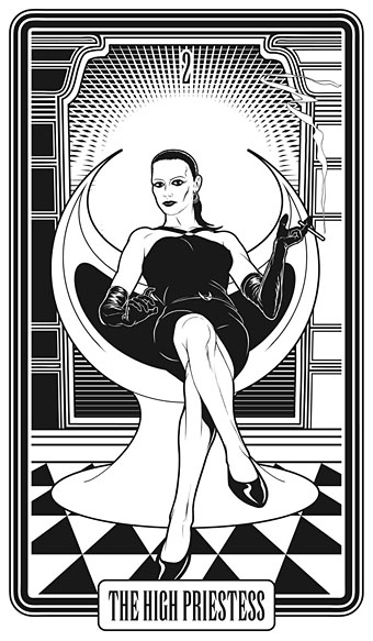
Back in February I bought a Wacom Intuos drawing tablet, something I’ve been using with regularity for the past few months. The Alas Vegas Tarot cards I designed in the summer were the first major attempt at getting used to working with it; Lovecraft’s Monsters, a forthcoming fiction anthology for Tachyon is the second, and I now feel very comfortable working with it. More than that, I’m increasingly pleased with the way it’s possible to combine the drawing techniques I’ve been using for years with the additional possibilities provided by working in Photoshop. As always, it’s the end result that counts but arriving at an end result can be easy or difficult. Some of these illustrations look no different than they would have done had I used ink on paper but they took half the time to create, a considerable benefit when a deadline is looming.

The stories Ellen Datlow has chosen for this collection all present different aspects of monstrosity seen through the lens of Lovecraft’s fiction and his cosmic menagerie. Some are full-on extensions of the Mythos, others are more allusive; all the pieces bar one have been published before but I’d not read any of them so for me this was fresh material. Having spent the past few years saying I was finished with Lovecraft’s fiction I was excited to be working on this book. The stories are good, and I welcomed the challenge of having to illustrate such a variety of material.

Larger copies of all the pictures can be seen here.

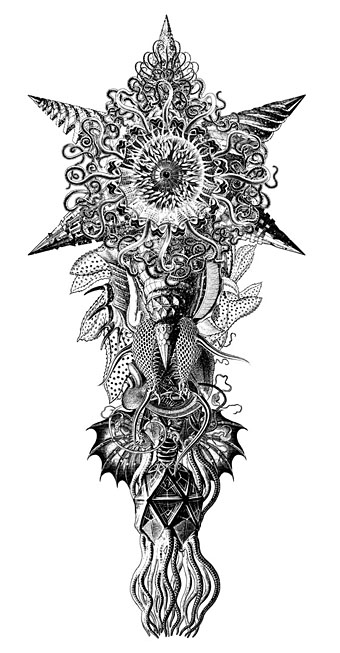
The star-headed thing at the top of this page is another amalgam of elements plundered from Haeckel’s Kunstformen der Natur and other sources. I’ve leaned rather heavily on Haeckel in the past, something I wanted to avoid here; this serves as a kind of visual punctuation separating the stories.
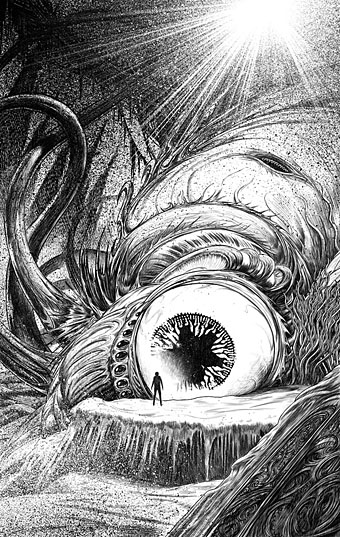
Lovecraft's Monsters

Cthulhu.

The drawing I’ve called Cthulhu is a piece for the introductory pages. Having already produced a lot of Cthulhoid art I didn’t want to repeat myself. The initial idea was of a tiny human figure faced with something enormous and nightmarish; that could be a vast eyeball or it could be a mouth or some other organ/aperture, the vagueness was intentional. Lovecraft continually impresses upon his readers how difficult things are to describe or apprehend but you seldom find this quality in art based upon his stories. Cthulhu especially has devolved into little more than an outsize man-in-a-rubber-suit à la the Creature from the Black Lagoon. In The Call of Cthulhu the figure on the mysterious statuette is described as having a humanoid shape but Lovecraft doesn’t describe the appalling reality in any detail at all. When Cthulhu is struck by a ship at the end of the story it breaks apart and is then seen recombining, the implication being that the creature is corporeally amorphous.

Lovecraft's Monsters

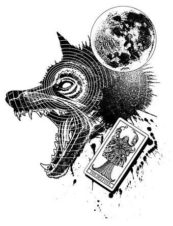
Only the End of the World Again by Neil Gaiman.

Neil Gaiman’s entry concerns a werewolf private detective in Innsmouth. Lovecraft’s decaying fishing village and its inhabitants turn up in several of the stories so care was taken to avoid repetition.

Lovecraft's Monsters

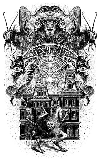
Bulldozer by Laird Barron.

A great story about another detective, a Pinkerton agent this time, hunting his quarry through the Old West. Collin de Plancy’s Dictionnaire Infernal is mentioned so I used some of Louis Breton’s illustrations from the third edition.

Continue reading “Lovecraft’s Monsters”

Magicians

magic01.jpg

The stage variety rather than occult practitioners. The levitating Mephistopheles above is the one I borrowed earlier this year for the Alas Vegas Tarot designs. “Kellar” was Harry Kellar (1849–1922), a popular American magician blessed with some talented poster designers who stripped away the superfluous text to concentrate on his name and the recurrent motif of a red devil. Considering their age (they date from around 1900) these posters are surprisingly elusive, with no indication on some of them that Kellar is a stage performer at all. He retired in 1908 so by this time his name alone was evidently enough of an audience draw.

Howard Thurston was Kellar’s appointed successor, hence the continuity of the red devils and type design. Devils and imps weren’t the sole property of the pair as the other examples here demonstrate. “Miss Baldwin” is a rare example of a woman achieving parity with her male colleagues, at least in the poster department. All these posters are from the collection at the Library of Congress where many more examples may be seen. A detail from the horizontal Kellar poster below appears on the cover of the recent lavish Taschen volume Magic: 1400s–1950s by Mike Caveney, Jim Steinmeyer, Ricky Jay and Noel Daniel.

magic02.jpg

magic03.jpg

magic04.jpg

Continue reading “Magicians”

Abraxas 4

abraxas4.jpg

My thanks to Livia Filotico at Fulgur Esoterica for sending these previews from the forthcoming issue of Abraxas, the Journal of Esoteric Studies. Abraxas is a beautifully produced large-format book whose artist interviews—as I’ve mentioned before—are especially valuable. Issue 4 will include:

Prof. Sarah Victoria Turner’s interview with artist Christine Ödlund on theosophy and synaesthesia, a special feature on the Italian artist Agostino Arrivabene, a documentation of Art Angel artist Lindsay Seer’s ancestral performance/installation Nowhere Less Now, Shannon Taggart’s extraordinary photographs of Brooklyn vodou and Valentin Wolfstein insightful analysis of the Mystic Fool. Following this tarot theme, the artist Francesca Ricci provides an account of her working with urban symbols, and their subsequent transformation into a unique tarot, titled Anarca.

Mention of combining urban symbols with the Tarot sounds especially interesting after I’ve recently dealt with that challenge myself. Those who buy the limited edition hardback will receive a signed suite of Francesca Ricci’s Tarot cards. Abraxas 4 is published on September 22nd. Further details and page previews here.

abraxas1.jpg

Nowhere Less Now by Lindsay Seer.

abraxas2.jpg

abraxas3.jpg

Previously on { feuilleton }
Abraxas: The International Journal of Esoteric Studies

Alas Vegas Tarot cards

alasvegasdevil.jpg

Back in February I bought a Wacom drawing tablet and said I’d show some proper results from its use later. For the past few months I’ve been working on this project using a combination of Wacom drawing and vector graphics. The initial brief from games designer James Wallis was for six Tarot-style card designs for his Alas Vegas role-playing game which has as its theme a fantasy extrapolation from Las Vegas and its gaudy mythology. The Kickstarter funding for the game turned out to be more successful than was anticipated so James asked me to expand the six cards idea into a full set of black-and-white Major Arcana designs.

This has been a fun series to work on although a number of the cards presented problems at first, the antique nature of the Tarot symbolism being a difficult thing to map across a very commercial American city. The symbolism from the Rider-Waite-Smith (RWS) deck was used as a rough guide although we deviated in a few places from the more traditional attributes. Las Vegas has changed over the years so rather than represent a single period of the city’s history there are references to different eras, from the huge casinos of today back to the buildings of the 50s and 60s with their distinctive “Googie” architecture. Notes for the cards follow below. The artwork can be seen at larger size here.

alasvegas00.jpg

The Fool is usually a young man about to step off a cliff edge with a dog barking a warning at his heels, hence the dog on the sign.

alasvegas01.jpg

Several of the cards convert the Tarot characters into cabaret acts. This one was pretty inevitable, and I’m sure it’s not the first time a stage conjuror has appeared on this card.

alasvegas02.jpg

The chair is based on the 1965 “Ball Chair” design by Eero Aarnio (as seen in The Prisoner TV series), adapted here to resemble the Priestess’s crescent moon.

alasvegas03.jpg

The style on this one is more 70s than 60s: patterned wallpaper (the hearts derive from the symbolism of The Empress, and from playing cards, of course), white rug, Kung Fu pyjamas.

Continue reading “Alas Vegas Tarot cards”

The Fool album covers

fool.jpg

The Fool (1968).

Many people know the work of design collective The Fool even if they couldn’t tell you the name or the names of any of the individuals involved.  The accelerated career trajectory of Dutch artists Marijke Koger and Simon Posthuma took them from a hippie enclave on the isle of Ibiza in 1966, to London and work for The Beatles throughout 1967 thanks to their distinctive brand of rainbow-hued psychedelia. Marijke Koger says the name The Fool was chosen after they met Crowley-obsessed blues singer Graham Bond who introduced them to the Tarot deck. Barry Finch and Josje Leeger later joined Koger and Posthuma. For The Beatles the group created the short-lived mural for the Apple boutique in Baker Street (removed after complaints), the decoration on John Lennon’s piano, and the inner sleeve for the Sgt Pepper album. The gatefold interior of the album was going to incorporate a Fool painting but Robert Fraser apparently persuaded the band to replace this with a group photo. The Fool themselves (and their decor) appear in the Beatles-produced feature film, Wonderwall (1968).

beatles.jpg

Proposed interior for the Sgt Pepper album (1967).

Given all this sudden visibility it’s surprising they weren’t more in demand for album cover designs although they were also busy producing florid outfits for other groups. The Beatles clothes on the All You Need is Love broadcast are Fool creations. Of the album covers, the one for The Incredible String Band is probably the most well-known. This small collection reminds me I still haven’t heard Evolution by The Hollies. The work on that cover led to a collaboration with Graham Nash on an album by The Fool (and session musicians) in 1968. The collective split up in 1969 with Marijke Koger and Simon Posthuma relocating to California.

Marijke Koger-Dunham’s site
Simon Posthuma’s site

beatles2.jpg

Sgt Pepper inner sleeve.

incredible.jpg

The 5000 Spirits Or The Layers Of The Onion (1967) by The Incredible String Band.

hollies.jpg

Evolution (1967) by The Hollies. Clothes and design by The Fool, photo by Karl Ferris.

degroot.jpg

Picknick (1967) by Boudewijn De Groot.

move.jpg

Move (1968) by The Move.

Elsewhere on { feuilleton }
The album covers archive

Previously on { feuilleton }
Through the Wonderwall