Morning of the Magicians book covers

motm01.jpg

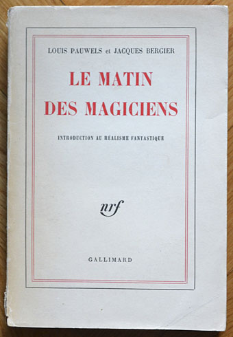
Éditions Gallimard, France, 1960.

Yesterday’s post proved popular so it seemed worthwhile taking another look at the book that birthed Planète magazine. The main problem The Morning of the Magicians presents for an art director is how to encapsulate such wildly diverse contents in a cover design. To judge from the examples here, most people seem to have either given up or gone for vaguely symbolic designs which at the most correspond to the contents in a minor way. The biggest surprise for me was seeing the cover of the first edition above, one of those typically sober French titles which gives away nothing of the intellectual fireworks within. Few of these designs have any credits, and this is nothing like a complete list (more editions may be seen at Goodreads). More recent editions have been avoided altogether since they’re pretty terrible.

motm10.jpg

Arnoldo Mondadori Editore, Italy, 1963. This edition, which runs to 476 pages, includes three translated stories inserted into the text: The Nine Billions Name of God by Arthur C. Clarke, A Canticle for Leibowitz by Walter M. Miller Jr, and The White People by Arthur Machen.

A hardback edition showing an alchemist at work.

motm03.jpg

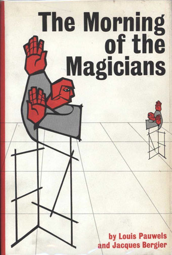
Stein and Day, USA, 1964.

You know a cover is failing when it could easily be applied to any number of other titles.

Continue reading “Morning of the Magicians book covers”

Mati Klarwein book covers

mati1.jpg

The World’s Desire (1972) by H. Rider Haggard & Andrew Lang. Painting: Astral Body Asleep (1968).

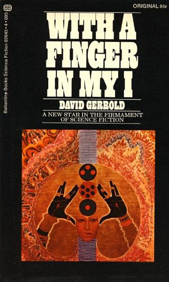
The use of Mati Klarwein’s paintings on album covers is well documented, the official Klarwein site has a small section devoted to some of the covers. Less well-known are these book covers which were evidently the product of a brief enthusiasm for Klarwein’s work in the Ballantine Books’ art department. As with many of the album covers, these are all pre-existing paintings which have been cropped for use as cover art.

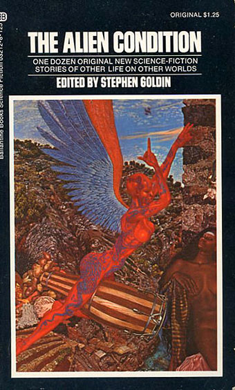
The most surprising example is the cover for The Alien Condition with its detail from Annunciation, a painting better known for its appearance on Abraxas (1970), a very successful Santana album. Given how visible that cover art would have been in 1973 you have to suspect that the painting’s use as a book cover was a deliberate bid to attract a youthful readership. All these titles are works of science fiction or fantasy; I don’t recall having seen a Klarwein cover for any non-genre titles. If anyone knows of an example then please leave a comment. (Thanks to Jay for the tip!)

mati2.jpg

With a Finger in My I (1972) by David Gerrold. Painting: Blessing (1965).

mati3.jpg

The Alien Condition (1973) edited by Stephen Goldin. Painting: Annunciation (1961).

mati4.jpg

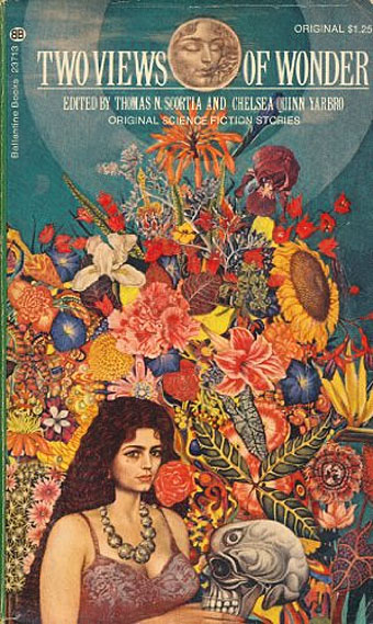
Two Views of Wonder (1973) edited by Thomas N. Scortia & Chelsea Quinn Yarbro. Painting: Unknown.

mati5.jpg

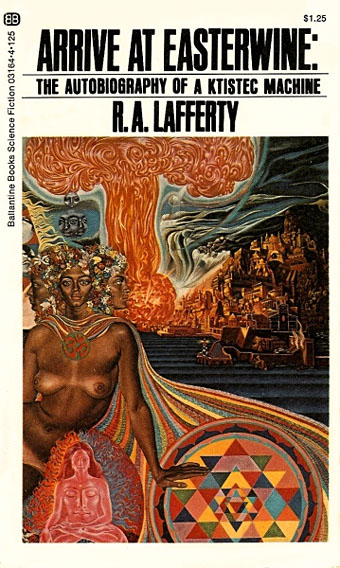
Arrive at Easterwine: The Autobiography of a Ktistec Machine (1973) by RA Lafferty. Painting: Nativity (1961).

Elsewhere on { feuilleton }
The book covers archive

Previously on { feuilleton }
The art of Mati Klarwein, 1932–2002

Weekend links 114

bowie.jpg

David Bowie’s cigaretted fingers and bulging silver crotch point the way to the future. This summer sees the fortieth anniversary of the Ziggy Stardust album’s release. The Melody Maker ad above can be found with a wealth of other Ziggy-related material at the very thorough Ziggy Stardust Companion site. For me the definitive artefact isn’t the album itself but DA Pennebaker’s film of the final concert from the 1973 tour; the songs really come alive and Bowie’s performance is overwhelmingly electric. Related: Cracked Actor, the BBC documentary from 1975 about Bowie’s post-Ziggy life on and off the stage.

• The week in books: Amanda Katz described the remarkable history of a single copy of The War of the Worlds by HG Wells then asked “Will Your Children Inherit Your E-Books?” | Bosnian novelist Aleksandar Hemon in The Browser’s FiveBooks interview put Blood Meridian on his list. | “Call me the greatest American novel”: Christopher Buckley on Moby-Dick. | The Brit Lit Map.

• For another anniversary, the Alan Turing centenary, there’s The Strange Life and Death of Dr Turing (part two here) and Breaking the Code (1996), Derek Jacobi playing the tragic genius in a biographical drama.

Commissioner of Sewers (1991) a William Burroughs documentary by Klaus Maeck in which the author reads some of his work and endures a Q&A session with surprising equanimity.

• Music, flesh and fantasy: When Mati Klarwein’s hyperactive paintings stole the psychedelic show.

• Move Over Casio: Teenage Engineering’s OP-1 Portable Synth Looks Cool, Does Everything.

• A retrospective of art by Madge Gill (1882–1961) at The Nunnery, London.

• “Art is unavoidably work”: Terre Thaemlitz interviewed.

• A trailer for Document: Keiji Haino.

WB Yeats, Magus

Pathétique 1 (1994) by Fushitsusha | Pathétique 2 (1994) by Fushitsusha.

Milton Glaser album covers

glaser01.jpg

Music For Space Squirrels (1958) by Al Caiola’s Magic Guitars.

Having sought out Saul Bass’s album cover designs recently, curiosity impelled me to see what fellow New York designer Milton Glaser had been doing during the same period. I already knew some of Glaser’s covers for the Tomato label in the 1970s but Discogs has many more, including a handful in the Pop/psychedelic style he used most famously for his Bob Dylan poster. Not all of these are to my taste—illustration-wise I prefer Bob Pepper’s art—but Glaser was nothing if not versatile. I’ve no idea what Music for Space Squirrels sounds like although it’s probably less interesting than the promise of those floating rodents.

glaser02.jpg

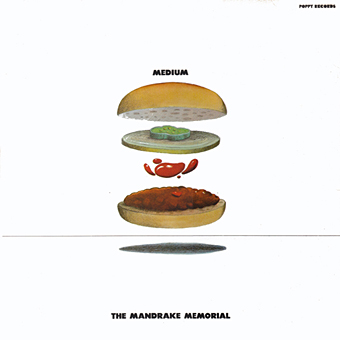
Medium (1968) by The Mandrake Memorial.

glaser03.jpg

Grieg’s Greatest Hits (1969).

Continue reading “Milton Glaser album covers”

The art of Robert Venosa, 1936–2011

venosa.jpg

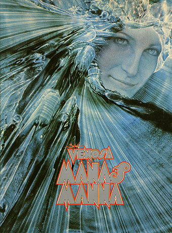
A few years back, while experimenting with the hallucinogens, I experienced visions of a dynamic energy in constant high-velocity motion, crystallizing and manifesting in a form which could only be described as angelic. Potential energy, crystallizing energy and structured energy were all visible in the same instant…time and space transcended. These visions, and a new-found awareness of spirit brought about through worship and meditation, were too powerful not to be expressed: a translation had to be attempted.

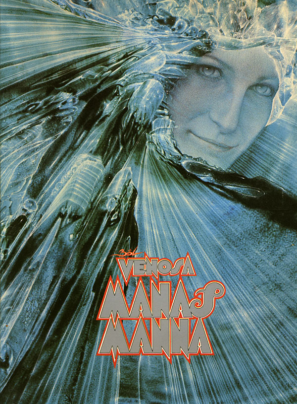
Robert Venosa, Manas Manna, 1978.

I only discovered a few days ago that American artist Robert Venosa had died last month. As with the late Sibylle Ruppert there’s the inevitable wish for some wider acknowledgement of the passing of these unique talents.
santana.jpg

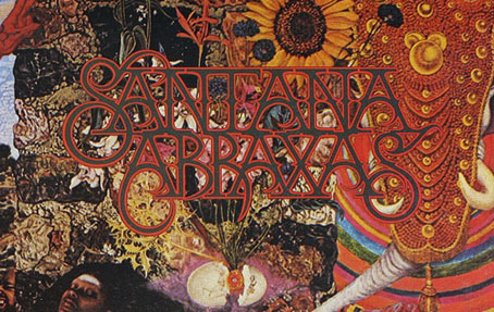
Millions of people have seen one of Venosa’s creations without being aware of it: in 1970 he designed the logo/title for Santana’s Abraxas album (the one with the amazing Mati Klarwein cover), a design which is still in use today. But it’s as a painter that he ought to be remembered. Manas Manna was the first collection of Venosa’s art published by Peter Ledeboer’s Big O imprint in 1978, and could be found on bookshelves that year with a pair of equally remarkable auto-monographs: Mati Klarwein‘s God Jokes and the first English edition of HR Giger‘s Necronomicon. All three artists were aware of each other (Venosa was friends with the other two), and all had managed the difficult feat of having their work sold in art galleries whilst also being visible to a much larger audience on album covers. All three books were eagerly plundered that year by the art team of OMNI magazine whose early issues made heavy use of paintings by Klarwein, Giger, Venosa, De Es Schwertberger and others. Of this Venosa has said:

OMNI was the first to give the artist equal credit with the author…something that to this day is still not seen in any other newsstand magazine. OMNI also put Fantastic Realism, Surrealism, Visionary, and every other type of ‘Fantasy’ art, square into the public’s eye. I and my colleagues owe OMNI a large measure of gratitude for its uncompromising stance and visionary concepts.

Venosa had been an art director at Columbia Records in the 1960s, a job he abandoned after he met Mati Klarwein and decided he’d rather devote his time to painting. Despite describing Klarwein in his book as his painting master, only a couple of his pictures are reminiscent of Klarwein’s distinctive style. Many of Venosa’s works are more loose and abstract than Klarwein’s tableaux, extending the processes of decalcomania which Max Ernst refined in works such as Europe After the Rain (1942) and The Eye of Silence (1944) to create stunning views of cosmic eruptions and vistas of crystalline beings rendered in a meticulous, hyper-realist manner. Many of his pictures could serve as illustrations for the later chapters of JG Ballard’s The Crystal World.

If the lazy definition of psychedelic art refers merely to shapeless forms and bright, clashing colours, Venosa’s art is psychedelic in the truest sense, an attempt to fix with paint and brush something revealed by a profound interior experience. This was deeply unfashionable by 1978, of course, but he carried on working anyway, and there are further book collections for those interested in his paintings. The Venosa website has a small selection of his extraordinary pictures although they really need to be seen at a larger size.

Elsewhere on { feuilleton }
The album covers archive
The fantastic art archive