Berni Wrightson’s Frankenstein

frankenstein1.jpg

A recent conversation with Evan J Peterson touched on the subject of Mary Shelley’s Frankenstein. Evan is currently working on something based on the novel and—in the interests of disclosure—he wrote a very flattering piece about these pages recently. In addition to this, Peter Ackroyd’s latest book works his familiar intertextual games with the same story, placing the monster creator in London where he meets various significant literary types. Andrew Motion reviewed the latter this week and wasn’t impressed.

frankenstein2.jpg

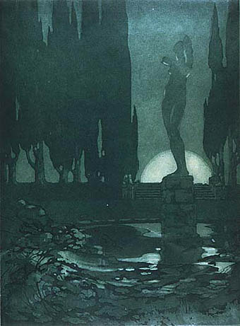
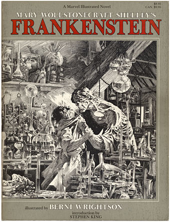
Which preamble brings us to Berni Wrightson’s treatment of the story and a work which was a major inspiration for my HP Lovecraft comics and illustrations. Wrightson’s illustrated edition of Shelley’s complete novel was published in 1983 with an introduction by Stephen King. I’d admired Wrightson’s technique for years but wasn’t always impressed by his subject matter which tended to revolve around the stock selection of favourite American horror characters—vampires, werewolves, zombies and so on—while much of his early art was indebted to the EC horror comics which never interested me at all. Jokey horror has always seemed to me a debased and neutered horror, horror-lite, and yes, that includes plush Cthulhus and the rest of that tat.

frankenstein3.jpg

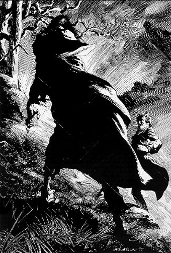
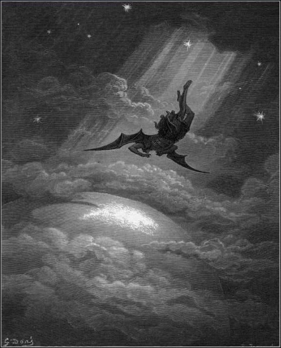
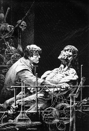
So the immediate attraction of the Frankenstein book was seeing Wrightson take the story back to its origins and treat it seriously. Frankenstein—creator, monster and myth—has been subject to as much degradation as Dracula over the past century which made Wrightson’s approach very welcome. Crucially, it also gave me the key to interpreting Lovecraft visually. It was very evident that his drawings owed a debt to a favourite illustrator of mine, Gustave Doré; two of the pieces were almost straight copies of Doré drawings from The Rime of the Ancient Mariner. In terms of overt influence, Wrightson’s book is dedicated to the great Roy G Krenkel, one of the finest fantasy illustrators of the early 20th century. I wasn’t aware of it at the time but Wrightson’s style here also owes much to American illustrator Franklin Booth (1874–1948), one of Krenkel’s own influences. If the monster in his drawings had a touch of the lumbering EC zombie about its features that was allowable given the other influences at work, and besides, his compositions are perfect. Once I started work on my Lovecraft drawings I quickly found an approach that suited my own obsessions with fine line and detail. But it was Wrightson’s example which pointed the way.

The only problem discussing this is that the copies available on various sites, including Wrightson’s own gallery pages, don’t do the drawings much justice at all. (There’s a large copy of one picture here.) Where the more detailed pieces are concerned you’ll have to try and find a copy of the book. This year is the 25th anniversary of the book’s publication so Dark Horse Comics will be publishing a hard cover edition in October 2008. In addition, Darkwoods Press have announced an “ultimate edition” which will reprint all the artwork (some drawings weren’t used) with quality reproduction. No further information about that, however, and given that they’ve having to source all of the original drawings it may be a while before it appears.

Elsewhere on { feuilleton }
The illustrators archive

Previously on { feuilleton }
Berni Wrightson in The Mist
The monstrous tome
Franklin Booth’s Flying Islands

The art of Stella Langdale, 1880–1976

langdale1.jpg

Nocturne (aquatint; no date).

One of Callum‘s recent book postings alerted me to the work of Stella Langdale, an artist and illustrator I hadn’t come across before. Judging from online listings her obscurity would seem to be a result of not having being as productive as some of her contemporaries, and her drawings are a deal more gloomier than the delicate pen-and-ink style that was common in book illustration at the time. But it’s her brooding charcoal masses which I find appealing. As with the better Gustave Doré illustrations, they adumbrate more than they depict by the use of careful composition. Some of her other works are aquatints, a form of etching which allows for similar effects to the graded atmospheres of charcoal.

Continue reading “The art of Stella Langdale, 1880–1976”

Karel Zeman

zeman.jpg

Inspiration (1949).

Karel Zemen (1910–1989) is a filmmaker I’m often telling people about but whose work isn’t easy to see, so it’s good to find that YouTube has gained some clips of his animations and examples of the partly-animated adventure films he made in the Fifties and Sixties. Zeman was yet another great Czech animator, and the YouTube collection includes his most celebrated short, Inspiration, which gives life to glass figurines, an unyielding medium that he moves as expressively as if it were clay or plasticine.

zeman2.jpg

The Fabulous Baron Munchausen (1961).

The adventure films are predominantly based on Jules Verne and place live actors into animated settings, many of which are taken directly from (or intended to imitate) the engraved illustrations of the original novels. The animation enabled Zeman to fill his films with dirigibles, submarines and various steam contraptions which would be too expensive to create otherwise. Zeman’s The Fabulous Baron Munchausen took the Gustave Doré illustrations for its visual style which is something this particular Doré enthusiast appreciates, and the film is closer to the spirit of the Raspe novel than the Nazi adaptation of 1943 or Terry Gilliam’s later version. The results are a lot more artificial than the seamless blend of animation and live action attempted by Ray Harryhausen in his own Jules Verne film, Mysterious Island, but the artificiality gives the films a distinctive charm.

A Deadly Invention aka The Fabulous World of Jules Verne (1958)
The Fabulous World of Jules Verne trailer (1958)
Excerpts from Baron Munchausen (1961)
The Special Effects of Karel Zeman pt. I | pt. II

Previously on { feuilleton }
Zeppelin vs. Pterodactyls
Jan Švankmajer: The Complete Short Films
Taxandria, or Raoul Servais meets Paul Delvaux
Barta’s Golem
The Hetzel editions of Jules Verne

Angels 4: Fallen angels

delville_satan.jpg

The Treasures of Satan by Jean Delville (1894).

Some more favourite paintings today. Jean Delville produced a splendidly strange portrayal of Satan as an undersea monarch lording it over a sprawl of intoxicated, naked figures. When Savoy Books decided to put together the definitive version of David Lindsay’s equally strange fantasy novel, A Voyage to Arcturus, I felt this was the only painting adequate to the task of filling out the cover. That was in 2002; a year later Gollancz used the same painting on the cover of their Fantasy Masterworks paperback edition of the book. Lindsay’s book has been plagued by bad cover art for years so we managed to raise the bar for future editions. Delville was one of the great painters of the Symbolist school, all his work is worth looking at.

There are numerous representations of Lucifer but Franz Stuck’s is especially striking and apparently caused viewers to cross themselves before it when it was first exhibited.

Gustave Doré’s tumbling figure is from his illustrated edition of Paradise Lost, a book full of armour-clad, spiky-winged angels. Some of those wings have even found their way into my work via the miracle of Photoshop.

stuck_lucifer.jpg

Lucifer by Franz Stuck (1890).

dore_lucifer.jpg

Paradise Lost by Gustave Doré (1866).

Elsewhere on { feuilleton }
The etching and engraving archive

Previously on { feuilleton }
The art of Thomas Häfner, 1928–1985