Illustrating Hyperborea

hyperborea00.jpg

The Book of Hyperborea (1996). Cover art by Robert H. Knox.

“My Hyperborean tales, it seems to me, with their primordial, prehuman and sometimes premundane background and figures, are the closest to the Cthulhu Mythos, but most of them are written in a vein of grotesque humor that differentiates them vastly.” — Clark Ashton Smith

Since re-reading Clark Ashton Smith’s The Tale of Satampra Zeiros I’ve been revisiting more of Smith’s stories set in the lost world of Hyperborea. And having put together a post some years ago that gathered all the original illustrations for Smith’s Zothique cycle, I thought I’d try and do the same for another of his story series. As I noted in the earlier post, we’re fortunate today that it’s so easy to see illustrations that in the past would have been impossible to find unless you owned (or had access to) a huge collection of pulp magazines. Pulp illustrations aren’t always very good—in the case of the early issues of Weird Tales, they’re frequently amateurish—but those that illustrate new fiction for the first time are historically important if nothing else.

pennington1.jpg

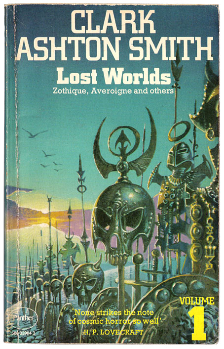
Lost Worlds: Volume 1 (1974). Cover art by Bruce Pennington. Lost Worlds was a single-volume collection published by Arkham House (USA) and Neville Spearman (UK). The Panther paperback covers by Bruce Pennington could easily be used on other books but these were the first Smith volumes I owned.  

The first Hyperborea stories were among Smith’s earliest prose fantasies, owing something to Lord Dunsany on the one hand (HP Lovecraft detected a Dunsanian quality), and the writers of antiquity on the other, the name “Hyperborea” (“Behind the North Wind”) being borrowed from the Greeks. The northern location is about the only feature of the continent that the Greek writers would recognise, Smith’s world being a temperate pre-Ice Age realm of mountains and verdant jungles. Dinosaurs and megafauna share the lands with human inhabitants for whom sorcery is a common practice. As with Zothique, the cycle was an influential one. Lin Carter in the introduction to his Ballantine collection, Hyperborea (1971), suggests that the name of the continent might have prompted Robert E. Howard to set his Conan stories in “the Hyborean Age”. This could be the case: Howard and Smith were writing for the same publications, and the first Conan story was published in Weird Tales shortly after The Tale of Satampra Zeiros; but Howard was also reading the Greeks as well. A more substantial influence may be found in Fritz Leiber’s Nehwon, a world in which aspects of Hyperborea and Zothique are combined. Sword and sorcery begins “behind the North Wind”, in other words, although there’s very little sword-play in Smith’s fiction, that was Leiber and Howard’s department.

pennington2.jpg

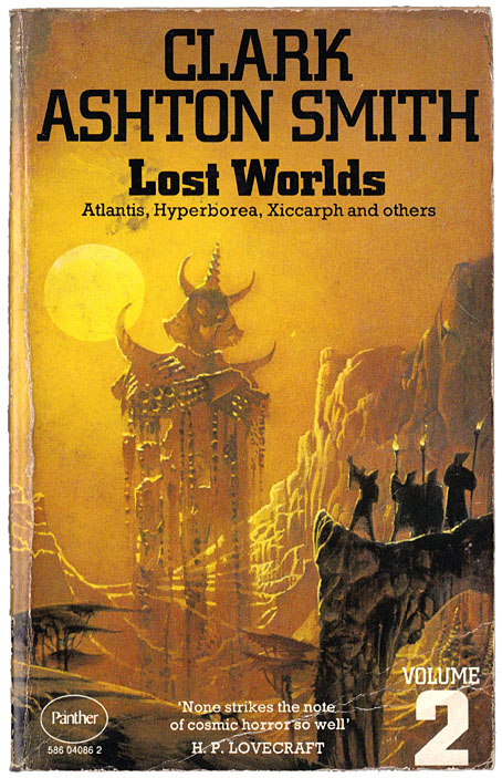
Lost Worlds: Volume 2 (1974). Cover art by Bruce Pennington.

The original Hyperborea illustrations are fewer than those for Zothique. As with the later cycle, several of the stories are unillustrated, while others were given lacklustre artwork. In the earlier post I followed the story order chosen by Lin Carter which attempted to contrive an internal chronology for the cycle. Carter did the same with his Hyperborea collection so I’ve followed his example once again. Later collections, like Will Murray’s Book of Hyperborea, tend to order the stories by publication date.

hyperborea01.jpg

The Seven Geases, Weird Tales, October 1934.

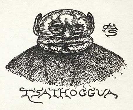
An illustration of Tsathoggua by Smith himself. The toad-god turns up in person in this story.

hyperborea02.jpg

The Weird of Avoosl Wuthoqquan, Weird Tales, June 1932.

Continue reading “Illustrating Hyperborea”

Four Horsemen

adolfs.jpg

Drie Apocalyptische Ruiters (c. 1943) by Willem Adolfs.

Willem Adolfs’ painting only shows three Horsemen of the Apocalypse but his picture is too good to be buried at the foot of this post. Adolfs was a Dutch artist whose work I hadn’t looked at before. His painting is a product of wartime, so the absence of the white horse (usually symbolising war) may perhaps be taken as referring to the conditions of its production. Adolfs spent the later war years in German concentration camps, dying in one near Hamburg in 1945.

duvet.jpg

Saint John sees the Four Horsemen (no date) by Jean Duvet.

After looking at Albrecht Dürer’s apocalyptic woodcuts last week I went searching for more depictions of the Four Horsemen. The quartet are the most familiar characters of the Book of Revelation, and such a useful symbol that their appearance has over the centuries become detached from their Biblical origins. War, Pestilence, Famine and Death embody perennial, universal fears, they don’t require a Christian framing to be acknowledged.

flamande.jpg

Apocalypse flamande (15th century).

There are many depictions of the Four Horsemen, especially from earlier centuries when war in particular tended to arrive on horseback. Recent depictions are less common. In 19th-century art Christian symbols had a cultural weight they no longer possess; paintings of Lucifer or the Whore of Babylon are staples of metal album covers but you’re unlikely to find them in art galleries.

west.jpg

Death on a Pale Horse (1796) by Benjamin West.

The Bruce Pennington paintings at the end of the post are unusual in this respect, being relatively recent and seriously intended despite being the work of an artist known mainly for his book covers. The paintings are from Eschatus, an album-sized volume published by Paper Tiger/Dragon’s World in 1976. The book is a series of pictures illustrating Pennington’s own translations of the prophecies of Nostradamus, a cycle of events which he depicts as apocalyptic science fiction. It’s a strange work, and not a very comprehensible one, but it does include the inevitable Horsemen on the cover painting, along with a portrait of Death (aka Ghost Rider) which appears in a detail on the back cover.

sabatelli.jpg

Vidi, quod aperuisset agnus… (1809) by Luigi Sabatelli.

Continue reading “Four Horsemen”

Corgi SF Collector’s Library

corgi02.jpg

Cover artist unknown.

“Here, for the connoisseur, for the devotee of the SF genre, and for those who like their reading to combine excitement with good writing, is the Corgi SF Collector’s Library – a series that brings, in a uniform edition, many of the Greats of SF – standard classics, contemporary prizewinners, and controversial fiction, fantasy, and fact…”

Only in the 1970s would you find a line of SF paperbacks with all the titles set in Thalia, a Victorian typeface revived by the post-psychedelia predilection for any design that was florid and ornate. Corgi’s SF Collector’s Library was published from 1973 to 1976, arriving just as my reading was moving from child-friendly SF to adult fiction. Consequently, I bought quite a few of these books, and still own a couple of them. The design was uniform but with a surprising amount of variation for such a short-lived series. The background colours ranged from deep blue to purple, while the card used for the covers was regular paperback stock for some of the titles with the majority using textured card, a treatment that further distinguished the series from its rivals on the bookshelves.

corgi12.jpg

Art by Joe Petagno.

Looking at these covers again I’ve been wondering if the idea of framing the artwork in a circle was borrowed from Penguin’s run of HG Wells reprints from 1967. Corgi had done something similar the same year with their Ray Bradbury series (all with art by Bruce Pennington) but the Wells editions went through several reprints, and the SF Collector’s Library follows their form even down to allowing the artwork to break the frame.

corgi03.jpg

Art by Bruce Pennington.

The samples here are a small selection of the series which featured a fair representation of British SF illustrators of the time. None of the artists were credited on the covers, however—a poor showing on the part of Corgi—so a few of them remain unidentified.

corgi01.jpg

Art by Tony Roberts.

corgi05.jpg

Cover artist unknown.

Continue reading “Corgi SF Collector’s Library”

Crank book covers

kolosimo2.jpg

Cover art by Tony Roberts, 1974. A book I received as a present for Christmas, 1974. Also the first place I encountered the words “Popol Vuh”, before discovering the music of Florian Fricke and co. a few years later.

Yes, “crank” is a pejorative word but it’s used with some degree of affection, as in “harmless crank”. It’s also a convenient umbrella term for the books referred to in the weekend post which embrace diverse subjects, from lost continents and “Earth energy” to ancient astronauts and flying saucers.

The prime crank decade was the 1970s, a period when publishers were falling over themselves to cash-in on the massive popularity of Erich von Däniken’s dubious investigations, while also catering to the by-products of the hippy era and the occult revival. Books by Charles Fort, Immanuel Velikovsky and James Churchward (the Mu series) all received reprints, with some appearing in paperback for the first time. The British editions of these books were published by imprints like Corgi, Panther and Sphere who were also publishing large quantities of science fiction, a situation that led to many crank titles being packaged as though they were fiction or fantasy. Sphere was in the vanguard, presenting a wide range of books with the same cover designs, cover artists and Novel Gothic typeface as their SF titles. A cynical move, no doubt, but it also makes the crank books seem more like fiction than their authors might have intended.

This post presents a selection of crank titles with cover art by SF artists but there are many more examples out there. (Watch the skies!) I’ve limited the selection to British publishers but the same syndrome was evident in American publishing, as documented at Absolute Elsewhere. And I’ve included a couple of books by sceptics John Sladek and Dr. Christopher Evans. These were intended to dismantle the claims of L. Ron Hubbard, Erich von Däniken and co. but were still packaged in paperback to resemble the books they were attacking. The major demolition of Von Däniken is Ronald Story’s The Space Gods Revealed but covers for that one have always been relatively restrained.

Missing from this list are three paintings by SF artist Peter Jones for books by Dr. Celia Green. The art may be seen in Jones’s Solar Wind collection but I couldn’t find any of the printed covers, which suggests they had a limited run if they were printed at all. These are odd for being typical fantasy imagery attached to serious studies of lucid dreaming and out-of-body experiences. Dr. Green is a philosopher and science researcher (she coined the term “out-of-body experience”) so she doesn’t belong on a crank list in any case. Also absent is the most popular British cover illustrator of the decade, Chris Foss, who would have been too busy working through his fiction commissions and creating designs for feature films.

kolosimo1.jpg

Cover art by Tony Roberts (?), 1974.

evans.jpg

Cover art by Bruce Pennington, 1974.

Evans was a computer scientist, an occasional contributor to New Worlds magazine, and also the model for the deranged Vaughan in JG Ballard’s Crash. Cults of Unreason investigates crank sects such as the flying-saucer worshippers of the Aetherius Society (hence the cover art), and the Scientologists who caused a stir in Britain in the 1960s when L. Ron Hubbard set up an outpost at East Grinstead.

fort2.jpg

Cover art by Colin Hay, 1974.

fort1.jpg

Cover art by Angus McKie, 1979.

Continue reading “Crank book covers”

Weekend links 576

haberfield.jpg

Cover art by Bob Haberfield, 1976.

• I’ve been reliably informed that Australian artist Bob Haberfield died recently but I can’t point to an online confirmation of this so you’ll have to take my word for it. “Science” and “sorcery” might describe the two poles of Haberfield’s career while he was working as a cover artist. His paintings made a big impression on British readers of fantasy and science fiction in the 1970s, especially if you were interested in Michael Moorcock’s books when they appeared en masse as Mayflower paperbacks covered in Haberfield’s art. Haberfield also appeared alongside Bruce Pennington providing covers for Panther paperbacks by HP Lovecraft, Clark Ashton Smith and others, although his work there isn’t always credited. Dangerous Minds collected some of his covers for a feature in 2017. (The US cover for The Iron Dream isn’t a Haberfield, however.)

• “Like Alice, who can only reach the house in Through the Looking-Glass by turning her back to it, Gorey reversed the usual advice to ‘write what you know’ and wrote the apparent opposite of his own situation.” Rosemary Hill reviewing Born to Be Posthumous: The Eccentric Life and Mysterious Genius of Edward Gorey by Mark Dery.

• “Orvil…wanders the countryside, visits churches, rummages in antique shops, and encounters strange men to whom he is no doubt equally strange.” John Self reviewing a new edition of In Youth Is Pleasure by Denton Welch.

• At the Wyrd Daze blog: Q&A sessions with Stephen Buckley (aka Polypores), Gareth Hanrahan, and Kemper Norton.

• “Fellini liked to say that ‘I fall asleep, and the fête begins’.” Matt Hanson on Federico Fellini’s phenomenal films.

• A Beautiful Space: Ned Raggett talks to Mick Harris about the thirty-year history of Scorn.

• Deep in the dial: Lawrence English on the enduring appeal of shortwave radio.

Clive Hicks-Jenkins on making a picture for Annie Darwin (1841–1851).

DJ Food looks at pages from Grunt Free Press circa 1970.

• Mix of the week: Fact Mix 814 by Loraine James.

• New music: Clash (feat. Logan) by The Bug.

• At BLDGBLOG: Terrestrial Astronomy.

LoneLady‘s favourite albums.

• At Dennis Cooper’s: Porn 2.

Tilings Encyclopedia

Betrayal (Sorcerer Theme) (1977) by Tangerine Dream | Science Fiction (1981) by Andy Burnham | Sorceress (2018) by Beautify Junkyards